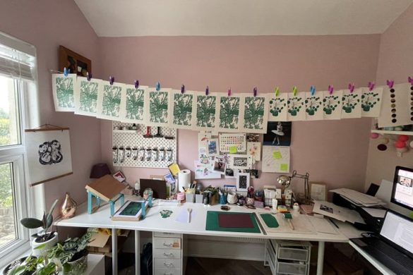
This month, we’re delighted to present a selection of monochrome prints created by the talented members of our Official POP community. Through utilising just one colour, our members have conveyed powerful messages combined with a plethora of printmaking techniques.
Studio Turbo: How to Build a Robot
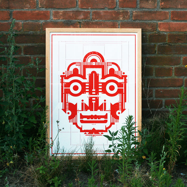
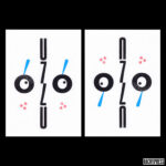
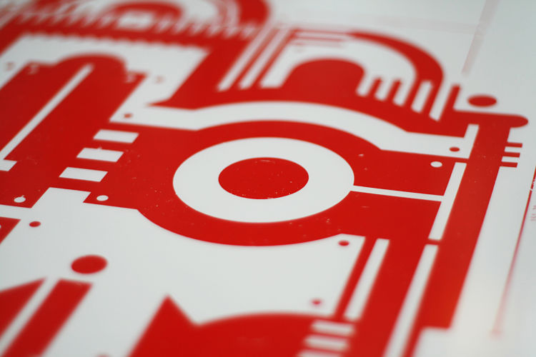 “I love drawing on grids and using geometrical shapes. To me, the limitations of a strict grid in combination with only geometrical shapes are both challenging and fun,” says Raoul Wilke of Studio Turbo. This monochrome screen print was designed on a grid of 1,25mm squares. He comments further; “It was tricky to only use 1 colour and still get some kind of depth in the face of the robot but in the end I think it worked out pretty well”. So if you ever want to build a robot yourself get this blueprint, or should we say, redprint.
Ashley Jouhar: Monochrome Collages
 Much of Ashley Jouhar’s printmaking is monochrome. The prints shown here are all recent works and are evidence of his passion for graphic directness. “I find the removal of colour, other than black and white to be quite liberating, as it allows the viewer’s eye to read imagery, compositions and shapes more directly. There is also a discipline with working in monochrome to create striking, impactful pictures,” describes Ashley. Each of these pieces are collages made up from found elements as well as elements Ashley has created himself.
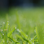
Margaret Mallows: Grass Hopper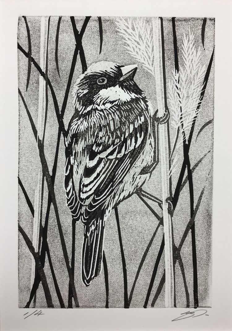
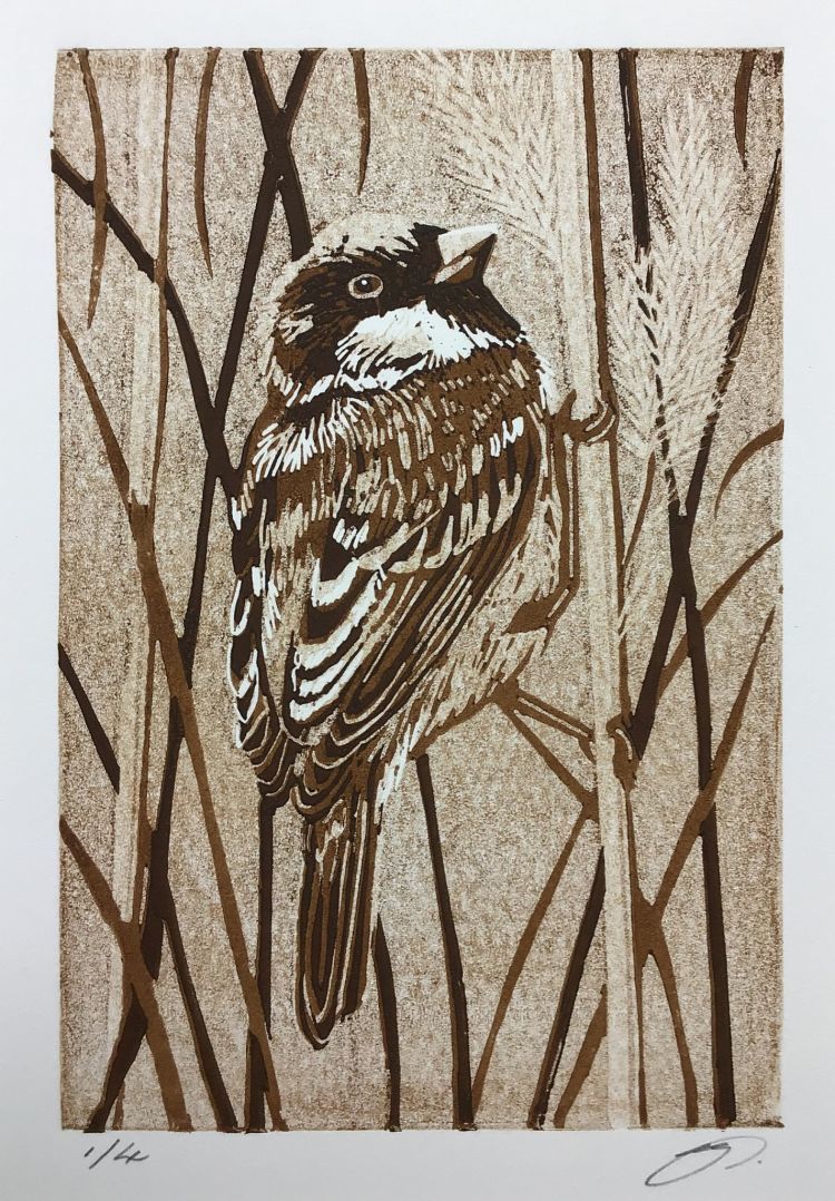
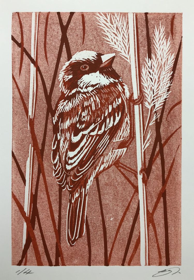 Grass Hopper is a monochrome print by Margaret Mallows created using just one colour for each of 3 variations; “A happy experiment to find a good tonal range with one colour of ink”. This tiny reduction print size 10 x 15 cm was made in several layers, with tonal values achieved with a mixture of extender, ghost printing, and roller pressure. Margaret made 3 variations of the same print for colour comparison; 4 prints each of black, sepia, and burnt sienna. Making this print gave her useful experience for future work and a taste for experimenting more.
Emily Pallett: Inside/Outside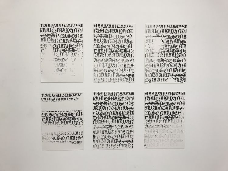
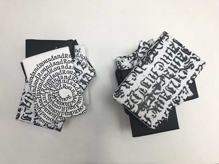
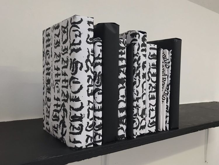 Emily Pallett has been exploring her identity by looking into the term ‘don’t judge a book by its cover’. To do this she has been experimenting with old English calligraphy and letterpress type which she then turned into screen prints and book wrappings. As a book lover and a letterpress printmaker, it is important for Emily’s work to include text in some way. These pieces are the result of understanding judgement and how people treat others who appear to be different on the outside, whilst not considering what’s on the inside.
Zoe Cloke: Little Houses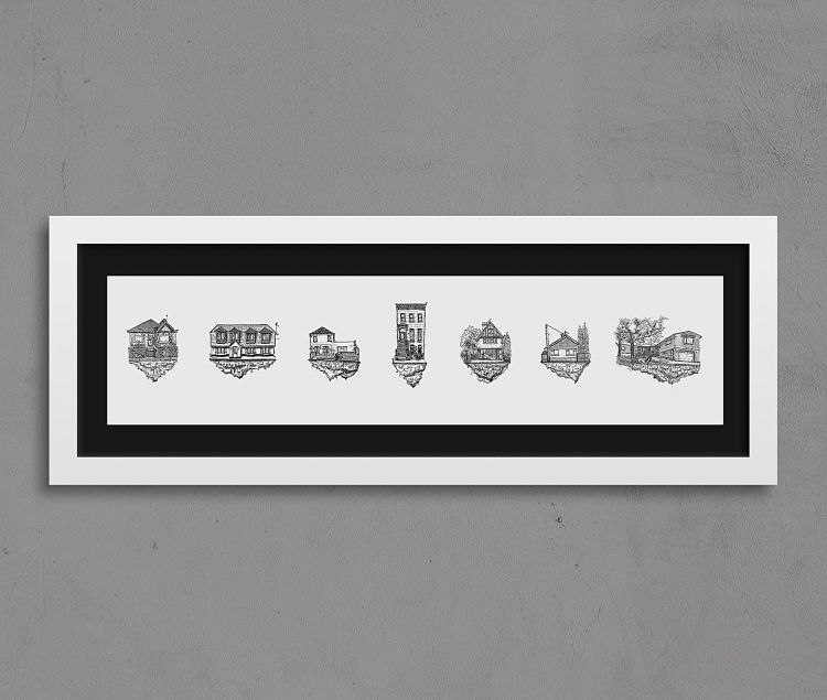
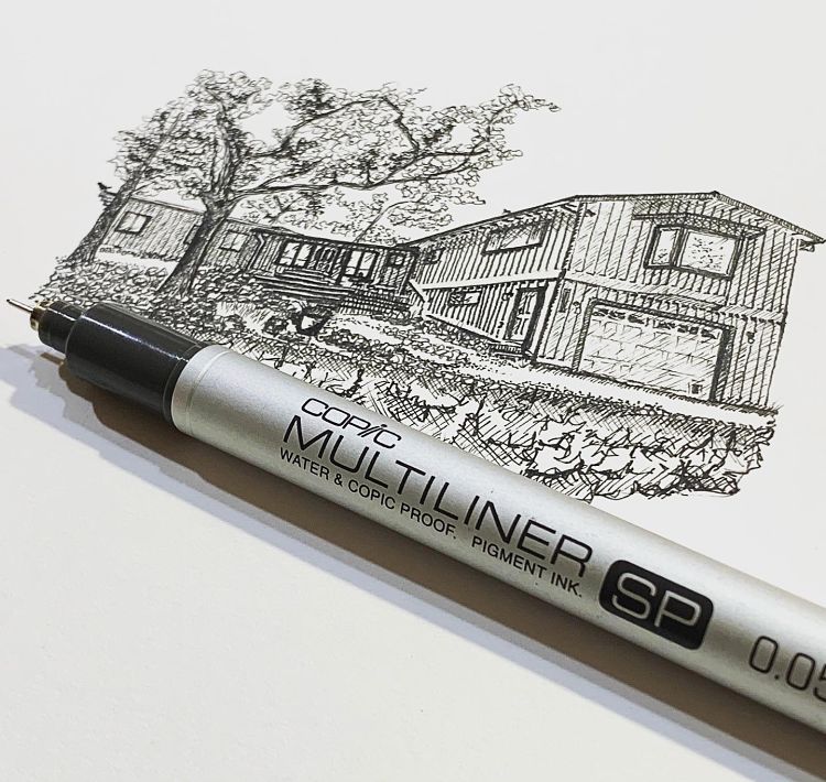
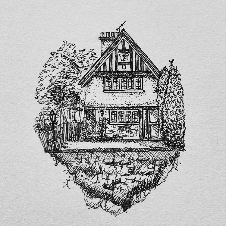 Across the world many of us found ourselves in some form of lockdown during 2020. Trapped on our own little house islands, Zoe Cloke began a series of fine line pen drawings of houses that were sent to her. Seven were digitally captured to create a limited edition Gicleé print. Each house in the print has a story to tell; the first house was bought just before the UK went into lockdown (and was someone buying back a home that used to be in their family) and the last house was perilously close to the Californian fires and its future was uncertain. The Brooklyn Brownstone standing tall in the middle measures just 9cm in height, with the smaller houses being around 6cm. The small scale emphasises how the small actions of so many had such a big impact on changing outcomes.
Becci Salmon: You & Me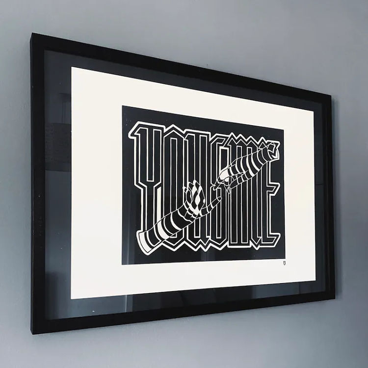
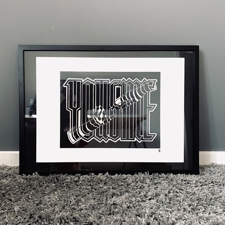
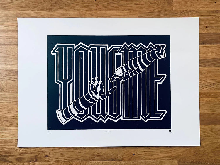 Most of lincout printmaker Becci Salmon’s work utilises a monochrome palette. In this piece, titled You & Me, Becci uses distorted type to create the shape of two hands. This is her first typographic print and also her largest work in size to date.
Filippos Fragkogiannis: Saturnine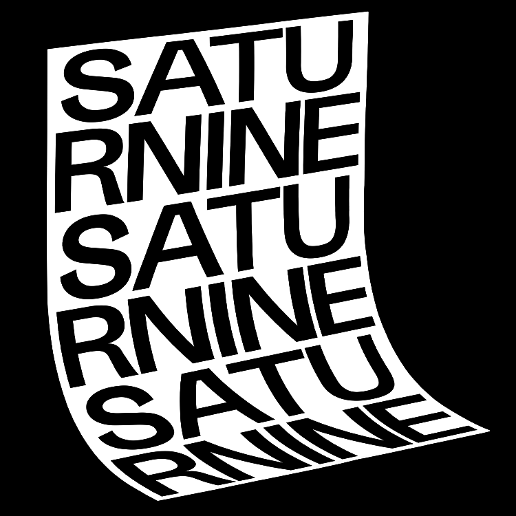
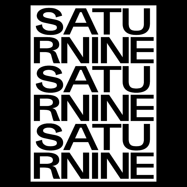
 This typographic poster from Filippos Fragkogiannis represents Saturn; a planet of commitment, routine, and structure, and Saturn Return; an event that will happen two or three times in your life which acts as “a period of getting serious about who you are, what your legacy is, and what you’re here to leave for the world”. Filippos describes; “Saturn’s action is slow, thorough, and inevitable. It is the planet of real worth, as apart from show and make-believe, and gives to all things their permanent and lasting qualities.”
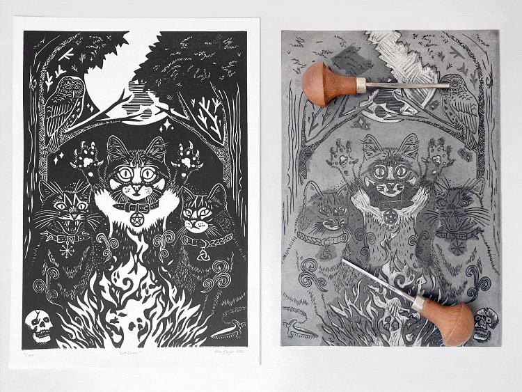
Mike Black: Cat Coven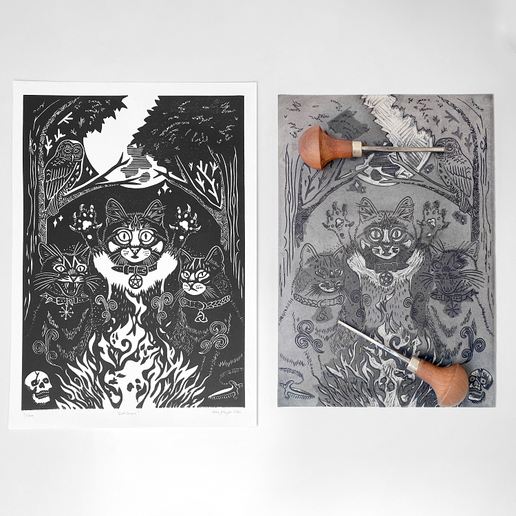
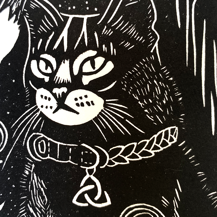
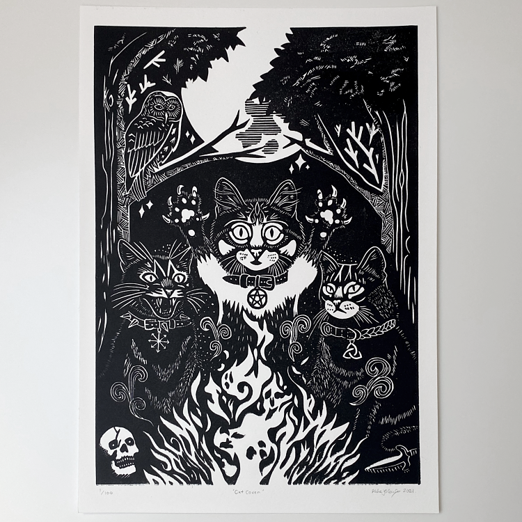 Inspired by an actual coven of cats printmaker Mike Black happened upon in the woods (you can see a pic over on his website), this linocut print features a trio of magical moggies conjuring under the light of the full moon. He states; “As a kid growing up on witchy staples like Buffy, The Craft, Practical Magic, and a hundred other 80s and 90s pagan influences, it’s pretty much ingrained into my psyche. So when I saw these cats and the idea hit me I just knew I had to make a print out of it!” A labour of love, this limited edition relief print took three weeks of planning and carving to reach its completion. Printed on the highest quality archival printmaking paper, it will last for years to come and would make a great addition to any spooky home.
Caroline Erolin: Sleeping Badgers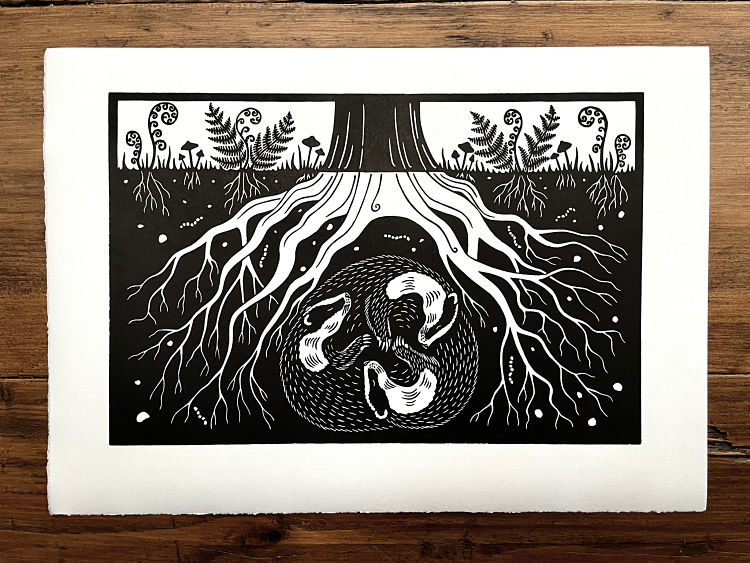
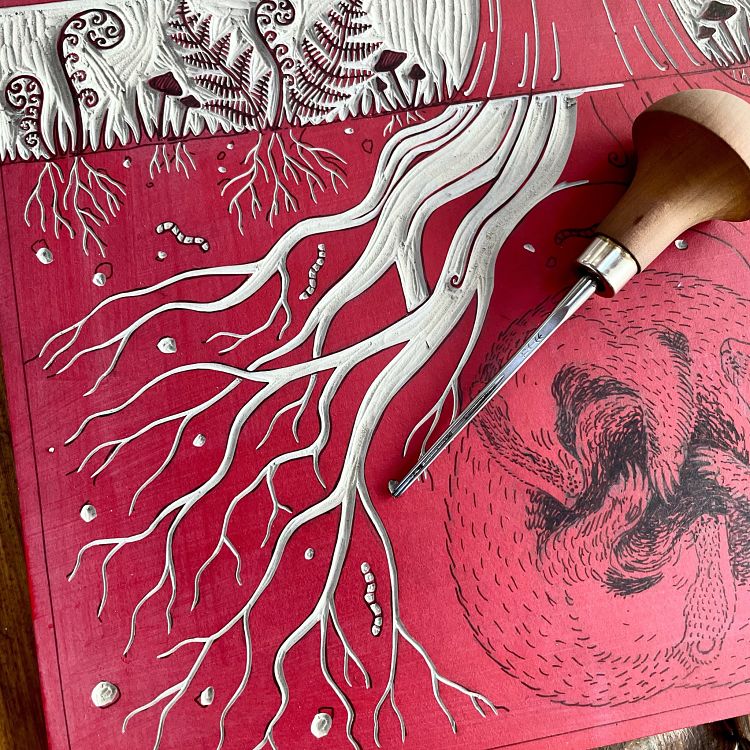
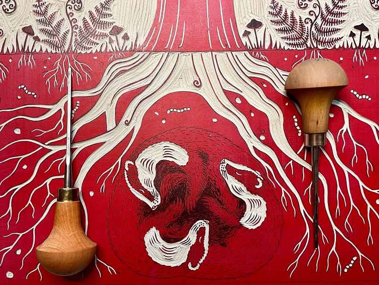 Caroline Erolin works predominantly in lino printing and tends to alternate between colourful reduction prints and more stark monochrome prints. Generally speaking, her monochrome work tends to be slightly ‘darker’ in mood, often referring to the cycle of life and death, depicting both the living animal and it’s skeleton. However, this piece, Sleeping Badgers, is lighter in mood, depicting a trinity of adorable badgers amongst the roots of a tree, whilst still referencing duality with the distinct above and below motif.
Luke Matthews: Damn Your Eyes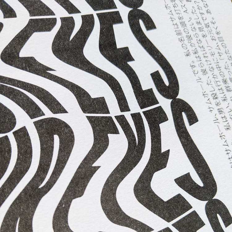
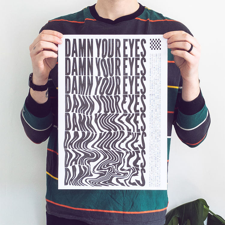
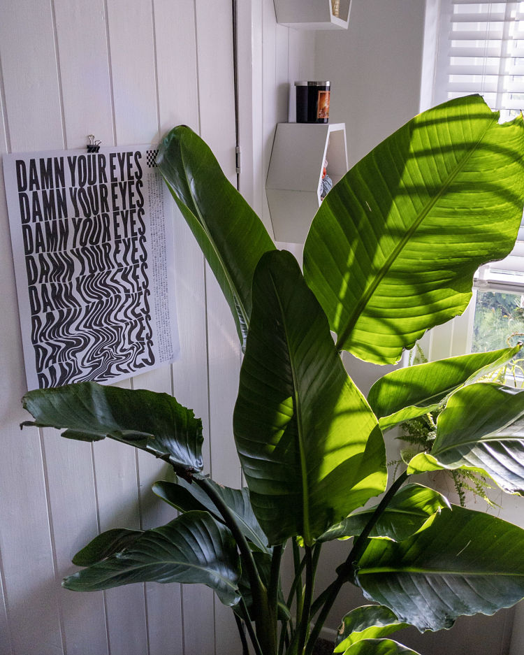 Damn Your Eyes was the first typographic design that Luke Matthews had printed upon setting up his OKNO shop, and it’s proven to be the most popular so far! The line comes from Johnny Cash’s recording of Sam Hall where it appears at the end of each verse; “I saw Molly in the crowd, and I hollered, right out loud, hey there, Molly, ain’t you proud? Damn your eyes!” Luke stumbled across a Japanese translation (a terrible one, it turns out) of the song online and felt this would sit nicely next to the warped, melting text that makes up most of the design. Luke concludes; “This print means a lot to me, as it’s how I started my small business, and I’ve sold more than 200 of them around the world”.
Mathilde Roussillat Sicsic: Echo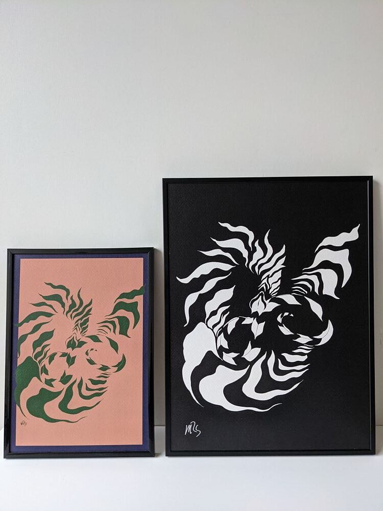
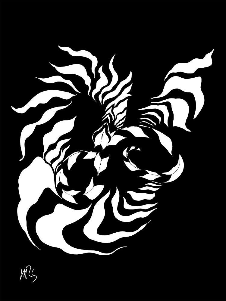
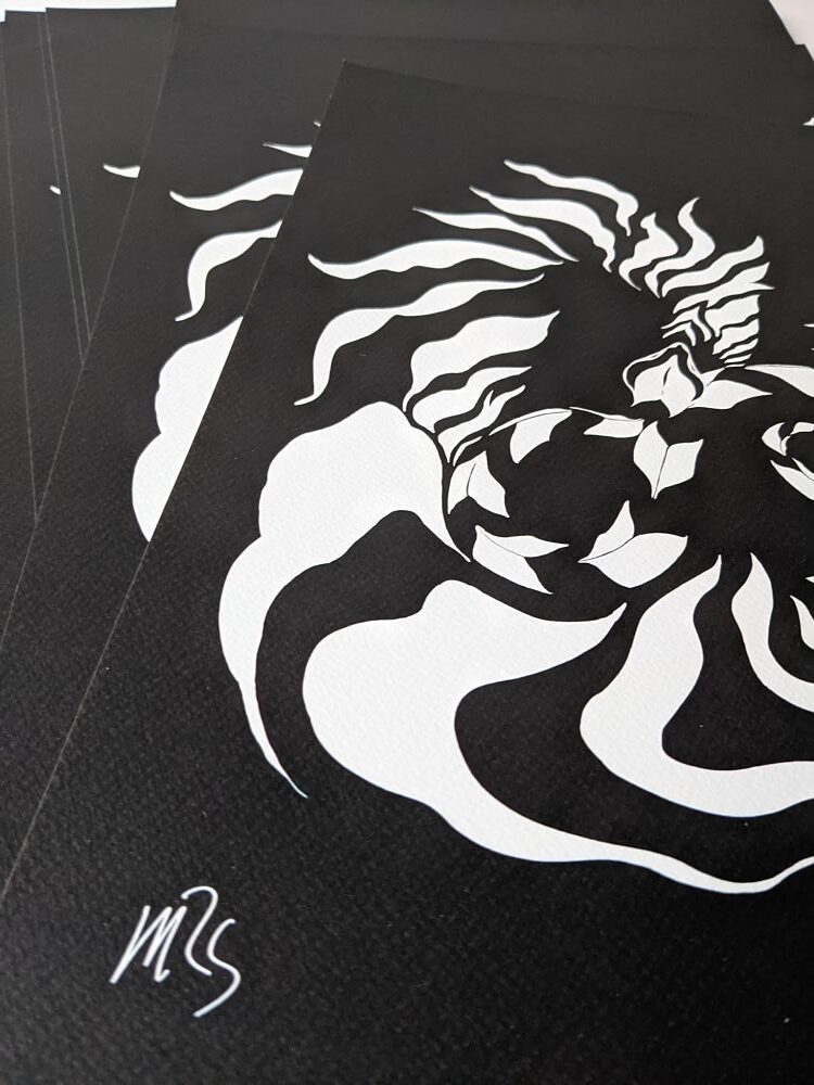 This monochromatic illustration created through a combination of ink and digital drawing by Mathilde Roussillat Sicsic utilises imagery of a snake to represent the waves of music from the MOFO festival. “All in sinuosity, the serpent undulates and each of its movements is echoed throughout his body. The effect is no longer butterfly but winds like a shock wave, vibrating. Music, a powerful energy, penetrates us with its sound waves,” describes Mathilde. The flow of the snake’s scales echoes vibratory flows, and becomes a pattern when one zooms in on the surface of its optical body.
Check out all of our members’ profiles and apply to join our membership community and benefit from a heap of perks on www.members.peopleofprint.com.
You might like...
 Andrea Chronopoulos
- Sarah Ransome
- Trilingua | Interview with Adonian Chan
- Alice Potter
- KOPIJ :: Three Times A Layer
- Badlands 777 — A Self-Published Magazine
- Werkstatt Studio | Dissociation
- POP Member Showcase | 7 Giclee Prints
- Visual Editions
- Klingatron
- KENZO X EVIAN
- VFILES Sport Plus
- Video :: Emma Shoard
- Ye Olde Gangster
- Rach Lloyd Press | Being Silly
- Nobuhiro Nakanishi


Want to know more about our membership? Give us an email at members@peopleofprint.com.
- Tim Belonax |All Of My Mistakes Have Led Me To You - April 26, 2024
- The Humber Printmaker - April 25, 2024
- Horizons by Angus Vasili - April 24, 2024