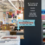
Once again, we’re proud to present a selection of projects from members of our Official POP community. This month we’re excited to showcase 13 letterpress print projects, including reinventions of Virginia Woolf’s words, typographic posters of mottos to live by, and prints inspired by the uncertain times we’re living in.
Prelo Prints: Dracole Waida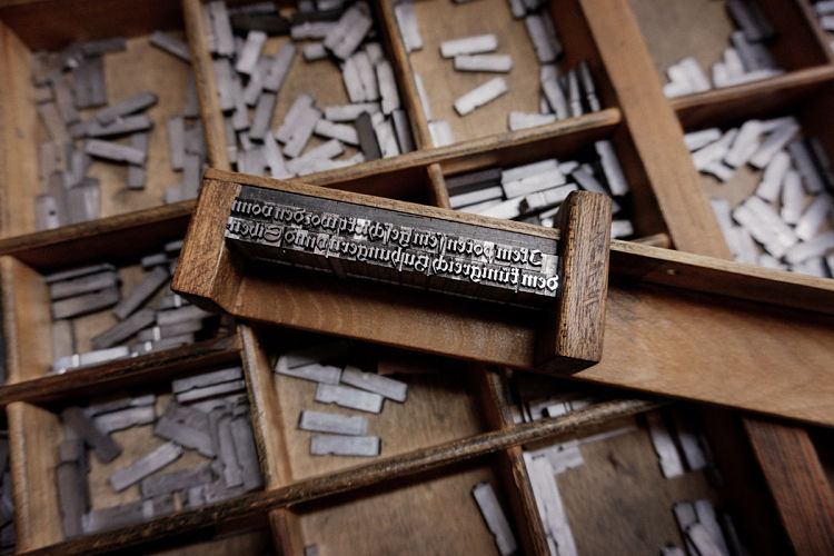
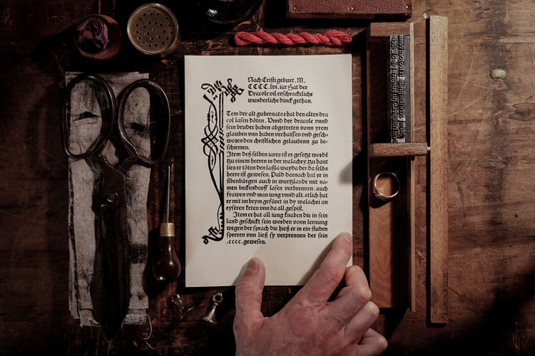
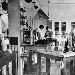
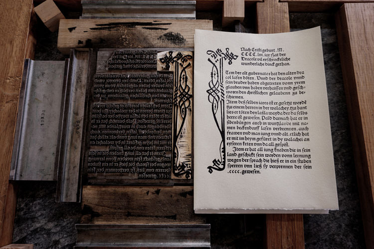 The second publication fresh off Prelo Prints’ press is based on Dracole Waida, a pamphlet published in Nüremberg in 1488. The booklet presents Vlad III’s (known as Vlad the Impaler) various crimes prior to his death which was used as a propaganda instrument. The popularity of the work is proven by the different print runs up to the 16th century in various German cities. Vlad Tepes, also known as Vlad Dracula, was the person who inspired the famous fictitious vampire, Count Dracula. The print work was letterpress printed with a Schwabacher typeface, 16pt, together with woodcuts, and was printed using a wooden hand press, as it would have been in the 1480s.
Coxswain Press: Love is Love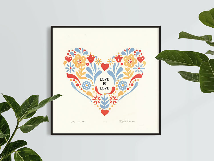
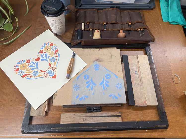
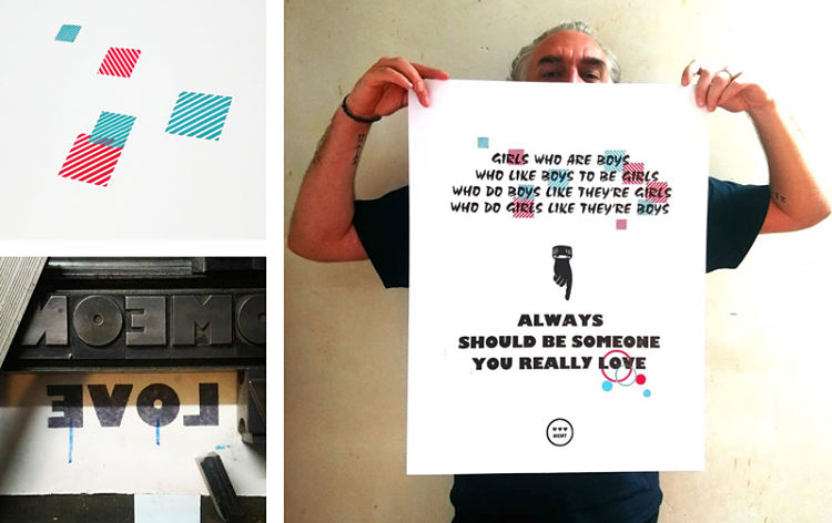
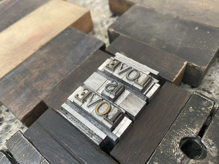 Love is Love is a letterpress printed block print celebrating and inspired by Pride and love equality. Printed in four passes on a vintage 1909 Golding Jobber Printing Press, Love is Love combines hand-set vintage type and a hand carved reduction linoleum block. Coxswain Press is a small letterpress printing and book arts studio located in Tacoma, WA, with a focus on limited edition art prints, greeting cards, hand printed textiles, and artist books.
Ane Thon Knutsen: On Being Ill – A Covid 19 diary
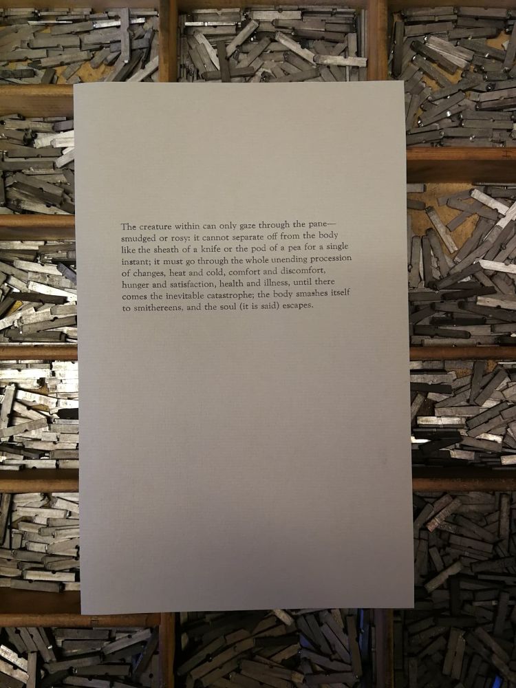
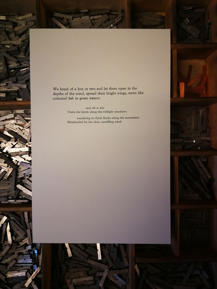 Between March 23rd 2020 and August 29th 2020 Ane reprinted the entire essay On Being Ill by Virginia Woolf by composing and printing one sentence a day. A ‘sentence of the day’ was posted on Instagram and provided a very slow reading of this essay. The essay is one of the three stories Virginia Woolf wrote, composed, printed and bound herself on her private press, The Hogarth Press. On the process Ane states; “...Working on these sentences (which I had already planned to research down the line anyway) has been much more of an embodied experience than I could have ever imagined. It happens again and again, that subjects “find me”, but maybe it is not strange at all?….“.
www.cargocollective.com/anethonknutsen
M.C. Pressure x Kendrick Kidd: Beaches of North Florida Artist Print Series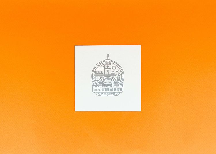
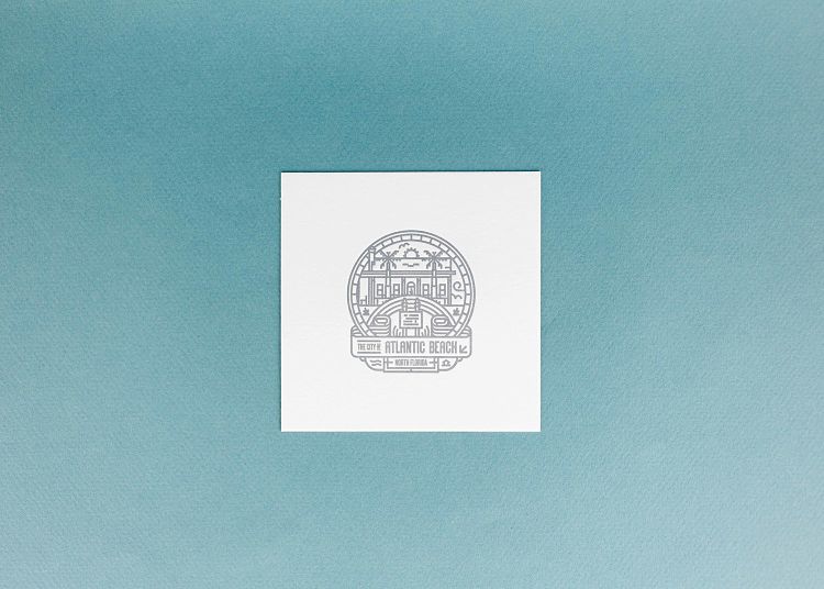
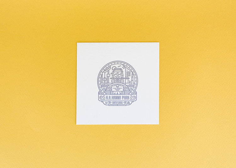 When Ryan Tempro started M.C.Pressure, he wanted the chance to work with talented creatives, thus started the Artist Print Series. One designer he dreamed of working with was Kendrick Kidd, whose work he had admired since school. Ryan reached out to Kendrick when the series began to see if he would be interested, and, to his surprise, he was on board immediately. The team also admired the work Eric Hires, a local videographer who shoots with 16mm Film. Ryan worked with him on a set of business cards back in the early days of M.C.Pressure but wanted the chance to work together again. The stars then aligned, and Kendrick came back to them with the series, Beaches of Northeast Florida. It consisted of five designs: Jacksonville Beach, K.A. Hanna Park, Neptune Beach, Atlantic Beach, and Mayport. Ryan asked Eric to come to their studio while the series was printing and film the process. “The combination of collaboration between local creators as well as the analogue processes of film videography and letterpress was perfect” desrcibes Ryan. The series was printed in an edition of 100 on 118# natural white savoy cotton paper from Reich Paper and printed in PMS 877 silver ink.
Watch the video here.
www.mcpressure.com
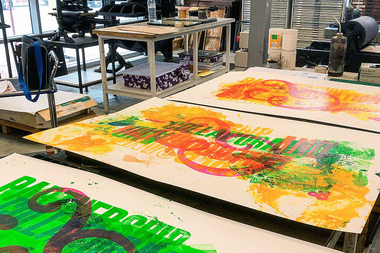
Fresh Lemon Print: And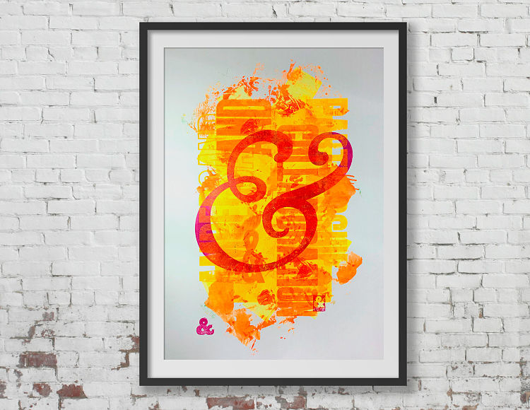
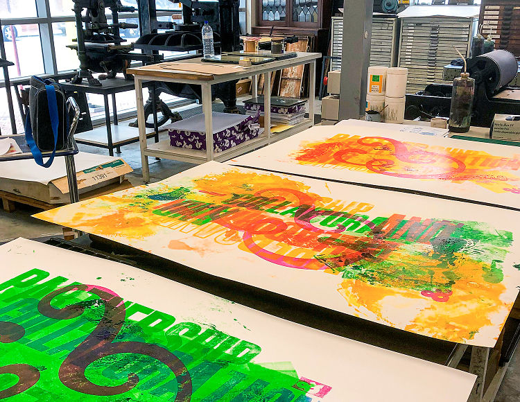
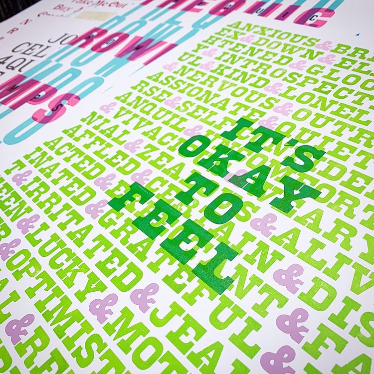
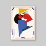
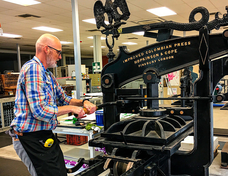 In the heart of Perth’s modern CBD, nestled within a state-of-the-art educational institution, is an impressive letterpress studio from a bygone era. These days it is predominantly underused by the students of print and design who prefer digital pursuits, but when Phil Gambrill of Fresh Lemon Print was invited to become Artist in Residence, he jumped at the chance to be able to indulge himself in their expansive collection of type and printing presses. Whilst undertaking the residency he was free to explore typographic subjects that had long-term fascinated him; one of which was the ampersand letterform. Phil looked at the ampersand ligature in all of its shapes and forms and eventually settled upon an oversized Goudy italic font iteration as the centre piece. The background was created from various 30 and 40 line condensed fonts, all printed on their masterful 19th Century Colombian press. This large format, 1000mm x 700mm print is his celebration of the symbol, and in his trademark style of ink textures and overprints has created a colourful, grungy, typographic poster.
No Plan Press: There is No Plan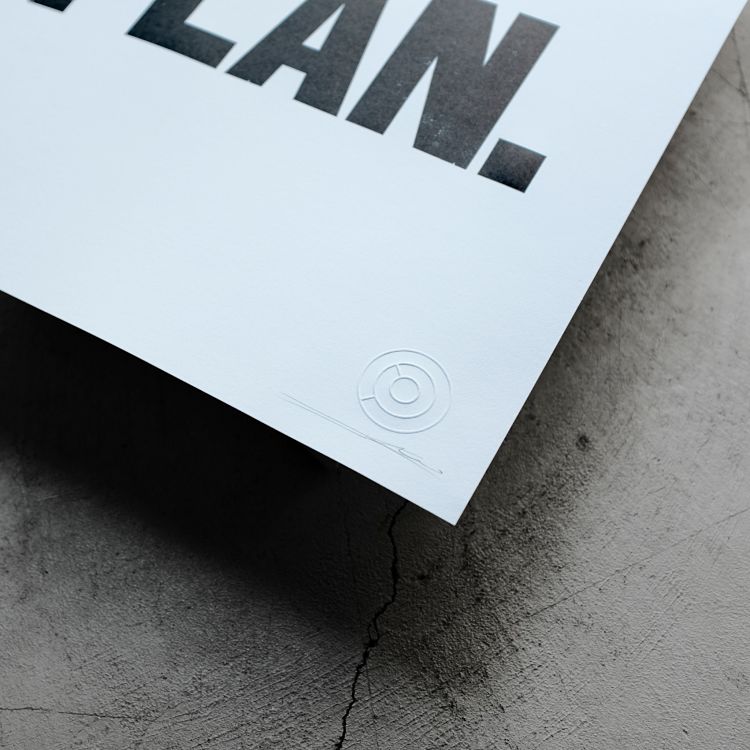
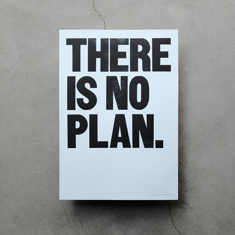
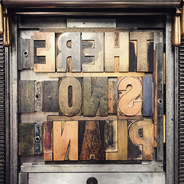 There is No Plan is a 14×20 letterpress print made with antique wood type on 300gsm cotton lettra, fluorescent white paper and printed on a Vandercook 4T. The poster is inspired by the name of its creator, No Plan Press; “which is the idea that sometimes the best plan is no plan, to allow the process, your surroundings, your tools, your accidents, your community… the undexpected to guide you and the work… it’s ok not to know where you are going“. Jesse Kirsch of No Plan Press created this print back in February before the world was shut down due to Covid. Now the idea that “there is no plan” has taken on an entirely new and very relevant meaning, be that good or bad. “Either way, it’s a sentiment that people can connect and resonate with and is a daily reminder of the unpredictable world we live in” concludes Jesse.
Moi & Mes types: Letterpress Journey
 Martial of Moi & Mes Types used to be a graphic design teacher, and had an underlying interest in typography and printing techniques. One day, by chance, he met an old master printer who enlightened him to his monotype casting machine. He then melted a piece of movable type in a hand mould, a couple of months later, he got his first type case, and Martial’s passion for the printing technique was born. Martial entered the game of letterpress printing for three reasons: to not only start his own letterpress collection, but to teach the art to his students; because he loves the tactility of the art (“The letterpress workshop is the place to find a sensitive way to make… it’s a matter of hand, to get closer to design materials, feel them and be part of each moment of the craft experience”); and to maintain the art and heritage of letterpress printing and prevent it dying out.
Emily Woolford: Letterpress Prints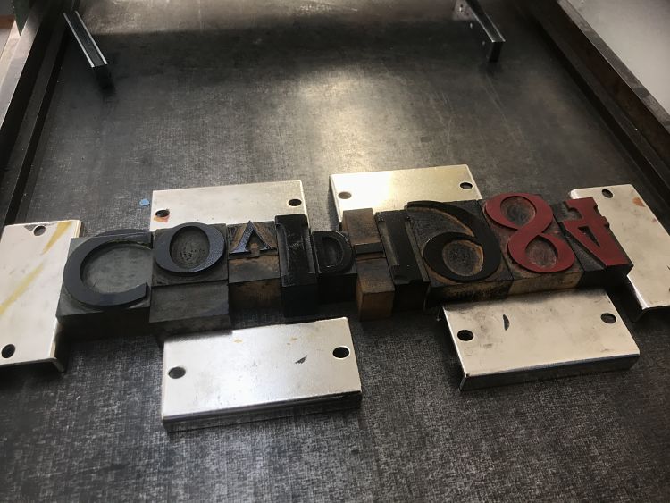
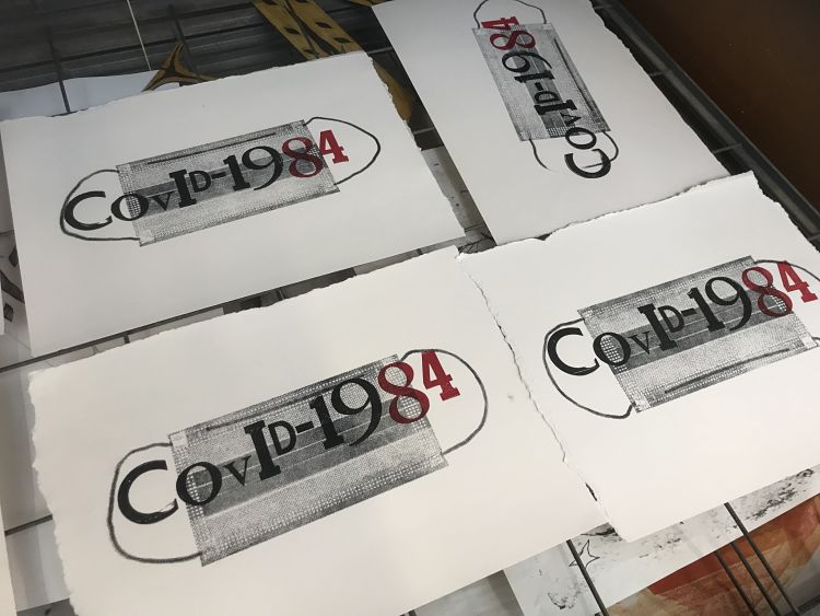
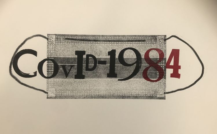 Printmaker Emily Woolford’s artwork often features letterpress printed elements alongside imagery that is inspired by literature. Since the outbreak of Coronavirus, Emily’s work has featured inspiration from dystopian authors such as George Orwell and Margaret Atwood. At the beginning of her second year at university, she created a Covid-1984 facemask print showcasing her worries about the current pandemic. Emily hopes to continue with this idea by creating more prints with this poignant and important theme.
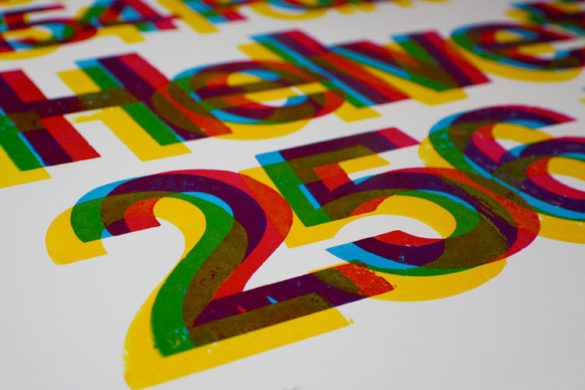
Archivio Tipografico: Aldo Novarese – Maestro della Modernità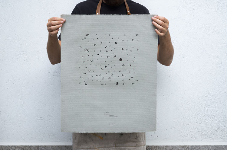
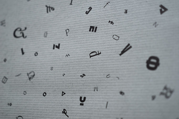
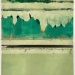
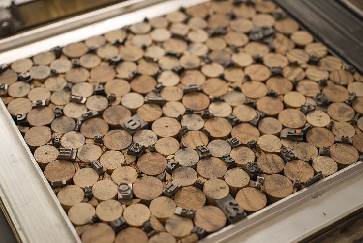 This project was born mostly out of ready-made elements that Archivio Tipografico had lying around in the printshop, in the context of their reissue of Alfa-Beta by Aldo Novarese and the 100th anniversary of his birth. They had an amazing composition lying in a drawer that the team wanted to showcase. The piece had been set by Archivio Tipografico’s founder Emanuele Mensa fifteen years ago, exclusively with lead typefaces from Nebiolo designed by Novarese. They dived into their archive of antique and out-of-production papers, chose a watermarked Fabriano with an undefinable green/blue/grey colour, and pulled a couple hundreds of copies on their trusty Grafix GX2. The team then set a title and a small colophon using various sizes and styles of Magister, another half-forgotten Novarese typeface that they recently rediscovered. They conclude; “We like to think this poster represents Novarese’s work quite well: never excessive or over-the-top but well-thought and refined… It doesn’t shout but has stories to tell for those who’re willing to listen“.
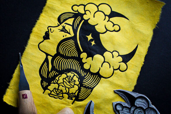
One Strong Arm: Four Letter Words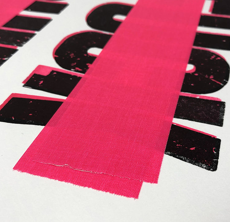
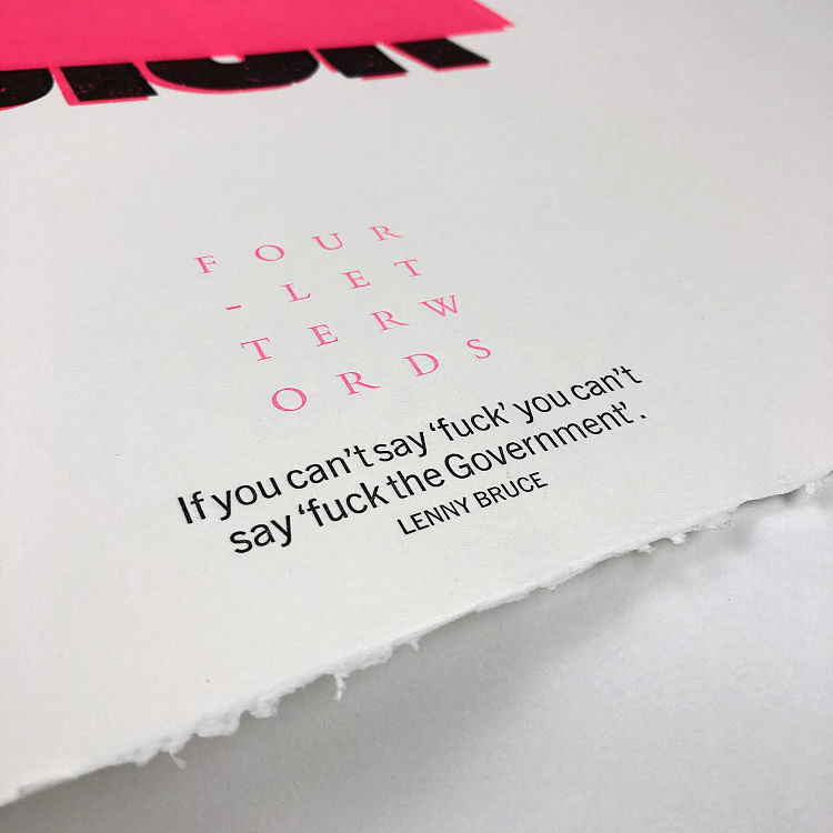
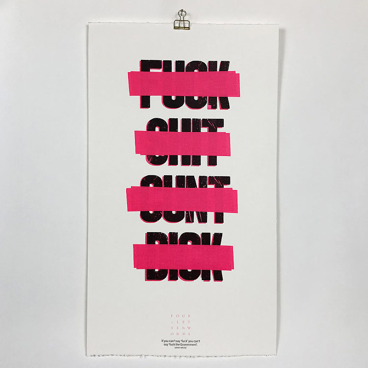 Four Letter Words was created by Dublin-based letterpress studio One Strong Arm for Letterbomb Dublin’s first show Taboo. The exhibition explored ideas of censorship and what’s often considered inappropriate language. The piece was printed in two overprinted colours using wood and metal type, with the addition of flour tape doing the job of censoring the words.
Wood Words Letterpress Art: Look Book No.3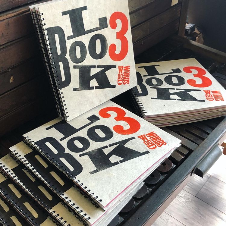
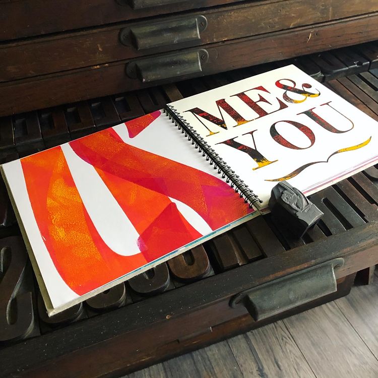
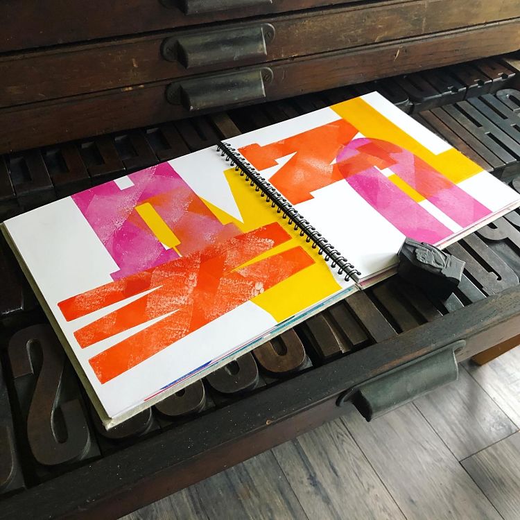 Lockdown created time, and in this time Wood Words created a set of three Letterpress Look Books, each designed to explore the visual possibilities of wood type and the loveliness of letterpress. Look Book 3 is the largest book consisting of 28 original letterpress prints bound in a book 210mm square. Each original print explores different print styles and typographic shapes. The design is considered across balanced spreads, each with rhythm and movement, and the book is full of colour and texture with a pinch of humour. It is unique and original, a visual story created in letterpress in an limited edition of 10. It was designed and hand-printed by Julia Humfress, and a digitally printed edition has also been designed and produced.
Grab yours from www.woodwordsletterpress.com.
IS Projects: Posters from the Selikoff Collection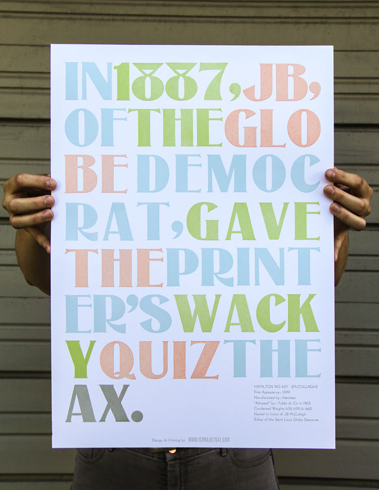
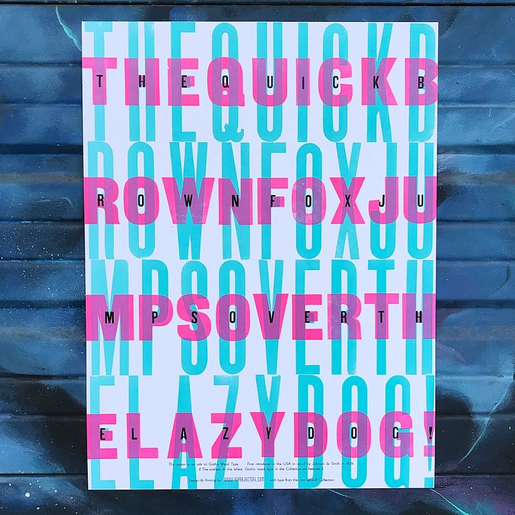
 Each poster in this series consists of a pangram; a sentence that contains all the letters in the alphabet, showing off a different typeface from the Jon Selikoff Collection at IS Projects. The project is a celebration of the history of the collection, as well as the history of the typefaces housed within it. “Jon was an amazing man and top notch designer, he acquired most of his collection from a single printshop and now I am honouring the legacy of that shop and Jon’s shop by ensuring that this collection stays intact and archiving it through this poster project” states Ingrid Schindall of IS Projects.
Gloria Ceballos: Nibu Letterpress
 Nibu Letterpress is a small print studio based in London. It was founded by artist Gloria Ceballos, (MA Printmaking, Royal College of Art) who has over 15 years of professional experience in the printing industry. The studio is committed to designing and letterpress printing bespoke stationery with professionalism, passion and love. Their respect for traditional printing processes lead them to offer handmade products; from the cutting of the paper, to the mixing of the ink, and from the setting up of their antique presses, to the manual inspection of each and every one of their products. The Nibu Letterpress dry stamp found in all of their handmade items is the proof of their commitment to excellence.
Browse our membership directory at www.members.peopleofprint.com to check out all of the services offered by our community. You can apply to become an Official POP Member and benefit from a heap of perks here.
You might like...
 Jillian Harvey
- The Analog Research Lab at Facebook: An Antidote to Digital Everything
- Beach London
- Emily Evans
- Pure Evil
- Wellcome Images
- Posterzine Issue 66 | KaCeyKal!
- Max Huckle
- Interview :: Peter Strain
- Black Scale WW AW13
- James Hoff
- Mesh Collective
- Hannah Waldron
- Johannah Muriel
- Whiteduck
- The RareKind Print Shop


Want to know more about our membership? Give us an email at members@peopleofprint.com.
- Tim Belonax |All Of My Mistakes Have Led Me To You - April 26, 2024
- The Humber Printmaker - April 25, 2024
- Horizons by Angus Vasili - April 24, 2024