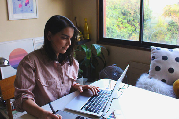
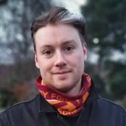
Our new series meets the people behind some of the industry’s most inspiring work. This week, typograph.Her mastermind Nicole Phillips on her creative influences, the future of typography, and her all-important favourite font…
 I’ve loved books and print from an early age.
My dad and uncle both worked in the newspaper industry, and my aunt worked at Random House, so publishing and print was something I was exposed to from childhood. I always did better in Science at school, but as soon as I could start choosing electives and narrowing my studies, I steered myself toward design and media. So I guess it’s always where I wanted to be. I also aspired to be a mermaid which I am still seriously considering as a career choice…
I paid my way through uni working in the fashion industry and doing some freelance.
The first time I got the opportunity to work in a publishing house felt like a huge win. Still, as soon as I started working on the project, I was completely overwhelmed and realised how much I had to learn! Twenty years into my career, I have had a lot of small successes for which I am very grateful, but I still don’t think I have achieved professional success!
 The smartest professional move I made was starting my own business.
On paper, I had my “dream” job – which looked to be very successful – I earned great money and was doing fascinating work, but I was working around the clock and burnt out, and feeling like a pretty amateur human. My husband [Mike] told me that work was getting the best of me. He encouraged me to start my own business, which was never on my radar and made me very uncomfortable! Today the professional success I strive for is to find the right mix of work that sustains me creatively and financially, while also challenging me to learn and grow as a designer and human. I’m also getting better at setting boundaries between my personal and professional life.
Professionally, I do a lot of publishing work.
I design documents and environmental graphics for urban design and architectural clients worldwide. I’m the editor of Design Assembly, an organisation which supports New Zealand Designers. I also occasionally write for other publications about design practice and our community. All of this work has typographic components and sits at the confluence of design and writing – I find this mix interesting and key influences always lie in the content. But I do draw inspiration from my ever-expanding library of design and typography books too.
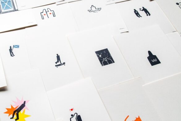
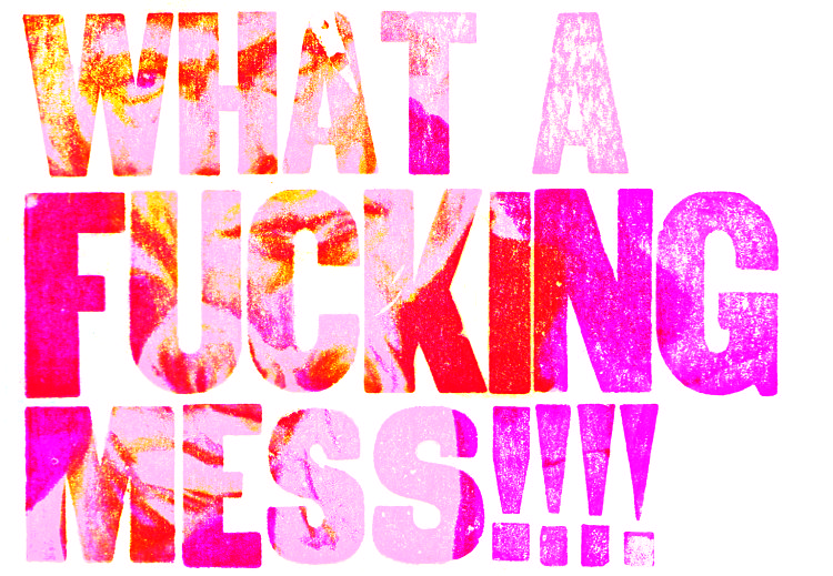
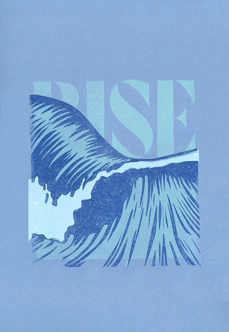
Personally, my printmaking work is all about learning and play.
I don’t do any print work for clients – it’s all self-indulgent exploration. I print to build my creative confidence – I work at a pace much slower than I could in my client work. I try to find new visual territory with old processes. Although my work doesn’t look anything Like David Carson’s… he is a guiding beacon for me; Carson’s dad was a test pilot, flying experimental aircraft and had a significant risk of on-the-job fatality. Any mistake he made would be catastrophic. When we designers fail, there are no lives at risk. This understanding fostered Carson’s daring in his work… So when I am printing, I try to be brave. I push myself, the processes and the outcomes as far as I can. And if it doesn’t work out, I go home and pour a glass of wine and watch the ocean – being brave as a designer isn’t that risky!
 The creative scene in New Zealand is phenomenal.
We are so privileged down here. In my role as the DA editor, I am consistently blown away by the calibre of work produced by our relatively small industry. In NZ we have something called ‘No.8 wire’ mentality [which has rural farming origins] but is about our resourcefulness and how we seek to innovate and problem solve as a nation. This ethos also scaffolds our creative community. I live in a remote area, on the Coromandel peninsula so outside of any of the main centres but my local area is super vibrant and creative too. Within an 800 meter radius of my print studio, there are five other art studios and two galleries!
Baskerville is a typeface I couldn’t do without in vector or lead formats.
I’ve used it throughout my personal and professional work over the last 20 years. My love for fonts starts as an immediate infatuation, but more often than not it’s a short and passionate affair before I quickly move on. Other fonts are steady constant companions – reliable and loyal friends that will be in your life forever. So this might be a bit boring, but Baskerville is my longtime favourite beau. I like the forms, I find it comfortable to read, but I also admire the origin story and how radical it was in its day.
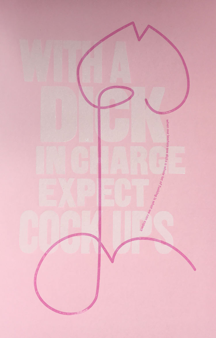
 Eddy Royal, the founder of Curative, said “If you are in a position to make or influence decisions you are in a position to change the way the world works.”
Her agency seeks to make the world better in some way through each of their projects – I really admire that. Typographically, Sam Winston’s work is always a delight. Luke Tonge is a longtime friend and inspiration – he wears his very big heart on his sleeve in his work – his recent Brum design fest posters are unadulterated love for colour and community! And I will never tire of Sabine Pick’s work, her methodology and craft are always an inspiration.
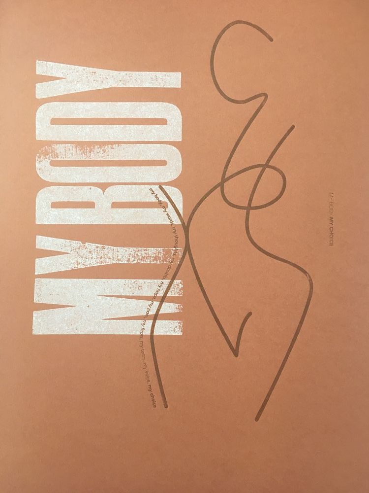
Read. Because typography is more than what language looks like.
I believe it is an act of co-authorship. You need to deeply understand the content for which you are designing to support the authorial intent. I just completed a project in partnership with Creative New Zealand and Design Assembly exploring the future of design here in NZ. Our community aspired to a drastic transformation and better societal outcomes. We see 2020 as a reset in the way we work and what we offer to clients. I think type is just one part of a designers’ tool kit – albeit an important one. Type is a conduit of meaning, and a means for delivery, so if we – the design community – are reimagining our future; Type is our collective opportunity to make noise, to have our opinions heard. Type is a means to be bold.
You might like...
 POP Member Showcase: 10 Publications
- Four and Sons
- Maschine Dinamo
- Hooksmith Press | East London
- Peter Bella
- Matt Reid: Still Life
- Ryan Duffin
- Dan Gonen
- Future You No. 2 by Nada Alic & Andrea Nakhla
- The Counter Press | Extra Condensed No.1
- The Science Of Play
- Sarah Maycock
- Fantasy, Witches and Mythology | Eunjoo Lee
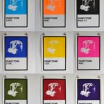
- Colour Black | PANETTONE
- Design Museum Shop
- Pierre Poux
- POP Meets | typograph.Her - December 3, 2020
- POP Meets | Josephine Rais - November 26, 2020
- POP Meets | Follysome Prints - October 26, 2020