This month we’re proud to showcase a selection of landscape print projects from the talented members of our community. From linocut prints inspired by hometowns, to scenes of animals in their natural habitats, our members have used a variety of printmaking techniques to inventively present landscapes from the world over.
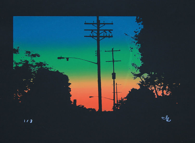
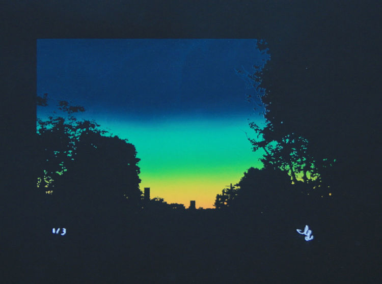
Lee James Abbott: Horizons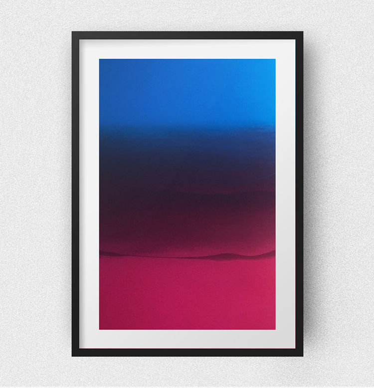
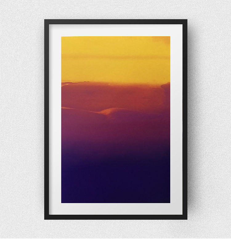
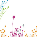
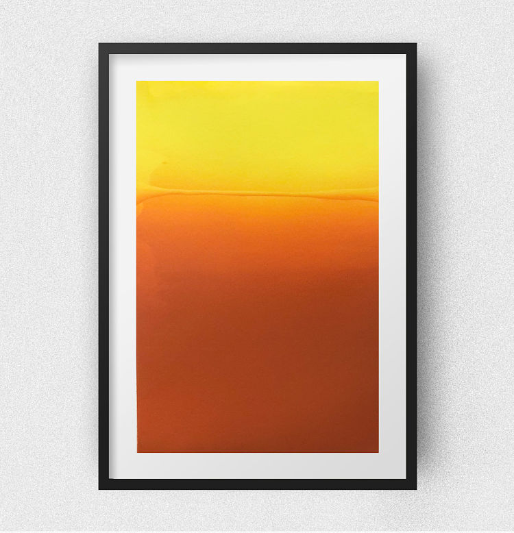 Lee James Abbott’s landscapes are horizon lines inspired by his travels around the world. With a focus on the vibrancy of colour that exists in the natural world around us, the pieces are entirely hand printed featuring multiple hand-mixed, water-based ink colours to create a set of original screen prints. The individual colours were created from blending process colours cyan, magenta, yellow, and black. These colours were then blended on the screen during each separate pull. “I love how these turned out, creating ethereal sunsets and even some 3D looking detail within the prints,” says the printmaker.
Concrete Nature: Icelandic Landscapes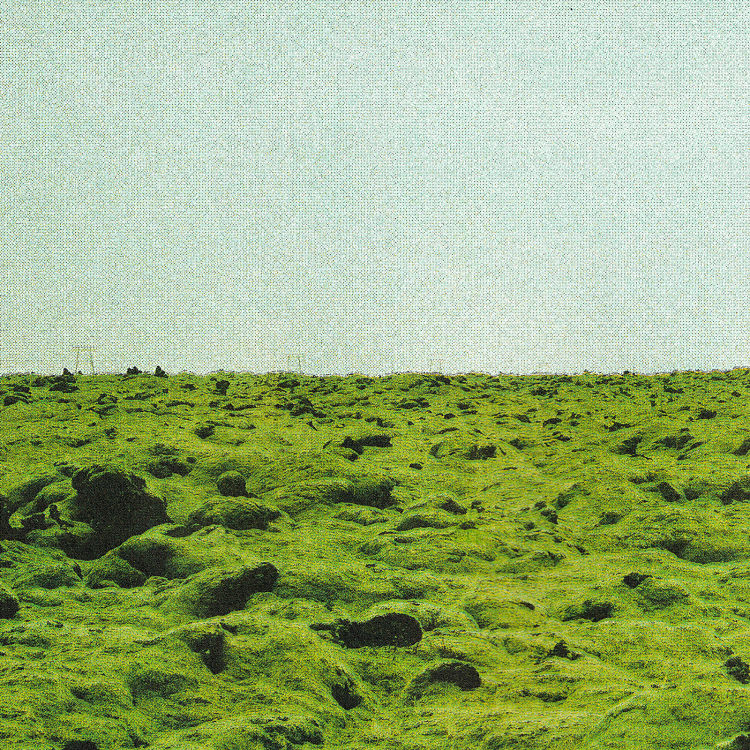
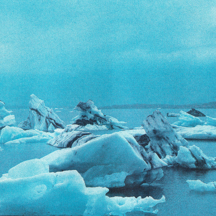
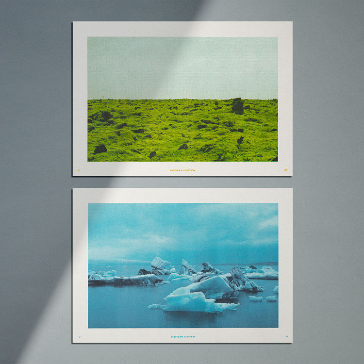 Each of these Risograph prints (Eldhraun and Jökulsárlón) by Concrete Nature features a unique combination of inks, bringing to life the rich and surreal colours of Icelandic landscapes and highlighting issues of environmental damage. Eldhraun is the second largest lava field in Iceland; it has a thickness of about 12 meters and is covered in fragile Woolly Fringe Moss. The beauty of this alien looking landscape relies on people’s carefulness as the plant takes decades to recover from damage. A combination of Sunflower Yellow, Sea Foam, and Black was used to recreate the vivid but oddly soothing mossy green of the velvety looking lava field. While being a stunning sight, Jökulsárlón is also a vivid representation of climate change as it only came to exist as the glacier started to melt and retreated from the ocean due to rising temperatures. The intensity of the icy lagoon was recreated by combining Black, Aqua Blue, and Light Mauve.
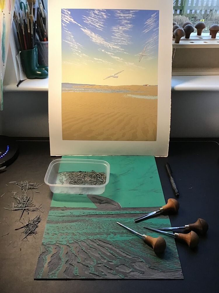
Caroline Erolin: Taking Flight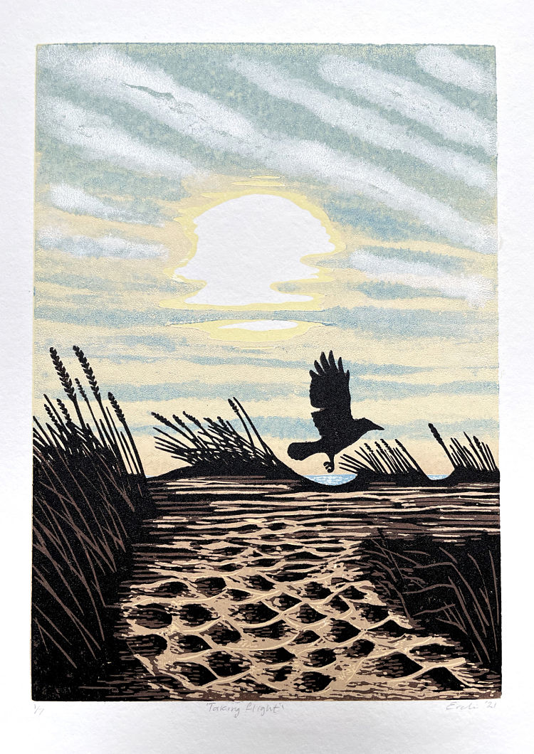
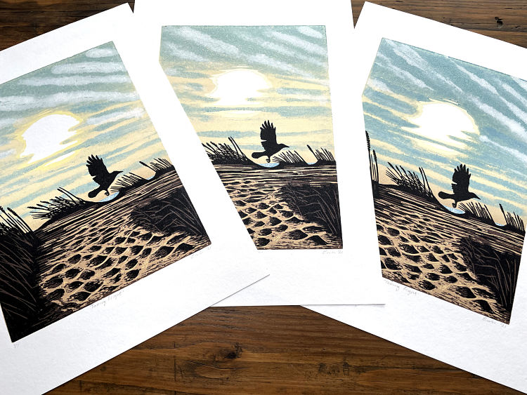
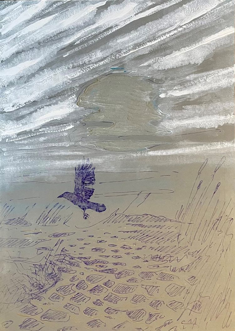 Taking Flight is a reduction linocut print Caroline Erolin made over the summer of 2021, based on a photograph she took of a crow taking flight over Monifieth Beach in Angus, Scotland. The clouds were painted directly onto the lino so are unique for each print. She tells us; “I’m a lucid dreamer and once dreamt that I turned myself into a crow as I flew over this very beach”.
Julie Miammmiam: La Panthère des Neiges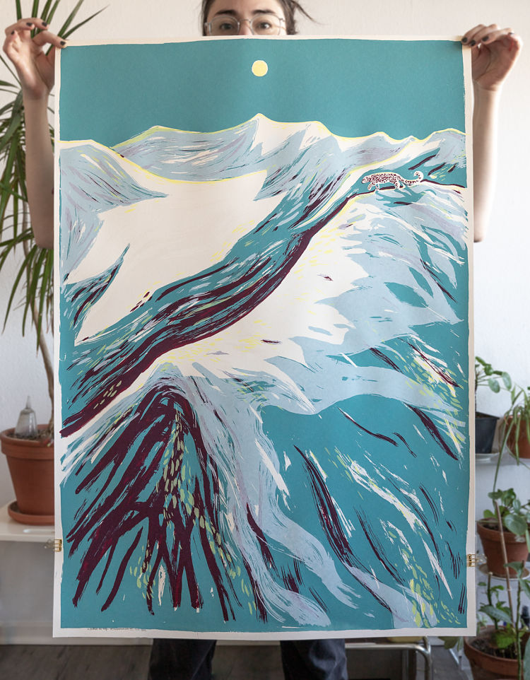
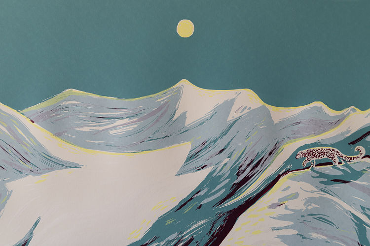
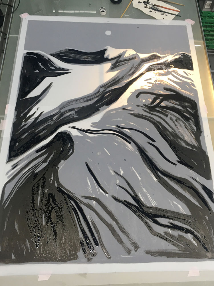 For this new 4 colour screen print Julie Miammmiam developed a new colour palette to obtain light snow colours by transparency. She used an expressionist brush effect, directly on the template, thus the mountainous landscape becomes almost abstract, and the rare animal remains hidden in the details of the wild nature. The piece is inspired by the documentary movie of Marie Amiguet and Vincent Munier The Velvet Queen from 2021. The film tells the story of the quest to see the wild animal, rare and discreet in the grandiose landscapes of Tibet.
Hannah And Her Press: From the Shore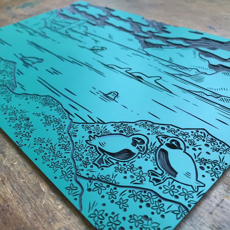
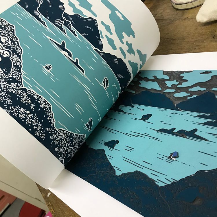
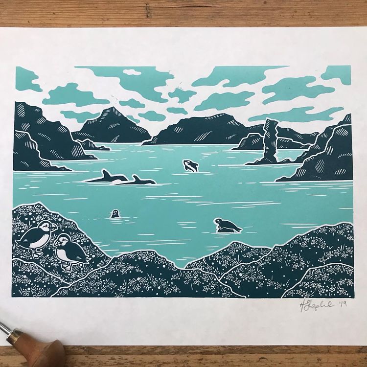 This landscape linocut print by Hannah Shepheard is inspired by the beautiful Scottish coastline and wildlife. Drawing upon different geographical references, Hannah has created a fantastical bay of impressive cliffs, calm waters filled with whales and seals, a rich hillside decorated with flora and fauna, and all watched over by a pair of puffins. The print was made from a single block of lino, which once carved, was carefully and precisely cut up like a jigsaw, allowing each piece to be inked up separately before being reassembled and printed as a whole.
Sarah Delanchy: Sunset on the Mediterranean Sea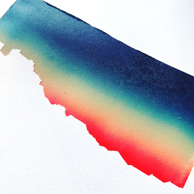
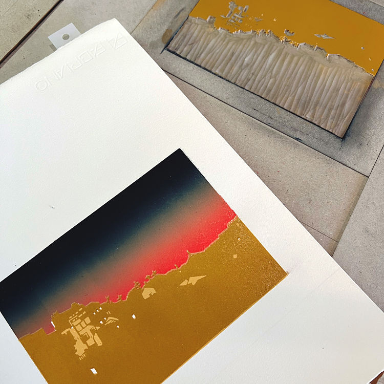
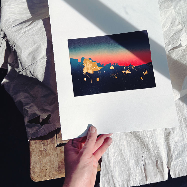 Inspired by a beautiful sunset on the Mediterranean sea that Sarah Delanchy watched from a balcony in Marseille, France, in January 2022, this linocut print is composed of two blocks. The first block was used for the creation of the gradient sunset sky, and the second for the buildings of the skyline. This second block was a reduction lino composed of 3 layers : light ochre, orange, and dark blue. Sarah started with the sky, and then worked layer by layer for the buildings, which meant that the print took her over two months (with the drying time) to complete. She explains; “The last layer was supposed to be black but I found it contrasted too much wih the sky and the previous layers so I made a soft gradient from dark blue (where it meets the sky) to black.”
www.sarahdelanchy-illustration.com
Abbie Lois: Grá Máthair – Limerick Landscape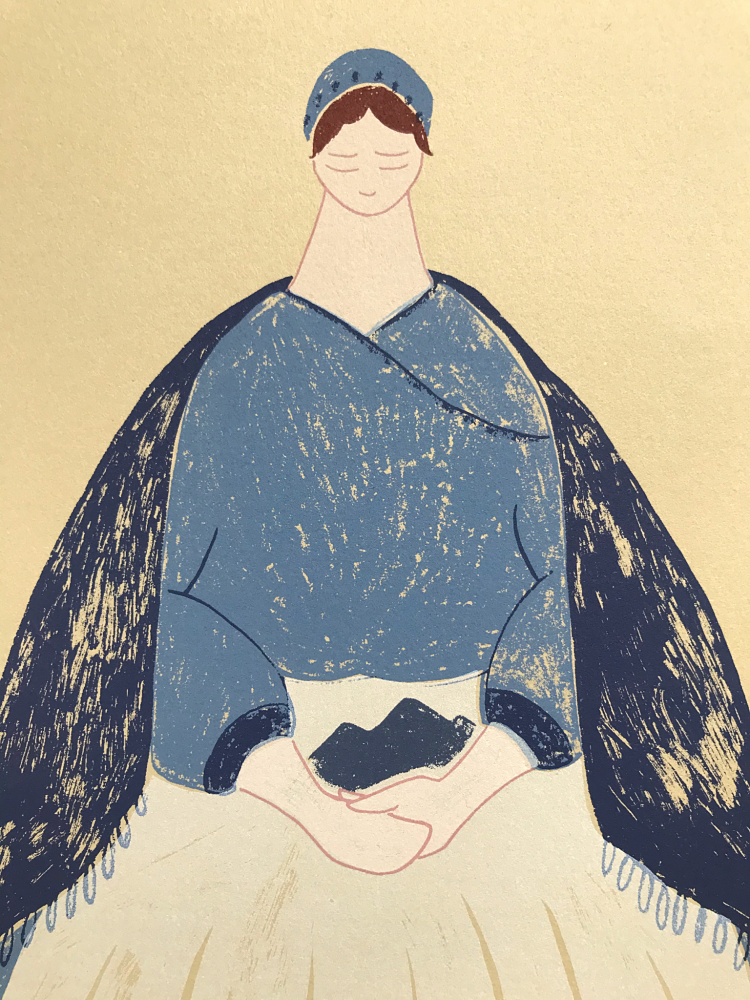
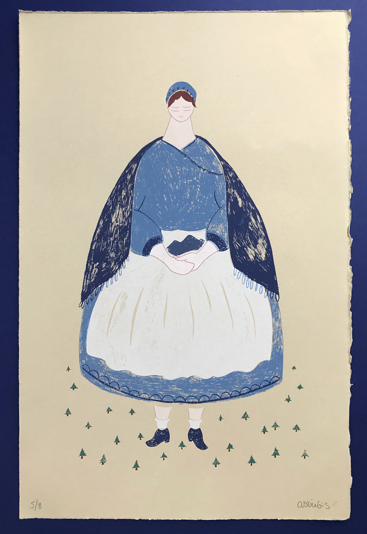
 Grá Máthair translates as ‘A Mothers Love’ in Irish Gaelic. This screen print by Abbie Lois was inspired by the story of a woman who was rumoured to be a witch, and lived beside a lough (loch or lake) with her son in County Limerick, Ireland. The story goes; Her son loved to swim in the lough, but one day he tragically drowned. Torn apart with grief, the woman grew to a great height and stormed across the land. She sought out a hill that she could carry back to the lough to fill it, so no one could suffer the same fate. When she reached the hill, she took a great chunk and carried it back in her apron. However, just before she reached the lough, her apron strings snapped and the rock landed just beside the lough. To this day, the rock still lies there. Abbie created this screen print whilst on a ten-day printmaking residency exploring the local folklore in Limerick, Ireland.
Normandie Syken: Wild Cats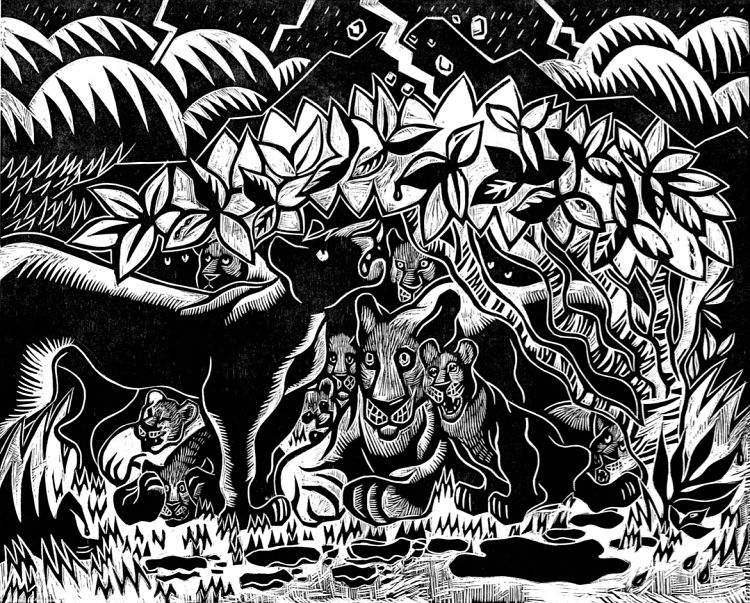
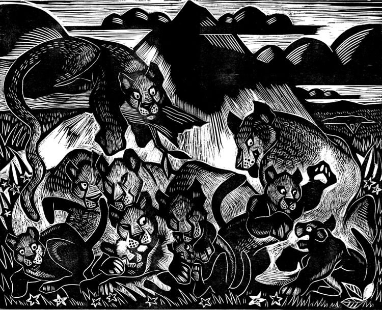
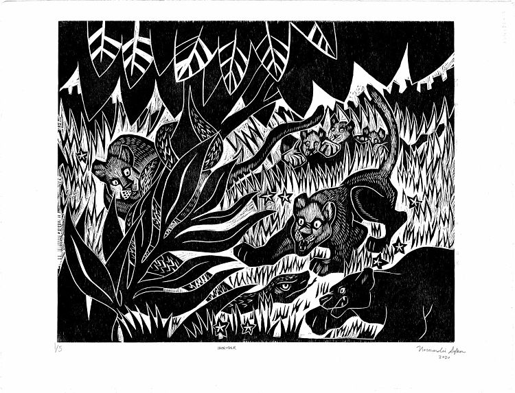 This linocut project by New York-based illustrator and printmaker Normandie Syken illustrates the story of why there are different types of cats. Each illustration in the series depicts a beautiful landscape with cats in their natural habitat, and is created as a monochrome piece.
Anna’s Drawing Room: Birch Trees in December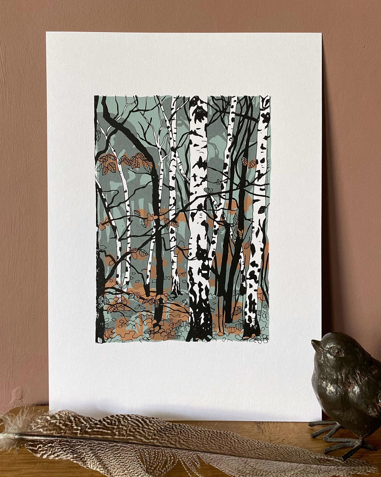
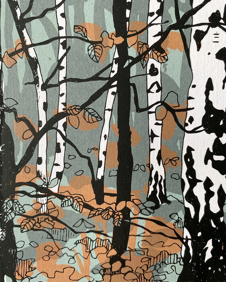
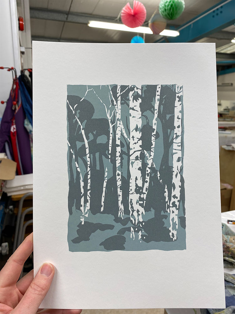 A scene from a favourite walk, combined with an ongoing love of depicting trees and forests, led Anna to create this screen print. The piece features tall evergreens such as Scot’s pine in the background, with silver birch in the foreground. Anna describes; “I love these trees, especially in winter when their branches are bare and sculptural”. The print layers were made in watercolour and pen, then scanned into photoshop to make the files to print onto acetate. “I really enjoy transforming these rough painted textures into flat print colours, as well as featuring my favourite medium of drawing in screen-printed form,” says the printmaker.
Anna Francis: Pripyat River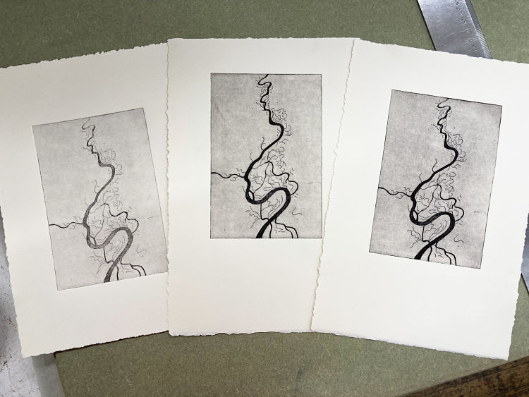
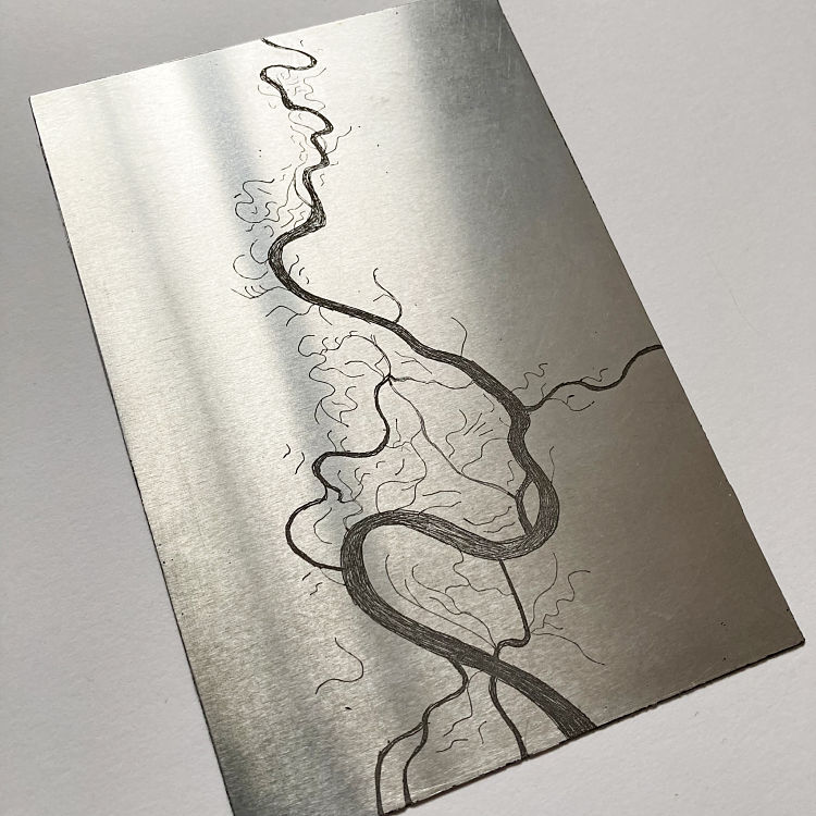
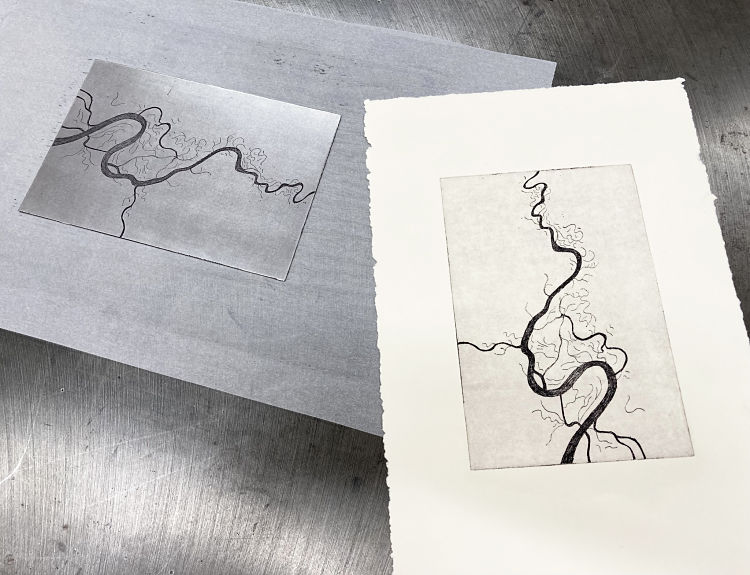 Anna Francis is currently partaking in a 10 week etching course at Spike Print Studio, Bristol, where she is exploring how her cartography work might look when produced as etchings. Several weeks ago, Anna decided to draw a study of the Pripyat river which runs past Pripyat and down past Chernobyl, the area which was directly affected after the nuclear accident in 1986. The piece is an aluminium plate etching, 11cm x 16.5cm, printed on to Somerset 300gsm soft white paper. Ann explains; “I had no idea what was about to happen recently in Ukraine and have been selling prints to raise money for the Save The Children Ukraine Appeal”.
Naomi Arbuthnot: Escape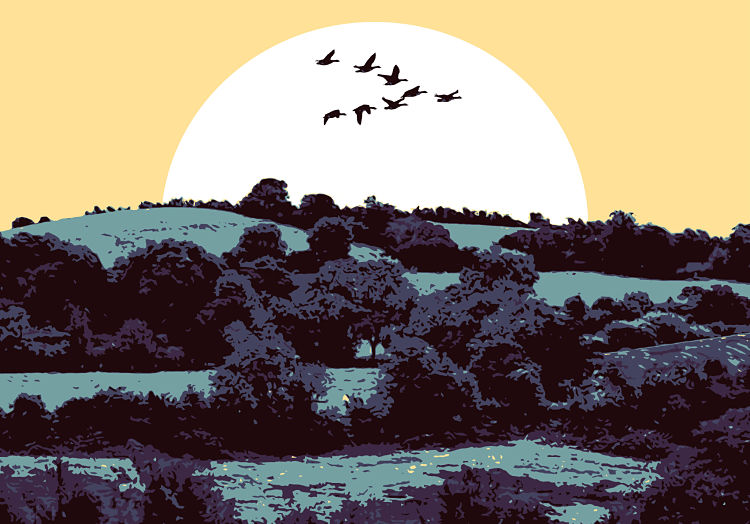
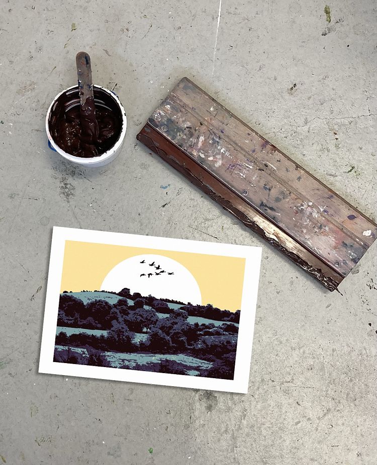
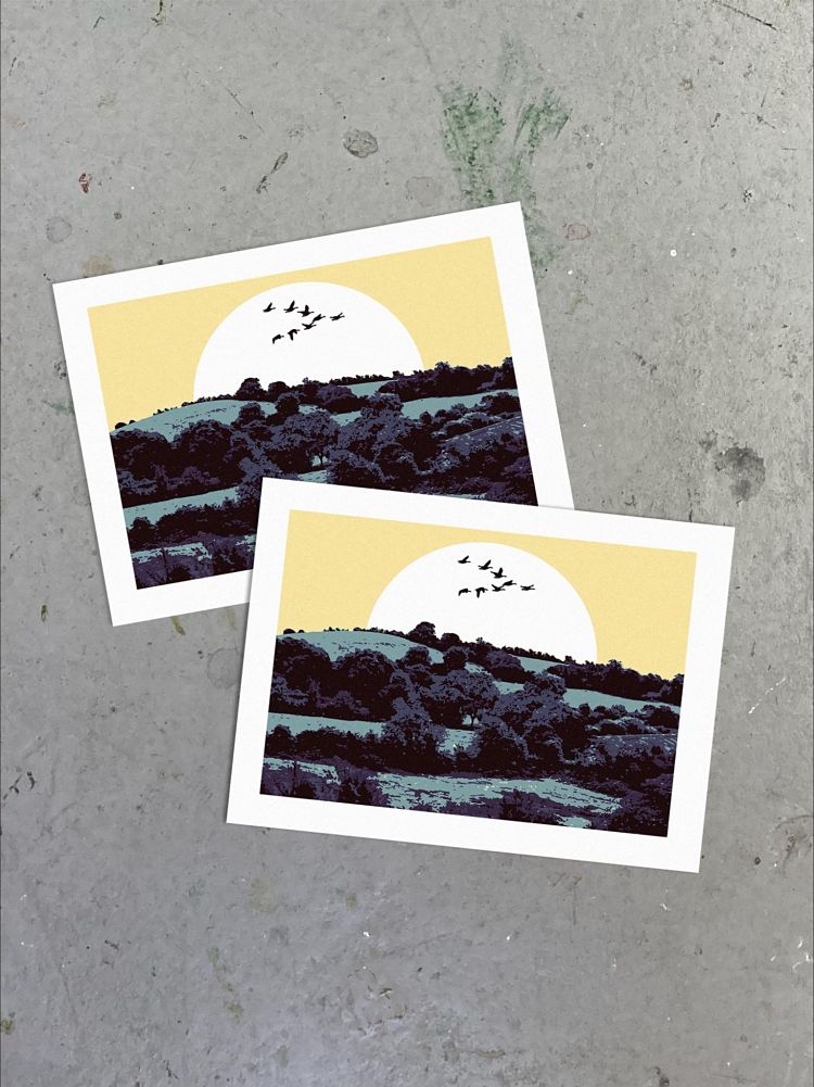 Naomi Arbuthnot used a combination of silk screen printing and hand drawn illustration to create this 6 layer screen print titled Escape. The print is visually based on the countryside where she grew up in Northern Ireland, and features geese flying in a V formation as she “always found that fascinating to watch”.
Isle of Riso: Green Lochan / An Lochan Uaine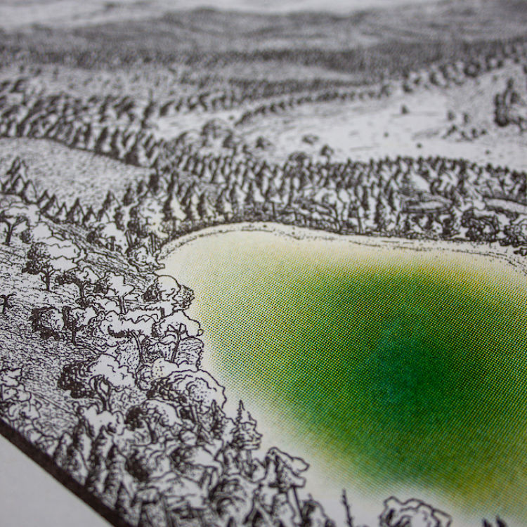
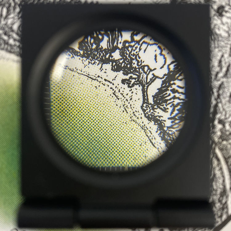
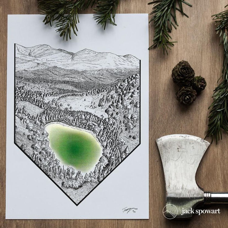 An Lochan Uaine, better known as the ‘Green Lochan’, is found in the Cairngorm National Park, Scotland. Isle of Riso worked Jack Spowart to recreate the otherworldly landscape using Risograph printing. Alice, owner of Isle of Riso, tells of how they brought the scene to life; “Jack’s inky landscapes usually only require our black ink. But this time, he fancied dipping his toes in the wonderful world of coloured inks – and the Green Lochan sprung to mind. We helped him to understand how the Yellow and Teal inks could mix to make a luscious emerald colour that mimics the lochan’s unique hue. The use of gradients and the Riso’s screen-cover setting, worked to create the gradual fade towards the shores – we love it!” The results were better than they had both imagined and a testament to the collaboration between artist and print technician! Some prints are still available on Jacks online shop.
Sian Hulse: Whitstable Shore Landscape Reduction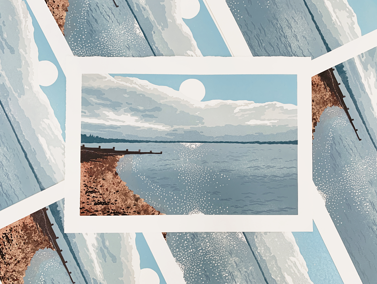
 Sian Hulse has been learning reduction lino techniques with the very talented landscape printmaker Deb Wing through her programme ‘Parallel Printing’. “It’s been a tremendous learning experience that has enabled me to take on a landscape of my hometown beach, Whitstable,” describes Sian. This is her fourth ever reduction, and her skills have come on leaps and bounds with the help of Deb’s printing programme.
AMCD Studio: Australian Landscapes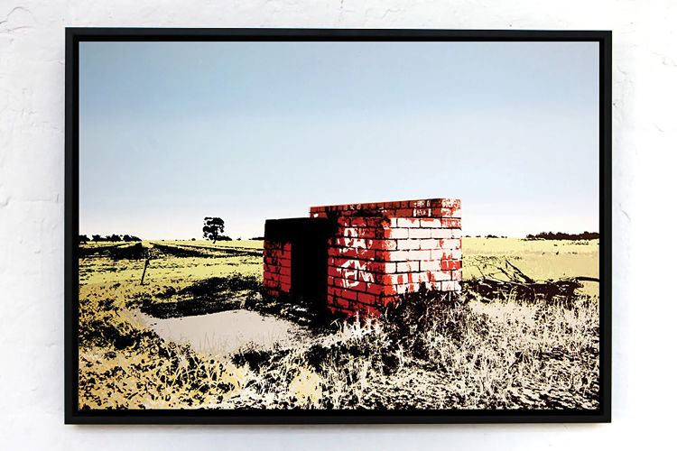
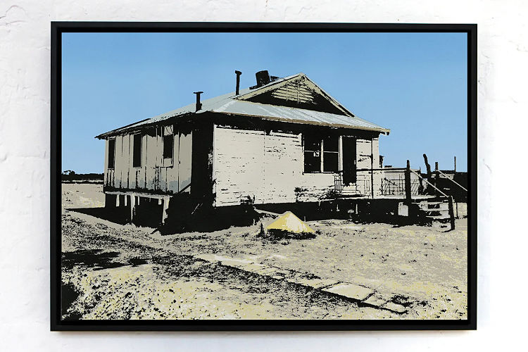
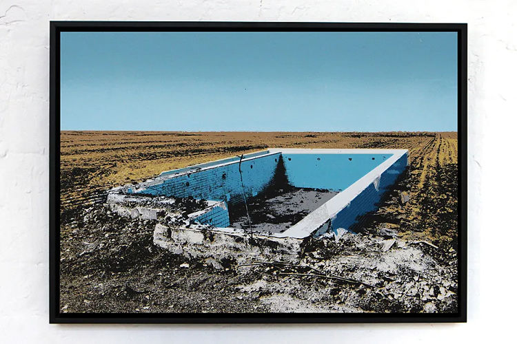 The Australian landscape is continuously used as a strong source of inspiration towards Andre Clapham’s practice. These works consist of superimposed photographs put through an illustrative digital process, fully realised through a succession of layered screen prints onto metal. Backdrops of the images are a series of landscapes that have been taken from his hometown of Deniliquin, NSW. These become the base of the images, suggestive of drought and isolation through an over-exaggeration of remote, barren spaces. Forgotten objects are then injected into these landscapes, captured throughout suburbia from Footscray to Lilydale and other developing Melbourne suburbs that have been affected by the real estate market. As the objects chosen have been forgotten, deemed useless and unwanted, their decaying appearance paired with the natural setting highlights how urbanisation negatively impacts the Australian landscape, leaving it scarred and destitute.
Saki Matsumoto: Litho Landscapes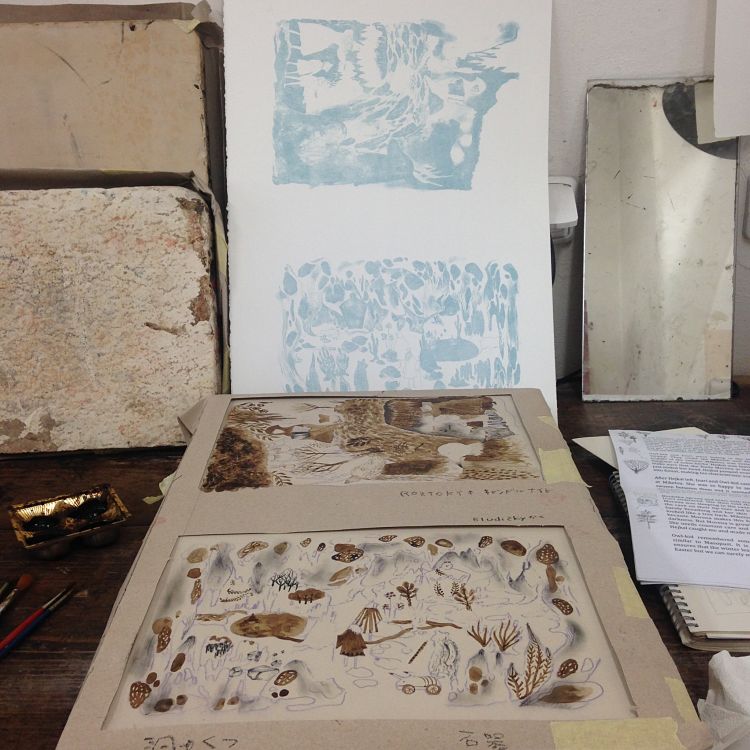
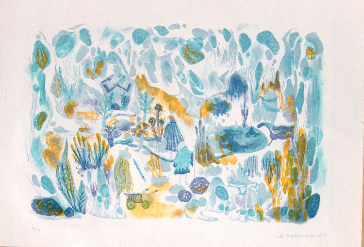
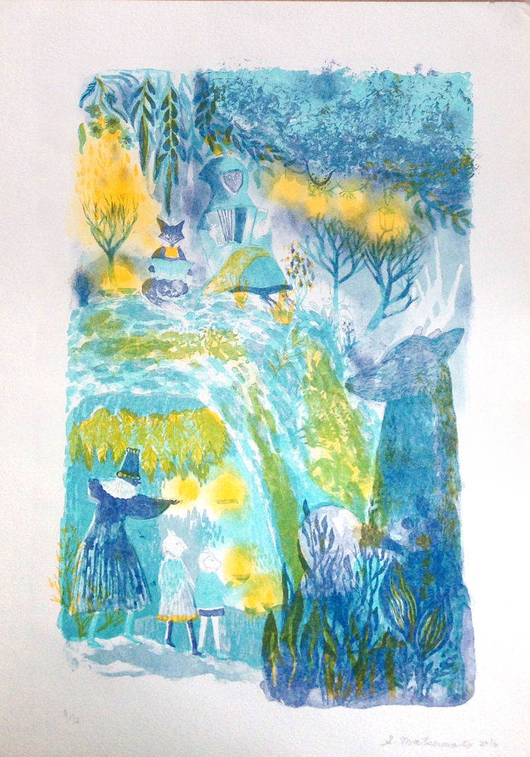 Each of these lithograph prints by illustrator and design Saki Matsumoto feature 3 colours printed on a stone. The first landscape print is from an experience of a forest night walk in a town next to Prague in The Czech Republic, and the second depicts an image of a cave.
Arron Foster: We Should Be Home
 As an artist, Arron Foster is concerned with how physical landscapes transform into cognitive ones, and how personal and public spaces intersect in the stories we tell about a place and the way we choose to represent it. As a consequence, most of Arron’s work begins with a site or a location that becomes a jumping-off point for his imagination. As an Appalachian transplant to Northeast Ohio, he is interested in the deep connections between the two regions. Migration has been an important part of the Appalachian experience and reflects the conditions of a changing world. This body of work strove to graphically represent the physical and cultural landscapes of the places people left and the places they settled in. Arron states; “I believe that the shared exploration and interpretation of places can encourage empathy for the spaces we occupy and perhaps foster a greater sense of stewardship and care.”
www,arron-foster.squarespace.com
Emmanuelle Orr: Sensation
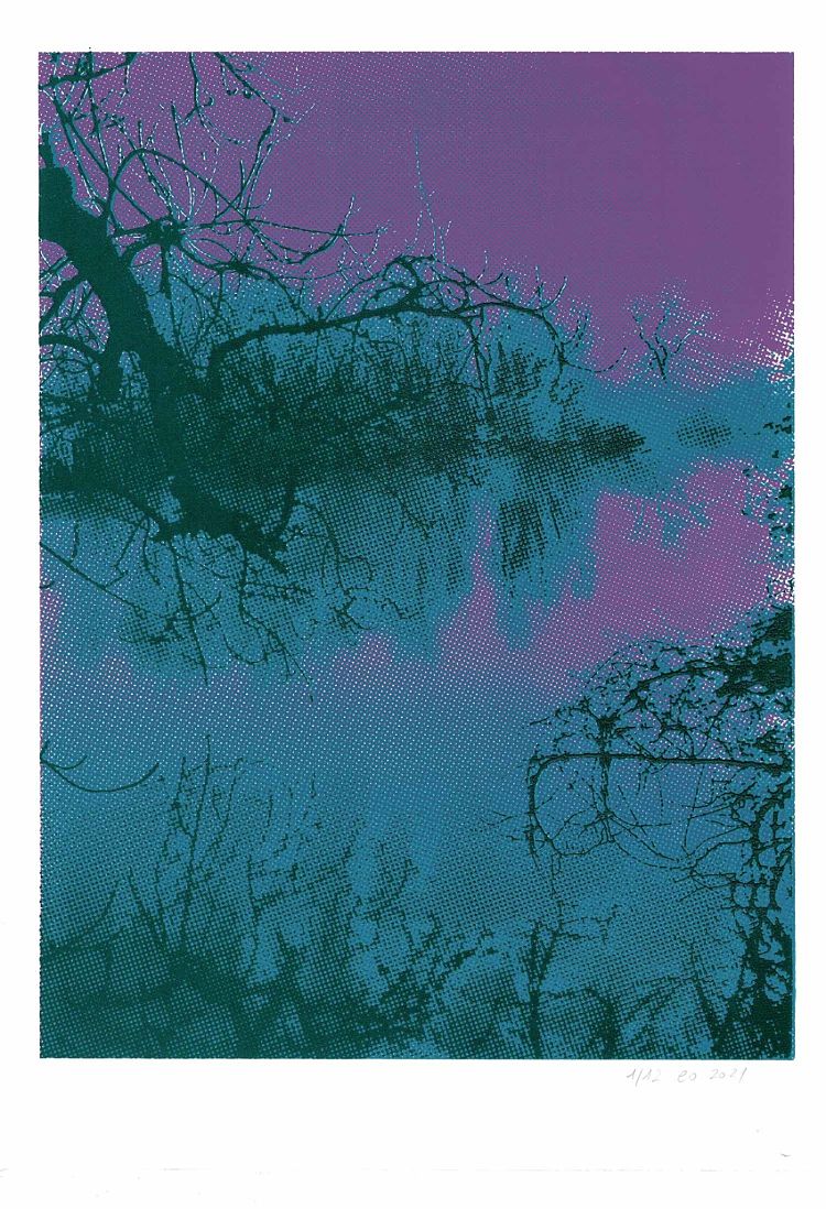
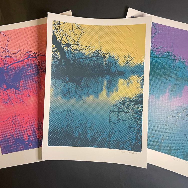 Last year, printmaker Emmanuelle Orr went for a long walk alongside the Arun river in the South Downs. She describes; “It was the end of Winter, the end of lockdown, and we were stepping out into the world again after the dark Winter of the pandemic. Starved of contacts, and used to living like housecats in front of computers, we took a few tentative steps in the countryside, seeing everything for the first time again. Minds were silenced, bodies open to all sensory clues, we were alive again.” These prints, bright and serene, take her back to this day, a reminder that Spring (and life) returns at the end of Winter. The name was chosen in echo of a beautiful poem by Arthur Rimbaud.
Margaret Mallows: Patterns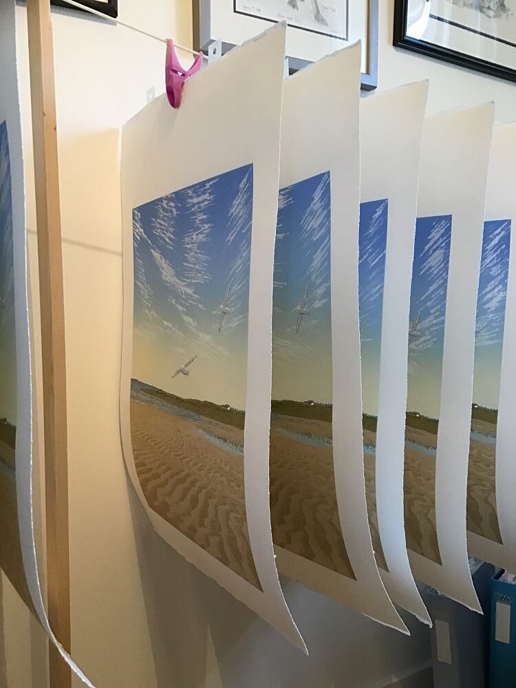
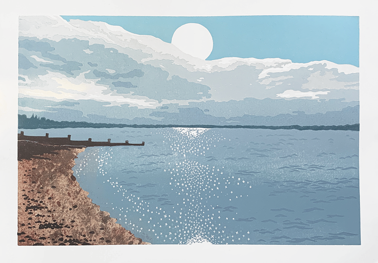
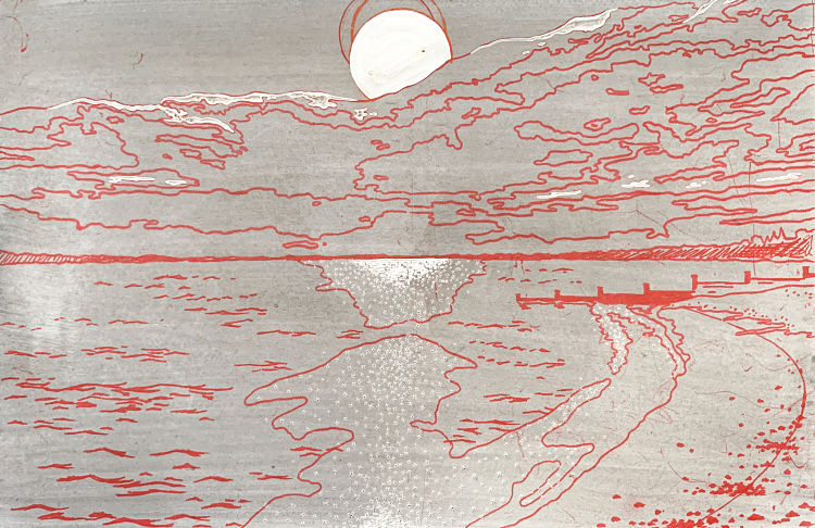
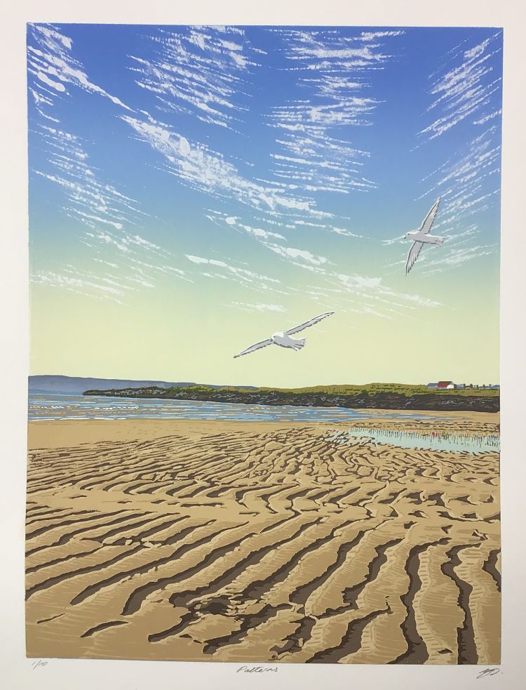 Patterns is Margaret Mallows’ newest lino reduction print. The piece is composed of 17 colours on 13 passes, inspired by the patterns left in the sand from the receding tide on a beach on the Isle of Lewis in the Hebrides. Handprinted on a table-top press with Schmincke water based inks, the image is 30 x 40 cm on 300 gsm Somerset satin 38 x 48cm. Margaret explains; “I tried an experimental approach for the clouds, by inking the lino with a brush freehand, rather than cutting out the white to begin with; this created a more transparent effect which I really liked, without the need for extender.”
Malo Malo: The Meteor
 “In the last few years, our world faced global crisis, ecological threat and disturbance of peace. This is a moment where we patiently watch the destruction coming our way. But we don’t know the impact it will have on our world. This moment represents the calm before the storm,” says illustrator Malo Malo. They created this illustration for an exhibition project called From My Window, launched by the Canadian studio Sale Caractère. The selected posters were sold to help the homeless during the 2020 lockdown.
Jo Boddy: Forest Landscapes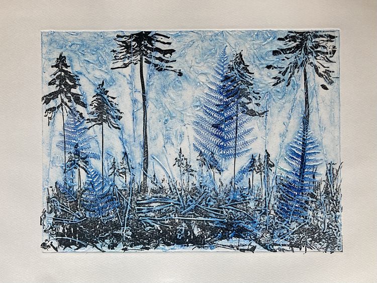
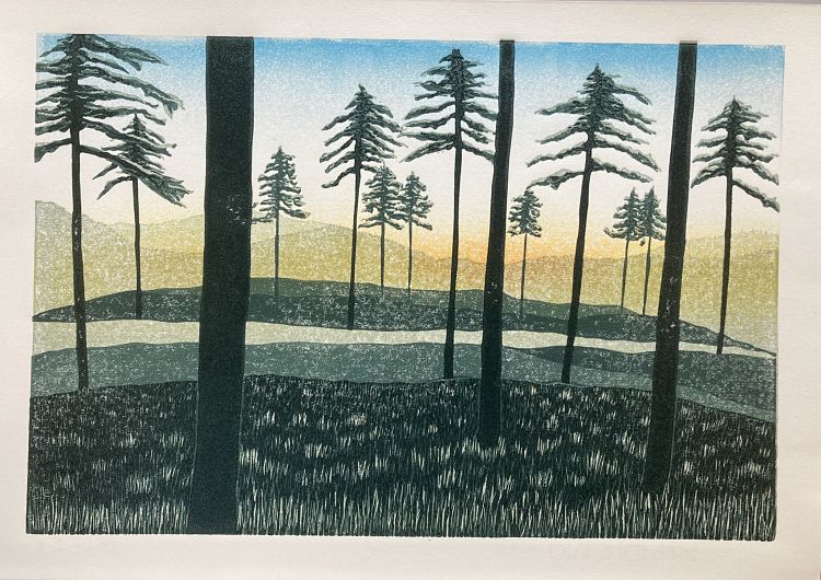
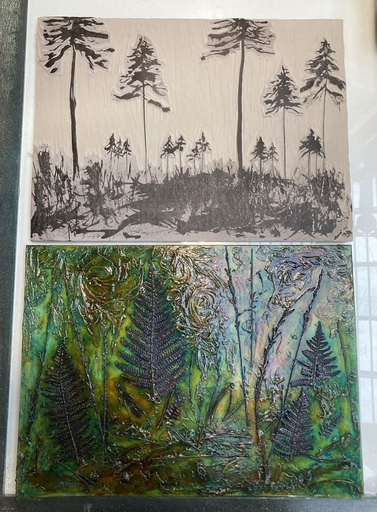 During the lockdown of 2020, Jo Boddy became a frequent visitor to the Swinley Forest which borders her village. In lockdown 2021 she turned to linocut printmaking, able to do it from home. The forest continues to feature heavily in her linocut prints; “It has a very striking appearance with areas where the bulk of the timber has been harvested just leaving a few remaining trees which have beautiful silhouettes.” Jo usually works in reduction, but has also begun to experiment with different ways to mark make on the lino, one of her favourites being to use a home made dip pen and Indian ink. She has also tried layering a linocut over a collagraph plate, using natural materials foraged from the forest. Jo has made several sunset prints inspired by late afternoon walks during lockdown, when the sun would highlight the silhouettes briefly and beautifully.
Lopez and Son Pgh: Sunsets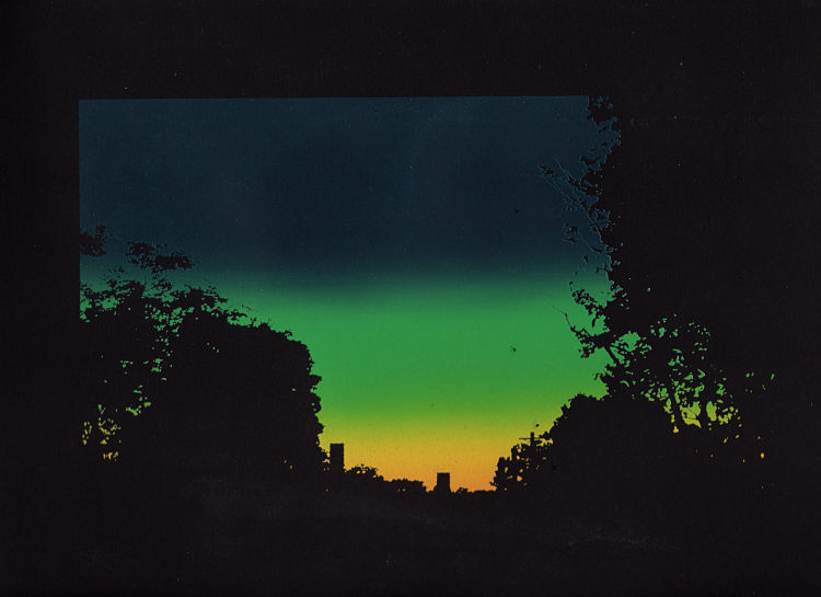
 “What makes the sunset beautiful? Is it the limited time to see it, the colours, the end of a long day?” question the mother and sun duo behind Lopez and Son. The pair aim to capture this essence within these prints, culminating in simple but powerful interpretations of a sunset.
Check out more incredible projects by our community and apply to become an Official POP Member at www.members.peopleofprint.com.
You might like...
 Hoxton Hall :: Creative Agency
- Kerry Day
- Polly Nor
- Russell John
- Print Isn’t Dead 001 | Full Review
- POP Member Showcase: 6 Repeat Pattern Projects
- Pápay Fanny
- Alex Lucas
- Visvim :: F.I.L Indigo Camping Trailer :: Kerchief Down JKTS 2
- Chopped Liver Press
- Polaroid and Retrospekt X Killer Acid
- Chris Pig
- Megan Hopkin: Printing Through The Pandemic
- Posterzine Issue 02 | Heretic
- Redwan El-Harrak
- Posterzine Issue 08 | Killer Acid


Want to know more about our membership? Give us an email at members@peopleofprint.com.
- Tim Belonax |All Of My Mistakes Have Led Me To You - April 26, 2024
- The Humber Printmaker - April 25, 2024
- Horizons by Angus Vasili - April 24, 2024