This month we’re proud to present a selection of Risograph projects from members of our POP community. From botanical-inspired prints, to Riso printed album covers, and thoughtful zines, our members have used the Risograph machine to bring a variety of unique and innovative projects to life.
Alizée Cayla: Fruity Shades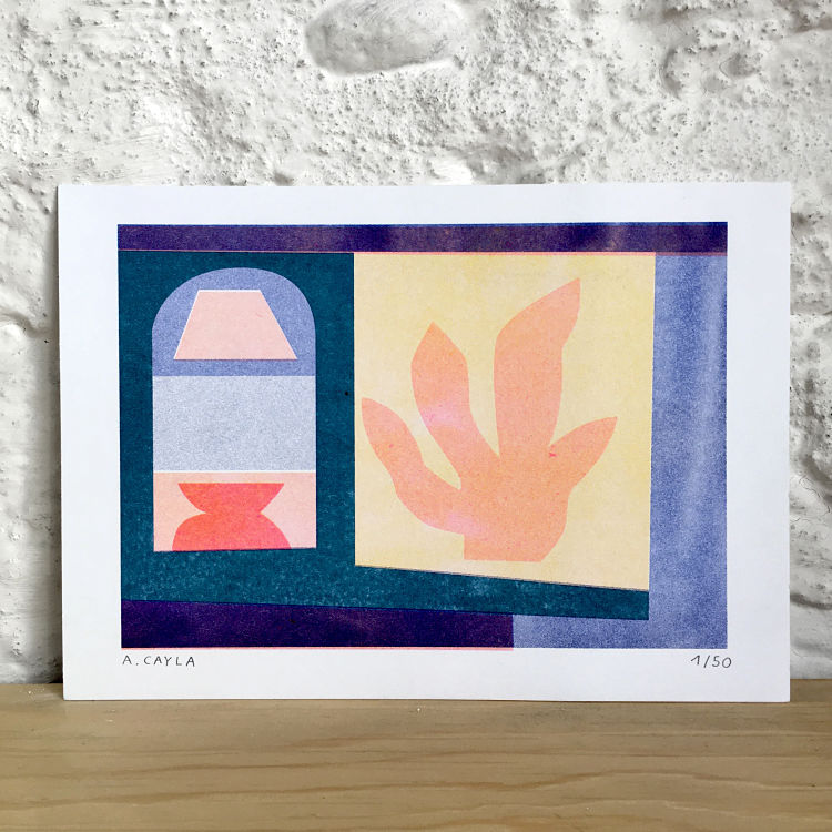
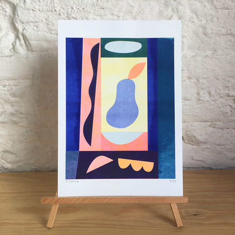
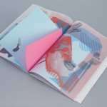
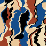
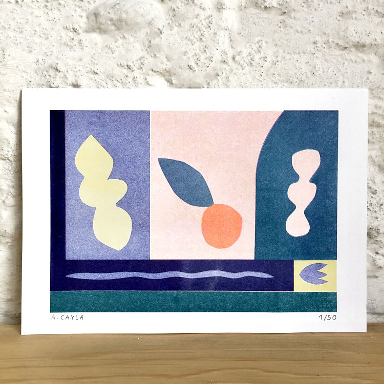 Fruity Shades is Alizee Cayla’s first project incorporating Riso printing. These prints were specially made for a collective exhibition which took place in late June 2020. “The challenge for me was to play with the wide range of vivid and luminous colours that this technique allows such as neon pink or teal inks” describes the artist. Alizee built her visuals by initially thinking of them in grayscale, and later found it magical to see the result of the colour conversion and the subtle nuances that the layering of the masters allowed her to achieve. By playing around with this new colour palette Alizee was able to work with different hues that she wasn’t used to.
BEAST Studio: Lindblom & Lindblom – “Obducenten & Allmänläkaren” Colour Vision Deficiency Test Book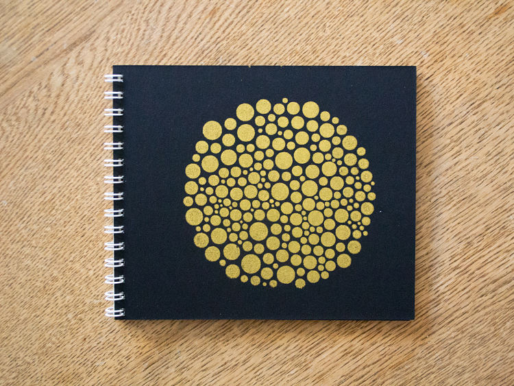
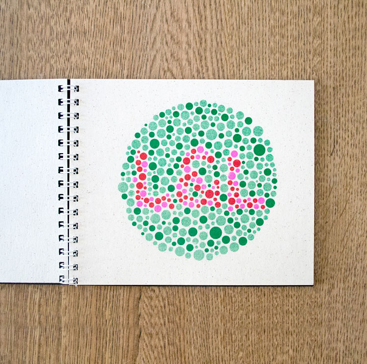
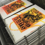
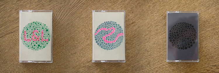 Obducenten & Allmänläkaren was designed for the physical release for the band Lindblom & Lindblom, who Robert Lindblom of BEAST Studio is a member of. “Since the actual music can be distributed in high quality through services like Bandcamp these days, we figured we’d get rid of the music bearing medium for this one and make a book” explains Robert. As both members of the band have deficient colour vision, the duo wanted to release an object with images that they couldn’t read themselves. They researched the groundbreaking work of Shinobu Ishihara, who invented the way of testing colour vision deficiency as we know it today, and made up a set of test plates with images relating to the band and the music. All plates were Riso printed on Bier Papier Lager 135 gsm, and the covers screen printed in gold on black cardboard.
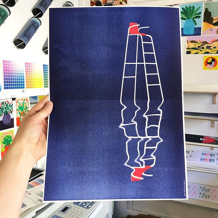
Diane Bresson: Pendulum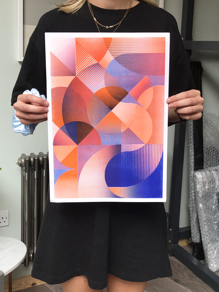
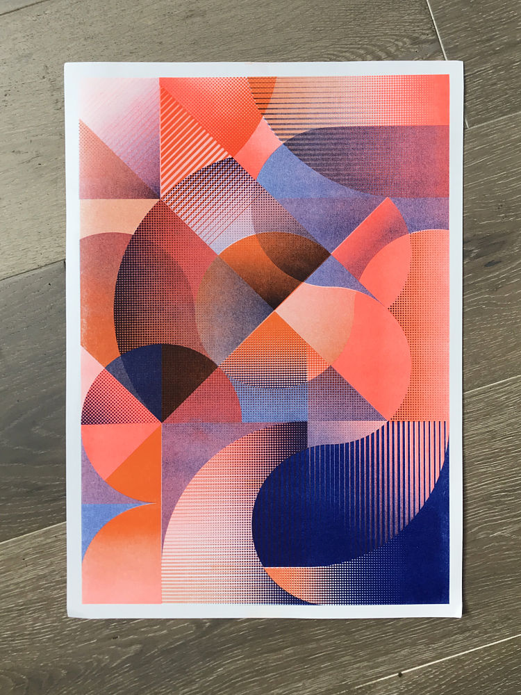
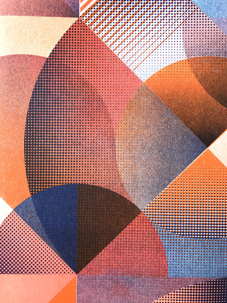 Pendulum is screen printer Diane Bresson’s first Riso print. Diane wanted to experiment with the medium to see how colours react to each other and interact with the pattern. “I feel like prints designed entirely digitally can feel a bit too neat, and are missing some textures and this particular feel that makes handprinted prints unique” describes the printmaker. Due to the roller marks and miss-registration, she decided that Riso would be a strong in-between printing method that would allow her to design in a more controlled way, whilst simultaneously allowing room for happy mistakes to happen. Tending to print without a precise plan, with Riso printing Diane had to take a new approach where she had to be conscious of how the colours layer, with a final result in mind at all times.
VrijFormaat: Extra Ordinary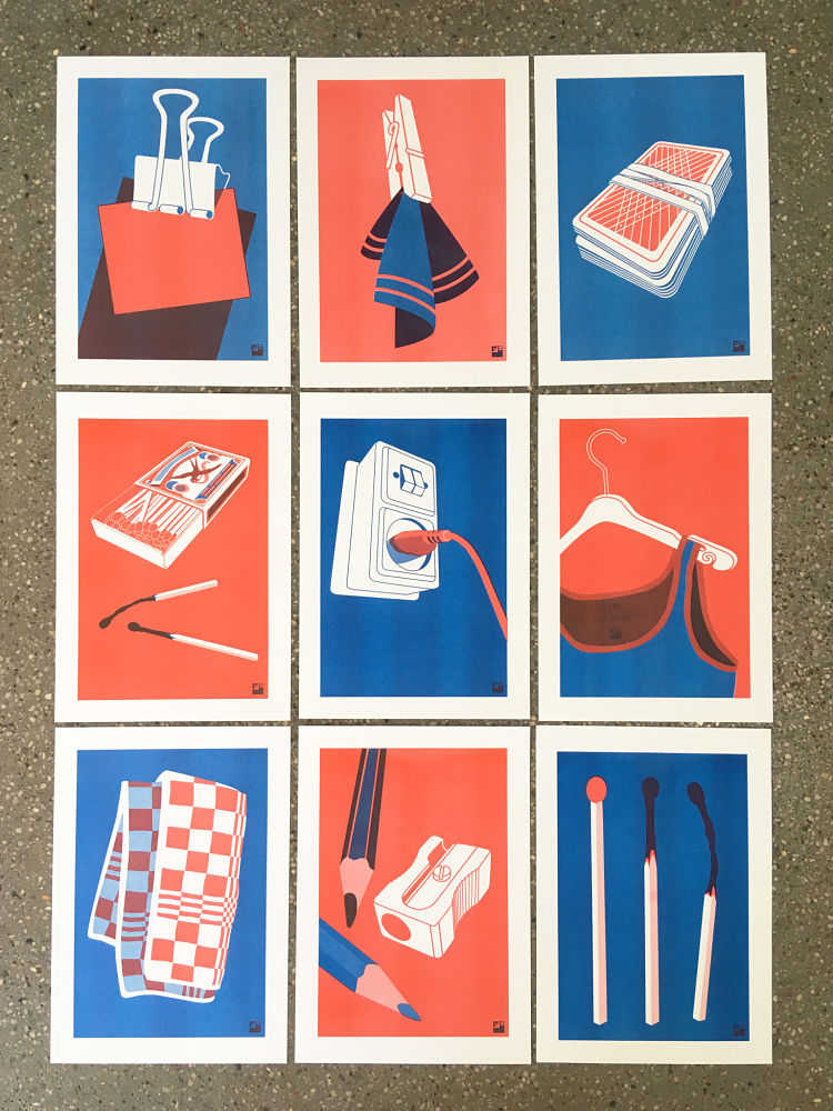
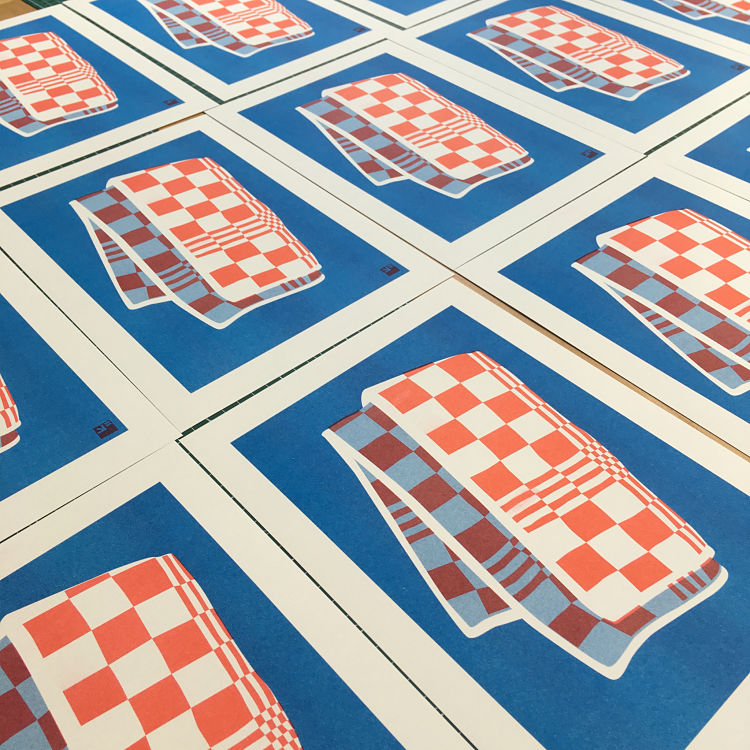
 Extra Ordinary is an evolving series of illustrations by VrijFormaat that they design digitally and print on their single drum EZ300 Risograph. The series is a tribute to everyday items, celebrating the objects we use daily without considering the often wonderful design or greater concept behind them. These objects are often deceptively simple in terms of design, and VrijFormaat aim to amplify this by using only two colours; red and blue, and the shades and colours that come from their mixing.
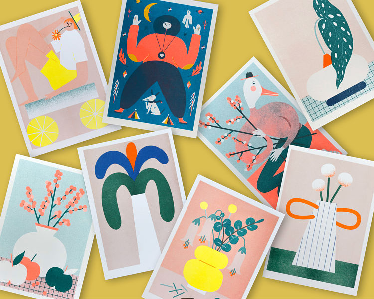
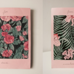
Danii Pollehn: Botanical Riso Prints
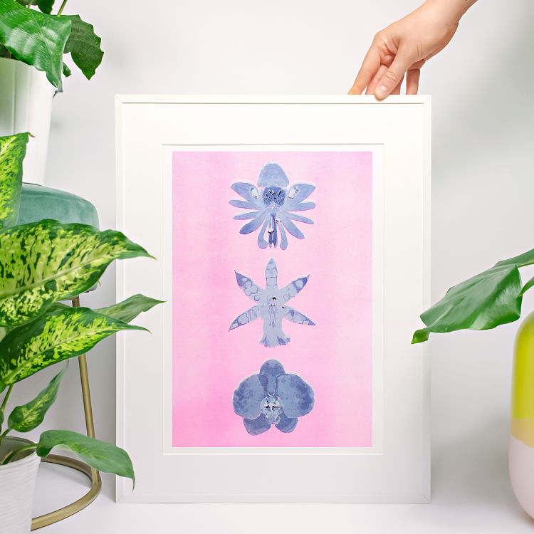
 Print designer and illustrator Dannii Pollehn of Dancel Studio created these Riso printed botanical artworks in collaboration with Risofort in Hamburg. The new prints include floral motifs of the trendy swiss cheese plant and orchids.
The prints are available on Department Store here.
www.daniipollehn.com
Shane O’Driscoll: Lockdown Riso Prints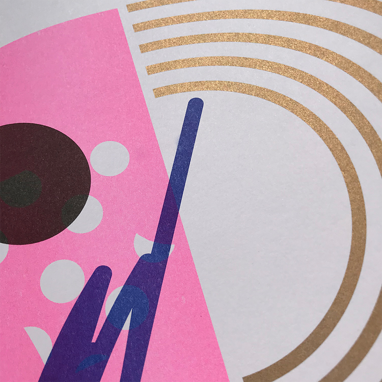
 During lockdown, with no access to the print studio where he creates his trademark screen prints, Shane O’Driscoll created a series of Risograph editions. The artworks were printed in Dublin by Damn Fine Print studio. “Riso was something I had wanted to do for a while and these turned out great. It has me thinking about further projects using Risograph, like a zine or another edition” states Shane.
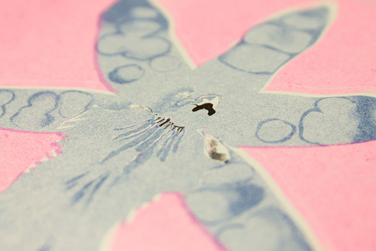
Sabine van Rooij: Blossom Girl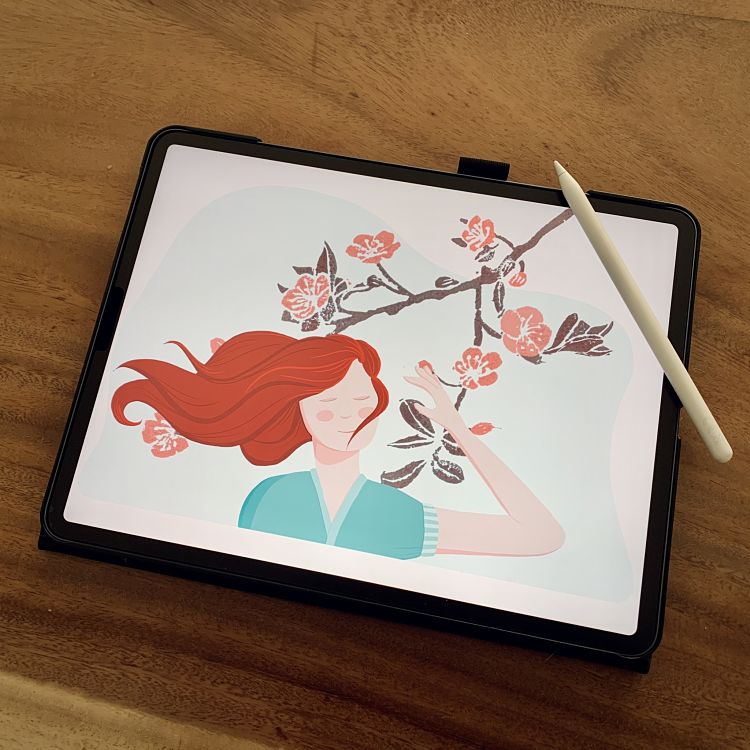
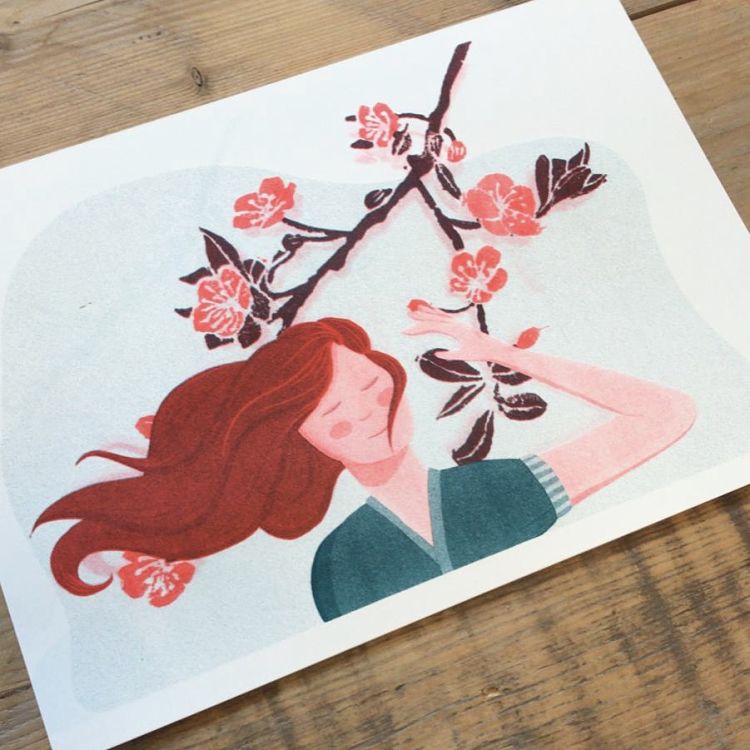
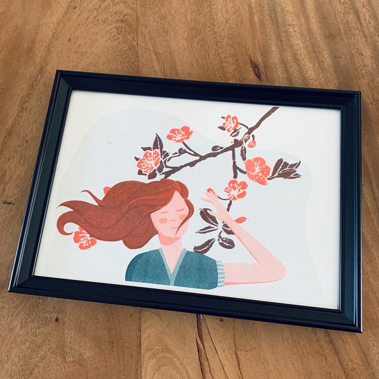 Blossom Girl is Netherlands-based printmaker Sabine van Rooij’s first Riso print. Usually working with linocut, Sabine decided to digitise a previous lino print she had created (The Blossom), to which she added more texture and an illustration of a female interacting with the tree.
Lorna Robey: Rainy Day Riso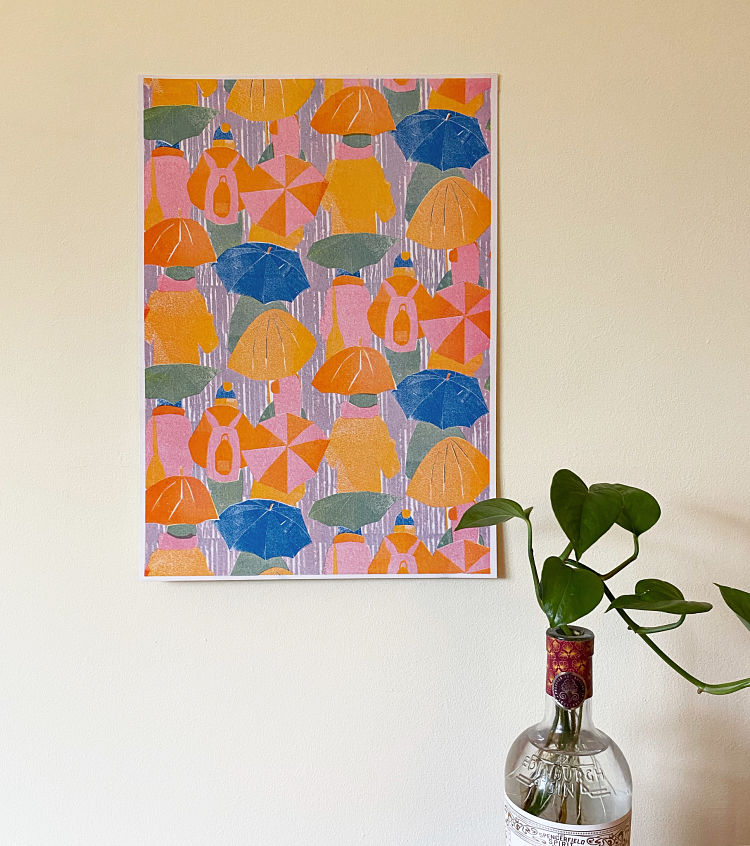
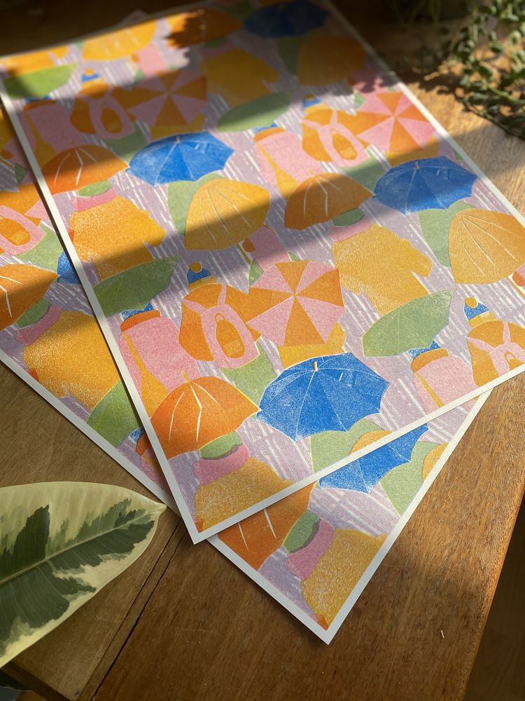
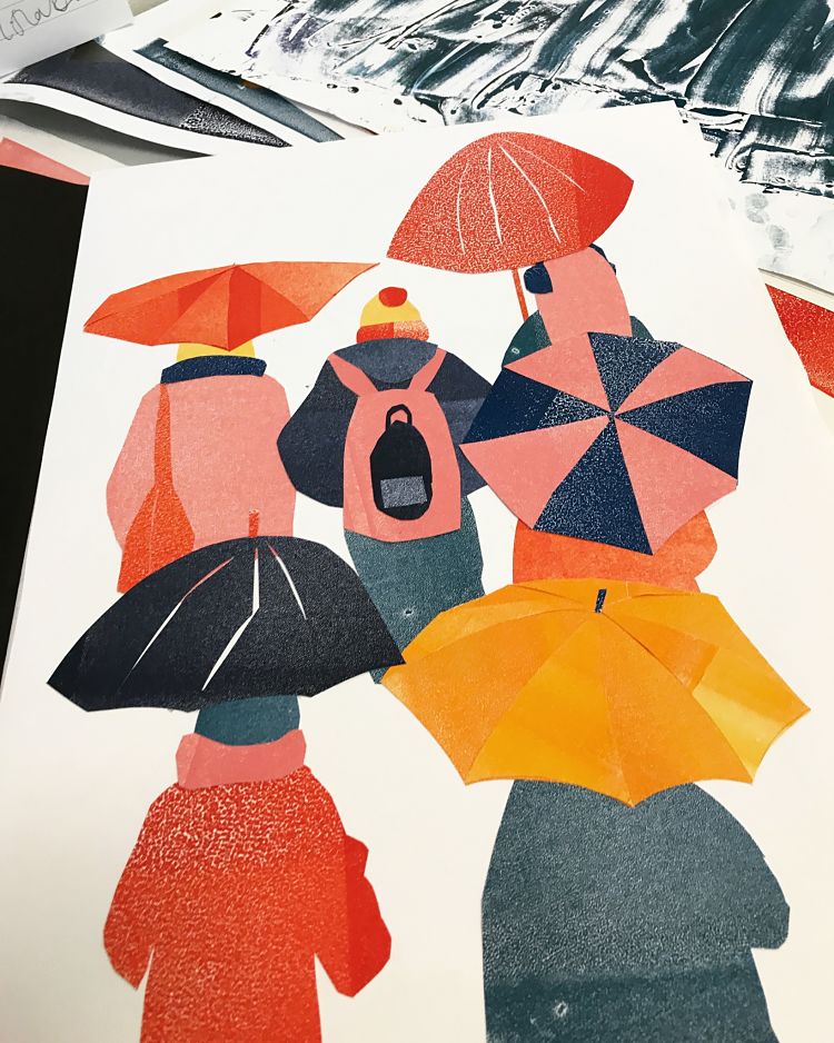 Rainy Day began in a coffee shop on a rainy February afternoon. Drawing the busy commuters and city dwellers through the window, Lorna Robey aimed to capture a sense of the city. The messy and imprecise initial sketches were refined and translated into papercut collage using monoprinted papers in bright colours, injecting the initially dull and gloomy scene with the sense of fun and vibrancy of the city Lorna loves. Originally screen printed by hand, she recently produced a Risograph printed version, produced by Footprint Workers’ Co-operative in Leeds. Lorna used overlaid blue, red, and yellow inks to create a range of colours close to the original screen printed version, the slight imprecision of the Riso process lending even more texture and charm to the collage aesthetic.
Malo Malo: Asleep
 This illustration was created by French graphic designer and illustrator Malo Malo for an exhibition in Paris, organised as part of the Les Nuits des Arènes festival. Asleep was Risograph printed in three colours by Parisian printing house Fidèle Éditions.
Mina Braun: Hugs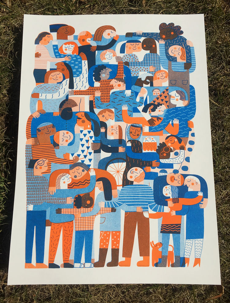
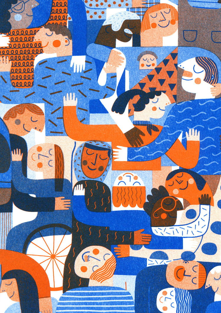 Unable to comfort each other with a hug during lockdown, illustrator Mina Braun wanted to share some hugs on paper. She explains; “I feel that right now it is especially important that people unite and work together, I wanted these hugs to be about inclusion, community and responsibility towards each other as well as our environment“. Group Hug and Tree Hug are two-coloured Riso prints, printed onto 175 gsm Metapaper, using orange and blue for Group Hug, and red and teal for Tree Hug. Mina loves the overlaying colours, and potential to produce a large variety of different tones in a limited colour palette that comes with Riso printing. The series was printed at Drucken3000, a graphic studio based in Berlin, Germany.
One Strong Arm: The North is Next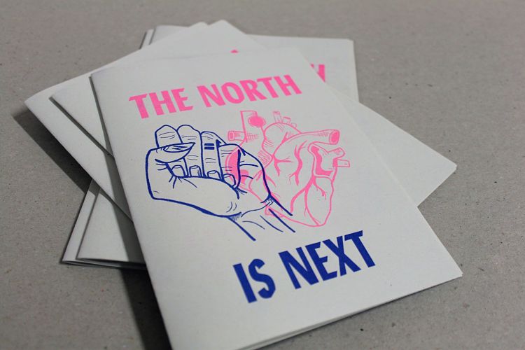
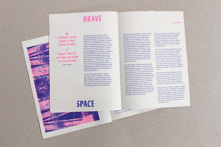
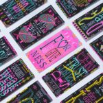
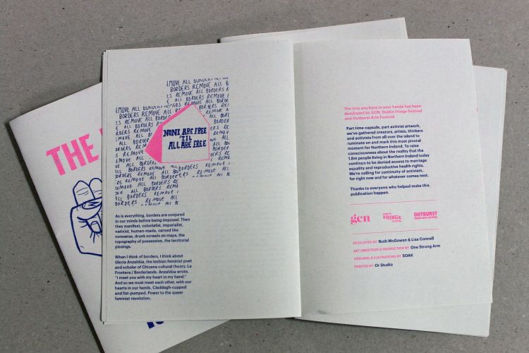 The North is Next is a zine created to support a special live event with performances and discussions around marriage and reproductive health rights in Northern Ireland. The zine was designed as a care package of sorts by One Strong Arm to let their neighbours in the North know that they were still in their thoughts. The Riso printed zine contains five essays relating to the issues paired with illustrations by the musician SOAK. The main visual takes its inspiration from the fact that a human heart and a human fist are comparable in size, and the idea that revolution and positive change comes about from equal measures of loving and fighting.
Charlie Jennings: Aftershow
 Inspired by the unique musical history of Leith Theatre in Edinburgh, independent design agency Touch, and graphic designer Charlie Jennings, created a series of hanging banners; each a response to one of the acts that has played at the venue over the years, from Thin Lizzy’s career-defining early performances, to Kraftwerk’s electrifying 1975 show, Anna Meredith’s intoxicating compositions, and Young Fathers’ triumphant gig on home turf earlier that year. Limited edition riso prints, tote bags, and t-shirts based on the hanging banners were available online and from the pop-up shop in the venue. All profits raised went towards the ongoing transformation of the historic venue.
Susann Stefanizen: Riso Prints
 Berlin-based Illustrator and designer Susann Stefanizen has been making Riso prints for the past few years. Her foray in to Riso printing began through the creation of a series of greeting cards, and she later began designing bespoke pieces for clients. Susann’s Risographs can be purchased through her new online shop, and are all printed by the team at Drucken 3000.
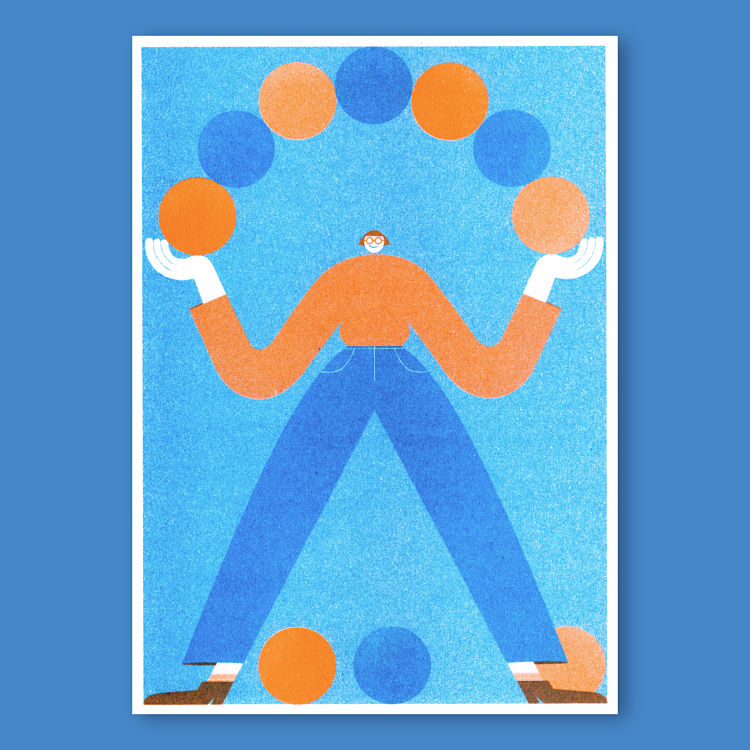
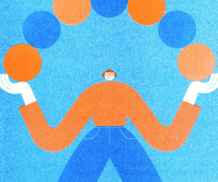
Jeroen Wellens: Circles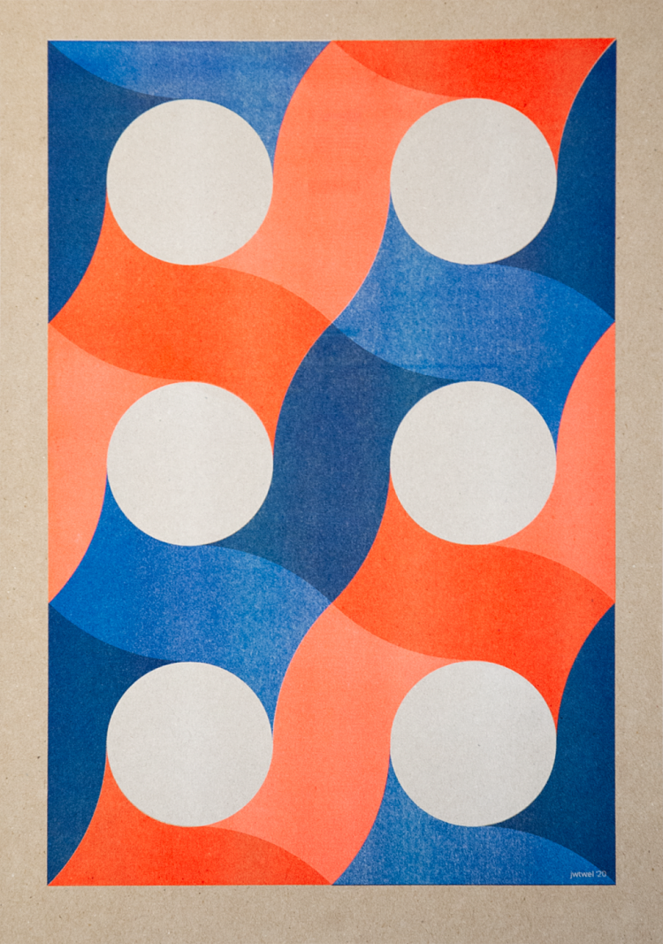
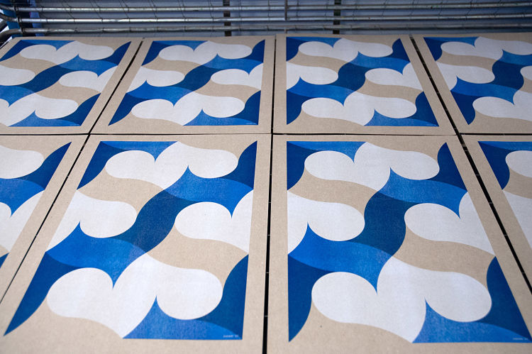
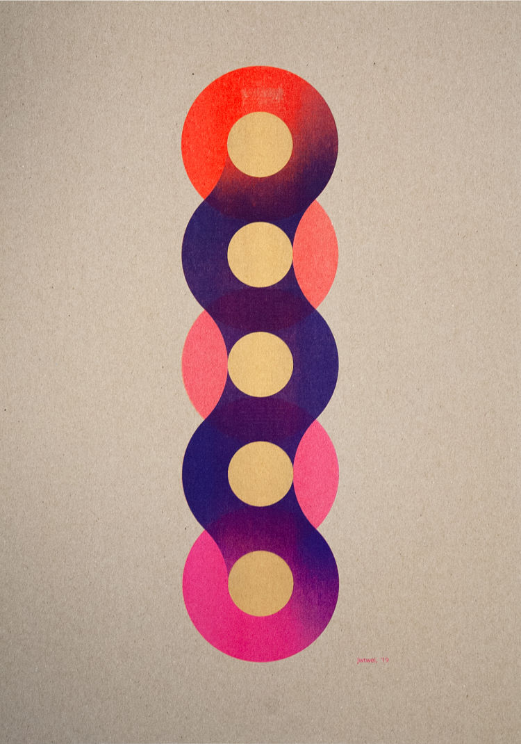 Circles is a new collection by the wall art label jwtwel, founded by Jeroen Wellens. The series is a growing exploration of a pattern of circles, with simplicity and wonder fuelling their creation. Jeroen builds his work in layers, starting with uncoated and unbleached paper so that he has more freedom to to fill or leave empty space. This approach creates a striking illusion and adds extra depth to the work, making the viewer look more closely. Through the imperfections of the Riso machine, life is given to each unique graphic work. “The bright, fresh, and transparent colours are a joy to work with… The recognisability of my work is my language of form,
with the Riso I can put even more emphasis on this, making powerful, fresh, rough, and surprising work.” describes Jeroen.
Shop Jwtwel’s collection on Department Store here.
@jwtwelwinkel_nl
Anne Albert: Hello New Year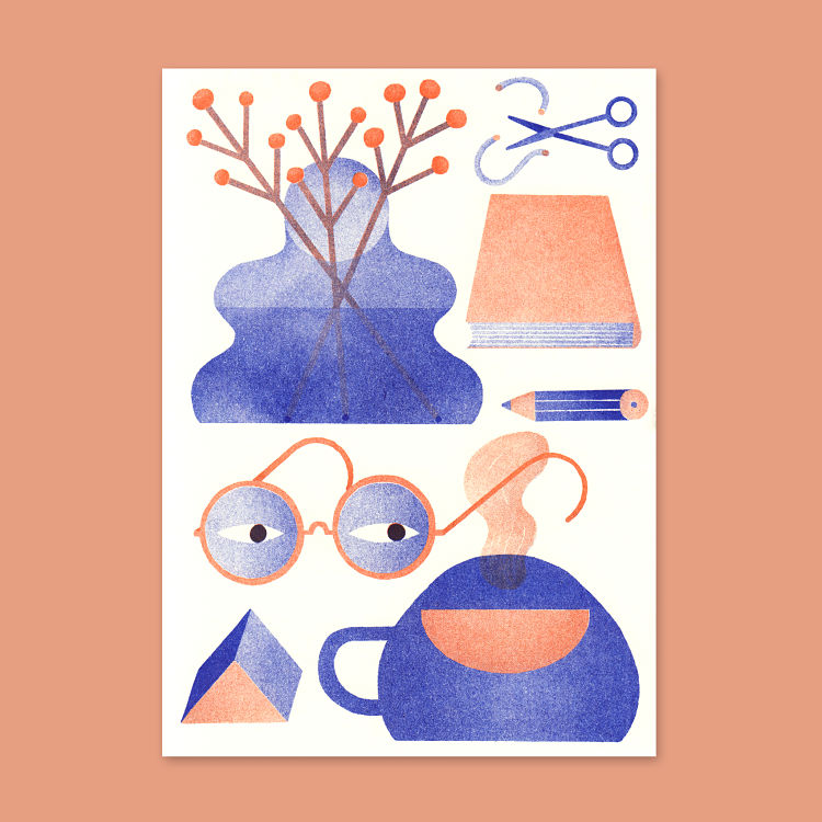
 At the end of every year illustrator Anne Albert creates a Riso printed new year card that she sends to friends and clients. Anne likes to draw random collections of things or women that perfectly fit in squares. These cards were printed by We Make It in Berlin.
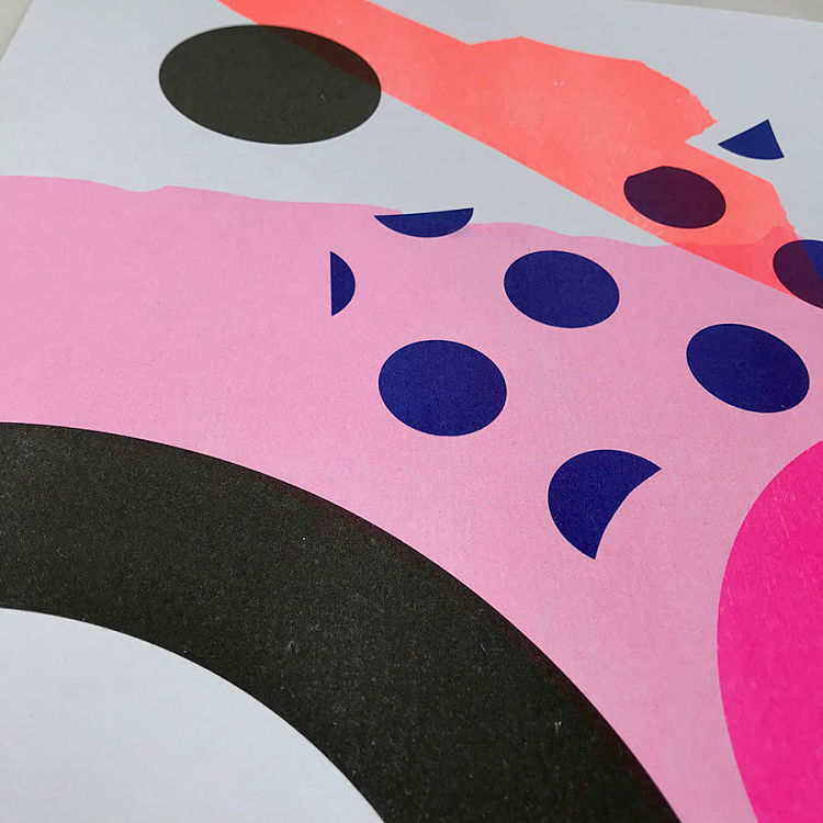
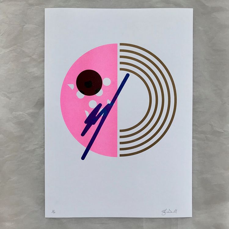
Petra Verkade: Riso Landscapes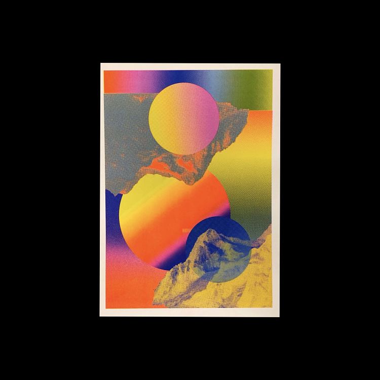
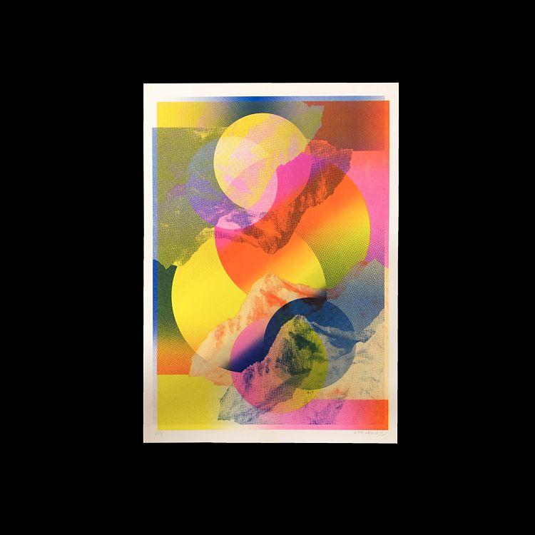
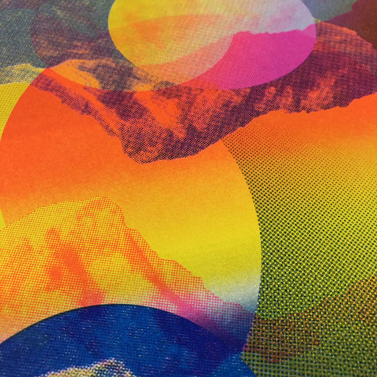 Petra Verkade’s latest Risograph work is all about exploring gradients, shapes, and colours. “I find it interesting to explore the limits of the printing process” describes the printmaker. In this process, Petra only uses three colours: fluorescent pink, blue, and yellow, which is her favourite colour combination. She loves to combine strong and colourful graphics with the beauty of the Risograph technique. For example, in her moon landscape prints Petra creates colourful compositions that explore the boundaries of the printing technique, resulting in popping and more complicated prints.
Jungyeon Roh: Riso Zines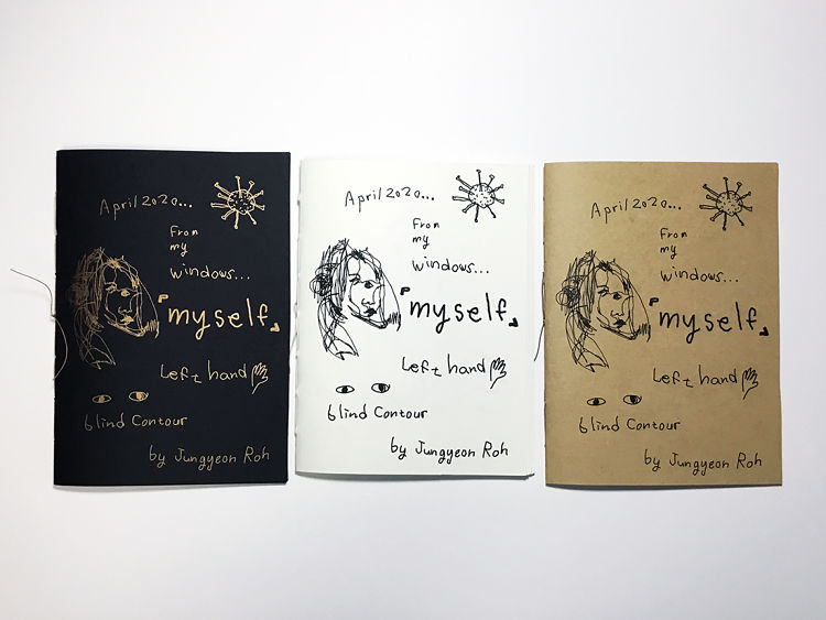
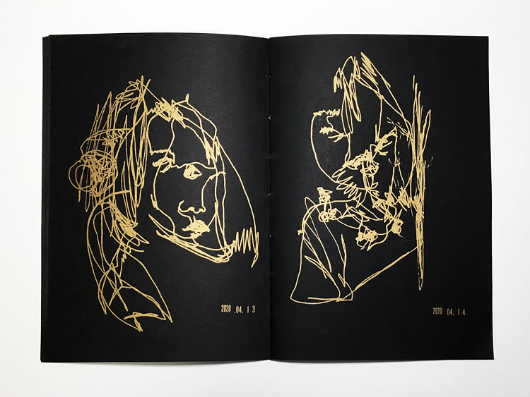
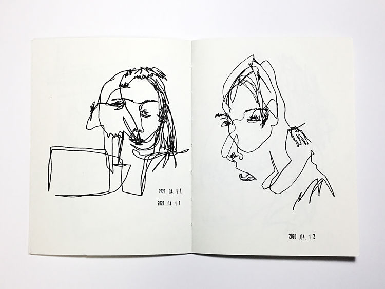 Every day in April 2020, Jungyeon Roh drew blind contour self-portrait drawings with her left hand. The faces on the pages are her reflections she saw in the window every night while in self-quarantine at home. After completing the drawings, Jungyeon gathered the imagery together and printed the collection into three versions of 32-page Risograph zines.
Johan Elmehag & John Schulisch: RISOKOMPIS
 RISOKOMPIS is a collaborative poster project where two unknown participants are paired together to design a poster on a common topic. The posters are created individually, and the participants first see what the other has created when the two artworks are printed on top of each other. Each participant’s design is one layer and one colour on the poster. This method opens up for an intersection of aesthetic expressions and exciting mishaps, and leads to a 1 + 1 = 3 result where the skewed and odd are noticed. In addition, participants are given a window to get to know other creative practitioners.
Sandrine Anne: Lucky Cat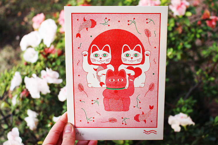
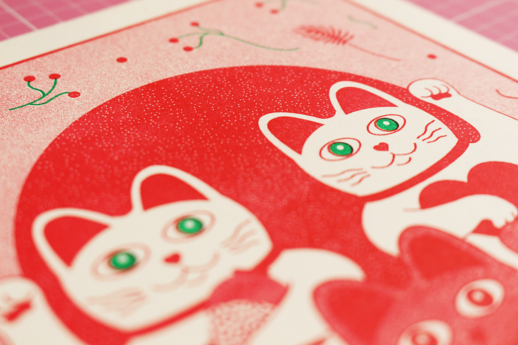
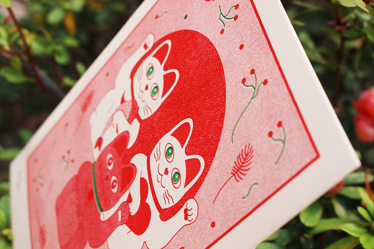 For this Riso print, Sandrine Anne took inspiration from Maneki-nekos (also known as lucky cats). She created a two-colour design for her personal brand, with different Japanese inspired elements and textures. Each one of the cats represents abundance, love, and good fortune. The 14×20 cm prints were produced in a limited edition of 60, and printed on acid-free, 216 grams recycled paper.
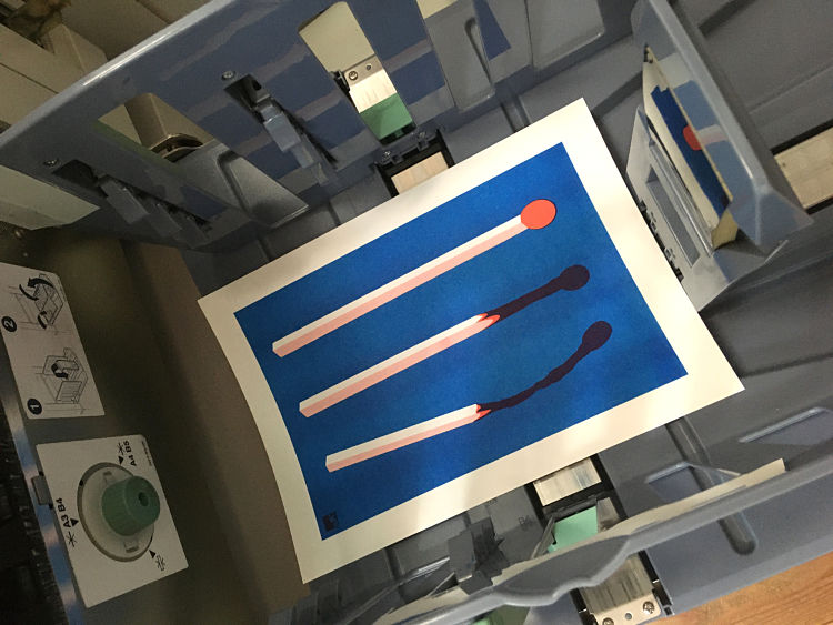
Lightship Print Shop: Riso Goodies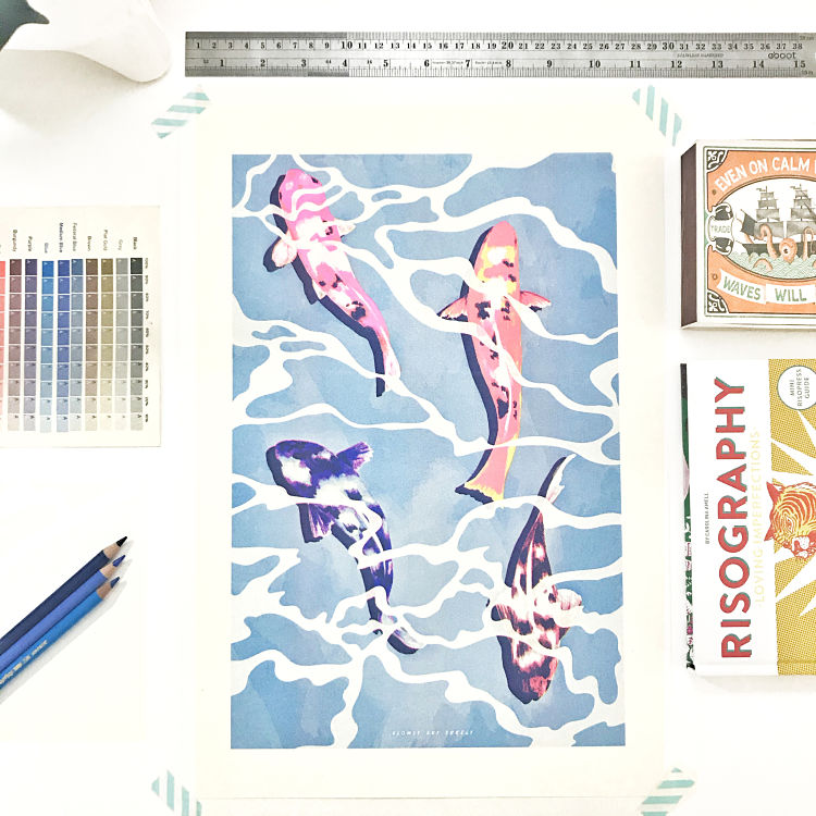
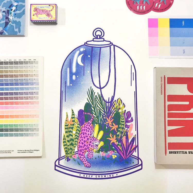
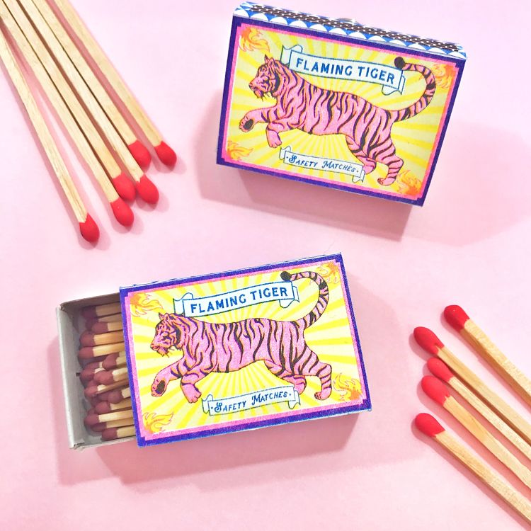 Lightship Print Shop have a Risograph with 3 colours in their studio; fluro pink, yellow, and Blue. The colours and textures of the Riso prints have inspired a number of their projects over the past year, from posters to matchboxes. Their latest project that features a jungle inside a cloche is the start of a new series of prints exploring miniature worlds. “Having only had a Risograph for the past year, the process has been a steep learning curve, full of joy, excitement and frustration for the team, but has become a bit of an addiction and exciting to plan the next drum colour addition” explains the studio.
Jesse Singleton: Flowers on Japanese Kimono Patterns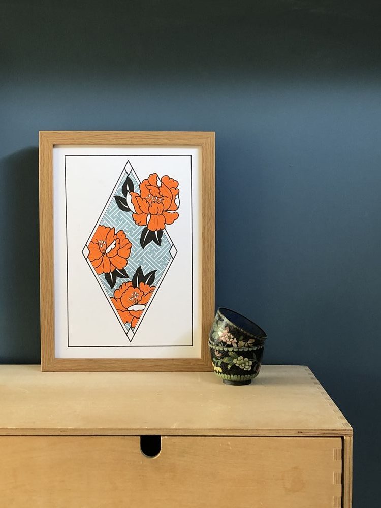
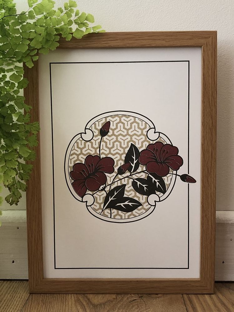
 Jesse Singleton has always been fascinated by Japanese graphic image and pattern work designs. Originally, he used this inspiration in his tattoo work, but this is his first foray into Risography printing. “I love exploring the the combination of the organic floral designs with the geometric lattice structures which appear so prominently in Oriental art” explains the illustrator. Risography also allowed Jesse to work with bold flat colours and blend these with softer textures.
Browse our membership directory at www.members.peopleofprint.com. Anyone working with print can apply to become a Verified POP Member here.
You might like...
 Wishing Cards Dark Series | Marijke Ludwig
- Protein Journal
- Jump From Paper :: She’s Electric
- Counter Print — Logos From Japan
- Charlie Soffe | A Zine About Birmingham City
- VIVID :: Value Increase by Visual Design
- Alleykats
- Lewamakes
- Print Club London | Group Show | Pick of the Bunch
- Thomas Danthony
- Liam Ashley Clark
- Maria Herreros
- Daniel Arnold
- Mathilde Roussillat Sicsic
- Vasty: Vicente
- Not RIP

Want to know more about our membership? Give us an email at members@peopleofprint.com.
- Tim Belonax |All Of My Mistakes Have Led Me To You - April 26, 2024
- The Humber Printmaker - April 25, 2024
- Horizons by Angus Vasili - April 24, 2024