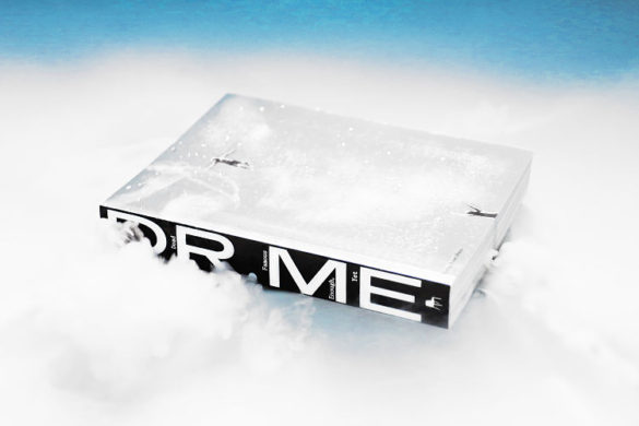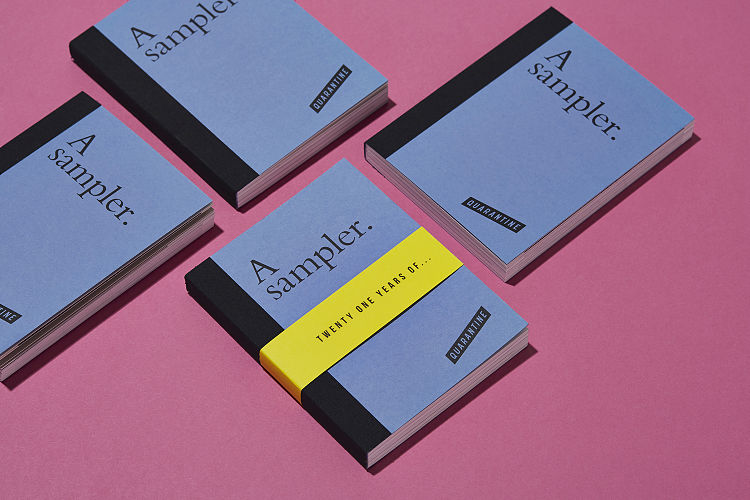
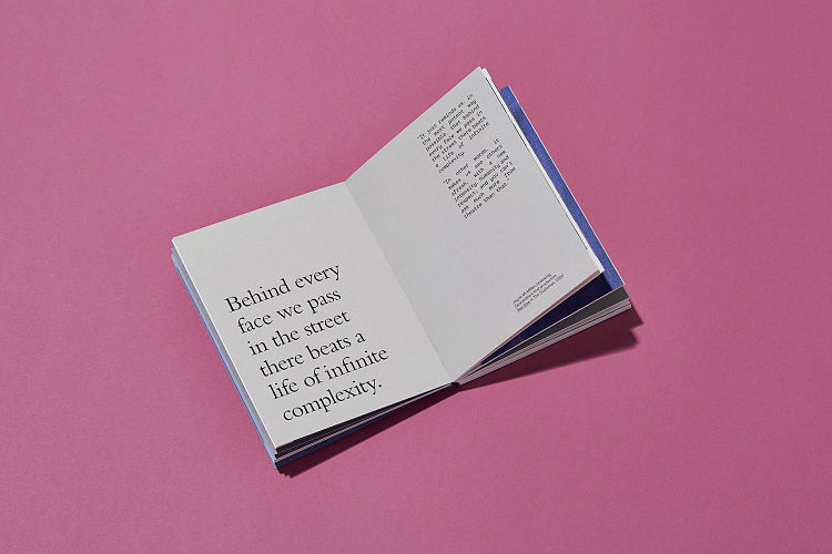
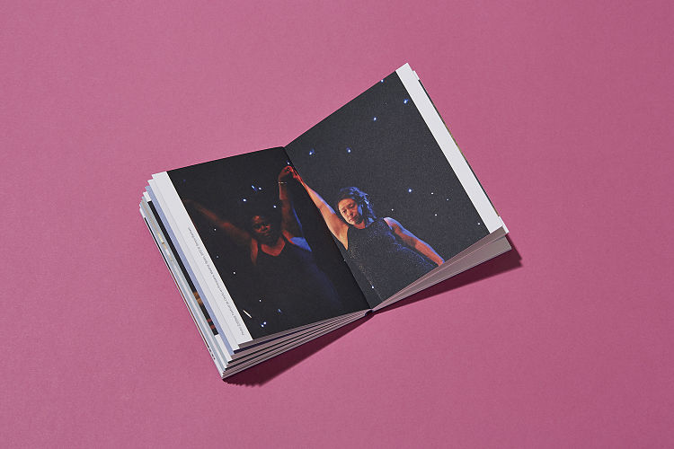
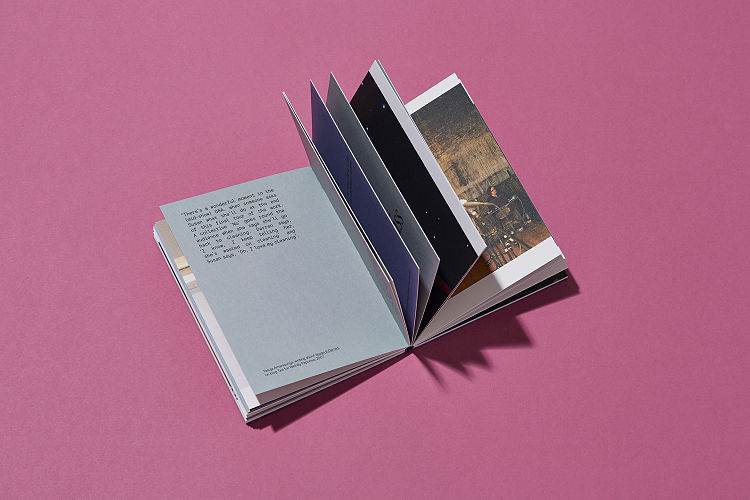
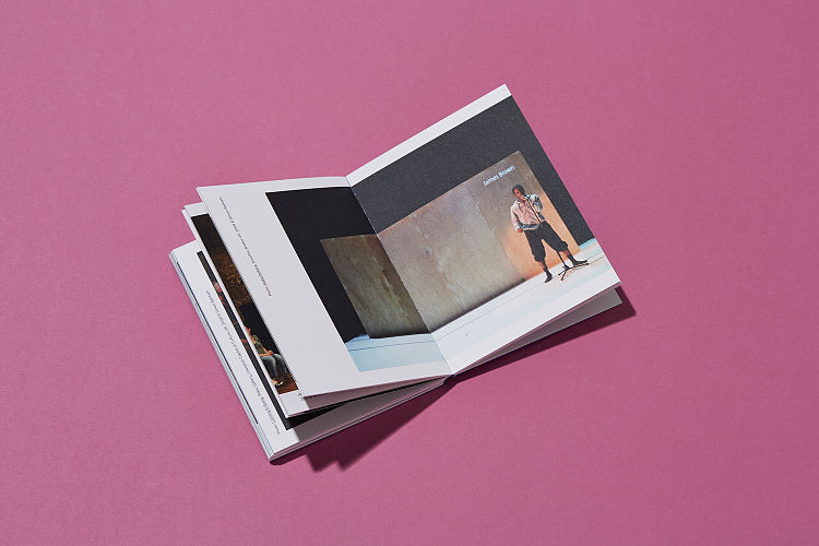
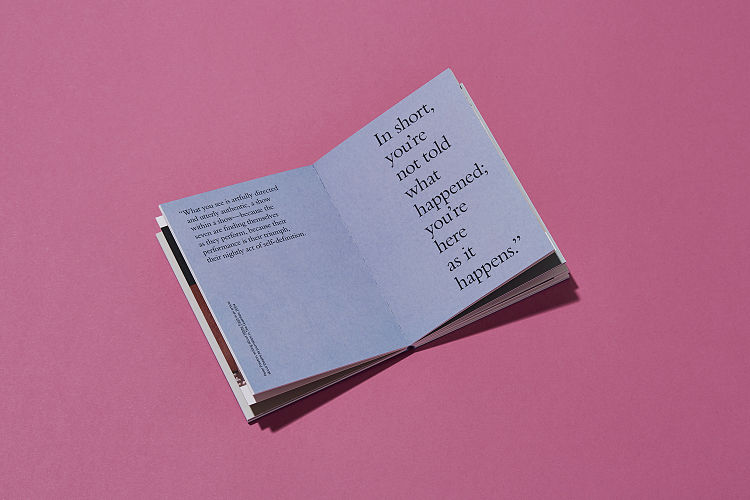
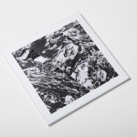
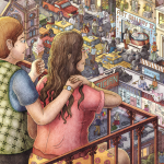
Following a brand refresh for their 21st birthday, Quarantine commissioned design studio, Dotto, to produce a piece of advocacy print to share with potential supporters, partners, commissioners and industry contacts. The book, printed by Pressision, provides an introduction to Quarantine and their work, and features quotes and imagery from their vast back catalogue. The design is composed of understated typography, beautiful imagery and intriguing words, making a fitting celebration of 21 years of Quarantine.
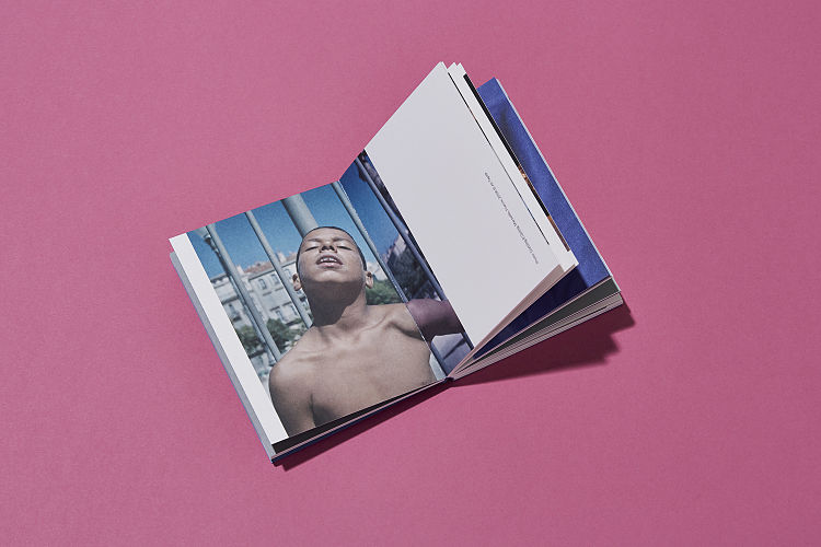 Quarantine is an ensemble of artists and producers who have gained an international reputation for their unique methodology for devising work with and about the people who perform in it. Conversation is central to their work, and they have worked on projects including the creation of karaoke booths, hosting shared meals and taking audiences on a journey through the dark one person at a time.
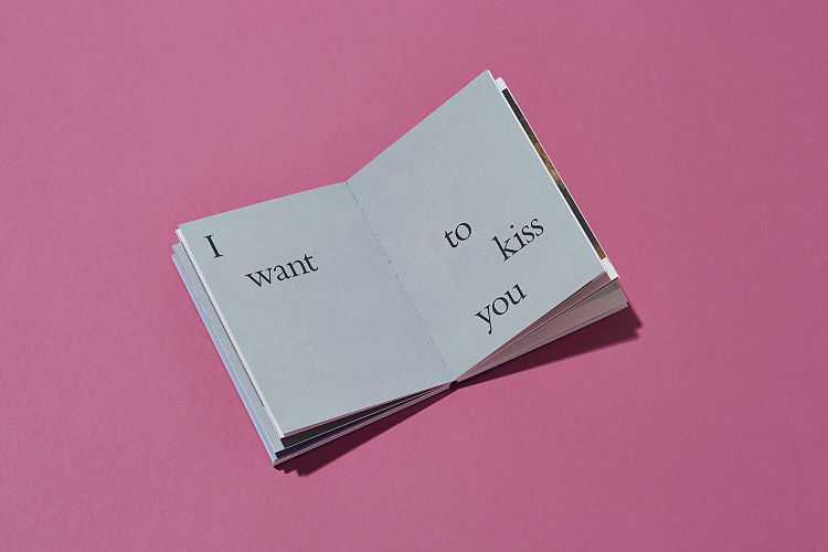
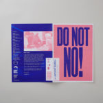
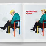
 Dotto’s design of the updated wordmark was born out of the original Quarantine ‘flag’, but simplified, elegant and more flexible. The typography was inspired by the brand’s values, and reflects the questioning and conversational themes they are often known to explore. Minimal, refined, functional and understated; every item was carefully considered to feel like part of them and their work. The chalky colour palette and complementary paper selection brings subtle vibrancy, whilst allowing intriguing words and imagery to take the forefront.
 The new brand identity is recognisably ‘Quarantine’, and successfully makes the brand contemporary once again, whilst still reflecting their current and core values and ways of working.
www.studiodotto.com
@studiodotto
Want to learn more about becoming an Official POP Member and be featured in exclusive blog articles? APPLY HERE.
You might like...
 POP Member Showcase | 6 Monoprints
- WRS_THG
- Luis Toledo
- Nike Air Max 90 Premium Camo Pack :: Atmos
- Benedikt Luft
- Kid Acne – “Colour me Bad 2”
- Carmen Fernández Sanz
- Posterzine Issue 04 | Anthony Burrill
- Graduate Print Awards 2014 | Top 10
- Streets of New York Illustrated by Tulips and Chimneys
- Modern Design Review x GTF
- Printed and Pink | Begin Again
- RIP :: Dieter Roth
- Clement Cases
- Michael Wolf
- People of Print: 20 Screen Print Artists You Should All Know About.


Want to know more about our membership? Give us an email at members@peopleofprint.com.
- Tim Belonax |All Of My Mistakes Have Led Me To You - April 26, 2024
- The Humber Printmaker - April 25, 2024
- Horizons by Angus Vasili - April 24, 2024