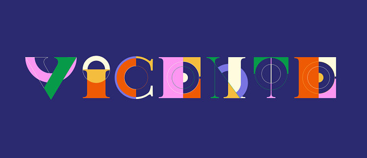
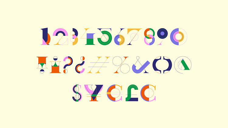
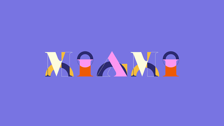
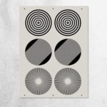
Multidisciplinary design studio and Official POP Member, Vasty, have recently launched a new typeface; Vicente. Taking #36daysoftype as motivation, Mariano, founder and director of Vasty, wanted to return to a digital approach after participating twice before with other alphabets created in real set design (Landscape Typeface), and paper craft (Colorful Paper Craft Alphabet). Created using a limited toolkit of bold, geometric shapes, some traditional serif and a colourful palette, Mariano was inspired by Bauhaus and Memphis fonts.
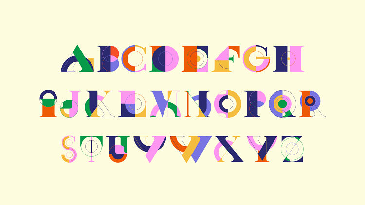
The design process flowed naturally for Mariano; “It is not a typical typeface where if you see a few letters you will know how the rest of the alphabet can continue. In this case I kept the system but in an open way, I want a surprise on each letter, playing with each rule I created“.
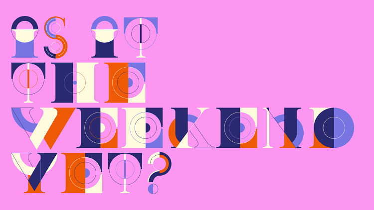
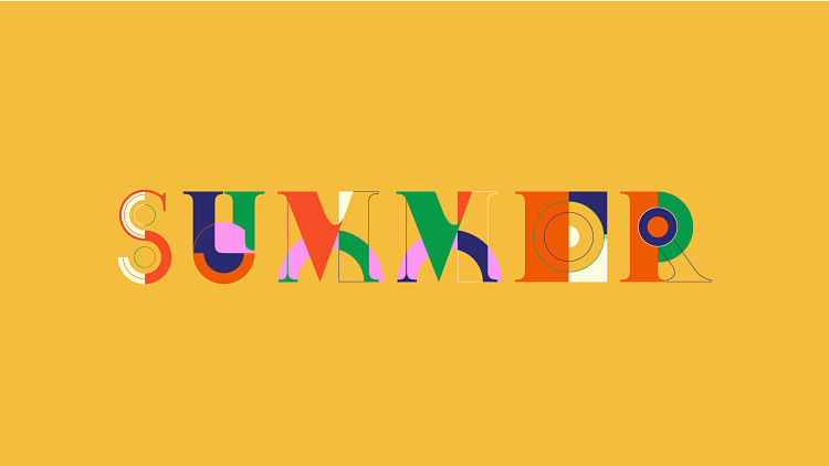 Vicente was influenced by Mariano’s passion for playing with bold and geometric shapes, and is a return and expansion from a poster series he designed a few years ago called City Poster Series. He began the design process by making hand-drawn sketches which he then translated digitally, creating the full alphabet in Adobe Illustrator. Mariano partnered with Jeroen Krielaars who took care of creating the static version using Fontself, as well as the animated version which respected the design and added a touch of magic.


Mariano is looking forward to seeing how people use Vicente as a joyful way to communicate something. Both versions are available at Animography.
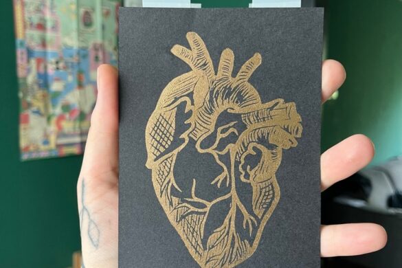
Want to learn more about joining our printmaking community? APPLY HERE.
You might like...
 Steven Harrington
- Vanda Sim Sim
- Video :: Creative Commons
- Lorna Robey
- Chantell Juanita
- Ben Gore | Bootleg Colouring Book
- Pantone X INTIMINA Period
- Weekday – “THUG LIFE” SS2013
- Andrew Clapham / AMCD Studio
- POP Member Showcase: 5 Zines
- Richards NYC
- Kodak Super 8 Camera
- Mékanik Copulaire
- Cat Wondergem
- Ryca
- Thyme James


Want to know more about our membership? Give us an email at members@peopleofprint.com.
- Tim Belonax |All Of My Mistakes Have Led Me To You - April 26, 2024
- The Humber Printmaker - April 25, 2024
- Horizons by Angus Vasili - April 24, 2024