This month we’re delighted to showcase a range of typography projects from members of our talented community. From reinterpreting iconic lyrics as letterpress prints, to creating bespoke typefaces for brands and unique Riso printed notebooks; our members have shown innovation in using a range of printmaking techniques to bring their typography projects to life.
Petra Verkade: Sorry Not Today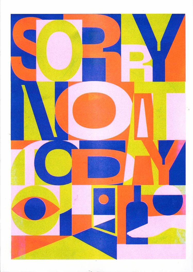
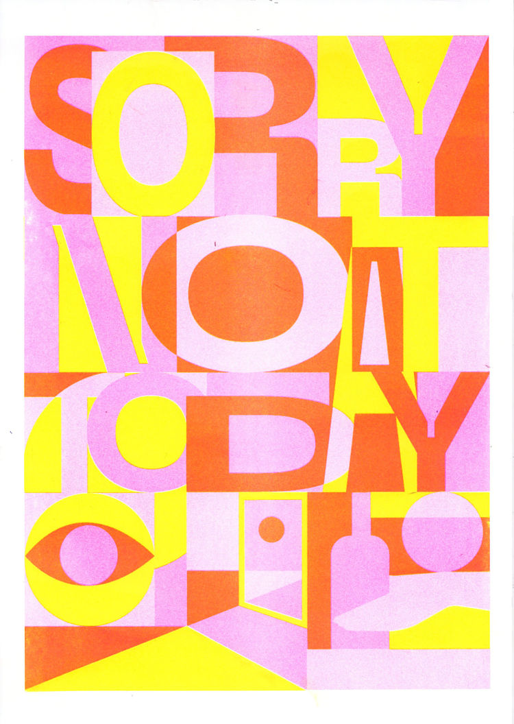
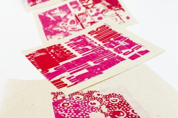
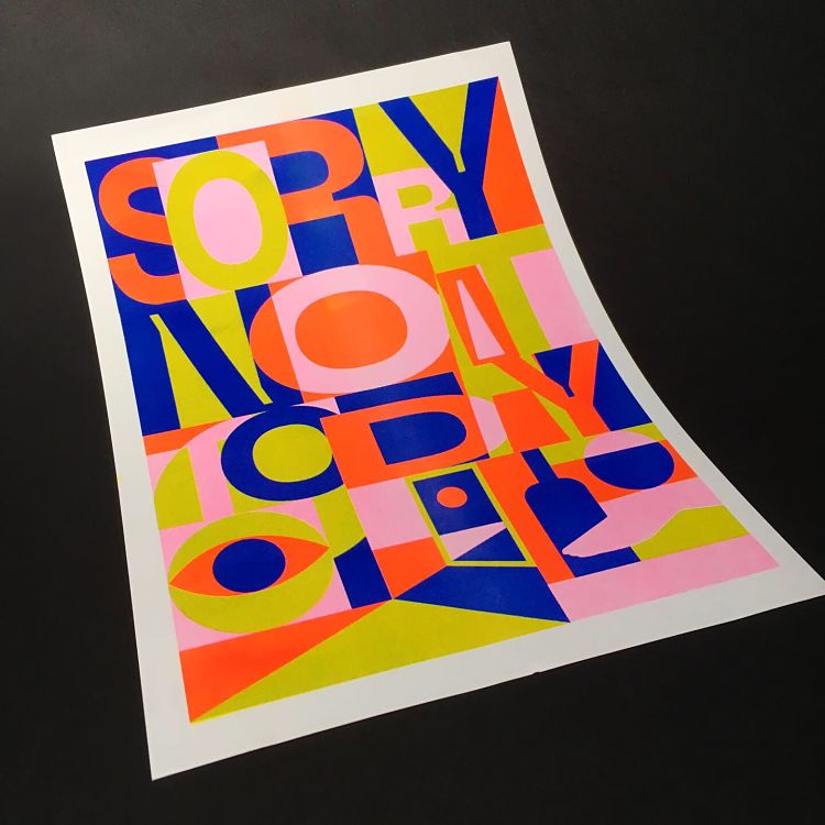 Created by Petra whilst studying in Berlin last year, this poster series was inspired by Berlin Club Culture. Sorry Not Today comments on the exclusive nature of some clubs’ entry policies in the Berlin underground world. The posters where Risograph printed in 3 layers; Fluorescent pink, yellow and blue on 200 grams A3 paper.
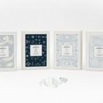
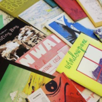
Drucken3000: Typographic Riso Misprint Notebooks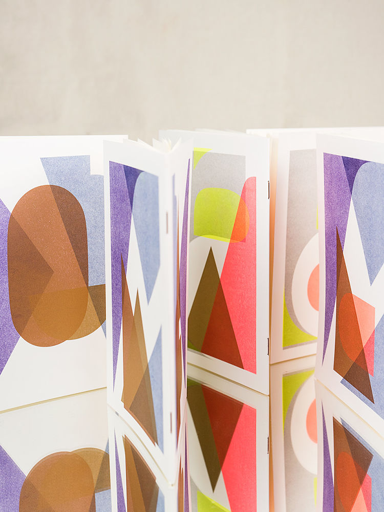
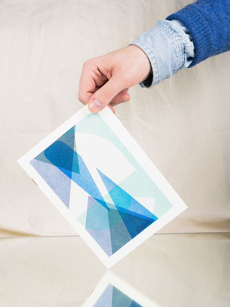
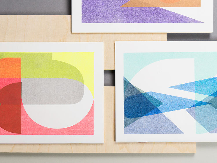 Designed and Risograph printed by Drucken3000 for Kami Berlin, these portable notebooks have been printed in a first edition of 500 pieces. Every notebook has a special typographic pattern that has been designed with a mathematical calculation that ensures that each cover has a unique intersection of letters and colours. They are available through Kami Berlin.
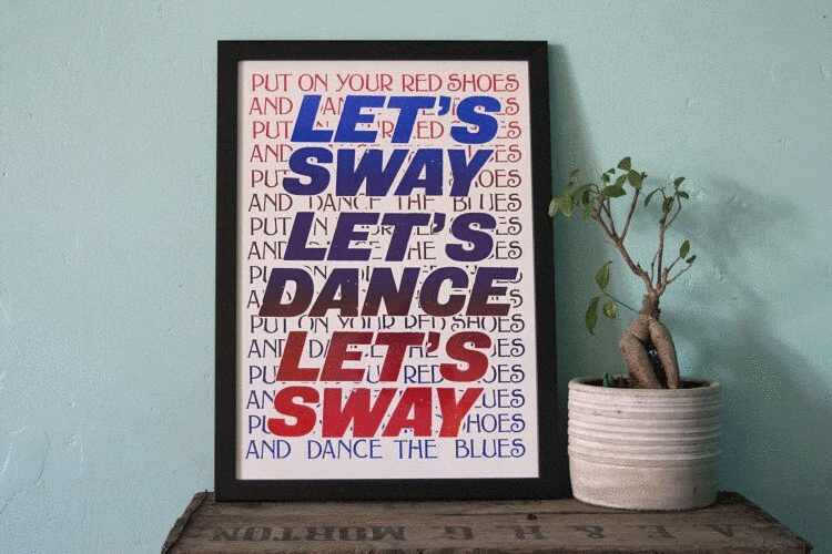
Jo Stafford: Bowie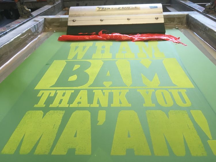
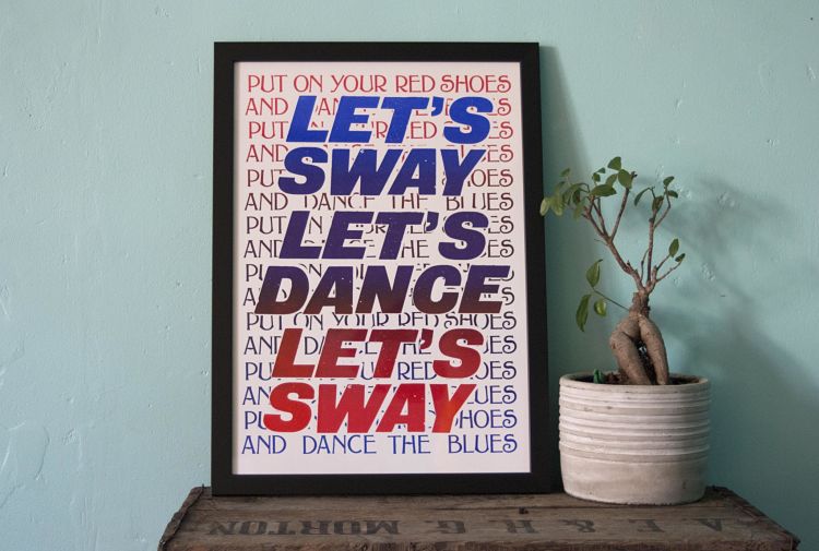
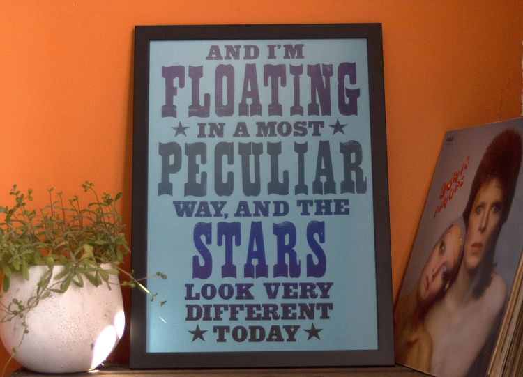 As founder and studio manager of Print To The People, an open access print studio based in Norwich, Jo Stafford loves all things print and her work has always heavily featured letterpress and typography. For this project Jo took inspiration from her favourite David Bowie song lyrics, as well as her favourite letterpress fonts, to create a series of screen prints which celebrate Bowie’s song craft and skill with words.
www.jostaffordjostafford.co.uk
Malo Malo: Surcouf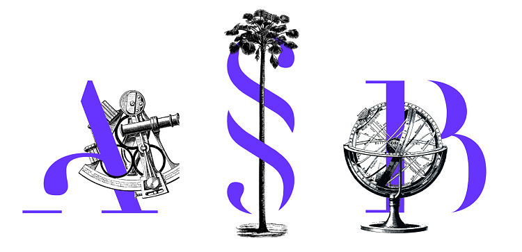
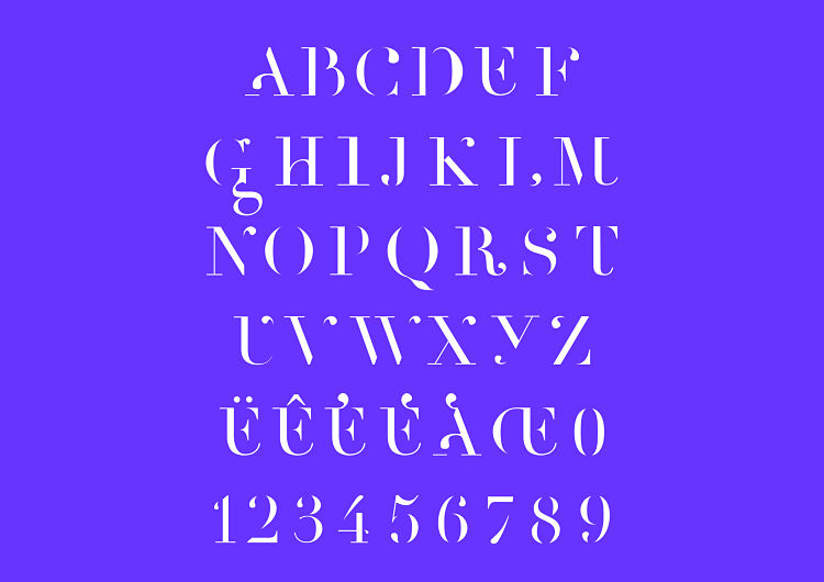
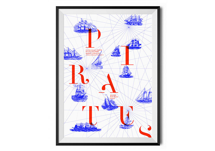 Surcouf is a titling font inspired by the marine world. Based on the Didot typefaces, the font plays with full and empty shapes as well as lower case and upper case in order to make Surcouf a new and fresh typeface. Known as “the Tiger of the Seven Seas” or “King of privateers”, Surcouf was the greatest and most famous French corsair.
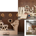
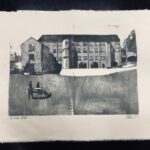
Dotto: Bespoke typography for Liverpool Everyman and Playhouse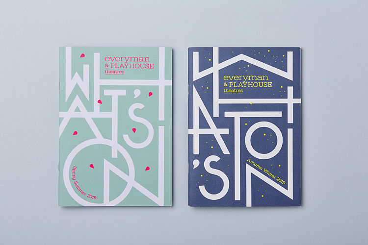
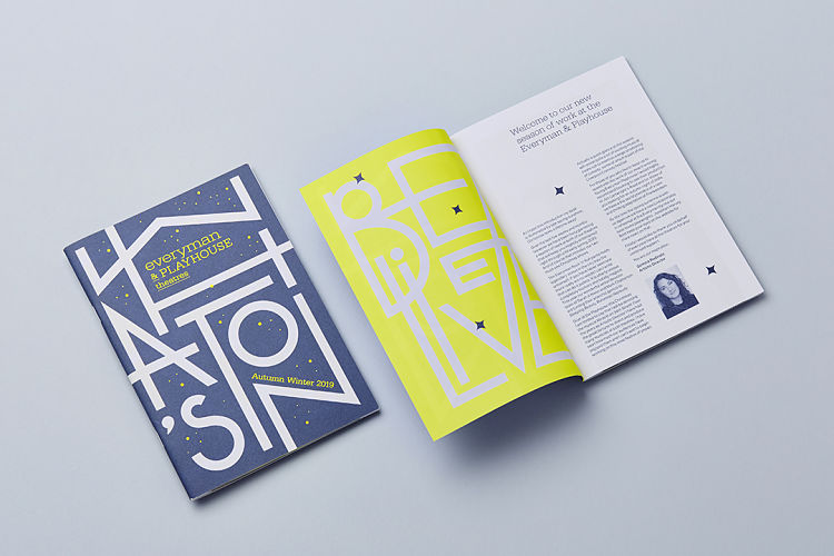
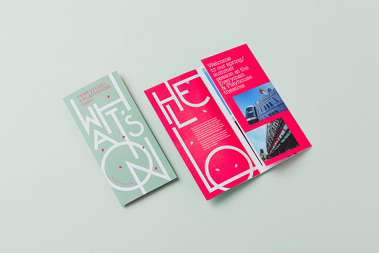 The Liverpool Everyman and Playhouse Theatres produce brilliant, forward-thinking theatre that responds to its time and place. Their mission is to dazzle and inspire, reflect the aspirations and concerns of their audiences and fuel civic pride. Dotto developed a series of bespoke typography alongside the guide layouts to use throughout their upcoming seasons. The Art Deco typographic style was inspired by architectural details and theatre history. It has a contemporary and colourful feel and was designed to stand out in the leaflet racks and feel collectable.
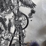
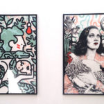
Kath Bell: Screen Printing Using Found and Hand-made Objects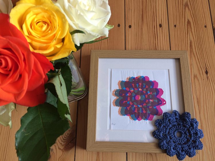
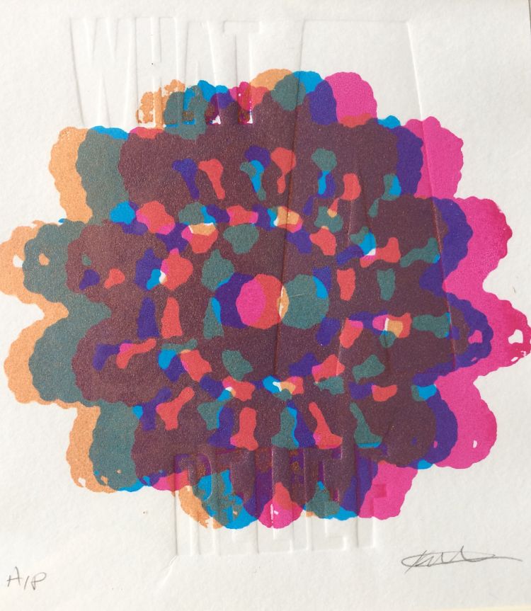 Kath Bell enjoys creating stencils for screen printing by exposing objects onto a screen. She uses items such as crocheted shapes, feathers, seaweed, seeds, grasses, scissors, leaf skeletons, or anything she finds that provokes interest of space and shape. In this project she has used letterpress printing methods to emboss the words ‘what a relief’ onto paper before screen printing. The outcome is that the words are under the surface of the crochet image, alluding to the ‘relief’ of creating images and how it can make you feel beneath the surface. This print has been entered into the Cascade Print Exchange at Oregon State University in the USA.
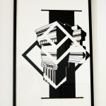
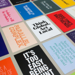
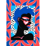
Effect Desire: THEY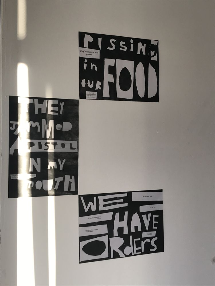
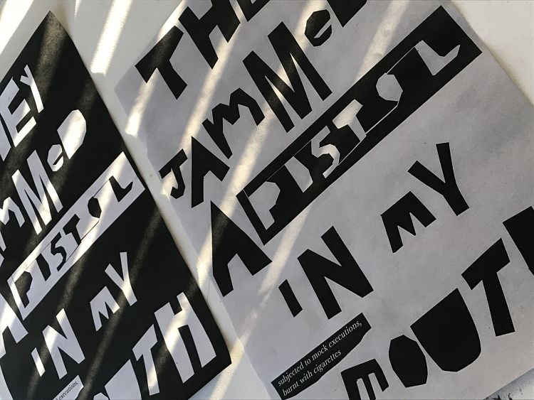
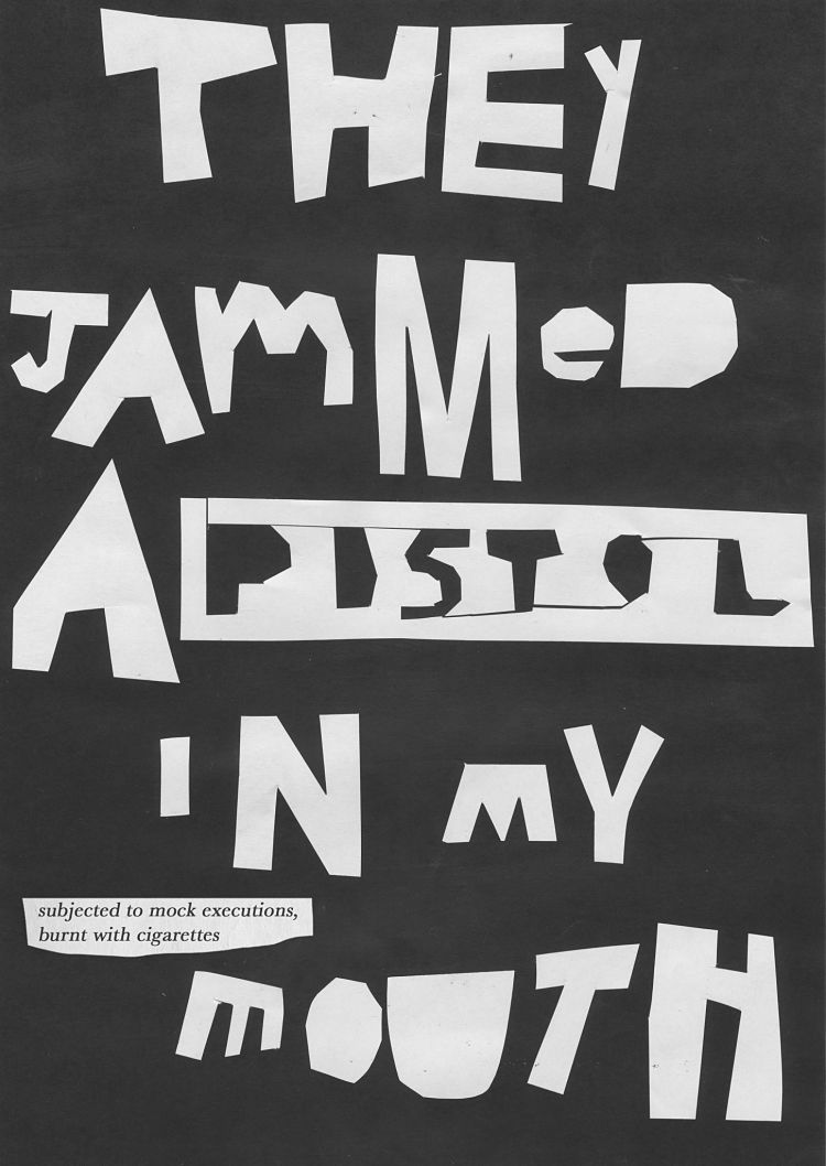 For They Effect Desire looked at the treatment of the ‘Birmingham 6’ following the 1974 Birmingham Pub Bombings where 6 men were wrongfully imprisoned for a crime they didn’t commit. During their 16 years in prison they were subjected to some horrendous crimes. The purpose of the project was to bring this topic to light and investigate ways of conveying feeling through subtle typographic design. However, Effect Desire wanted to limit himself with design choices as he didn’t want to give an inappropriate tone to the subject matter, resulting in the simple black and white colour palette.
Fresh Lemon: Eagle Letterpress Poster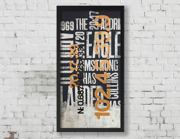
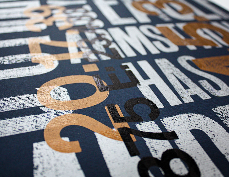
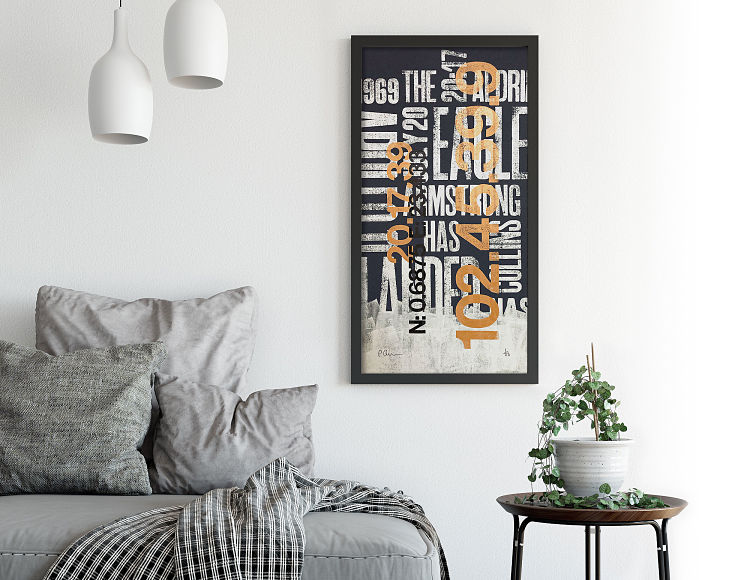 Fresh Lemon Print created this typographic poster to celebrate the first lunar landing of 1969. It centres around the infamous quote “The eagle has landed” and is overlaid with technical data from the mission: timings, dates and coordinates. It was letterpress printed using traditional techniques and vintage wood block type.
You can view all of our verified members and their projects on www.members.peopleofprint.com. Want to learn more about the perks of being an Official POP Member and showcase your projects to our global audience of print lovers? APPLY HERE.
You might like...
 Classic Aquavit
- Hello Marie
- Daniele Sonnino
- POP Member Showcase | 16 Block Prints
- Eimearjean McCormack
- It’s All Goods Co.
- Dupludó Collective
- The Designers Foundry: The Sampler
- Two Times Elliot:: 25 for 25
- Jennifer Dionisio & Sam Peet Collaboration
- Ben Brady
- Breakdown Press
- Lynnie Zulu
- Studio Mister
- Charlotte Audrey
- KC Ford


Want to know more about our membership? Give us an email at members@peopleofprint.com.
- Tim Belonax |All Of My Mistakes Have Led Me To You - April 26, 2024
- The Humber Printmaker - April 25, 2024
- Horizons by Angus Vasili - April 24, 2024