When you think of the term “brand”, it’s usually the global big guns that spring to mind – maybe Nike, or Google, or McDonalds.
You don’t think of, say, Peter Rabbit. This, then, is a very unusual kind of “brand refresh”, since it concerns Beatrix Potter’s most famous bunny.
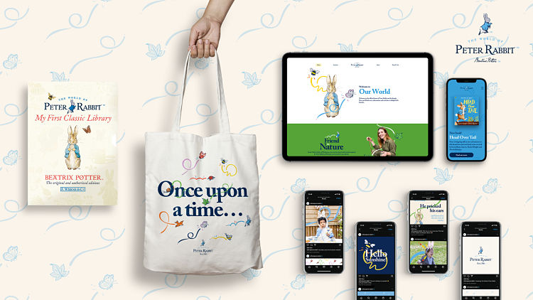
Penguin Random House Children’s announced the news of Peter’s makeover towards the end of September, and says that The World of Peter Rabbit™ brand refresh is being launched ahead of the classic character’s 120th birthday campaign in 2022. The publisher describes the new identity as “progressive” and “world-building,” placing Peter “front and centre of the world that Beatrix Potter created almost 120 years ago.”![]() Izzy Richardson, global owned brands director at Penguin Random House Children’s says that ahead of the big birthday next year, “it was important for us to refine and refresh the brand identity, to continue to futureproof the brand for a new generation.” She describes the result as a “subtle and contemporary refresh of our ‘running rabbit’ logo” that “brings energy and adventure to The World of Peter Rabbit.”
Izzy Richardson, global owned brands director at Penguin Random House Children’s says that ahead of the big birthday next year, “it was important for us to refine and refresh the brand identity, to continue to futureproof the brand for a new generation.” She describes the result as a “subtle and contemporary refresh of our ‘running rabbit’ logo” that “brings energy and adventure to The World of Peter Rabbit.”
The World of Peter Rabbit™ is managed by the Owned Brands Team within Penguin Random House Children’s, which initiated and managed the project and brought in Edinburgh-based design agency CreateFuture.
 “We felt a duty of care to Beatrix Potter’s legacy; to 120 years of memories held by the fans and to ensure that Peter Rabbit remains relevant and loved by the next generation and embraced by new audiences,” says Dave Ward, creative director of CreateFuture. “Striking the balance between heritage and modernity was always going to be challenging…”
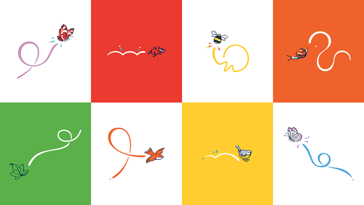
The new designs draw on early source material in a bid to keep the brand’s heritage front-of-mind. Illustrator Chris Mitchell was commissioned to create the new logo, which takes the form of a reinterpreted version of what Penguin describes as the “iconic Peter Rabbit pose”. This icon sits alongside the title font from the first edition of The Tale of Peter Rabbit, as well as Beatrix Potter’s signature as “signifiers of the official and original” Peter Rabbit brand.
 “The brief was to create a more contemporary version of the Peter Rabbit character to feature at the heart of the World of Peter Rabbit brand icon,” says Mitchell. “Along with the accompanying animal icons the illustrations had to be created in a contemporary solid line vector style to work across multiple platforms and touch points, with clarity of craft at all reproduction sizes.
“Retaining the charm, mischief and character associated with the original illustrations was paramount. A colourful graphic trail adds energy and flow to each icon, individually crafted to represent the natural movement of each creature.”
One of the key challenges of the project was to ensure that the illustrations didn’t just work perfectly across the physical books, but that they translated for a variety of other applications “while retaining their integrity and unique originality,” as Penguin Random House Children’s art director Anna Billson puts it.
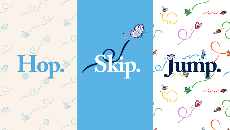
The new design system is built around three distinct aesthetics dubbed Hop, Skip and Jump which are selected depending on the demographic of the intended audience each touchpoint is aimed at. Hop, for instance, is more gentle to cater for the infant sector, suing a sfot, muted colour palette; while Jump was created for more “high energy” contemporary applications by using primary colours against clean backgrounds.
The “graphic trails” mentioned by the illustrator, Chris Mitchell. Aimed to add energy and narrative to the static images that reference Potter’s own animal drawings.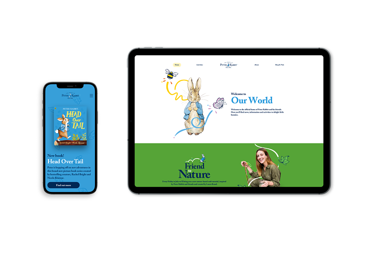
The new brand identity has been rolled out across social channels and digital platforms, and will appear on publishing and licensed product packaging from autumn this year in the UK. The global launch will begin in parallel with the 120th birthday celebrations next year.
You might like...
 Neil Webb: Agatha Christie Royal Mail Stamps
- Gataller Gráfico
- LINOCU_T
- Posterzine™ Issue 42 | Aga Giecko
- Container
- James Turner
- Believe in studio launch
- Graphic Design Visionaries | Caroline Roberts
- Mina Hamada
- Georgie Estill
- RAD Studio
- Anna Lomax
- Mansi Shah
- Kate Gibb
- RIP :: Richard Duardo
- Hans Arp | Chance – Form – Language (and a FRANZWESTigation)


- Autobahn - November 26, 2021
- Alphabetical - November 12, 2021
- SOFA Universe - November 8, 2021