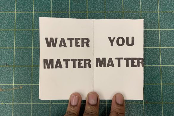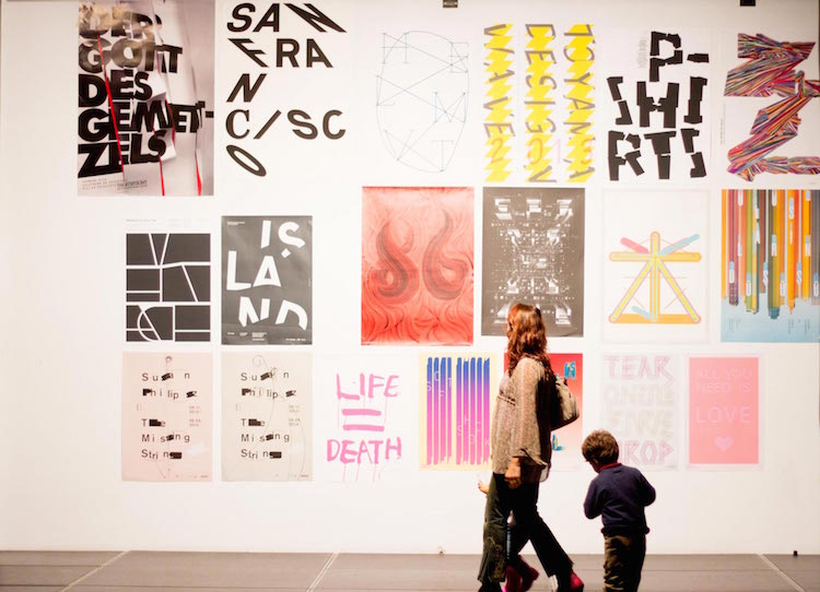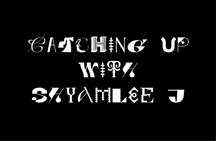
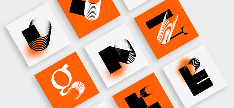
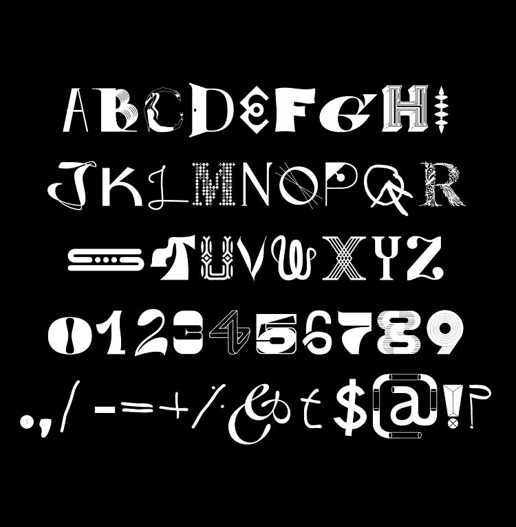
Today, people across the globe will celebrate World Diversity Day. To mark the occasion, we have teamed up with Distillery to launch the Diversity Type for download. With contributions from all corners of the world, Diversity Type has brought together letters and numbers from the Latin alphabet inspired by hundreds of individual stories and experiences. A total of 308 creatives from 54 countries have contributed to creating what is truly, the world’s most diverse typeface. Here, we introduce one of the participants, Shyamlee J, who’s design for the letter ‘B’ is included in the typeface.
 A design college graduate, Shyamlee was introduced to type design early on in her studies, and became immediately fascinated with creating textures and forms using non-digital tools such as a thick brush, sponges, branches, or anything she could lay her hands on. It was later on that the doors of digital type were opened to her, and she then began to playfully experiment further, or, as she describes, “have way too much fun”.
 As part of the Diversity Type Project, Shyamlee submitted the letter ‘B’. When asked why she chose this letter, she explained that when she was reading up about project, she was automatically drawn towards the letter. “There was a concept running in my mind during that time and it all just fit together when I got to the artboard — B for ‘Be’. I wanted the alphabet B to represent the strength to ‘be’; honest to one’s identity and culture and to acknowledge the uniqueness of individuality around us and not ridicule it. After all, the words of wisdom have always been, ‘let it be’.”
 Alongside a strong cup of “good black coffee” every morning, and “soused with the thought that I am about to begin my day by doing what I love, by my choice”, Shyamlee’s ideas come from a combination of heavy research into particular topics as well as “spur-of-the-moment” ideas. However, either way, she aims to create something that “solves a problem and is memorable while at it”.
 The type designer is currently working on some top-secret projects, as well as making plans for a series of typography posters based on the letters she designed. She describes the process as a “long haul”, but one that she is very much looking forward to. Having lately been particularly intrigued and invested in learning about Google’s Inclusive Design, she hopes to one day team up with Google, who would be her dream client.
You might like...
 Home-Work
- Leendert Meets Ingrid | Art Print of the Month
- (fos)
- Department Store | 10 Screen Prints £50 and Under
- Haley Rich
- Posterzine™ Issue 46 | Marylou Faure
- Maude Complex Shop
- James Dicks
- J.D. Safak — The Artist Who Uses Blue
- HORT
- Sarah Andreacchio
- Typewine | Xmas Collection
- Rascals :: SS15
- Inside KKOutlet
- Alice Oehr
- Ricky Adam


robyn@peopleofprint.com
- Posterzine Issue 101 | Joe O’Donnell - April 29, 2024
- Benny Andallo X Foundation F.M Posterzine - April 26, 2024
- leafie Issue 01 Currently Crowdfunding - March 27, 2024