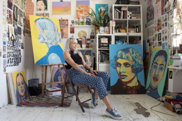
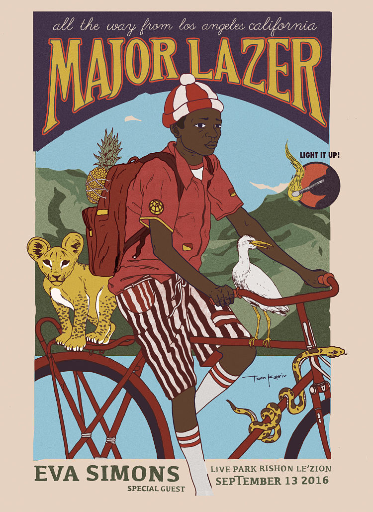
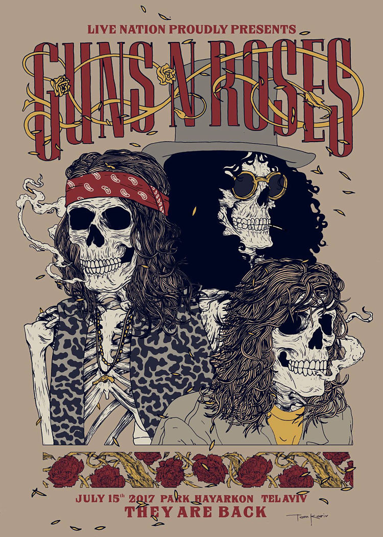
Like so many illustrators and designers, it was music that shunted art as a hobby into art as a career for Tom Kariv. However, unlike so many, he’s since worked with the likes of Major Lazer, Chronixx, Walshy Fire, Lil Dicky, Stones Throw Records, Raw Tapes Records and Guns n Roses.
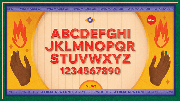
Working across video, illustration and graphic design, Kariv now holds the title of motion designer as part of the broadcast team at web development brand Wix. The team recently unveiled its major typographic overhaul for the brand in the shape of the Madefor campaign. This debuted Wix’s bespoke typeface, also called Madefor, which was created in collaboration with type foundry Dalton Maag to replace Wix’s former font across the company’s products and services.
We spoke to Kariv about his role in bringing the typeface to life, as well as his personal animation projects, what he’s listening to and The Velvet Underground’s superbly tragicomic song, The Gift.
 Tell me more about your involvement in Madefor…
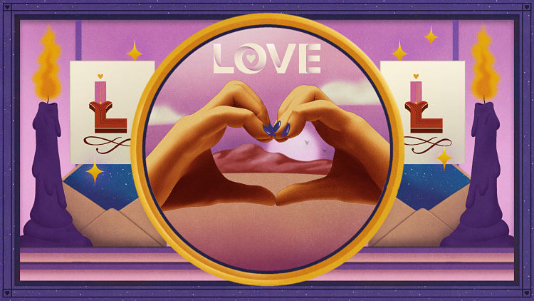
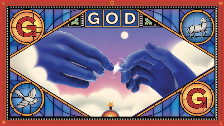
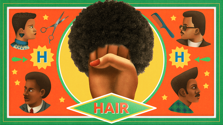
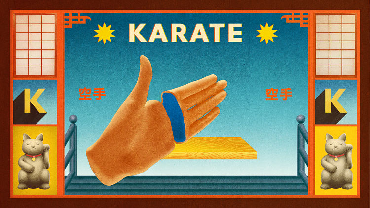
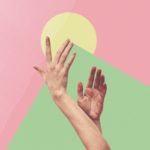
Working on the Madefor campaign involved a collaborative approach that was fascinating to me. We had a relatively big team working on it, and each of us took on different responsibilities. The films we created for the launch (here and here) are composed of multiple scenes, each representing a world built around a single letter. For instance, G represented the word ‘God’. We would brainstorm each scene and bring multiple cultural and professional perspectives together—a process that shaped the end result. Following each discussion, my role involved creating highly detailed B&W sketches for the scenes; then, together with Shira Nathan and Sivan Fitterman, we developed them using colour and details. To create visual consistency, we were always collaborating, looping each other in the process and swapping scenes. This film’s unique aspect was characterising the hands: we combined 2D illustration and design work with 3D, and gave the animation a touch of stop-motion feel that we were aiming for.
We wanted to provide an experience in which each time a viewer watches the film once more, they’ll notice another element, another layer. In the end, it was the collaborative process that added this magical and rich layer, with so many details and professional perspectives we couldn’t have reached alone.
 What’s your typical illustration process like, and what tools do you use?
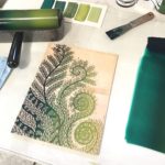
It depends on which kind of project I’m working on. I used to create my line work mainly with ink on paper, and then use photoshop to color my work. I tried to make the entire piece on one paper without any mistakes and was obsessed with this process. If I got something wrong, I would just start all over again using a light table. A few years ago, I started working on animation-related projects and shifted my process into digital tools since it would just take too much time to keep working. Lately, I have discovered proCreate, and since then, I spend most of my time on my iPad.
How would you describe your style?
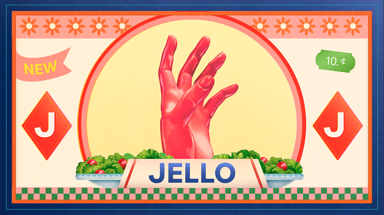
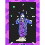
I’m a big fan of Old School retro design: old postcards, matchboxes, music posters, package design and film titles. I try to balance retro vibes in most of my work and combine them with modern colour palettes and typography. Using traditional graphic motifs, I give them something new from my own personality and just try to adjust them into our time.
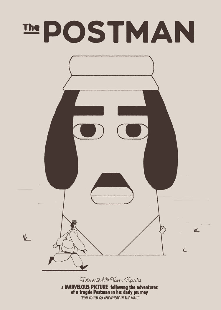
 Your animation, The Postman, seemed to mark something of a departure in your style—can you tell me more about that project and what it meant for you in terms of your work and its stylistic development?
Before The Postman, my style was much more realistic and detailed. Every piece was painted with precise hand-drawn lines, using as little digital means as possible. As a result, every project was highly demanding, and I stuck by that style until it caused me a major hand injury; I couldn’t even hold a pen for a few months. After considering ways I could illustrate again, I realised that my style—realistic figures and flat characters—needed to change. Developing a minimalistic line, my work wasn’t as detailed as before, but it created new freedom by allowing me to take my first steps into animation. I started playing around with characters and movement, and after designing simple animation loops, I decided to create a short film.
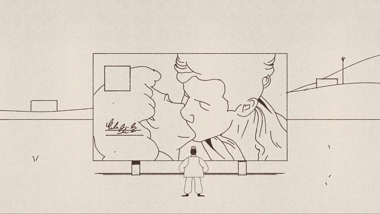
Since early on, I was interested in telling a story about the change and disappearance of communal life as we knew it; the film’s main character, the hero, needed to be a nostalgic, ever romantic figure representing this disappearing community. For me, that was the postman: a sensitive, fragile guy who carries messages from one to another and secretly yearns for human interaction. This minimalistic style was actually a perfect fit for the character and his world. In my work, a character’s inner and emotional world is conveyed by their surroundings; using a minimalistic style as the background setting created the isolated desert and isolated feeling seen in the film.
The project opened my mind to different styles and new approaches to storytelling, animation techniques, and film genres. But more so, it gave me a new perspective on challenges – and how they are opportunities to learn and evolve.
I read it was inspired by The Velvet Underground track The Gift. I love that song—can you tell me more about the relationship of music to your work (aside from the obvious, as in the client list!)?
Music plays a vital role in my work: I love listening to music and continuously exploring new artists. Also, every time I get into a creative block, I just turn up the volume. This connects to how I use inspiration in my work – and it’s a constant journey that I find myself coming back to at every stage of my work; I usually try to mix different sources of inspiration. I find inspiration both in musical pieces and in the visual world of music: my favorite musicians’ storytelling and graphic language really get my attention. I also observe how music and visuals come together in movie scenes – camera angles, scripts, storylines – and art, artistic movements, old posters, package designs, and different design cultures. So a song like The Gift inspires me as a story but also as a certain mood or style.
 What sort of things do you listen to when you draw?
Mainly hip hop, but it could also be other genres. I’ve been listening to Mac Miller, Brockhampton, Thundercat, Kali Uchis, Childish Gambino, Chronixx, and Koffee recently. I love watching NPR’s Tiny Desk Concerts. I really try to be open-minded to anything new, innovative, and exciting, no matter what genre it is.
In terms of interviews, lately I came across a podcast called Talk Easy with Sam Fragosso. He interviews people from different professions: filmmakers, comedians, activists, politicians, actors, etc. I really liked the ones with Willem Dafoe, Edward Norton, Peanut Butter Wolf and Mndsgn.
 Who would be your dream music client?
I always wanted to work with huge artists like Donald Glover (Childish Gambino), Anderson Paak, The Free Nationals or Kendrick. I really relate to their work, and just listening to and observing their work continually influences my own processes.
 What are you working on at the moment?
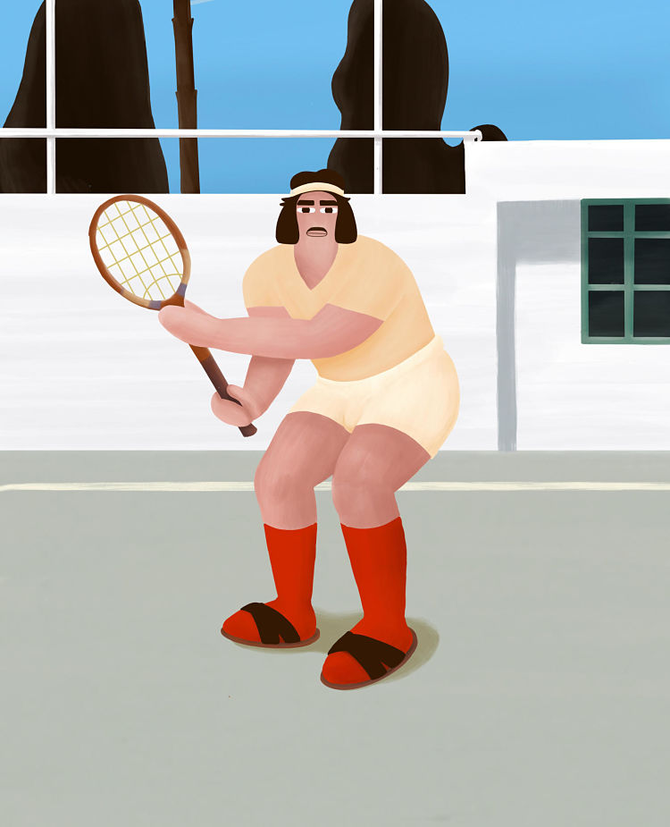
These days I’m working on a concept for a new (very) short film. I didn’t write a script yet since I’m trying to approach it from a visual perspective and just go with the flow. This time, the story is happening on a tennis court. It will be in colour, and in the centre of it will be a stout odd character with a moustache, high saturated red socks, and sandals. At the moment, I really have no idea where all of this is going, but I think that’s a good thing.
You might like...
 Redwan El-Harrak
- Jessica Ardizzone
- Gloria Ceballos: Shores of Plastic
- James Burgess
- Jessie May Bennett
- Neptooncat
- Lemuette
- Dotto
- H.Y.T. Studio
- Poster Screen Printing 2-Day Course with Dan Mather
- 20 Stocking Fillers For Creatives
- Emmanuelle Orr
- Luiz Junior
- THE PALACE BOOK
- Interview :: Chloe Greenfield
- Bureau Kayser


- Autobahn - November 26, 2021
- Alphabetical - November 12, 2021
- SOFA Universe - November 8, 2021