Designer and artist Dave Towers boasts a pretty cool CV, taking in a placement at The Face back in its heyday, and working as inhouse graphic designer at lava lamp saviours Mathmos in the 90s, when they were the ultimate partner for other hip home objects like inflatable chairs and those weir lights that look like anemones.
 Perhaps the most impressive thing about his past, though, is how he broke into the design industry in the first place. Forced to drop out of his graphic design course at art school in Dundee due to financial constraints, he turned his joblessness into opportunity. He designed his own fanzine, named Dave on the Dole, which was printed on job centre forms, brown paper bags, P45s and old billboard paper using an old three colour photocopier, “red toner, blue toner and black toner – artwork masked off by hand and passed through the machine three times,” he explains.
The zine documented his quest to gain employment, and ironically went on to actually gain him employment when it was covered by Creative Review magazine, and he began picking up creative work from there.
 Since then, he’s worked at big name agencies like Lowe and Fallon, and now holds the role of executive creative director of design at Ogilvy UK. Outside of agency hours, however, he takes his knowledge of colour, witty copywriting and typography into the art world, and has gained a following around the world for that side of his practice.
The turning point from designer to designer/artist came in 2009 when he discovered the Molotow pens, which are usually used for graffiti. “It looked like a magical thing I’d never seen before. You could create screen print type visuals on your kitchen table,” he says.
Ever a man with a knack for going viral, Towers promoted his art on Instagram, and caught many people’s eyes with his process videos. These got picked up by blog DesignMilk, and he found himself with commissions for his art flooding in.
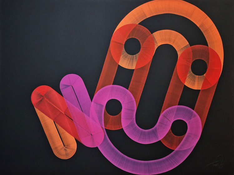
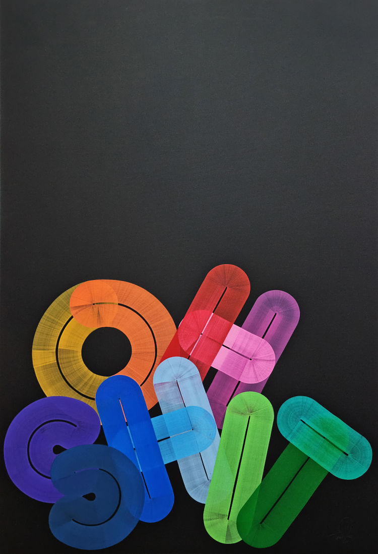
 His works draw on the Japanese concept of “wabi sabi”, a concept derived from Biddhist teachings that’s centred around the idea of finding beauty in imperfections and impermanence.
“Essentially my work is a form of calligraphy with the brushwork,” he says. “As humans we warm to the humanity in imperfection. I think this is part of the appeal of my work. The acceptance of its imperfections makes the work feel authentic – something that’s less common these days.”
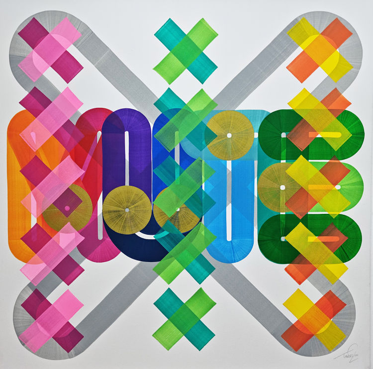
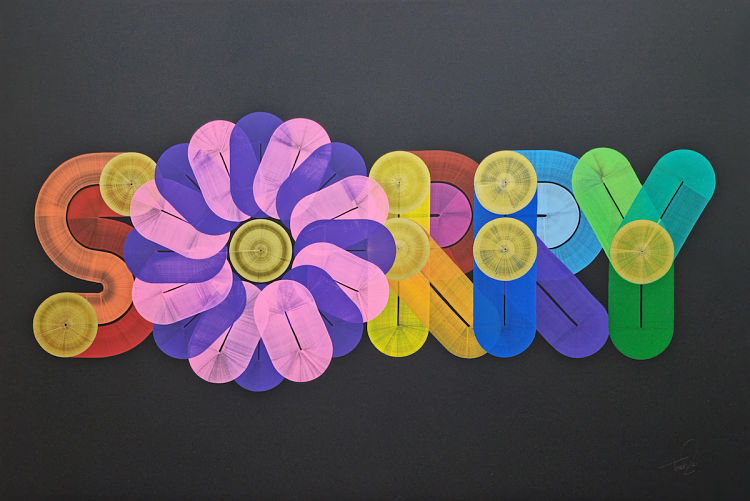
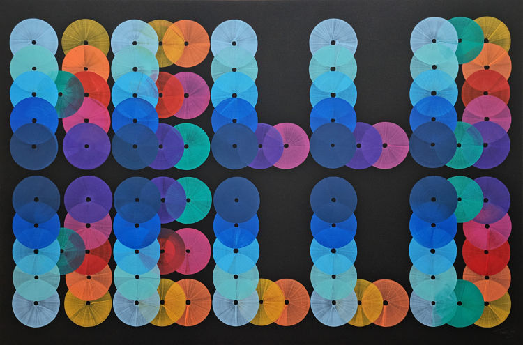
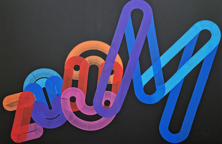
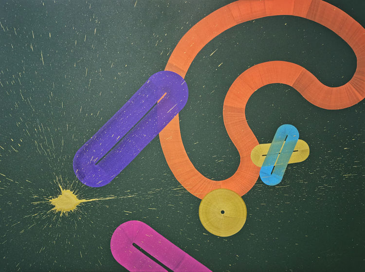
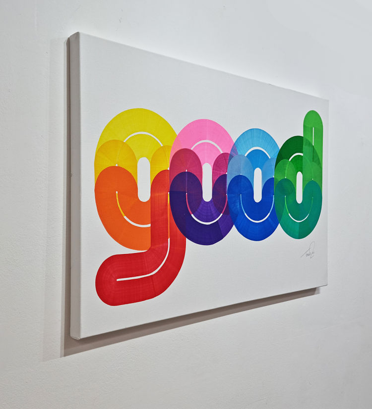
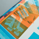
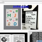
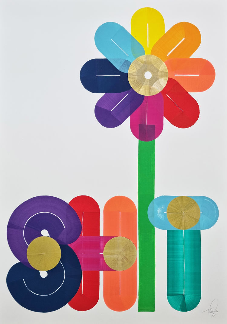 As such, his works take the form of typographic-based, boldly colourful artworks that draw on contemporary issues and phrases. The pieces in a current show at BSMT Gallery in Dalston, east London, bear titles and words like Moderna, Pfizer, You Are On Mute, and in four letters that many would say describe the past year or so, Shit.
The show, titled FREE, is loosely based on people’s experiences of the pandemic – as well as his own, and much of the work toys with wry humour and irony. “These new pieces are influenced by the experience of working for 16 months working in a small, dark bedroom,” he says. “It’s the continued evolution of my design process and an aesthetic I’ve been working on since 2012.”
He adds, “‘FREE is a black and gold rainbow, it doesn’t have a euphoric feeling about it, feeling more uncertain than free, but it also has a deep lying optimism that is at the centre of everything I create.”
The exhibition, on now until 12 September, draws together 20 handmade, unique pieces described as a “selection of thoughts and ideas pieced together” as a cohesive whole.
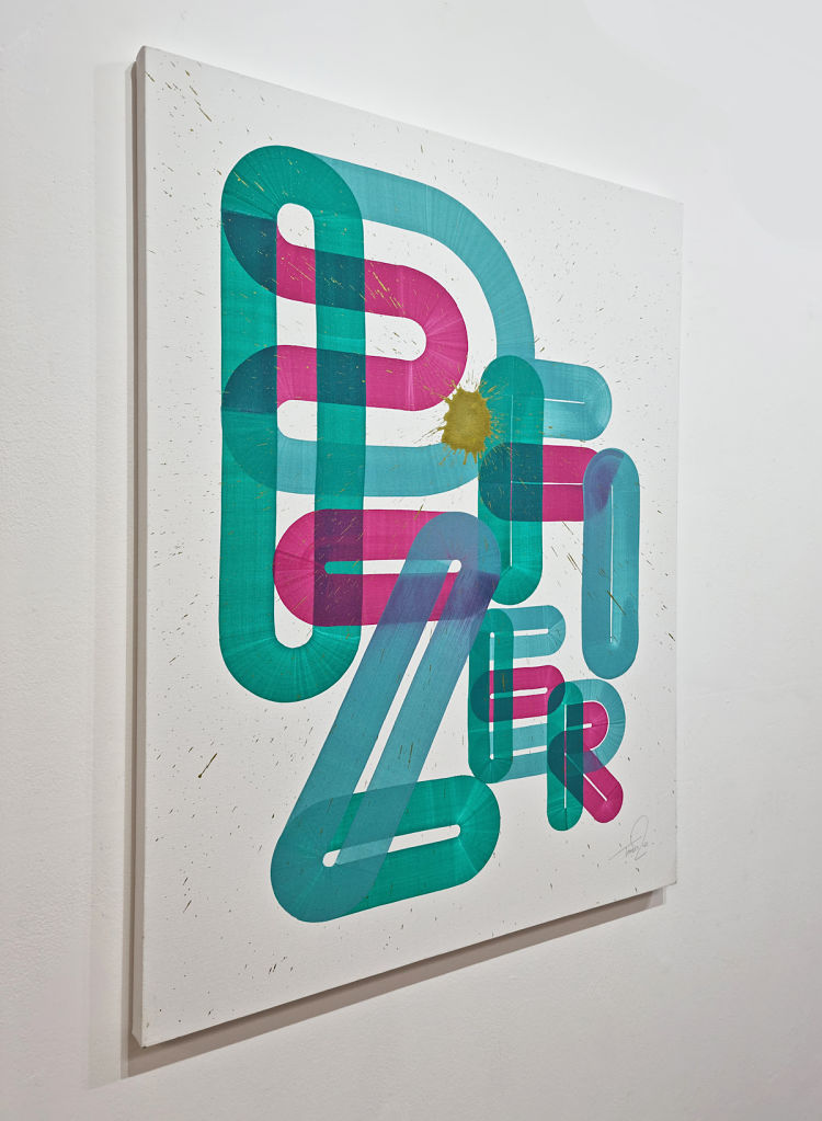 “I love the unpredictability of creating artworks by hand rather than digitally. The ink has a lovely humanity to it, as it’s been dragged by hand across the canvas,” says Towers.
You might like...
 POP Member Showcase: 13 Graphic Designers
- Ill-Studio
- Nadia Resta | Spaghetti Ramen
- Rosie Moss | Interview
- RIP :: Andy Warhol
- Amani Willet
- Top 50 Posts of 2014
- 8 Website & Portfolio Tools for Freelancers
- Temps de Vacances :: Les Couleurs
- Matt Manson
- A Boogert :: 271 Years before Pantone
- KesselsKramer & Daniel Gebhart de Koekkoek | ARTE Summer of Brothers and Sisters
- Stellan Kristenson
- ‘THINK DIFFERENT’ Print | Karl Grandin
- Interview :: Jennifer Hope Clothing
- 10 Print-Based Tumblrs You Should All Follow


- Autobahn - November 26, 2021
- Alphabetical - November 12, 2021
- SOFA Universe - November 8, 2021