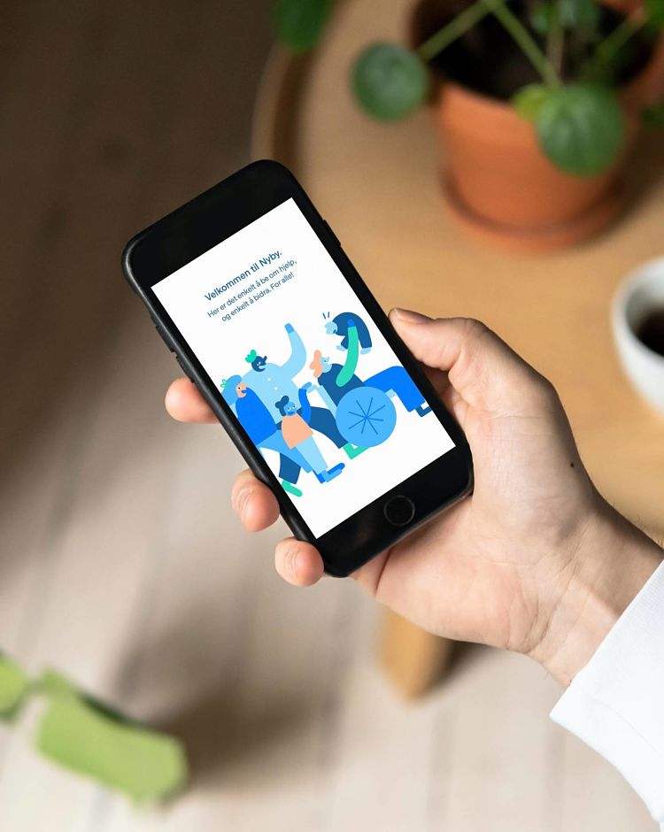
We’re longtime admirers of Oslo-based design agency Bielke&Yang, which has an apparently effortless knack for merging sharp graphic design and branding work with witty, playful illustration.
The studio was founded in 2012, and since then has gone on to work on projects ranging from LBGTQ health campaigns to design fair branding to startups, coffee brands, restaurants, a project for The Norwegian Radiation and Nuclear Safety Authority and more. According to Bielke&Yang, its design ethos is “rooted in usability, creativity, aesthetics and craft.”
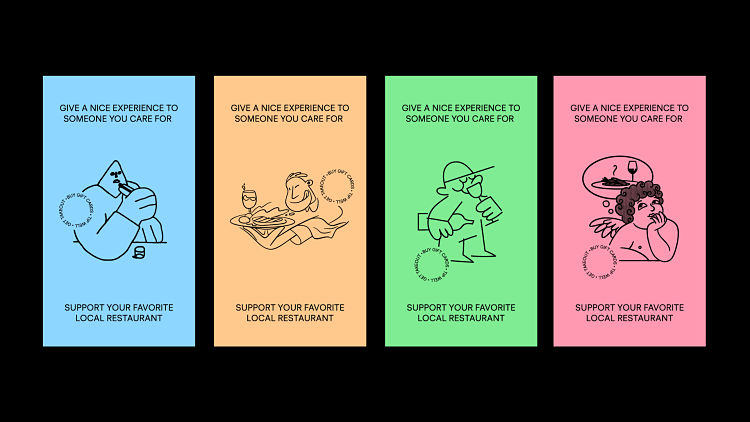
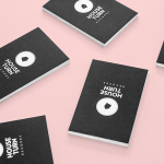
 Toward the end of last year, the studio decided to launch a self-initiated project to try and keep restaurants afloat in the wake of the pandemic and its impact on small businesses.
The campaign encourages people to buy more gift cards, order more takeaways and tip generously, focusing on a set of colourful stickers that people can download and share “in whatever way you like as long as it’s in support of this cause,” says Bielke&Yang, which has been promoting it on its Instagram account.
The cute, simple black line-based illustrations were created by Jon Arne Berg, Nicole Kamenovic, Ole Magnus Saxegård and Oscar Grønner; while the copywriting was taken care of by Alexander Fallo.

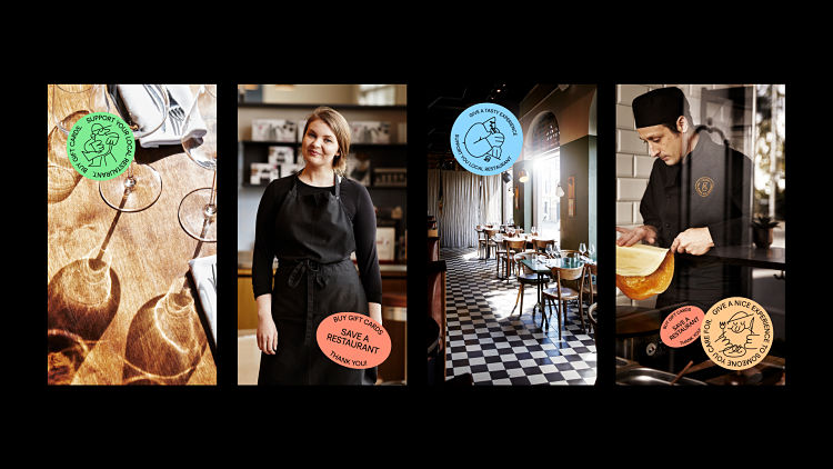 One of the main goals for the campaign was to get creative agencies to buy gift cards as 2020 Christmas presents for their employees, according to designer and partner Christian Bielke Steffensen. “Most companies buy Christmas gifts either way, so it’s a simple way to give something back to the ones that are struggling the most. But also to highlight their favourite restaurants and remind people that we need to support them for them to survive.”
 Another key project for 2020 was Bielke&Yang’s significant redesign of one of Norway’s biggest magazines, OBOS-bladet, published by OBOS, the largest housing developer in Norway and one of the largest in Scandinavia.
The publication aims to further the company’s vision to help “build the society of the future,” and its history dates back to 1947. Bielke&Yang’s redesign looked to highlight the future of urban development while acknowledging the company’s history of developing housing in line with social, environmental responsibility. “We wanted to highlight the OBOS vision of a smarter, greener and more humane urban development,” says the agency, adding that the new look is a “warmer and more compassionate expression.”
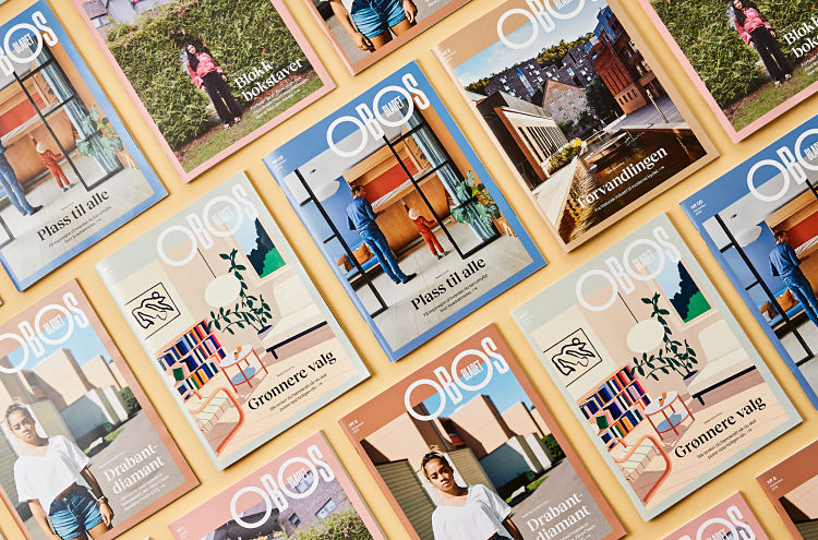 The new format, paper, grid, layout, photographic style, illustrations, colour palette and typography were largely inspired by the many decades spanned in the magazine’s history, including the geometric style of the 1950s masthead. This inspired Bielke&Yang to create a new custom typeface, OBOS Sans, that is also used as a display type elsewhere in the publication.
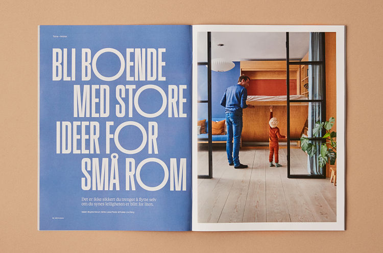 OBOS Sans’ letterforms reference Scandinavian functionalism, facade lettering and architectonic type in Oslo with a contemporary twist. The grid for the magazine’s design is based on architectural drawings referencing one of OBOS’ first housing projects in Oslo, and the system acts as an aid for consistency in elements like image ratios.
“With the redesign, OBOS celebrated their 90th anniversary, says Bielke&Yang. “OBOS aimed to express some of the substantial OBOS history, but also to look ahead to match their goal of ‘building a better future’.”
You might like...
 POPUP Prints
- Bastonnade at The Book Club
- 10 Deep :: Nightfall :: AW13
- Stone Island AW13
- Sarah Le Donne
- We Occupy :: Latest Prints
- Caskshare X Phoebe Phillips
- Luiz d’Orey
- Exhibition :: Fragments of Faile
- Joe Snow
- World Kindness Day With Zetafonts
- Revok
- Satu Maaranen :: Petit Bateau
- Mimi Mollica
- Making a Splash: Graphics that Flow
- Chris Long


- Autobahn - November 26, 2021
- Alphabetical - November 12, 2021
- SOFA Universe - November 8, 2021