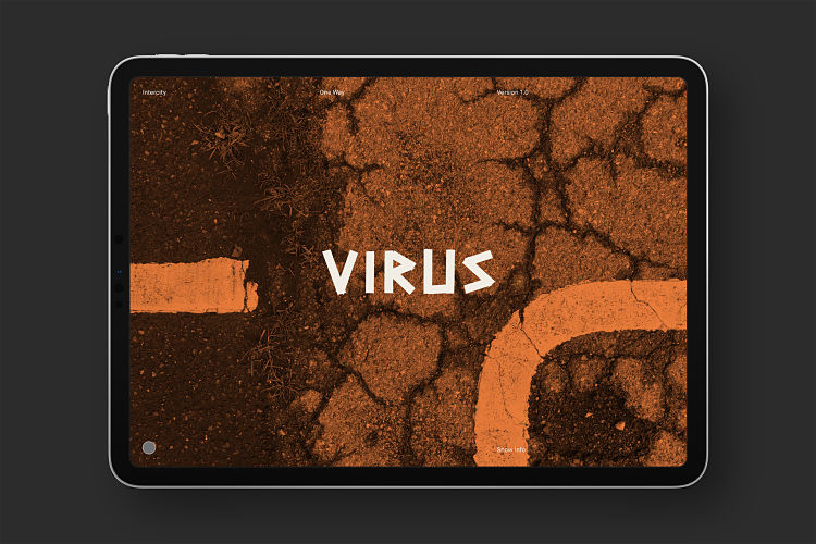
Designed by UK-based graphic design studio Intercity, One Way is a free typeface that marks the beginning of the new year; “an occasion that currently seems more important than ever” says the Intercity team.
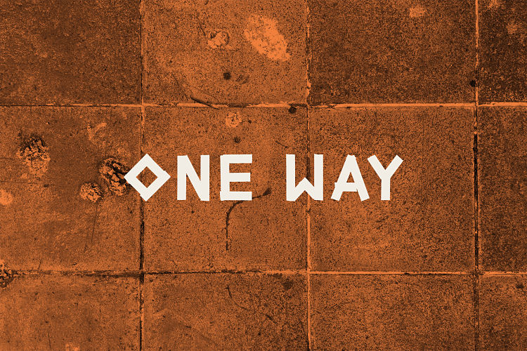
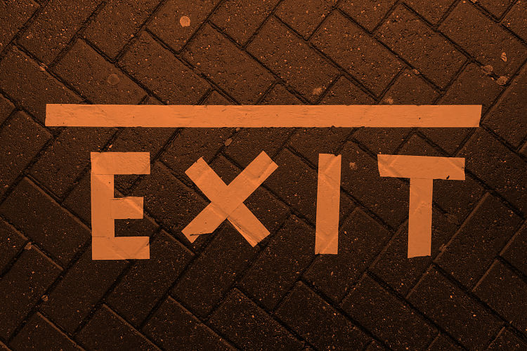
One Way is “an alphabet created to reflect the changing times that we now find ourselves in”, inspired by the improvised, directional, sticky tape signs and arrows that started to appear on floors and walls throughout 2020 as a result of the new social distancing rules.
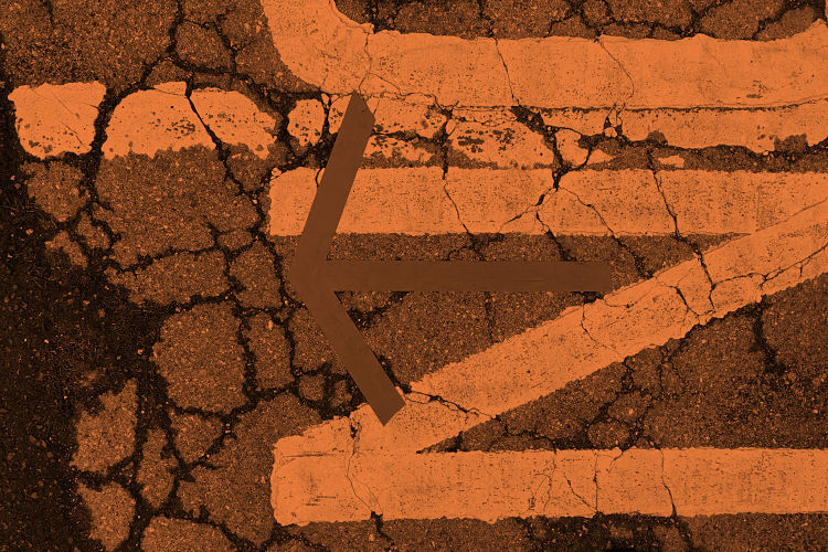 The idea for the alphabet started to form back in the spring of 2020, when Intercity first started photographing this rudimentary typography. They describe; “Bold typographic shapes combined with brightly coloured tape and well-worn flooring has created a visual language that symbolises the current global crisis”.
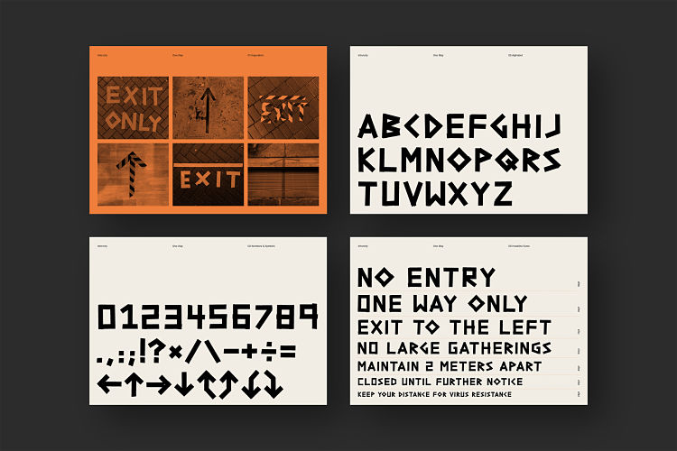
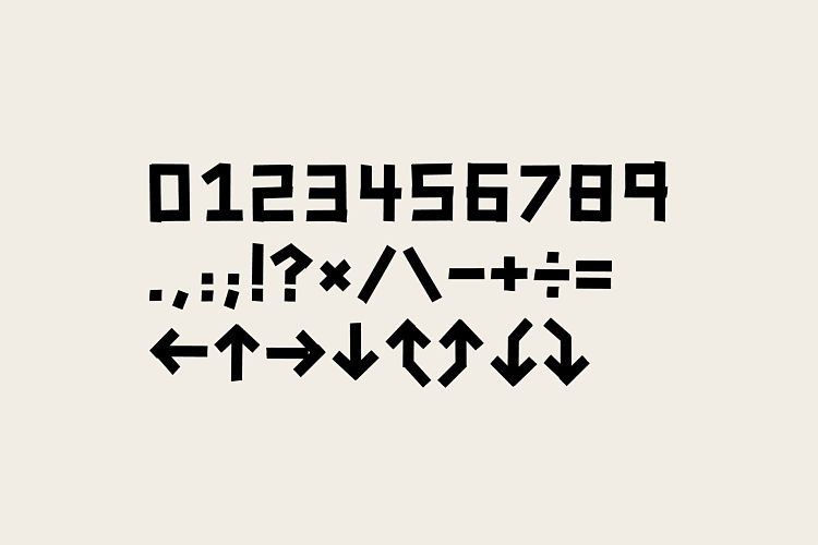
 Starting with a simple A3 grid, they initially sketched out the design for each character on screen, before committing to tape with the use of a lightbox. Each letterform was then photographed and digitised, including a set of stylistic alternates and limited punctuation.
 One Way can be downloaded for free here.
You might like...


robyn@peopleofprint.com
- Benny Andallo X Foundation F.M Posterzine - April 26, 2024
- leafie Issue 01 Currently Crowdfunding - March 27, 2024
- Reimagining The Nature of Work - March 5, 2024