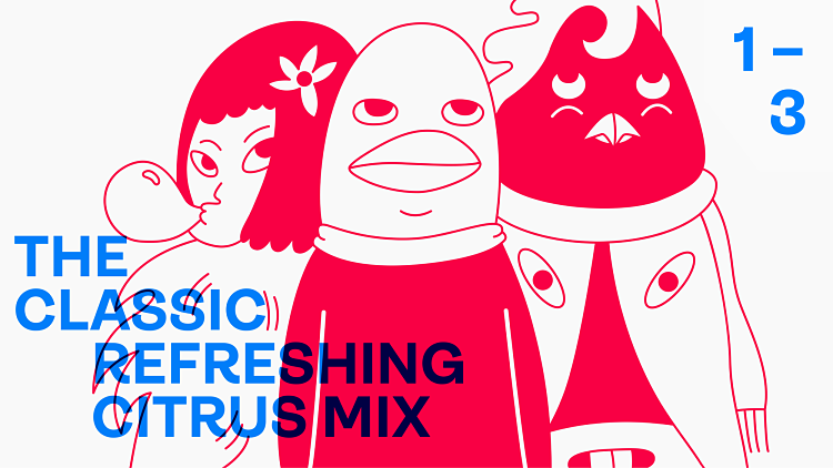
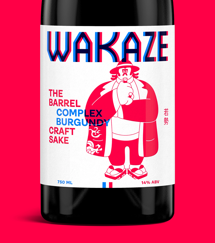
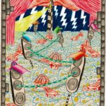
We came across the ad agency Our Friends in London thanks to the gorgeous identity it created for sake brand Wakaze, which launched earlier this year. What grabs you about the identity, first off, are the brilliant illustrations: strange, surreal but somehow very adorable creatures adorn the bottle labels, and perfectly encapsulate a brand that’s cognisant of tradition while being very playful indeed. The second thing that grabs you is the colour palette: a blue and red hue have been chosen, both of which are so vibrant that when placed alongside or on top of one another, the words appear to physically vibrate.
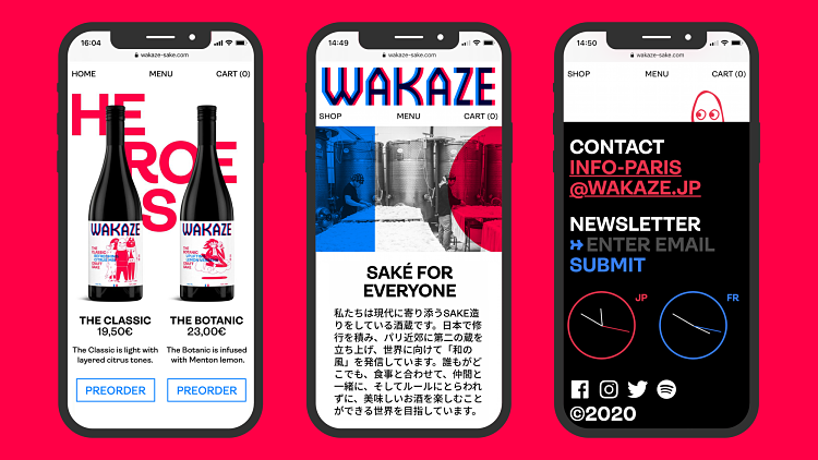 According to It’s Nice That, the agency was briefed to “democratise sake,” creating an identity that aimed to change the perception of sake for Western audiences, who usually view it as “a high ABV spirit, to drink only with Japanese food,” said agency founder Peter Hale. “But it has a versatility like wine.”
Wakaze’s founders were trained in Japan but set up their brewery in Paris, and so the brand combines Japanese tradition and French culture. Our Friends in London’s approach represents both of these things beautifully, and in an entirely original way that never falls back on lazy cliches: the calligraphic touches and character designs hint at Japanese costumes and other traditional elements, while the colours take the French red, white and blue into powerful contemporary new realms.
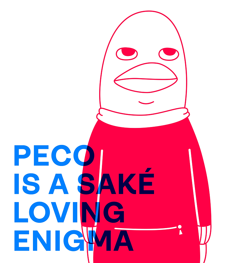 The team has said that the blue in fact represents France, the red, Japan; and these elements work together to underline the brand’s merging of “France and Japan, East and West, older and newer”. Los Angeles-based illustrator Andy Busc was commissioned to create the illustrations, drawing three characters: a rooster (apparently the French national animal), a Kanzashi flower and a “purposefully ambiguous ambassador, a blank slate for new influences,” according to the agency.
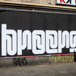
The whole thing feels all the more punchy and irresistable through the use of the typeface Ambit, by CoType; and a logotype created using the font Absolution by Helsinki Type Studio.
Hale founded the agency last year, and the team also comprises strategy director Linda Chen, creative director Russell Saunders and brand designer Eddie Fowler.
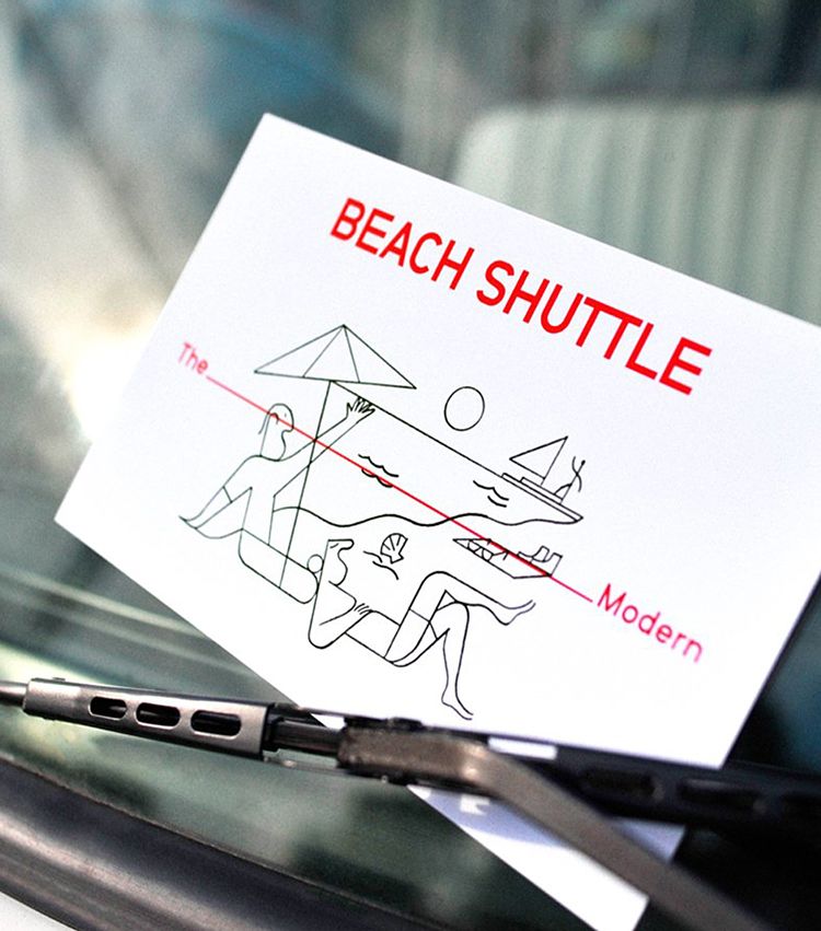
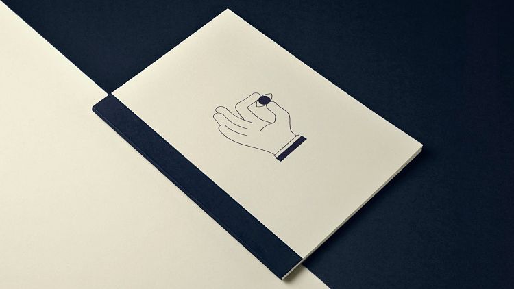
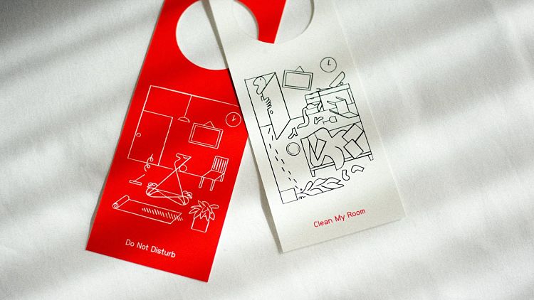 Elsewhere in the OFIL portfolio, the team demonstrates the same flair for tactility and design work with a highly illustrative bent. Another highlight is its identity for The_Modern hotel. Described by Our Friends as a hotel “where design, culture and play collide”; the team created a logo that was “inspired by The Sarasota School of Architecture: a movement adapting European Modernism to the culture and climate of subtropical Florida from the 40s to 60s.”
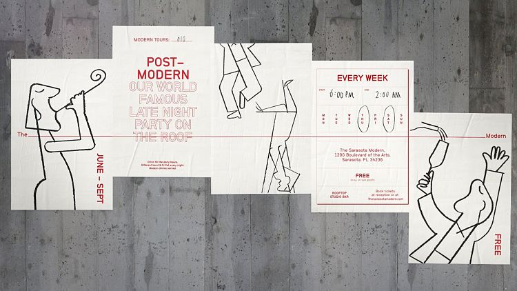 While it works beautifully on static applications like business cards, the logo was created to be “dynamic,” meaning it’s animated to shapeshift, expanding and contracting across “various formats and experiences,” as Our Friends puts it. “A playful illustration style captures vacation moments in the style of mid-century architects, such as Paul Rudolph or Victor Lundy.”
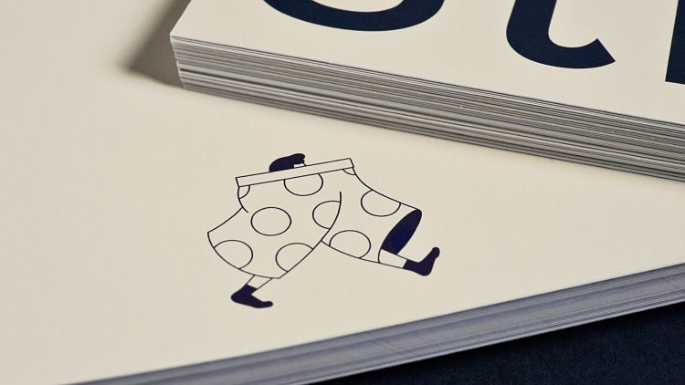
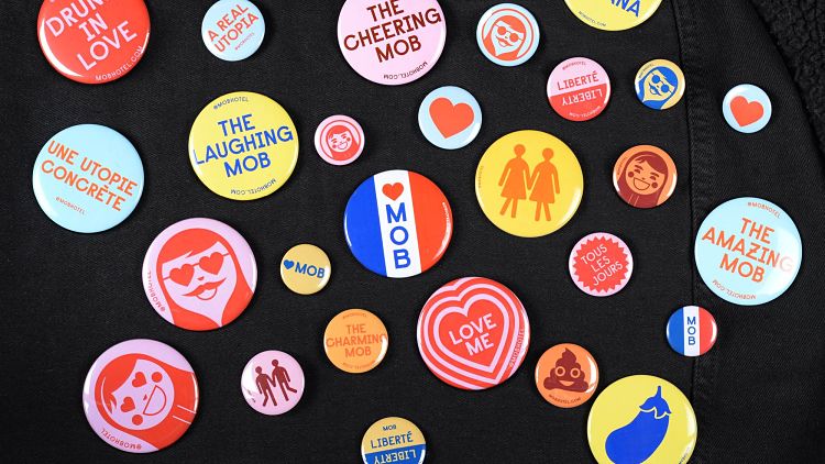
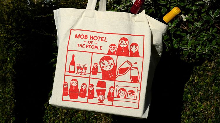
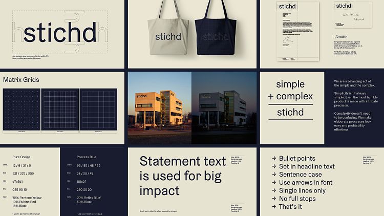 Despite its relative youth, Our Friends has already garnered a diverse and impressive portfolio that shows its chops across everything from advertising, art direction, branding, strategy, and digital to environmental design, packaging and moving image projects. Other highlights include its work for stitchd., a company that partners with brands like PUMA and Tommy Hilfiger on garment production; some sublime illustration-led work for MOB Hotel, and branding designs for sailing tech experts SailGP.
You might like...
 Feelings: An invitation to look inside
- Plastikcomb Magazine 2.0 | Crowdfunding Now on In Perpetuum
- Lea Linin
- Love & Work Exhibition
- Topo Copy | RISOGRAFIA #3
- Daniela Pollehn
- Roy van Wezenbeek
- Letman
- Basso and Brooke
- Hattie Stewart
- Posterzine Issue 78 | Sunflower Form
- Lee Coren
- Kate Gibb
- Andrei Tarkovsky
- Jaco Putker
- Daan Rietbergen


- Autobahn - November 26, 2021
- Alphabetical - November 12, 2021
- SOFA Universe - November 8, 2021