Loris Pernoux’s typefaces are characterised by a sense of delighting in extermination: his letterforms feel striking, unusual and yet highly versatile, too. The French typographer and graphic designer currently has two equally impressive fonts on show on his site: Langulaire, which launched in 20218, and the more recent Dolis.
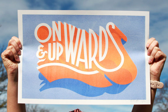
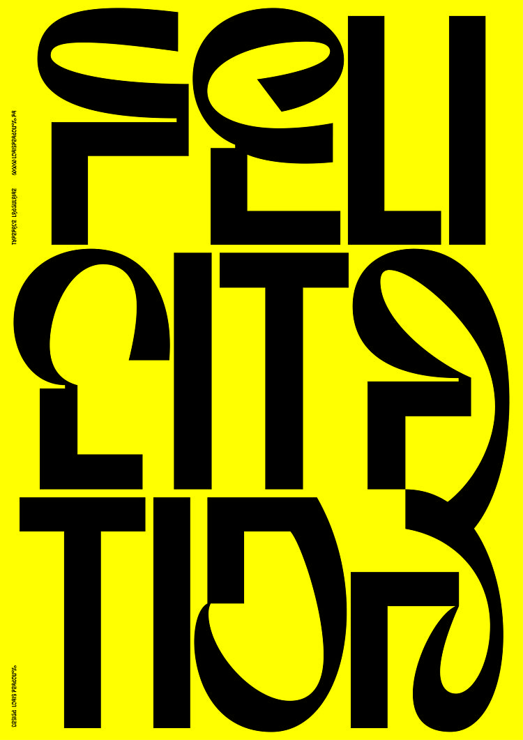
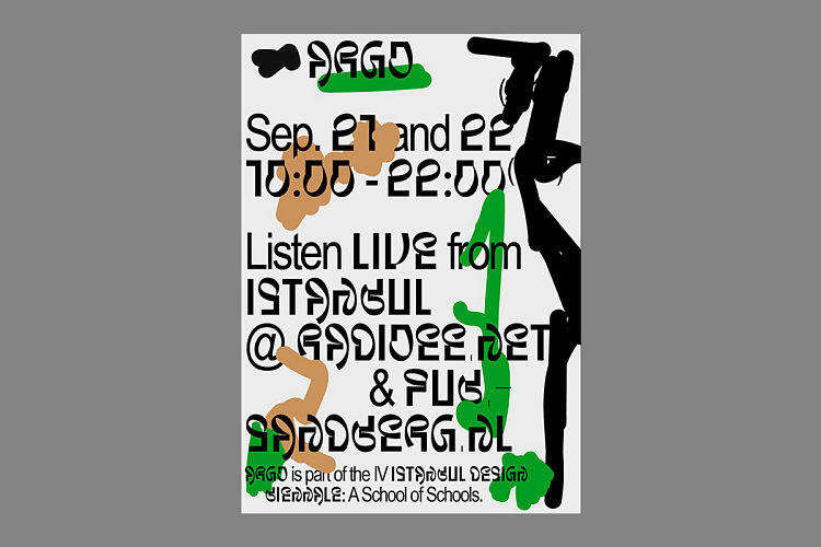
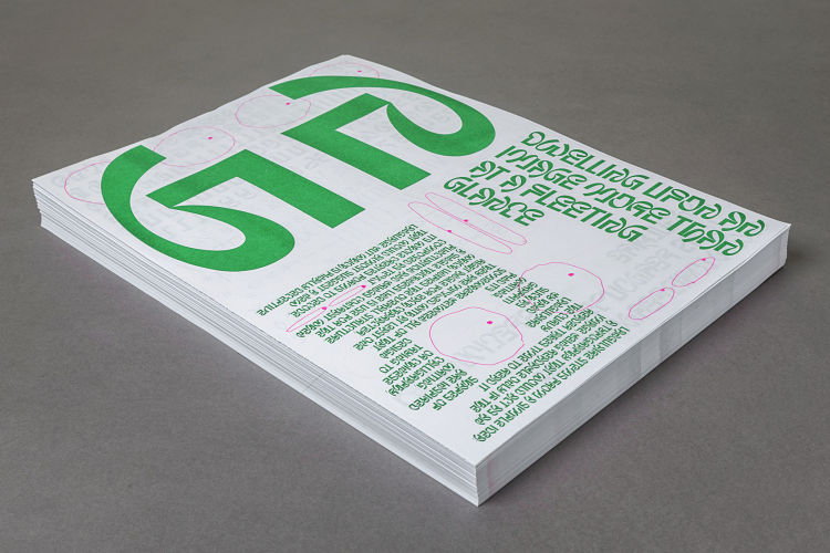
 Langulaire is a display font formed from the alluring juxtaposition of curves and start 90-degree angles. While the font has proved itself to be versatile across number of applications (uses including the graphics for LUCA School of Arts graduation show; exhibition graphics; record sleeve design; editorial projects; exhibition graphics; theArgo on Air project at Istanbul Design Biennial; Madrid’s Tentacular Festival; garment design and various visual identity projects that don’t shy away from more outré typography.
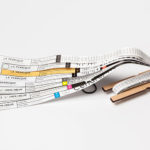
The font was deliberately designed not to be entirely legible at first glance, Pernoux has said, adding that the letter shapes were informed by hieroglyphs, graffiti and calligraphy in order to create type that was as rooted in pictorial shapes as it is in the alphabet. He started working on it in 2015 as part of typography workshop with designer David Bennewith while he was studying at Amsterdam’s, Gerrit Rietveld Academie; with the initial forms drawn using a marker pen with a wide edge and a think point to create the elegant contrasts between the lines in each letter.
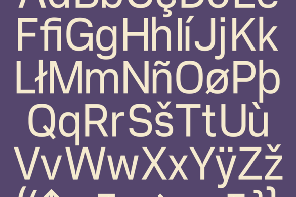
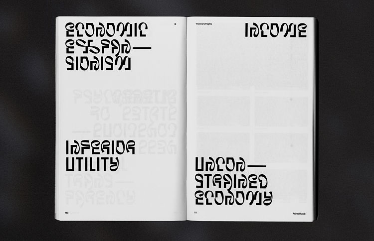
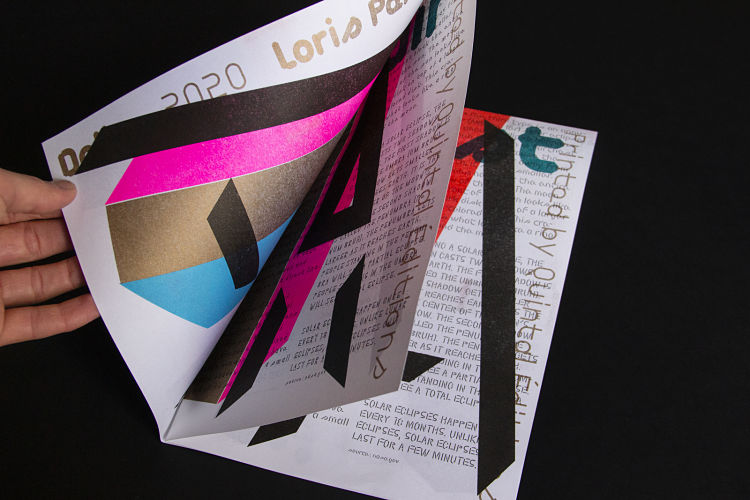
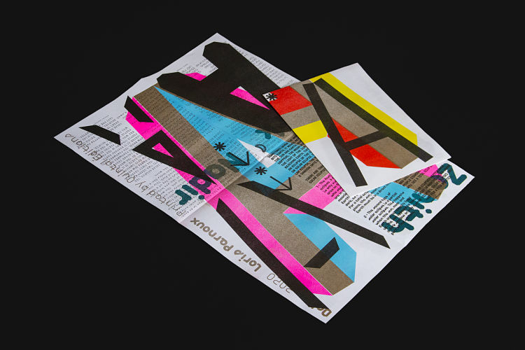
 Dolis, which was released in February 2020, is just as striking as Langularie, but with a far greater focus on legibility and a beguiling use of negative space within each letter. Even its six styles take an original approach—they’re named East, West, Dark, Bright, Zenith, Nadir rather than the traditional italics or bolds.
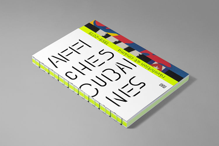
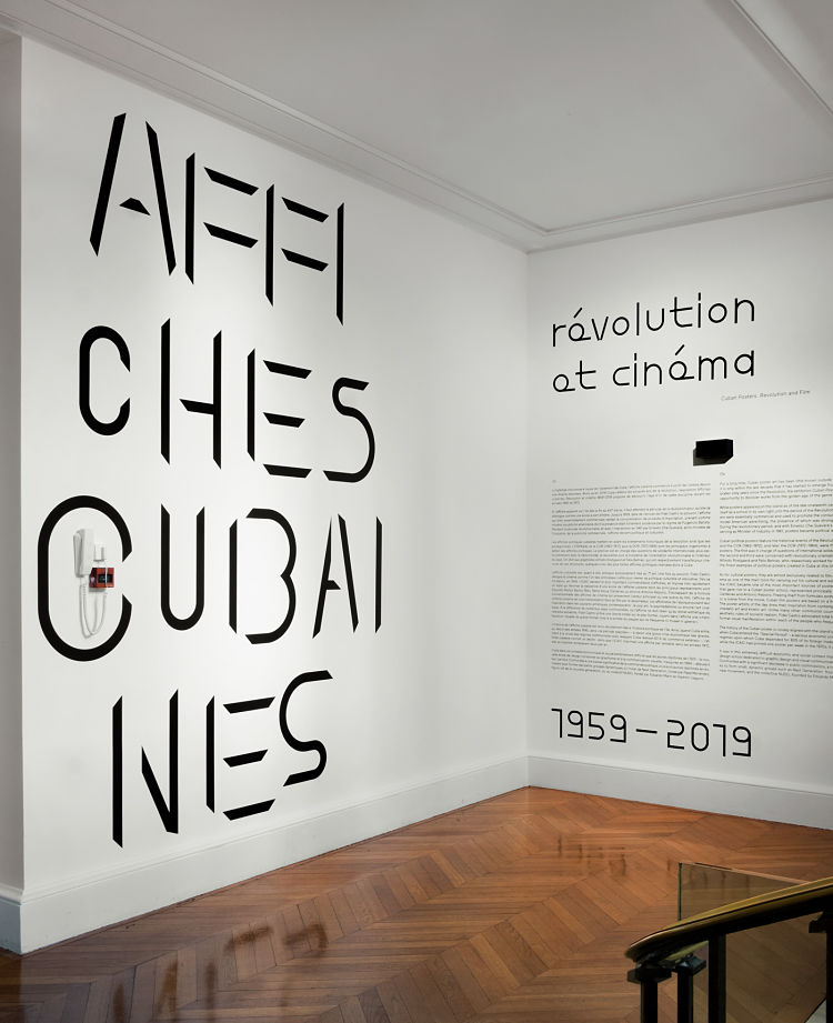
Like Langulaire, Dolis has proven to be a hit with cultural uses, and has so far been applied to exhibition posters; the graphic identity for design collective MOMN; signage and catalogue design for the Affiches Cubaines exhibition at the Musée des Arts Décoratifs in Paris and more.
 “I think my first connection with lettering was in my teenage years: I used to do graffiti, not much on walls but a lot in my sketchbook,” says Pernoux. “It is always interesting to see how other graphic designers appropriate [my typefaces] and what they bring it to. I think it helps them improve. The most challenging part of working on a new typeface is to finish it!”
Having studied graphic design at the Gerrit Rietveld Academie in Amsterdam, Pernoux currently balances his practice between the two disciplines. Just after he graduated in 2016 he joined the French graphic design collective Brest Brest Brest, which he currently leads alongside Arnaud Jarsaillon and Rémy Poncet.
 Brest Brest Brest started life in 2003, when some friends got together to work on graphic design commissions for theatre and music labels, and was finally named in 2009. Since then, the collective has evolved and has seen various people come and go, but has cemented its focus on work for culture and arts projects. The collective has exhibited in various galleries, cultural venues and international graphic design festivals; with its poster designs having been acquired for the graphic design collection at the Museum of Arts Décoratifs in Paris in 2016.
“We defend an authorial, contemporary and accessible graphic design, with an offbeat or poetic vocabulary,” says Pernoux. “What I find most exciting about graphic design is the wide variety of people we can meet or work with, therefore it is always inspiring.
“Working in the cultural and artistic fields confronts us with the fact that we have to produce design that appeals to a wide audience of all ages, especially when working for national theatres for example, but also to a more experienced audience when working with artists, which allows us a more intuitive approach to design. Both are interesting and feed off each other.”
He adds that a great collaboration is all down to having “a good feeling” between client and designer, alongside ‘the desire to have fun.” The marriage of the two, he reckons, “is generally a good mixture to produce beautiful things.”
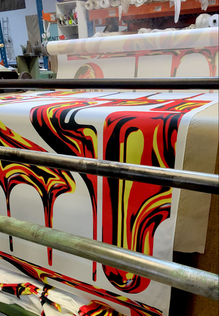
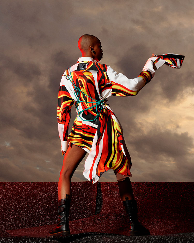
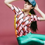
 Recently, Pernoux has collaborated with Paris-based fashion brand Marianna Ladreyt on a collection called Hephaistos—named after the Olympian god of fire, smiths, craftsmen, metalworking, stonemasonry and sculpture—for spring/summer 2021. “In the vein of the previous collections, Hephaistos evokes the mythology associated with the eponymous antic greek divinity and one of its contemporary nymphs, the volcanologist Katia Krafft,” he explains.
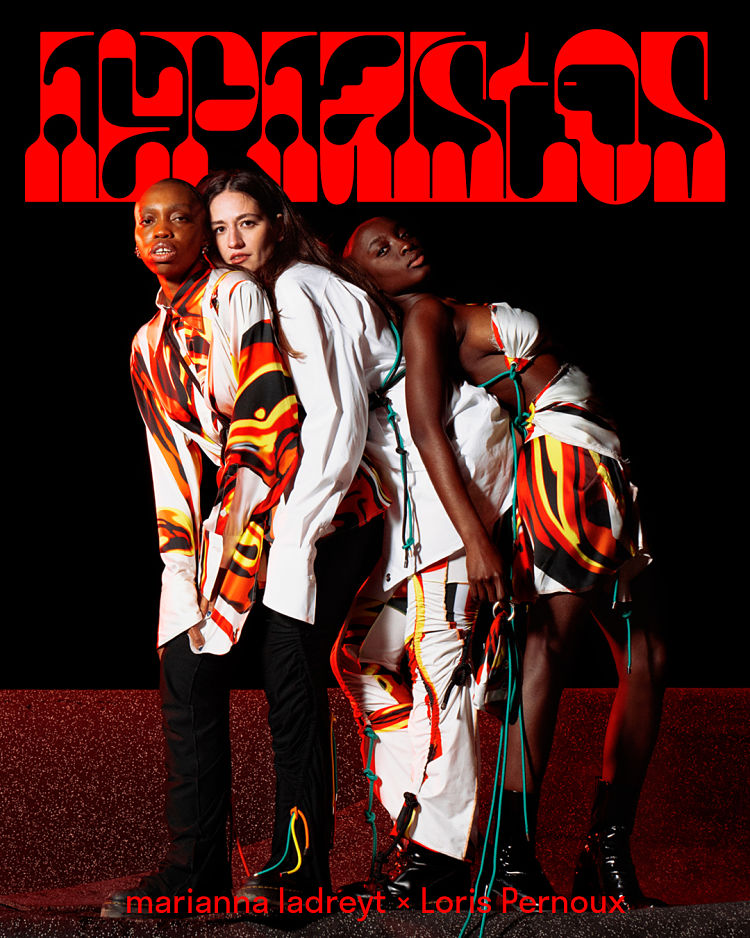
 “I imagined and created a lettering as high as the width of the fabric needed for the prints in the collection. The lettering takes up the word Hephaistos and its design is as if sinked, forged and assembled in the still hot material of moving lava.”
The “O” was drawn in the shape of a face in profile to embody the presence of Hephaistos and to “symbolically evoke the representation of the god on the reliefs of Antiquity,” Pernoux adds. “A formal encounter is thus created between the drapes of the pieces of the collection, the shapes of its print and the treatment of its colourisation.”
 As for the rest of this year, he’s hoping to release a new typeface that’s been in the pipeline since last year, as well as working on more collaboration projects.
So what advice would he give to people who want to get into type design? “I believe that it is important to nurture a form of intuition, which can sometimes interfere with the theoretical rules, but whose added value will be the singularity of its design.”
You might like...
 Best of May 2013
- Only More Never Less
- Feathr
- Franzius AW16/17 lookbook
- C-Heads (NSFW)
- William Jean
- Welcome Skateboards
- Elena Boils
- Black Matter Editions
- Rafael D’Alo
- La Perruque: Type Magazine
- Tatabi Studio for Diz-Diz popcorn
- Manual for Speed | Artist Residency Cycling Kits
- Top Trumps Trump
- Alphabetical
- Ladybeard


- Autobahn - November 26, 2021
- Alphabetical - November 12, 2021
- SOFA Universe - November 8, 2021