Once again, we’re stoked to present a collection of linocut artworks from a selection of the talented printmakers in our Official POP community. From commissioned pet portraits, to beautiful landscapes and political typographic pieces, our members have used the medium of lino to bring an array of innovative ideas to life.
Vonikdesign: Coornhert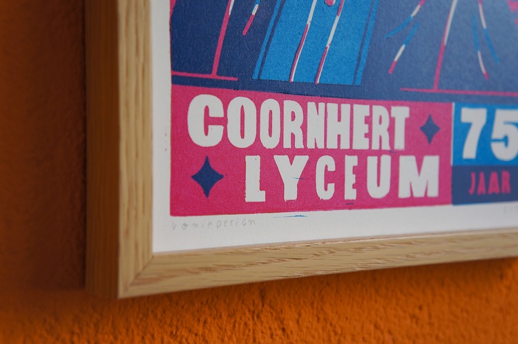
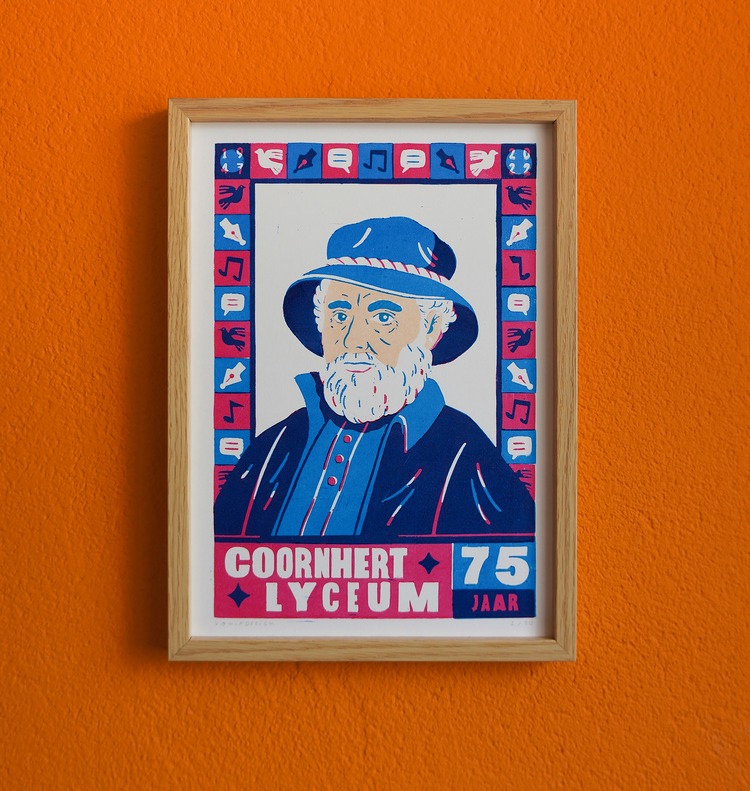
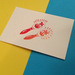
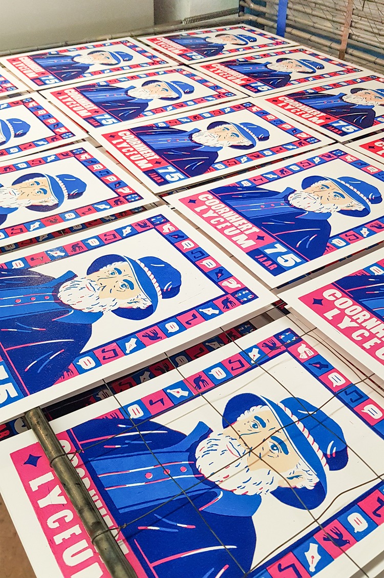 This colourful custom lino print was commissioned by the Coornhert Lyceum (Coornhert High School) in Haarlem (the Netherlands) to celebrate their 75 year anniversary. The school is named after Dirck Volkertszoon Coornhert, a prominent artist, scientist, printmaker and humanist. The portrait is an interpretation of one of his self portraits, and the icons around him are based on his main activities. The print is made with 3 different colours of ink, creating a 4th colour in the places where the light blue and the pink overlap.
Damien Giudice: Let There Be Sun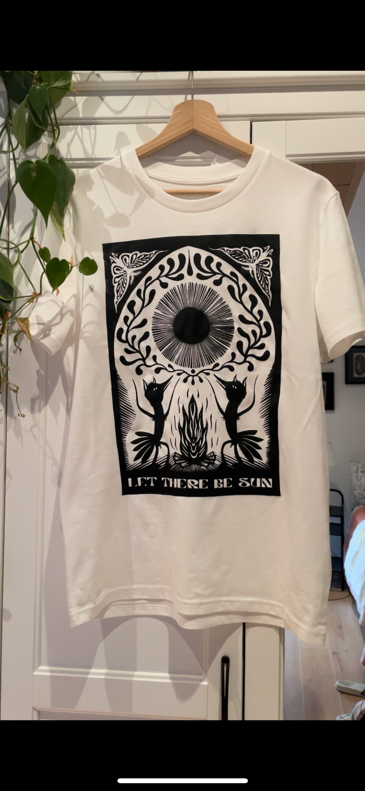
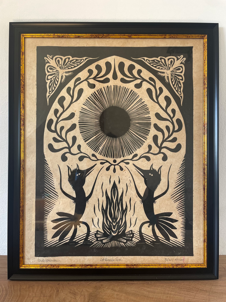
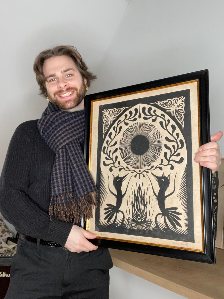 Damien Giudice’s latest work, Let There Be Sun, makes reference to the current climate situation. Two fox-like human beings perform a kind of spiritual dance in front of a campfire so that the sun will finally shine again and promise a good harvest. In this case, the sun is decorated with a plant ornament and a drop of water. In the upper corners there is a butterfly or a moth. For Damien, the butterfly stands for the beauty and wonder of our world or as a symbol of happiness. The printmaker then took a picture of the piece, re-worked it in photoshop, and added the text “let there be sun”. Damien then prepared a new screen, and screenprinted the design on a few T-Shirts. He tells us; “The whole process from linocarving – printing – the graphic design part – and the final screenprinting part was so fun and special to me, I’m sure there will be much more in the future.”
Jenny Robson: Shooting Star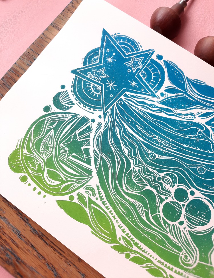
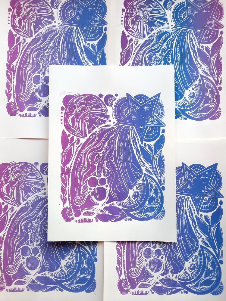
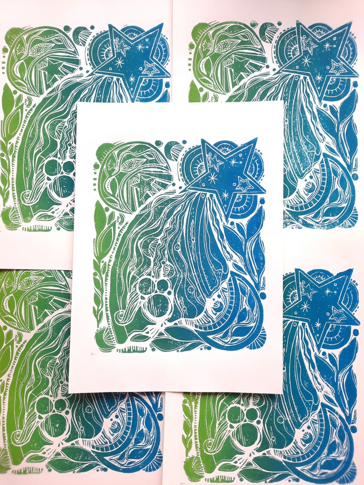 This piece by Jenny Robson was part of a series exploring celestial and botanical themes, carved and handprinted alongside other images in the series, over the space of a few weeks. Besides some initital drawing, Jenny designs the print as she carves, and often adds small, fine line details in along the way. “I’ve since enjoyed printing these shooting stars in a variety of gradient colourways, and have started working on a larger A3 variation,” says the printmaker.
Isabelle Lin: Fog, On Little Cat Feet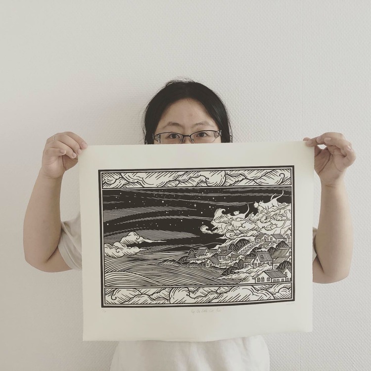
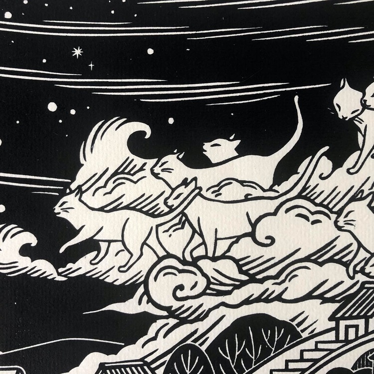
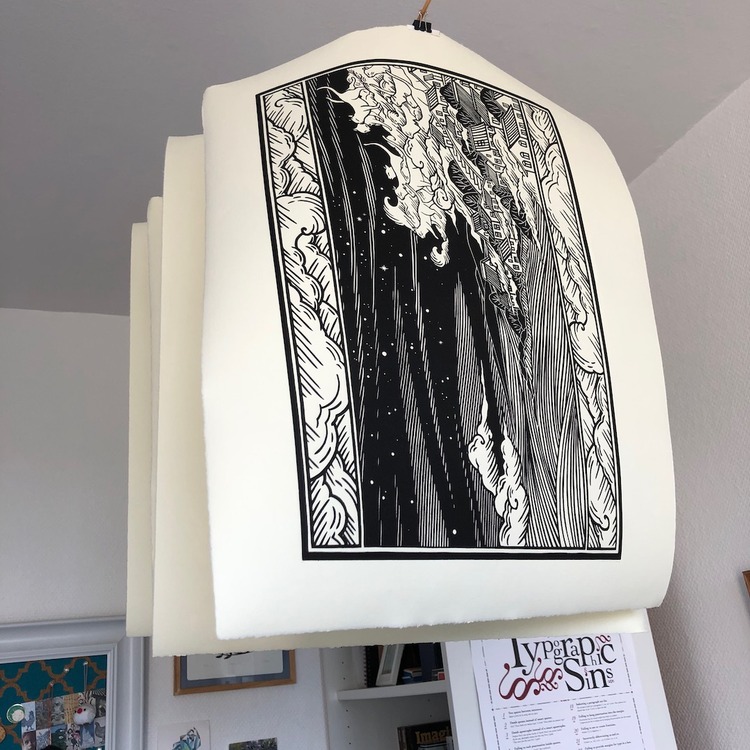 The design for this print is inspired by a line in a poem by the American poet Carl Sandburg (1878-1967): The fog comes / on little cat feet. Aesthetically, Isabelle Lin was drawn to Victorian woodcut illustrations, with their intricate decorative borders and flowing linework. This piece is her lagest linocut to date!
Caroline Erolin: Fire Salamander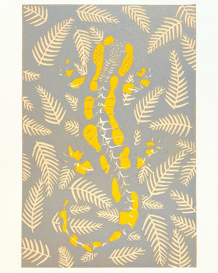
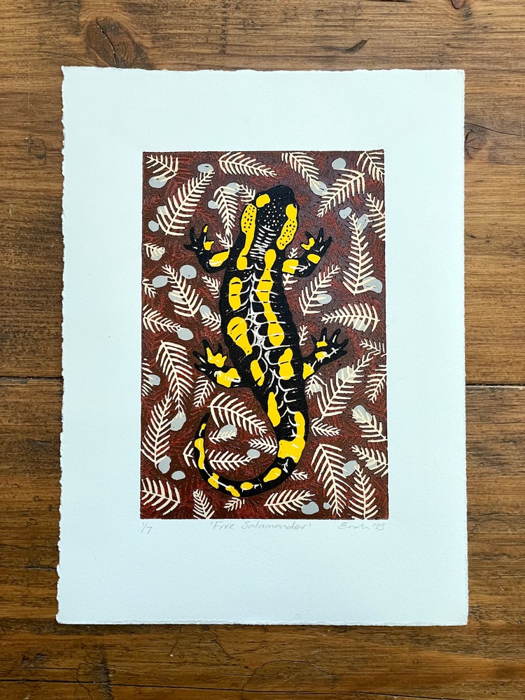
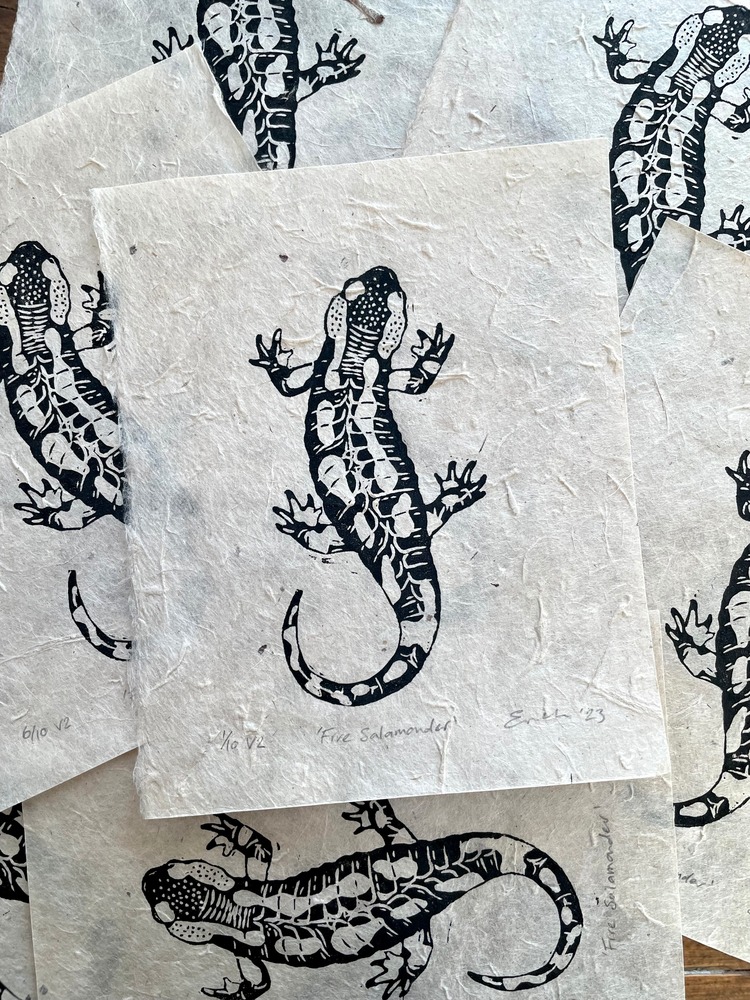 Fire Salamander is a linocut print of the European fire salamander (Salamandra Salamandra). In folk tradition, the salamander is said to be invulnerable to fire, a myth which likely came about by the burning of logs within which were hibernating salamanders, making it appear as though they emerged from the flames. There are two versions of this print; the first is a six colour reduction linocut printed onto acid free Somerset Satin 250gsm paper with Cranfield Caligo safe wash oil-based ink. The second is a single colour (black) print on Nepalese Lokta paper. This is a limited edition of just seven prints for the colour version, and ten prints for the black.
Mary Anne Molcan: Aureole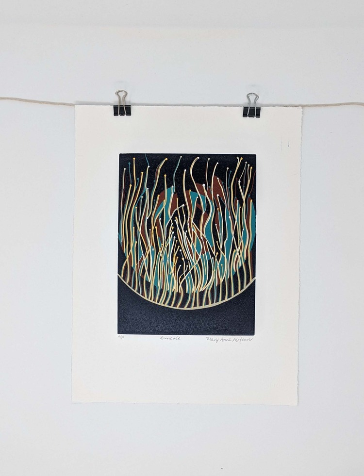
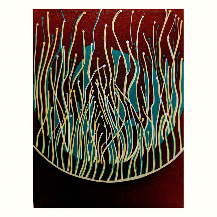
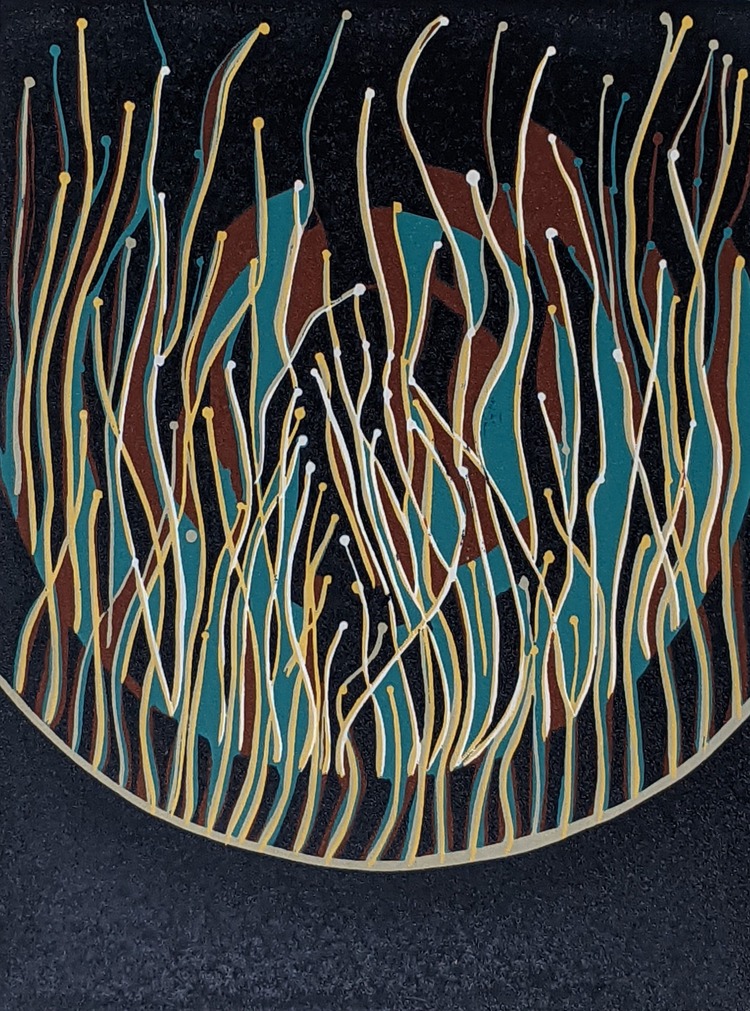 Printed using 5 layers of linocut reduction, in Aureole Marry Anne Molcan challenged herself with intricate line work. The print explores the energy of life and the underlying rhythm of order. Aureole signifies a halo of light and captures the upward rise of energy that occurs when seeds and spores in the soil are activated. Mary Anne comments; “I drew upon my own observations of fungal activity above ground and thus, the work presents a visual exploration of imagined concepts related to soil life and the root systems trees use to communicate.”
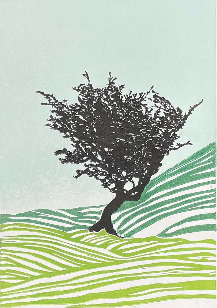
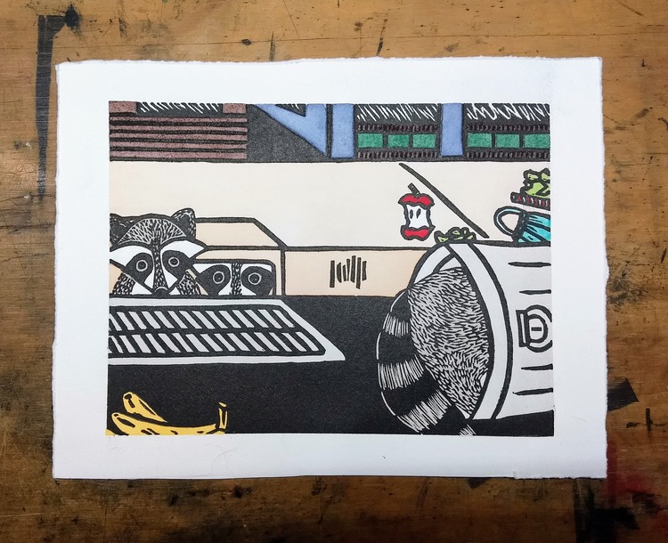
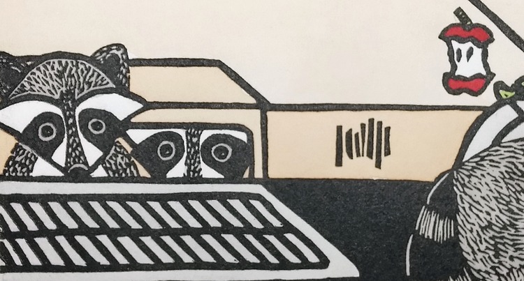
Kerry Pagdin: For the Birds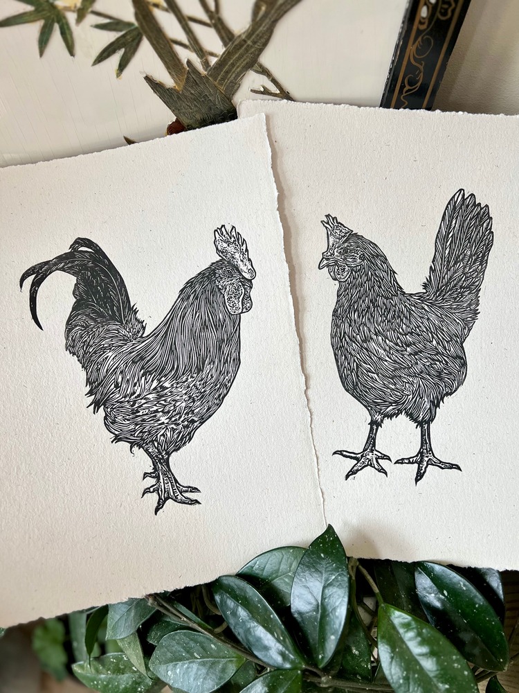
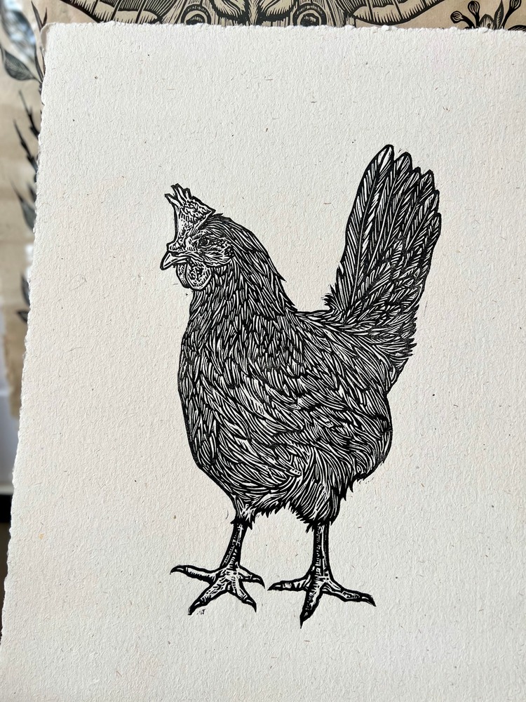
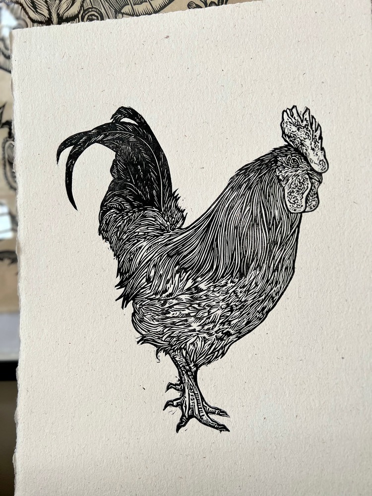 These two linocut portraits of a neighbour’s rooster and hen were created by Canadian printmaker Kerry Pagdin of Wayward Citizen. The prints measure 36 x 26 cm and are printed on handmade paper. Living on a small farm on the edge of the forest provides endless inspiration for the artist, whose work focuses on images of animals and botanicals. Portraits of her own pet ducks are next in the queue.
Charlotte Staunton: Jigsaw Linocut Prints
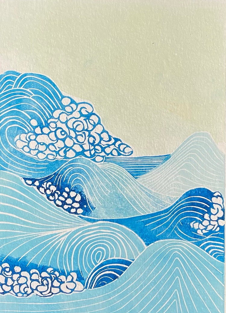 A jigsaw linocut is a method of printing which includes cutting the lino plate into pieces in order to print multiple coloured elements within in one session. Charlotte Staunton has worked on a few prints using this method, including Swishy, Swashy Waves, UFO trail – Rendlesham, and Windswept.
Steffi Möbius Ehrlich: O Children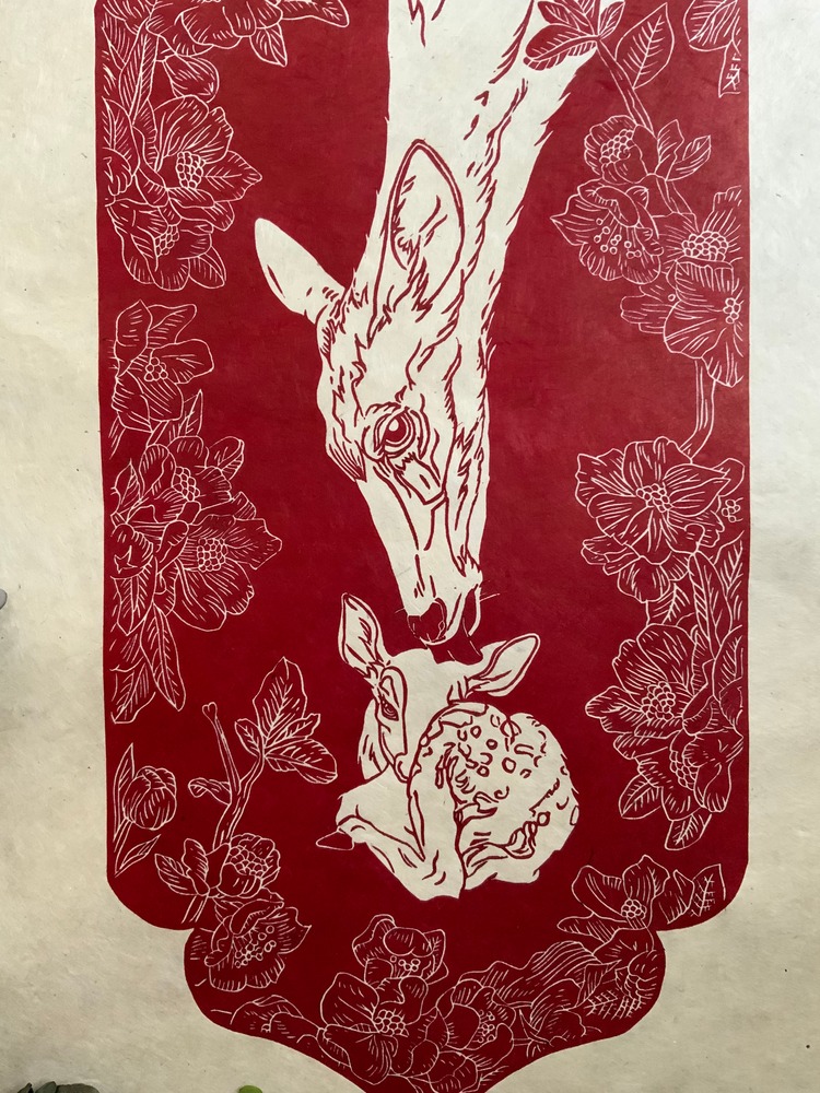
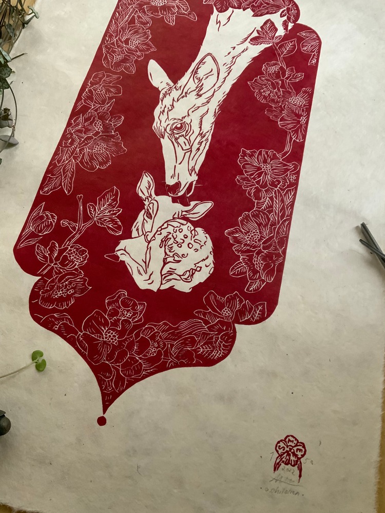
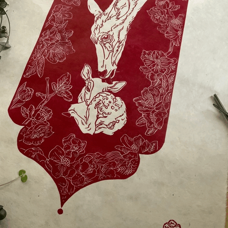
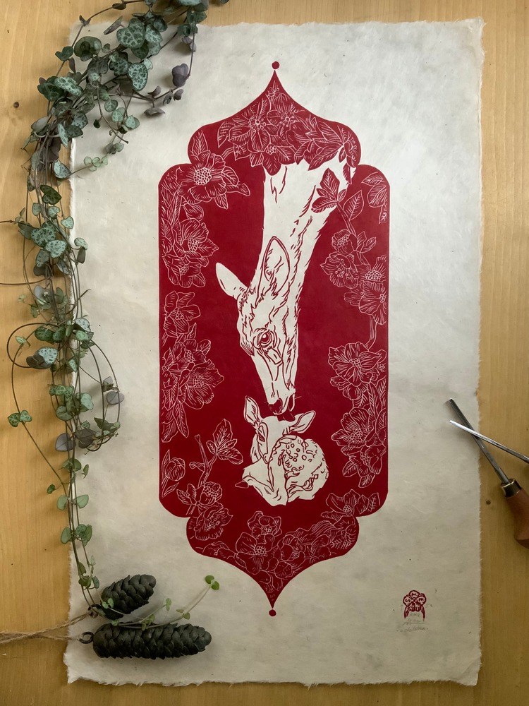 Printmaker Steffi Möbius Ehrlich of The Burrow Prints tells us; “O Children was born from the consideration of how we leave the world for our children. How we should treat our nature and its inhabitants and how we should not work for the preservation of nature and its inhabitants.” Just as the doe looks after her fawn, she takes only what she really needs from nature and leaves her fawn everything it will still need.
Alex Flower: Charlie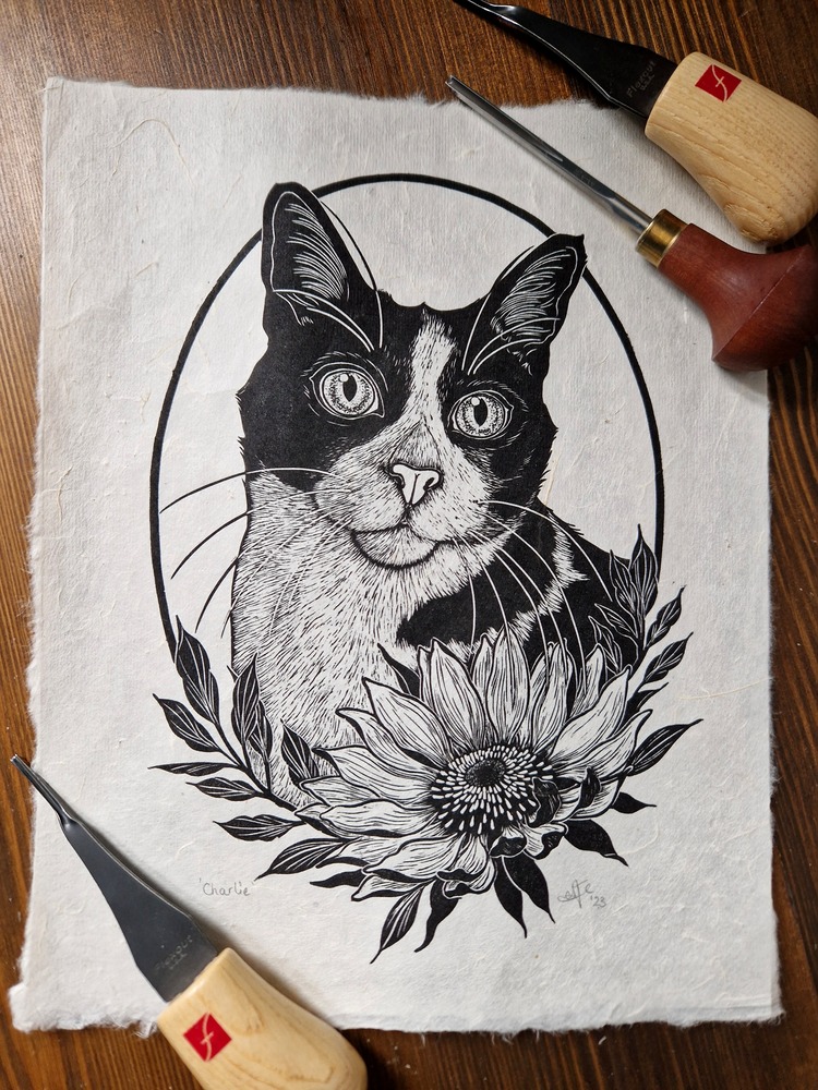
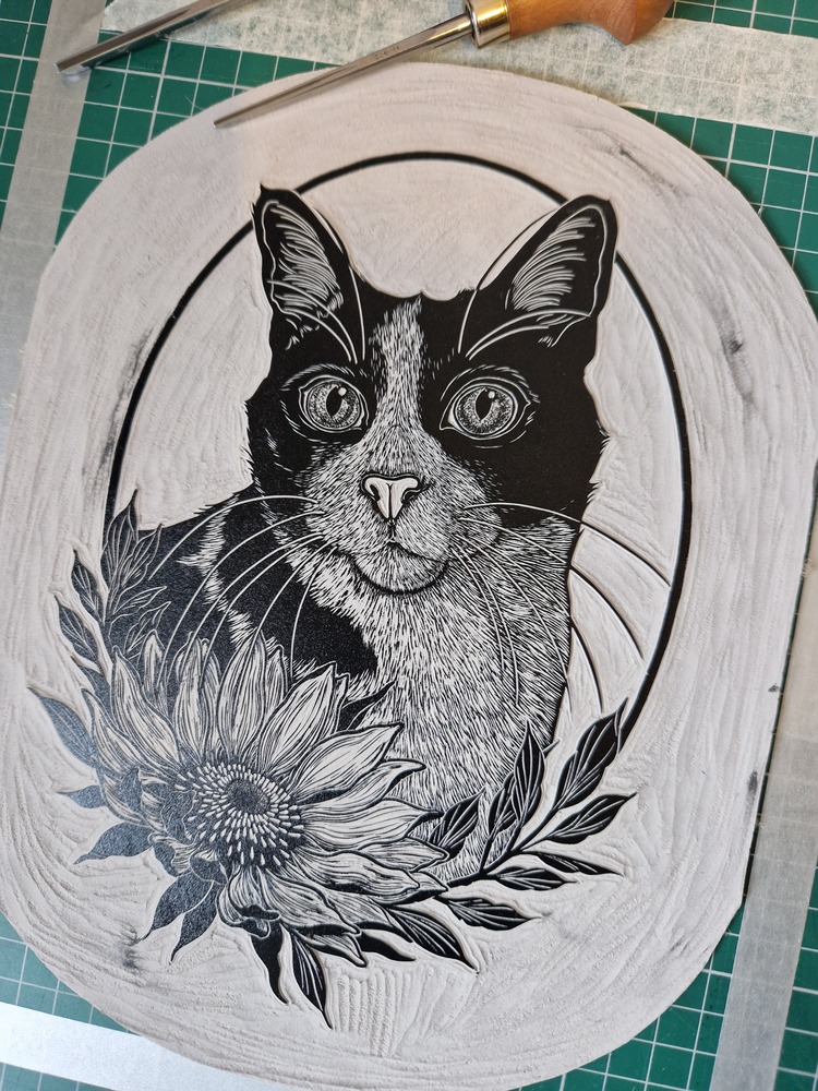
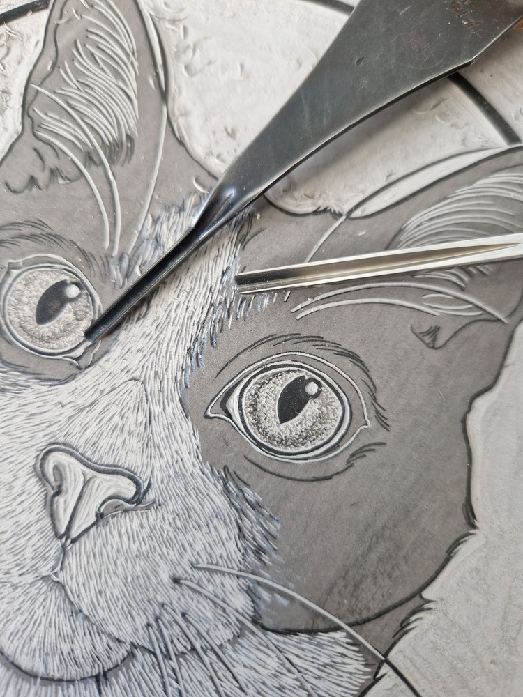 Alex Flower recently completed this comission piece of Charlie the cat for his owner. She describes; “I love working on Battleship Grey Lino for animals and fur textures. It allows me to carve an incredible amount of detail and holds its form enough for me to rework the piece and print it a few times which is important as I usually take 3 to 4 proofs before I am happy with the final outcome.” Alex used a combination of the Flexcut Micro Palm set and Pfeil tools to create the variation in fur texture and florals – her go to tools for any animal carving. It was then hand burnished onto beautiful Nepalese Mitsumata Washi paper.
Dave Lefner: LOVE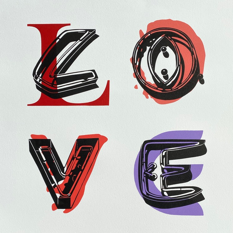
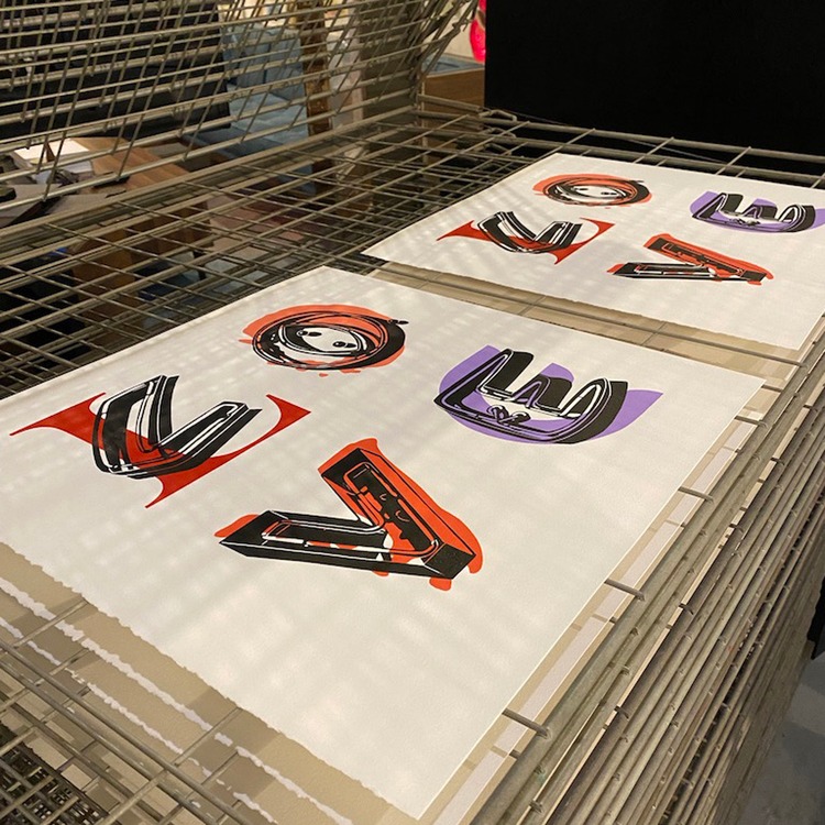
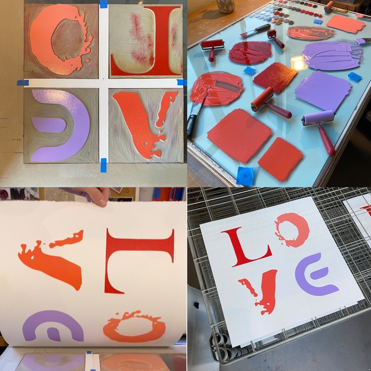 Normally, Dave Lefner’s medium of choice is reduction linocuts, but for this piece he wanted to be able to re-create it in many different colors. LOVE is part of an on-going Alphabet series, where he uses a two-block system. At the first stage, Dave carves a 15.24 cm x 15.24 cm block of each letter of the alphabet in a unique font. Then, he carves another alphabet set on 12.7 cm x 12.7 cm blocks, each based on actual “Neon Sign” letters. LOVE required 8 blocks and 5 different colours, using Cranfield Traditional Relief Inks. It is printed on Rives BFK paper, and is hand-deckled down to 41.91 cm square.
Becca Thorne: Butterflies & Moths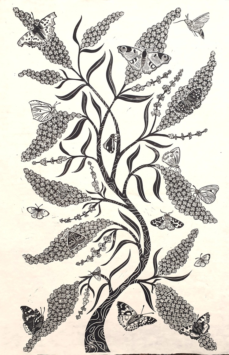
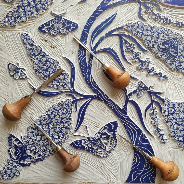
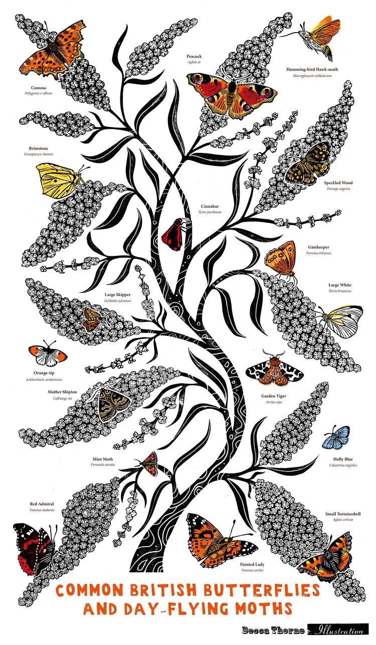 The UK is home to 57 species of butterfly and 2,500 species of moth. Unfortunately, the last 50 years have seen huge losses, with average butterfly numbers down 76% and moths down 28%. This large linocut print features some of our more common butterflies and day-flying moths on buddleia, aka butterfly bush. They join Becca Thorne’s Garden Birds and Social Bumblebees in her series of identification prints and illustrated tea towels, raising money for charity. 10% of sales of the black & white original prints, and digitally-printed, full-colour organic tea towels will be donated to Butterfly Conservation via Work For Good.
Lewamakes: Medieval Alphabet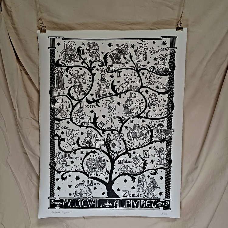
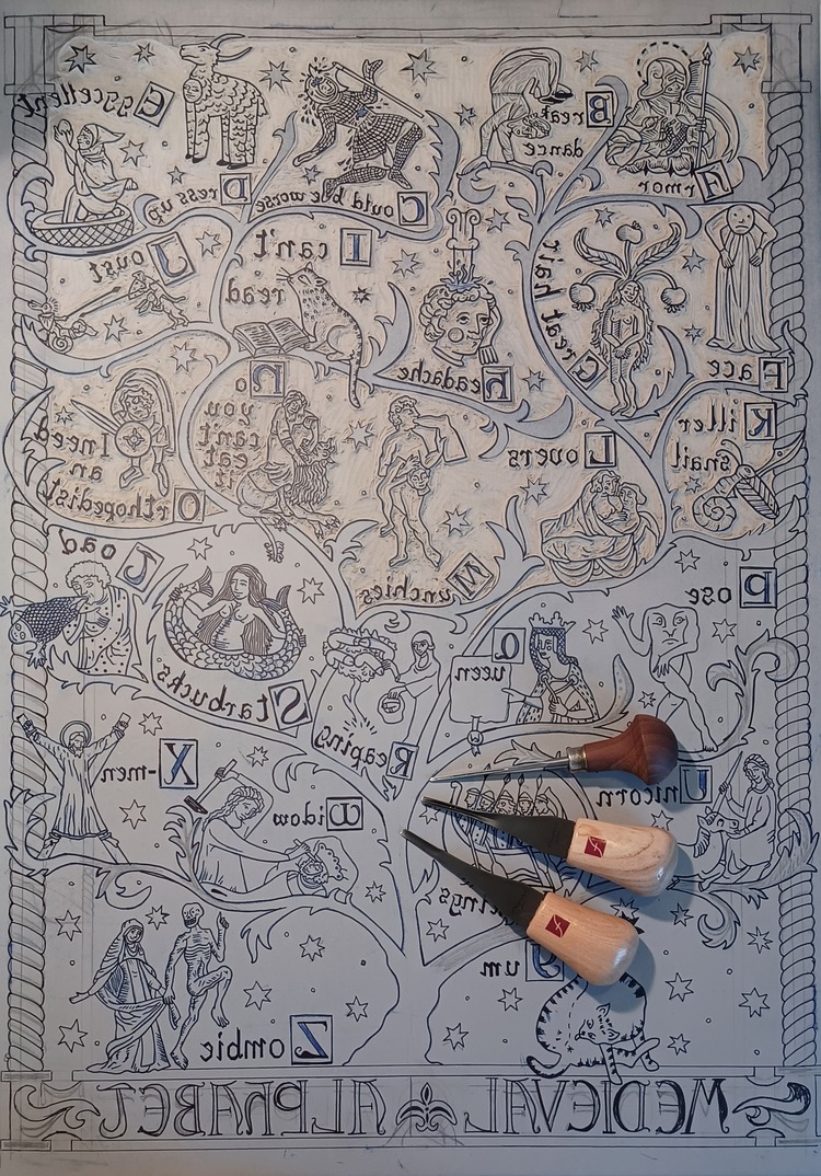
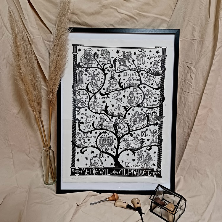 Lewamakes’ Medieval Alphabet is a collection of real illustrations from manuscripts of the middle age, put together and into a modern, sometimes ironical, context. For example, the two tailed siren from Jacobus Meydenbachs Hortus Sanitatis (1491) looks way too familiar to a certain logo of a coffee company. She states; “I simply wanted to show that medieval art is not only about Nobles, God and Christianity. In fact, it can be really fun and whimsical.”
Clare Morgan: Breathe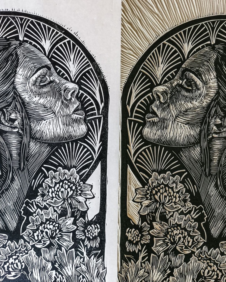
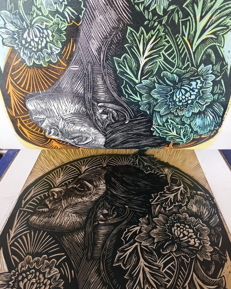
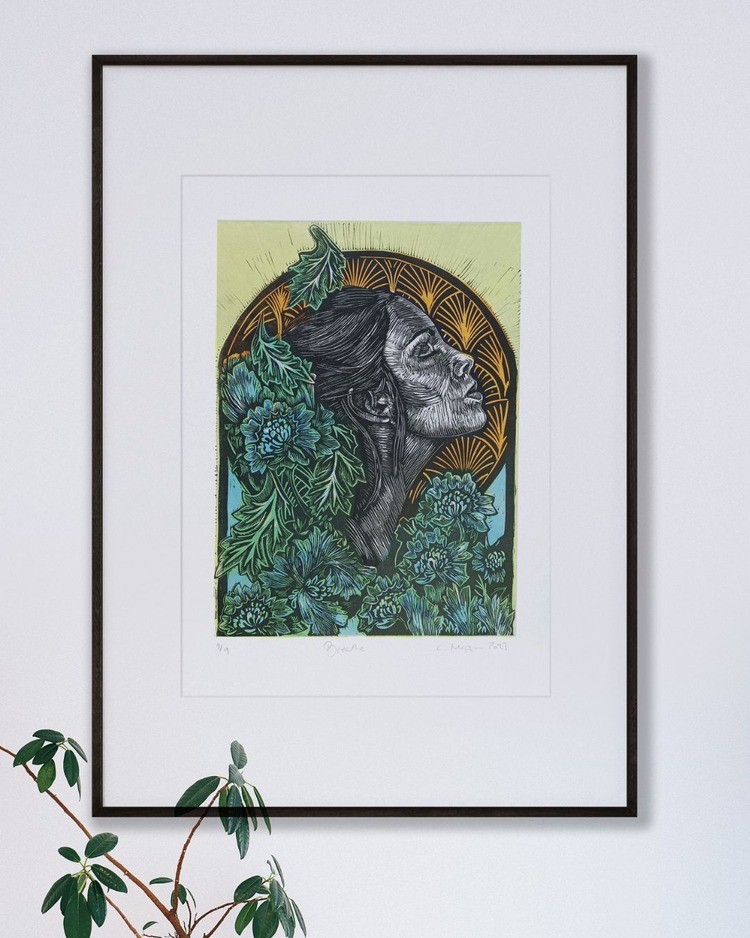 Breathe is a linocut by Clare Morgan made using 2 plates; one containing the detail, and the second in which she mixed reduction and jigsaw techniques to achieve her decided colour. The circle often features Clare’s work as an acknowledgement of the flow of the seasons and transience; here it is extended and becomes an arch, leaving the old behind to embrace the new. Created at the start of the year, the piece bursts with colour and is alive with carved marks and energy. She comments; “I love to leave evidence of the artist’s hand to me each mark is akin to a brushstroke in a painting”.
Enea Seregni: Shinobi Execution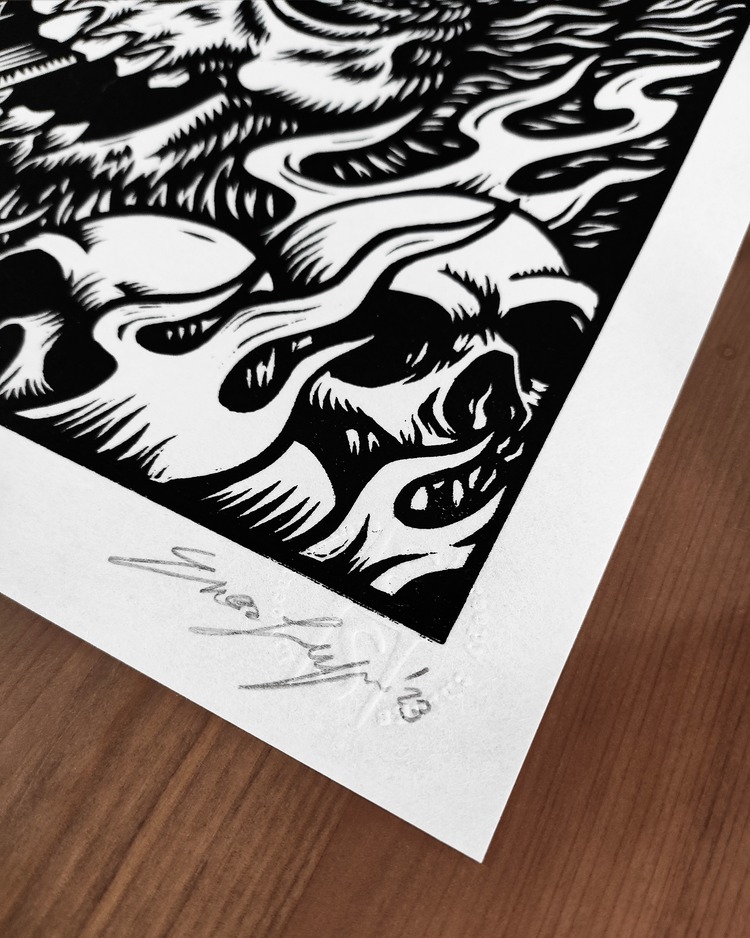
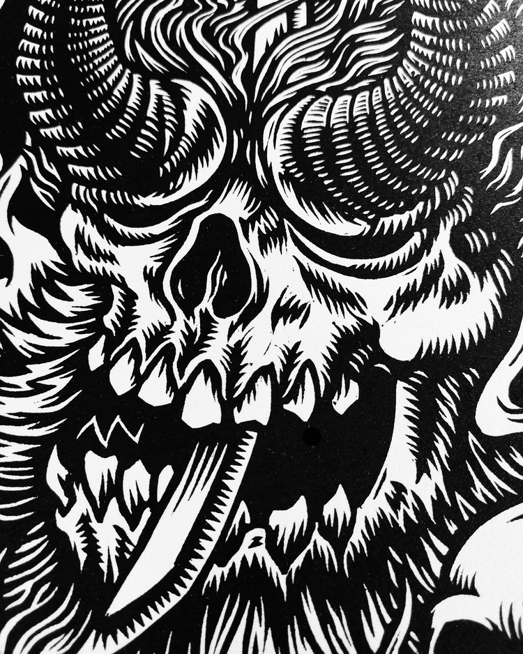
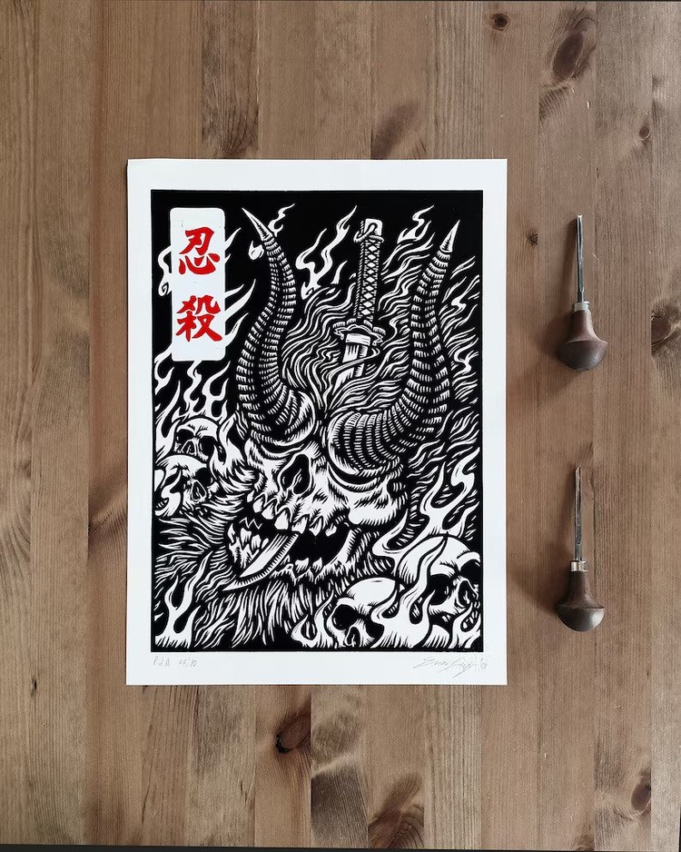 Part of EneArtworks’ artistic production is centered on fanarts. Enea is often inspired by movies, TV series, and video games, especially if they have some creepy elements in them. In this linocut, Enea pays homage to one the most difficult video games he has played; Sekiro: Shadows Die Twice. Set in a fantasy Sengoku-era Japan, the game tells the journey of a shinobi warrior and draws inspiration from Japanese folklore and history. This print represents one of the hardest bosses of the game: the Demon of Hatred. “Defeating this boss cost me several hours of play and once I succeded I can’t help dedicate a print to this terrible creature and its character design,” states Enea. Thanks to its tradition of artists and woodblock printers, relief printing techniques have a natural affinity with Japanese subjects and ideograms and regardless of the subject represented, they are always fascinating and evocative.
Federico Blu di Prussia: Pieni e vuoti come Luci e ombre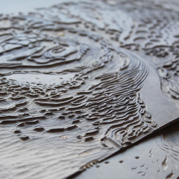
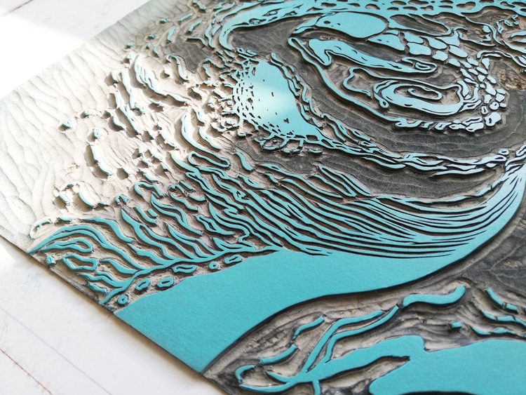
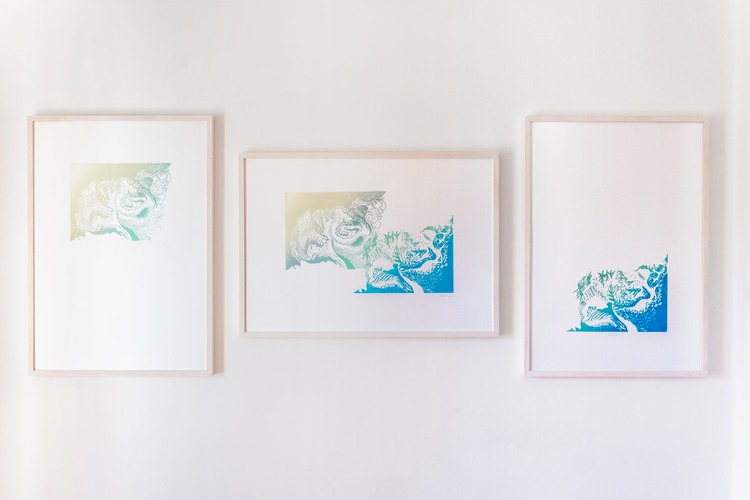 Pieni e vuoti come Luci e ombre is the thesis project of the Second Level Academic Graduation created as a crowning achievement of the Biennio Specialistico in Edizioni e Illustrazione per la Grafica d’Arte at Accademia di Belle Arti di Urbino. The engraving practice culminated in a series of three free graphics as the nucleus of multi-coloured linocuts starting from two articulated plastic blocks. The research of relief is not intended as the culmination of a path, but as a transitory phase to open up to a possible evolution of the graphic investigation. In this sense, the forms drawn from the collection Hamonshū (Wave Design) published in Kyōto in 1903 by Mori Yūzan, can be understood as a continuation of the fluid theme already expressed in numerous works, and here taken up again to understand the binary relationship between full and empty in the art of relief.
Idas Inkling: Who’s A Pretty Boy?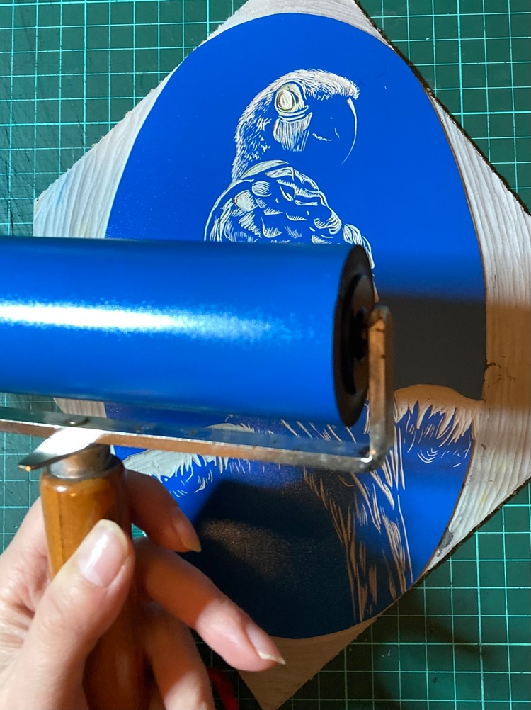
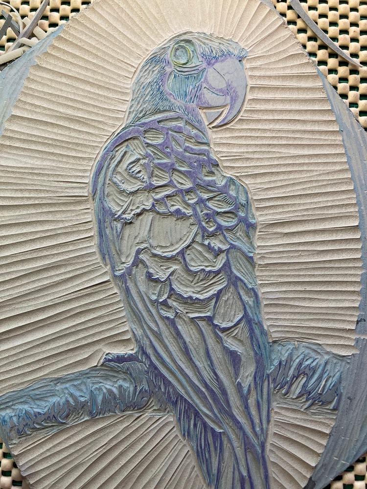 Who’s A Pretty Boy? is a four layer reduction linocut print using only blue and yellow ink. “I’m always inspired by vintage style and with his coquettish glance over his shoulder, I was reminded of vintage pin-up photographs,” comments Idas Inkling. She aimed to capture this vintage style by using an oval background whilst also keeping the background layer under-inked to create texture and a sense of analogue film photography. The piece is printed with Cranfield Caligo Safewash Prussian Blue, Process Blue and Arylide Yellow on Snowdon 300GSM printmakers paper.
Sian Hulse / StreamWalkStudio: Northern Lights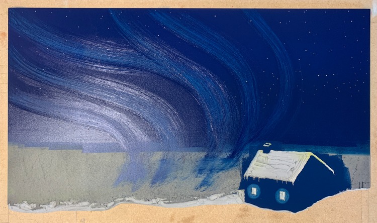
 Sian Hulse of Stream Walk Studio’s latest reduction linocut print, Northern Lights, is a 10 layer piece created from 2 blocks. She used a wiping technique to let the underlayer show through the top layer creating the soft bands of light in the sky.
Cat Wondergem: Treasure Hunting
 Treasure Hunting by Charleston-based linocut printmaker Cat Wondergem encourages the viewer to keep their eyes peeled, as there are riches everywhere! The 1 colour linocut has then been enhanced with handpainted watercolour elements.
Rachael Haggerty: Dreaming With You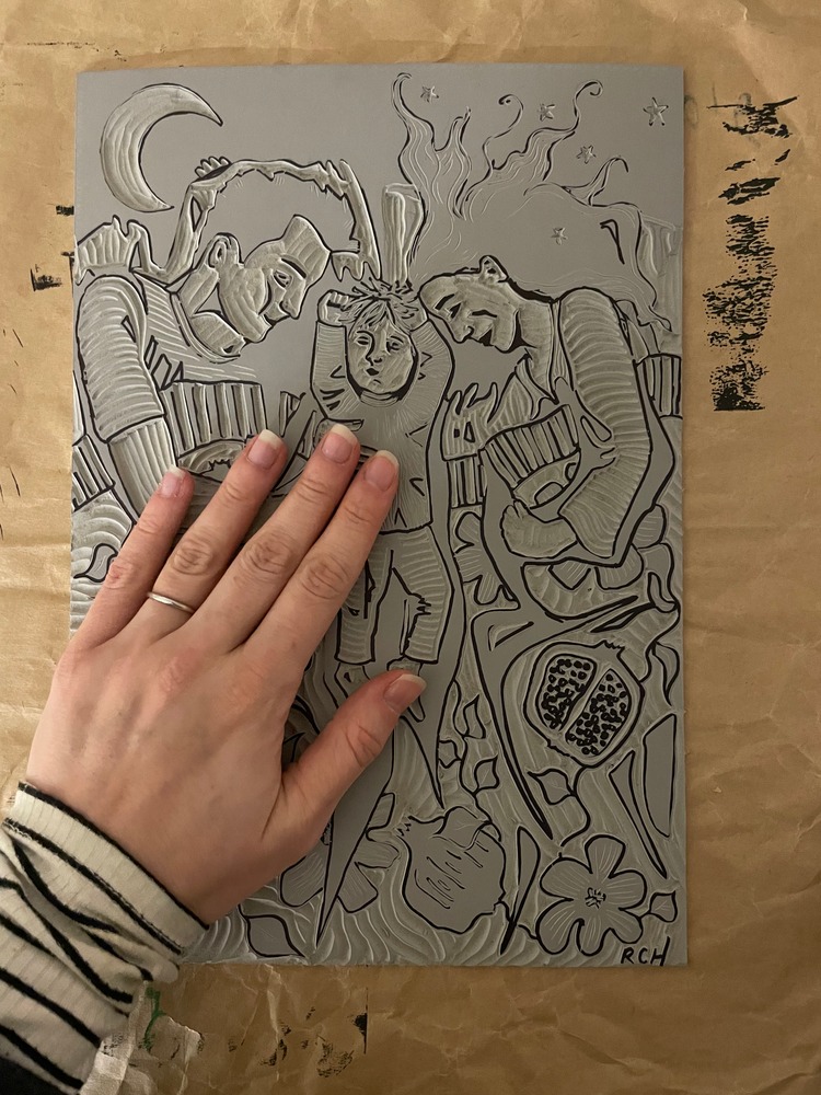
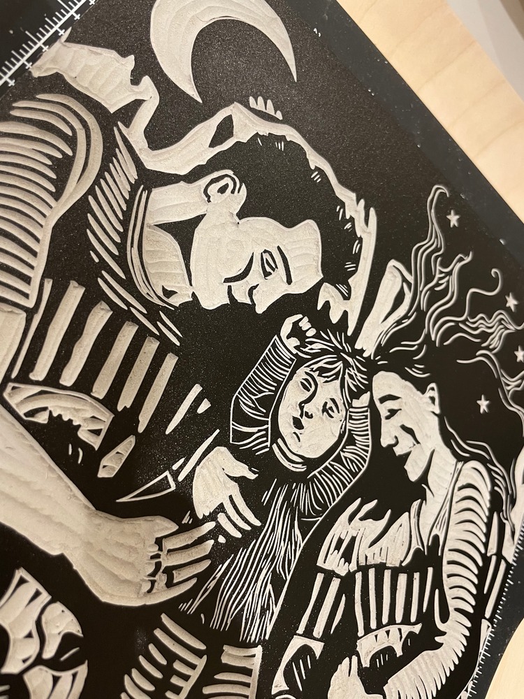
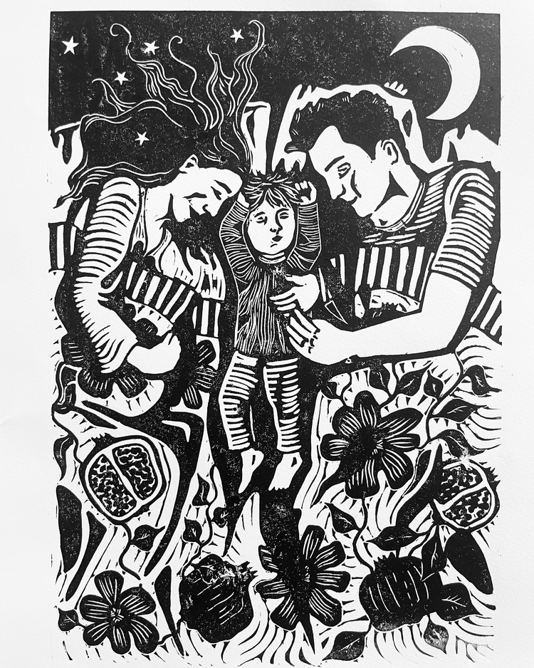 Printmaker Rachael Haggerty is very interested in dreams, and has explored this theme in previous prints. Dreaming With You is a very personal print for Rachael as she is currently expecting her second child. In the piece she drew on traditional fertility symbols, including the crescent moon and pomegranate motif. “I love the use of these motifs in the Arts and Crafts movement, which I find particularly inspiring,” says the artist. With this linocut, Rachael was looking to use simple black ink with strong contrasts to show a range of forms and patterns.
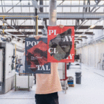
Dungarees + Squeegees: Tory Lies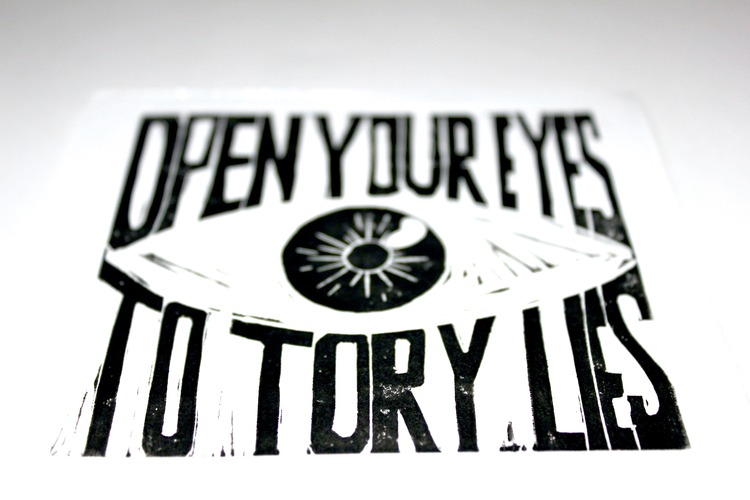
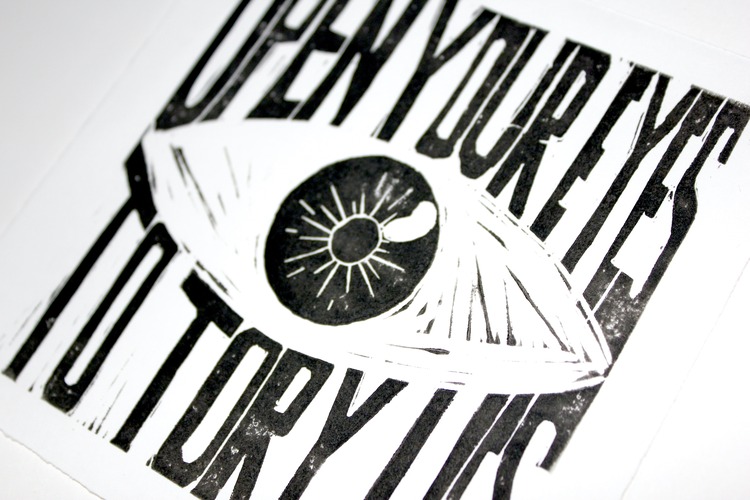
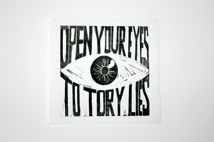 Open your eyes to Tory Lies is a 11.5cm x 11.5cm linocut by Nimai Varia, who has a strong interest in UK politics. This print has now been made into stickers, as well as screenprinted totes and tshirts by screen print studio Dungarees + Squeegees so any person can make a statement about the current government!
Browse more incredible projects by our community and apply to become a Verified POP Member at www.members.peopleofprint.com.
You might like...
 The Humber Printmaker
- Moonassi Series by Daehyun Kim
- POP :: Ceefax Print
- The Positive Press
- Andrei Tarkovsky
- PUTPUT
- John Knuth :: ‘Faded State’
- Nick Barclay Minimal Film Posters
- Midnight Project | SUPERTRASH
- Alternative Press at ‘No Dark Places’ Festival
- Antipodium London
- POP Member Showcase: 9 Graphic Designers
- Maison de Lee
- Mixed Special: Camberwell BA Illustration show
- Aelfie
- Vitoria Bas


Want to know more about our membership? Give us an email at members@peopleofprint.com.
- Tim Belonax |All Of My Mistakes Have Led Me To You - April 26, 2024
- The Humber Printmaker - April 25, 2024
- Horizons by Angus Vasili - April 24, 2024