Once again, we are very excited to introduce a selection of projects by our Official People of Print members. This month we are showcasing those who work with letterpress printing. From exclusive letterpress studios, to unique collaborations and meaningful campaigns, our members exhibit a wide plethora of innovate projects reinventing and bringing this traditional printing technique into the modern age.
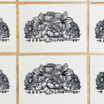
Neu Haus Press: Alpha-Blox
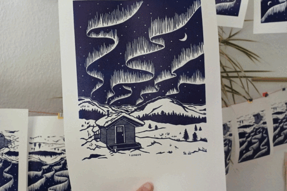
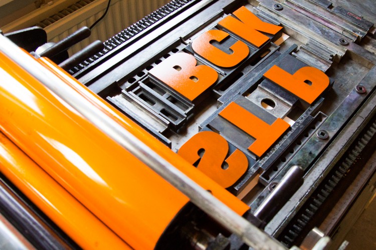
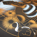
 In 1944, American Type Founders (ATF) introduced Alpha-Blox, an impressive modular font system of both solid and linear shapes that could be combined to create all manner of typefaces, ornament and pattern in one or two colours. Chris Chandler of Neu Haus Press recreated and re-envisioned this rarely used font in large wood block form by printing on his Vandercook 232P. With the assistance of wheatpasting by Max Collins, they have created billboards as large as 14’ x 20’.
North or Nowt: Letterpress Workers Summit 2019 
 For the past 7 years, each summer in the north of Milan, letterpress printers, designers and workers have gathered at the Letterpress Workers Summit.
Started in 2012 by Officina Tipografica Novepunti, Letterpress Workers Summit serves as a site for collaboration, learning, sharing and discussion of global developments and methods in letterpress printing. Since 2014 the Letterpress Workers Summit has been held at Leoncavallo Social Space, serving as a base of operations during the event.
Each year a growing number of letterpress printers from around the globe are invited to participate and contribute in the event, either by physically attending and participating in the summit or by submitting towards a yearly publication. This year featured printers from Italy, Spain, the Netherlands, the Americas and Japan. North or Nowt were fortunate enough to be invited to attend for a second time this year.
The premise for the summit and the work created is a simple yet effective format. A theme is established to form the starting point for work created during the summit and printers are randomly placed into working groups. Each day each group conceives, designs, sets and prints a full edition of prints. This format encourages discussion, collaboration and negotiation within groups, with each attendee bringing their own skills and methodologies to the press. No two final prints turn out the same and the resulting outcome is a wildly varied array of creative responses. This years theme was ‘Identity’, and all work created was in response to this.
Not only is the Letterpress Workers Summit a great meeting of minds, with skilled practitioners sharing skills and secrets, it is also a vital event for the nurturing and growth of the letterpress printer community. Long may it continue and long live letterpress.
www.northornowt.com
www.letterpressworkers.org
www.leoncavallo.org
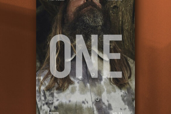
Letterpress Design: Ray Bradbury Letterpress Limited Edition Prints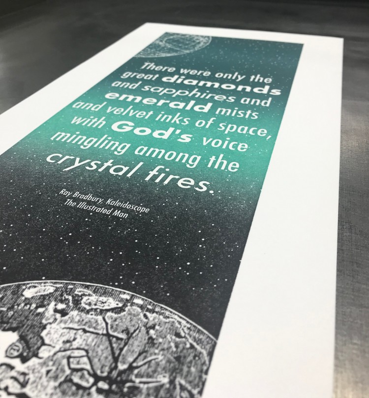
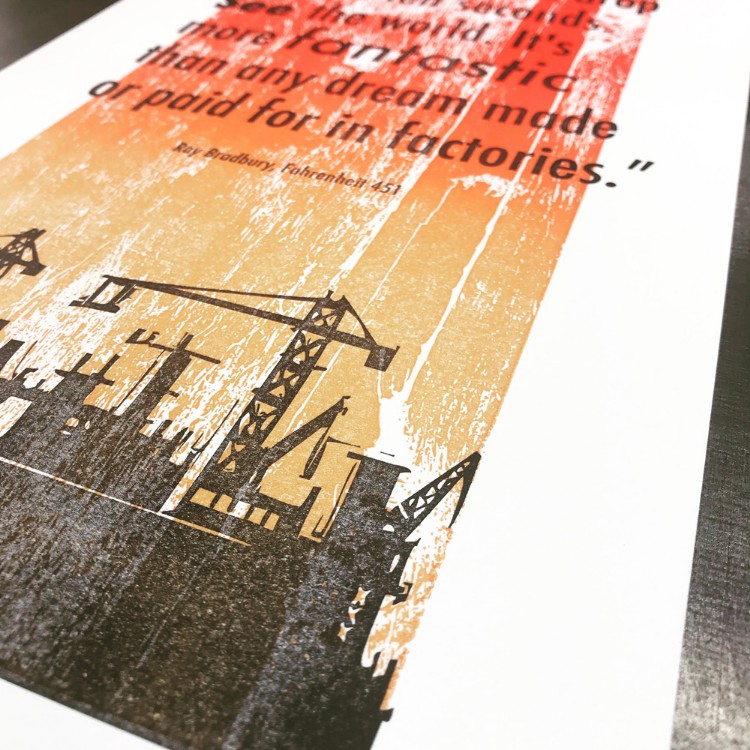 After printing commercially for many years Letterpress Design have gone back to their roots; printing bespoke and exciting pieces for everyone to enjoy. For their most recent project they wanted their creative process to drive the use of letterpress printing beyond the boundaries of pure typography, and into a place where the words and letter forms were married with colours and textures. Rather than being a simple exposition of the text, they became a way of conveying the essence of a story being told.
The team chose the work of Ray Bradbury, an iconic writer who was most well-known for his richly imagined science fiction stories. His words, succinct but perfectly chosen, wrought unforgettable tales that flowered in the reader’s imagination. From these stories they picked two short quotes to work with. Using a typeface contemporary to the time that they were written, they placed the words against backgrounds of colour and texture evoked by Bradbury’s words and themes.
These textures and images were applied using photopolymer printing plates, which gave them extensive flexibility in composition and enabled them to reverse the text on their Kaleidoscope Print.
Printing these images on a Farley 25 cwl flatbed proofing press they achieved this visual effect with the use of a split-fount technique, whereby multiple colours of ink are applied and blended on the ink rollers. Because of this instinctive manual process, they experimented extensively to achieve the right effect, thus every print is different.
“These have been a joy to print and the results are visually striking. Those who have read the stories may be able to read more into the decisions we have made in designing these and we may continue to add to this series” concludes Lisa Paice of Letterpress Design.
You can shop the prints on Department Store here.
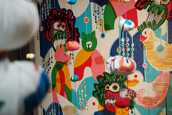
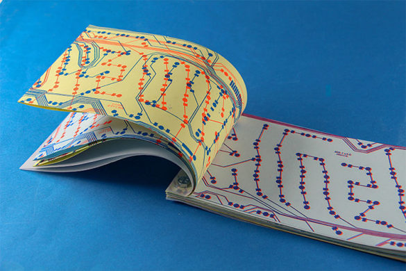
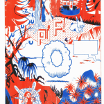
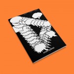
Karakter Prints: Collage vs Letterpress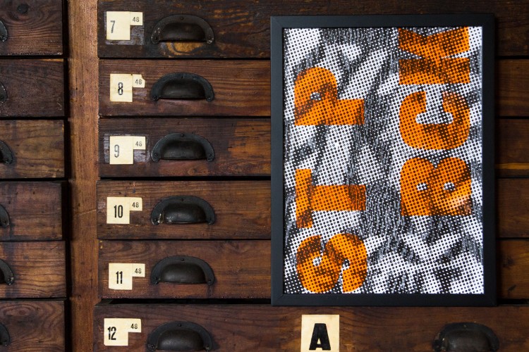
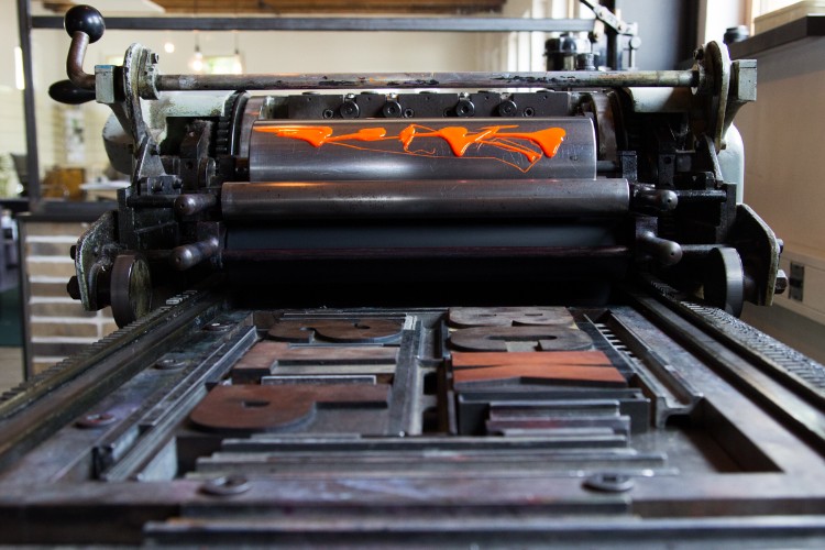
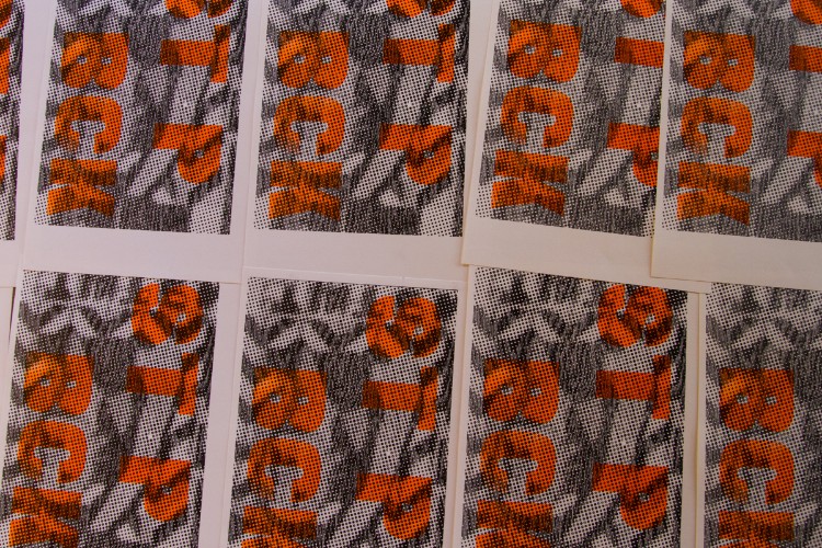 Karakter Prints are part of Tintenkillers who combine analogue printing techniques with collage art. Using copy machines, stamps, printing presses, graffiti art, pieces of tape and recycled posters they attend festivals and events.
This poster is a cut-out of one of the projects. For this piece Bart Heesen of Karakter Prints decided to invert the process by making a printing plate from the final result. Bart experimented with cutting a raster out of a wooden plate with a laser engraving machine.
The poster was printed in black on a FAG proofing press. The text was then printed in fluorescent orange using old woodtype recently obtained from an old French print shop.
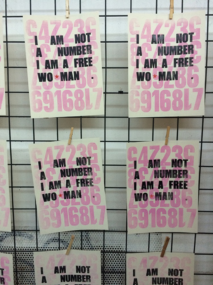
Danielle Wagner: My Body My Choice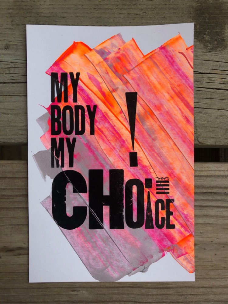
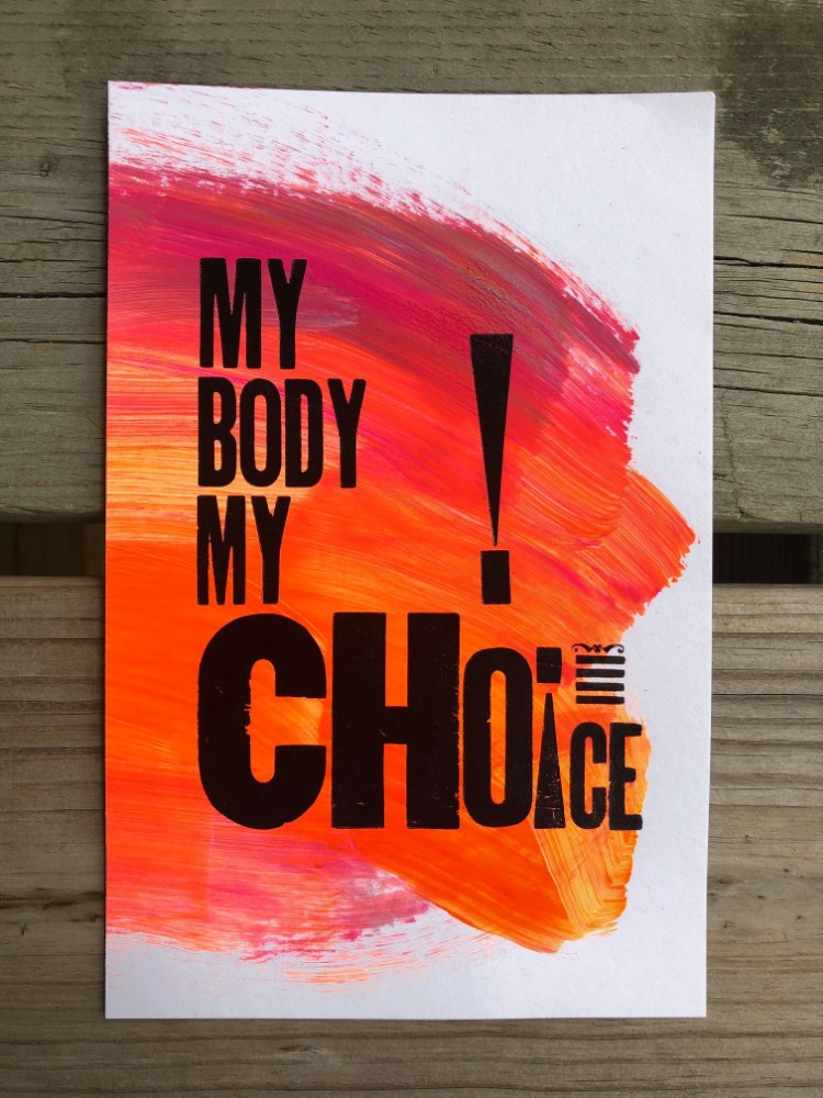
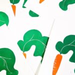
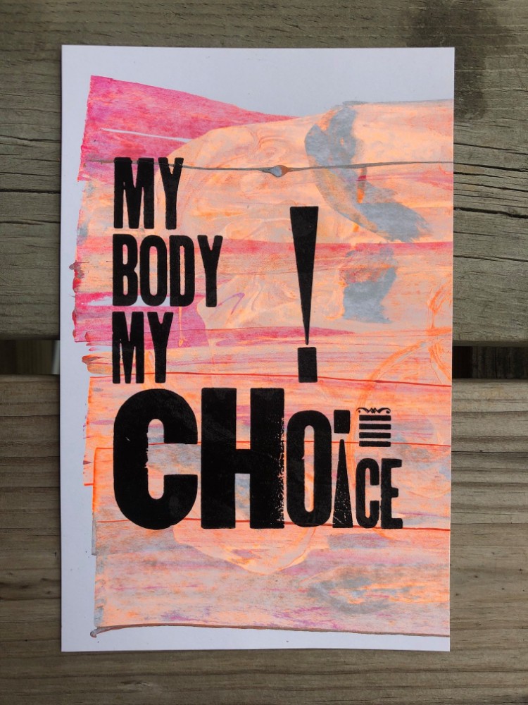 With the constant ongoing debates over abortion, Danielle wanted to create a print in support of the pro-choice community. Through using letterpress, Danielle was able to bring her message into life; “I feel frustrated about the many male politicians consistently trying to restrict and limit women’s rights.” Letterpress allowed her creativity to speak through bold colours and letterforms.
Each of the prints is 6″x9″ and printed on cardstock with a variety of background ink mixtures. They were created on a showcard tabletop press using a combination of wood and metal type.
10% of the proceeds from each print will be donated to Planned Parenthood.
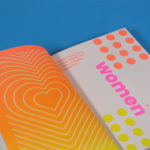
Studio Dotto: Tiny Guides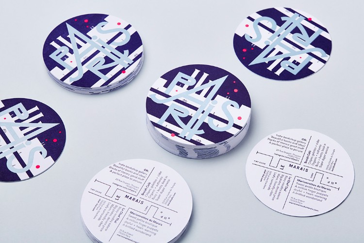
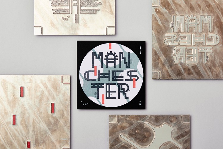
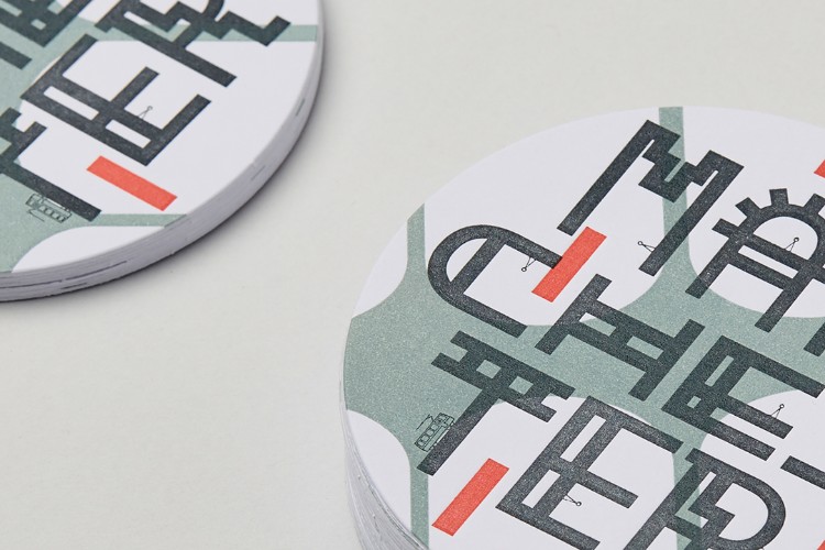
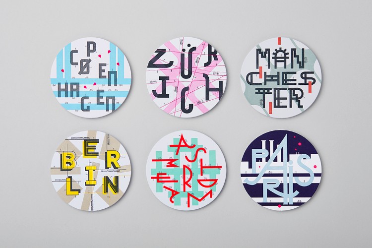 An exercise in creative exploration; Dotto Tiny Guides take inspiration from the feel and mood of a place and condense it into a teeny, tiny, typographic treat. Each guide features a design on one side and four places to visit on the reverse.
Dani Molyneux of Dotto explored lots of different ways to get them produced, but ultimately really wanted to use letterpress. “I’ve always loved traditional print techniques and wanted to get that beautiful little indent in the paper” states Dani. With letterpress, each colour has to be separated into plates, so she selected three Pantone colours for each guide. The joy in this is knowing that each colour will be really rich and vibrant, and it’s these colours and print technique that brings this kind of graphic imagery to life.
You can shop the collection on Department Store here.
The Garage Press: Curtain Up
 From clearing a corner in a garage and getting his first desktop press (a 1950’s Adana), Simon Trewin of The Garage Press now has 200 square feet of studio in Brixton, many presses including a 100 year old Arab Treadle, thousands of pieces of amazing type and hundreds of vintage illustration blocks. Simon also works with Photoshop and a few apps, with a direct line to Lyme Bay Press (another moniker of POP members Letterpress Design) if he wants to create something in digital form. With all this at his command, Simon finally had a way to unblock his creative imagination.
As a deeply creative person, but suffering a creative bottleneck, Simon was thrilled to discover an art form that enabled him to unlock his artistic bent; the art of letterpress printing. He states: “my mind is constantly full of images, textures and graphic ideas that I am desperate to get onto paper… but I have a problem… it is one of not really having the artistic skills that allow me to draw or paint in a way that does justice to the creative thoughts that are swimming in and out of focus up top“.
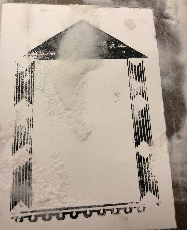
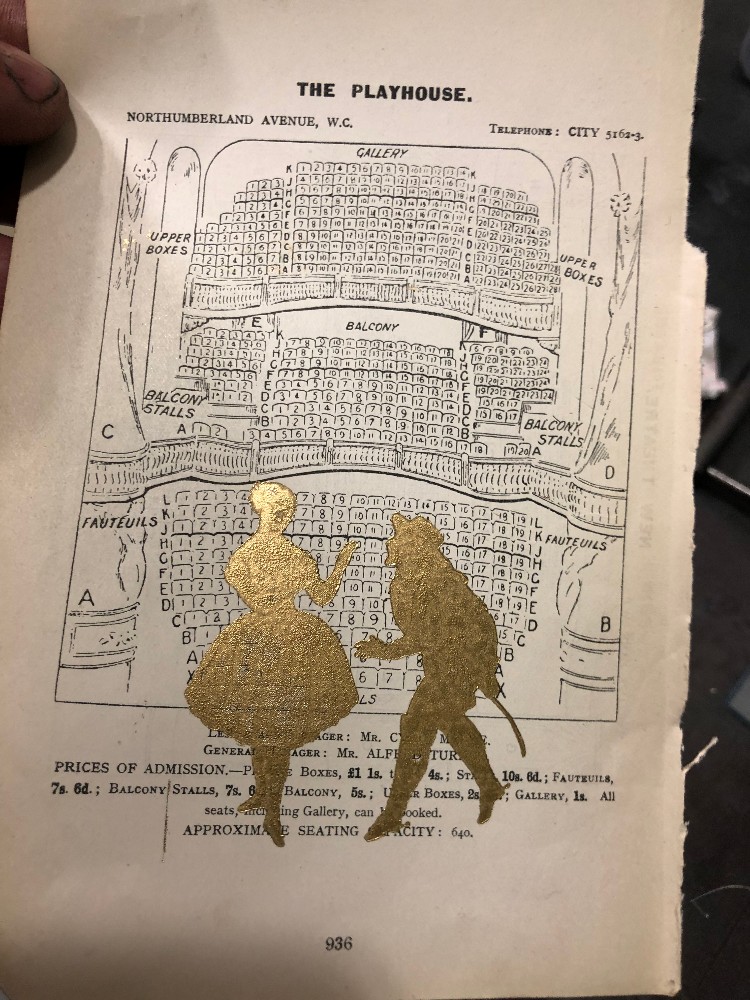
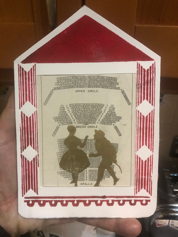
Curtain Up was created as a theatrical card suitable for sale at Pop-Up Vintage’s Fair at Wilton’s Music Hall. The card was created from a combination of photopolymer and wooden blocks and printed on 1930’s Adana Quarto 1A Hand Press. The piece was formed from selected ephemera including an old broken copy of Who’s Who In The Theatre, from which Simon removed the seating plans for various theatres. He used a group of random ornaments and wooden rulers from a drawer, and played with their arrangement in order to build a proscenium arch to frame to ephemera. A vintage image of two actors Simon found in an old volume of Theatre History was scanned and emailed to Lyme Bay Press in order to make it into a photo polymer plate. All pieces and elements were assembled in order to create the final finished piece.
For Simon, the joy of letterpress is that it is “primarily about composition and architecture and precision and paper“. He has also recently been experimenting with Thermo-powders (provided by Lyme Bay Press) and is about to add hot foiling to his repertoire.
@thegaragepress
www.thegaragepress.com
Letterpress de Paris: Mathieu Julien Collaboration
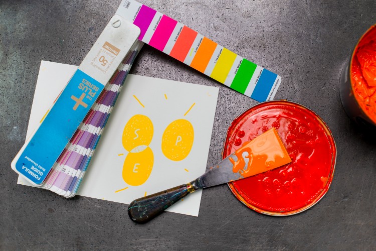
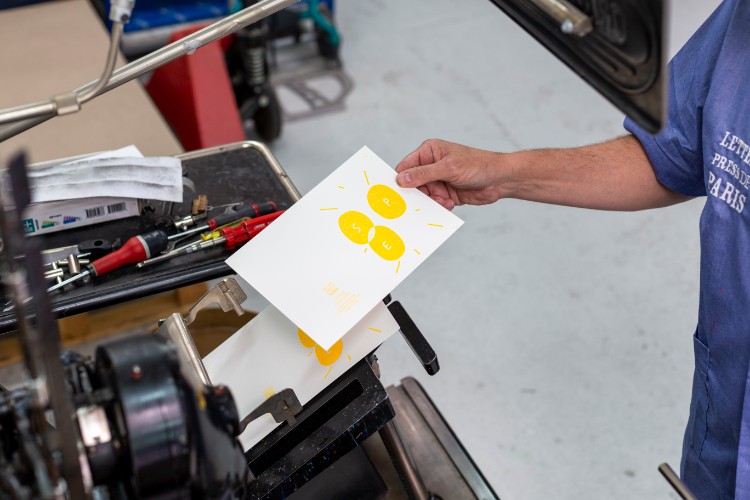
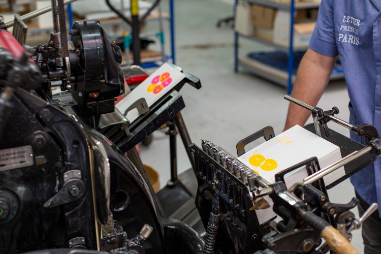 Letterpress de Paris is a stationery brand and letterpress print shop specialising in collaborations with artists from the young french illustration scene. These collaborations provide opportunities to carry out some exciting technical experiments.
This piece was created in collaboration with the graffiti artist and painter Mathieu Julien and printed with a 1970 Heidelberg “Windmill” platen. Mathieu imagined a composition with two colours, and generating a third tone using overlays. The piece was first printed in blue and red with violet overlays, with this second version as a new experiment with neon colours.
For the team, the most challenging part was to set up both prints precisely enough to get them perfectly overlapped, but with addition of the final colours, the magic of letterpress is revealed.
You can browse all of the amazing work by our verified POP members on our membership website here. Interested in joining our community? APPLY HERE
You might like...
 Bottle of Smoke :: New Tees
- Polaroid and Retrospekt X Killer Acid
- Jenny Pennywood
- Footprint Co-operative
- Better or WORSE?! lunkeymarna on Seeing the Abuse
- Circus of Illustration
- Daniel Puiggròs
- Free Font Vercetti Regular: A Year in Review and Future Plans
- Diana Rosinus
- Lizz Dunn
- HORT
- POP Member Showcase: 21 Relief Prints
- Pawel Mildner
- Ratiotype aka Wilf Whitty
- MuirMcNeil :: Geometric Type Systems
- Element #003 | Studio Yukiko | The Artist Series Cover


Want to know more about our membership? Give us an email at members@peopleofprint.com.
- Tim Belonax |All Of My Mistakes Have Led Me To You - April 26, 2024
- The Humber Printmaker - April 25, 2024
- Horizons by Angus Vasili - April 24, 2024