Back for it’s seventh edition from the 3rd through to the 6th November 2022, Woolwich Contemporary Print Fair will once again be bringing together an incredible line-up of 1000 original artworks in a unique hybrid exhibition of emerging artists, famous names, and specialist galleries. Visitors will have the opportunity to peruse original prints from the most exciting artists working today at accessible price points, as well as take part in a thriving interactive programme of talks, workshops and live demonstrations from leading Curators, Collectors, and Creatives.
Below, we check out some of the incredible prints that will be exhibited by members of our Official POP community.
Colour Black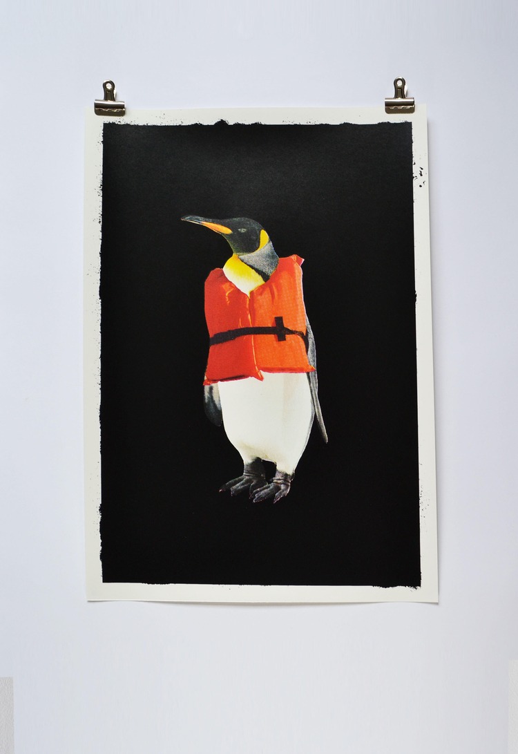
 Showcasing his signature playful, witty, and very black aesthetic, Colour Black will be exhibiting their Future Penguin print. This is the screen print artists first time at the fair. Dan tells us; “I’d heard of Woolwich print fair before, but this is the first time I’d applied, so great I got in, although I’d say I’m most excited about the private view and looking at all the other awesome printers work and prints – worried I’ll want to buy a lot.” Future Penguin aims to comment on climate change whilst also raising money to help towards fighting it.
Nicole Rose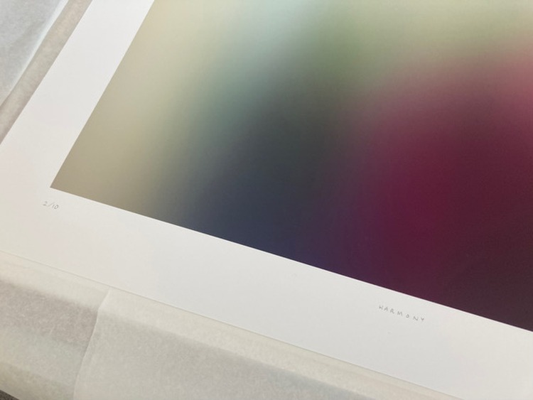
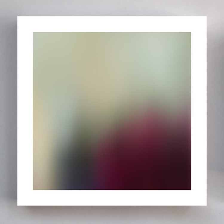 2022 will be Nicole Rose’s second time attending WCPF, as in 2021 she had a print selected for the Curated section of the Fair and shortlisted for the Fair prize. She comments; “The Fair itself is such an incredible event, I think a real highlight of the Art Fairs. The variety of work on show is really impressive and covers so many aspects of printmaking, that I found it very inspirational for my own practice. The visitors really seem to interact with the work too, and there was a real buzz to the weekend, so I was very keen to exhibit again.” Nicole’s print, Harmony, was chosen from the Open Call for the curated section of the fair. Her prints stem from her paintings which are abstract landscapes, with the prints acting as a further abstraction of the abstractions, resulting in ethereal and dreamlike pieces. Nicole’s strong use of colour makes them uplifting, but as she also uses gradients in her work, giving a sense of calm too. Harmony was inspired by things that caught Nicole’s eye on her daily walks. Not the grand landscape or view, but more the promise of a view, or what might be around the corner, so the light coming through the tress, or the shape of the path and where it’s leading.
Dan Gonen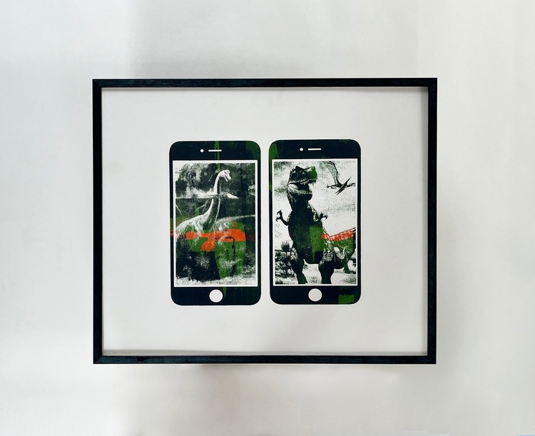
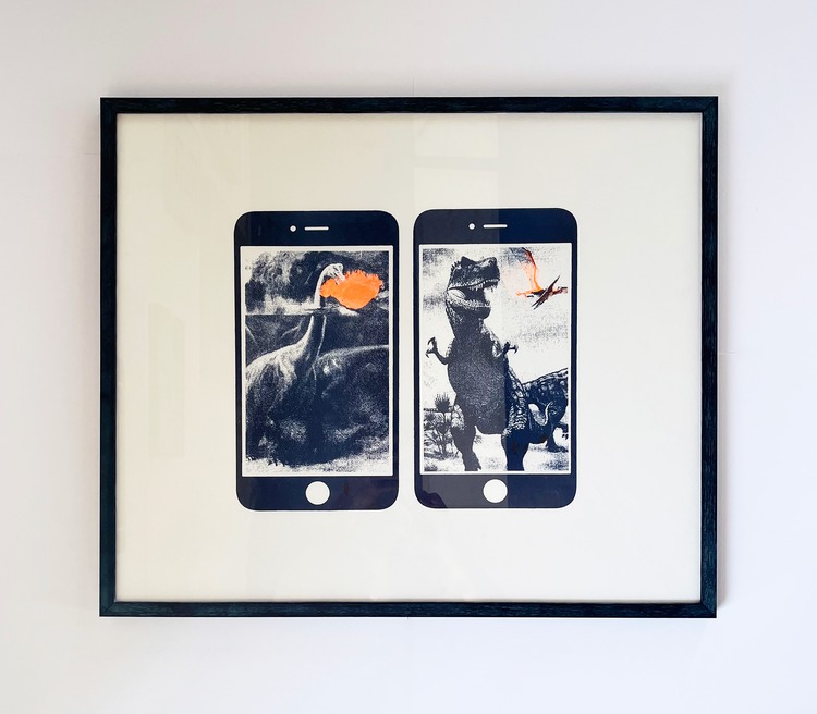 At WCPF22 Amsterdam-based screen artist Dan Gonen will be exhibiting 2 silkscreen works (one framed and one for the showcase) from a series titled Prehistoric Scenery. This will be Dan’s first time exhibiting in the UK, and he will be bringing his signature style that’s colourful, diverse, and inspired by the principles of pop-art. “I try to surprise myself with unexpected images,” states the printmaker, and this duo of prints is inspired by the perception of time and eternity – it is a humouristic point of view on our reality as human beings and on mass media, which we often take too seriously. Dan works mainly with the silkscreen technique and the process of printing is somewhat between painting and printing, involving experimentation with colour and ink.
Emma Studd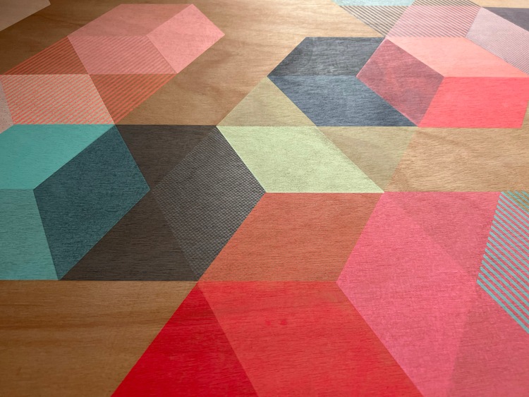
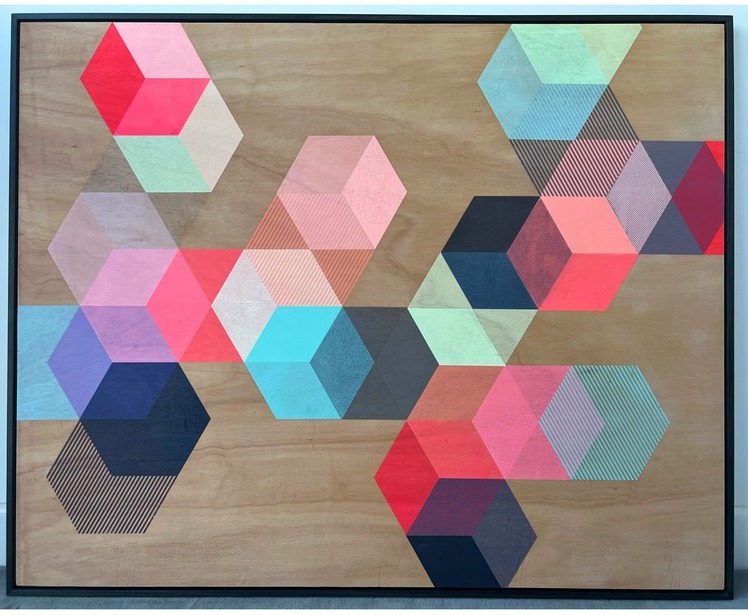 2022 will be printmaker Emma Studd’s fourth year of exhibiting at WCPF. This year, she will be showing Scatter; a screenprinted and framed wooden panel tray that includes over 30 silkscreened layers! Emma tells us; “Every year I apply to be in this particular fair because it feels like the heart of contemporary printmaking in the UK. It’s such a great event and at the PV I get to see many fellow printmakers and their fabulous work.” Her work is all about exploring colour through geometric shapes. In Scatter Emma has used only one polygon, the hexagon, to create infinite patterns and combinations of colour and tone. Feeling inspired by the colours around her, she tries to create a sense of balance within her work.
Sean Thornhill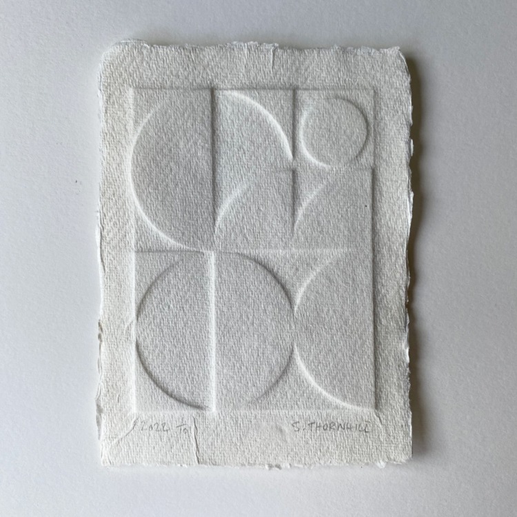
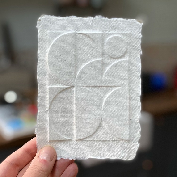 Taking inspirating from the Suprematism movement, the use of geometric shapes, and the creation of endless compositions, Sean Thornhill will be showcasing A Little Calm at WCPF22. This small print is embossed, playing with light and the picture changes throughout the day as daylight changes or the light changes in the environment it sits in. 2022 is Sean’s first year at WCPF; “Every year I see the posts on Instagram and always think to myself I’d love to put a piece forward, but never get round to it. This year I have made an effort to submit some works to exhibitions and luckily my print was selected for WCPF22.”
Jemma Gunning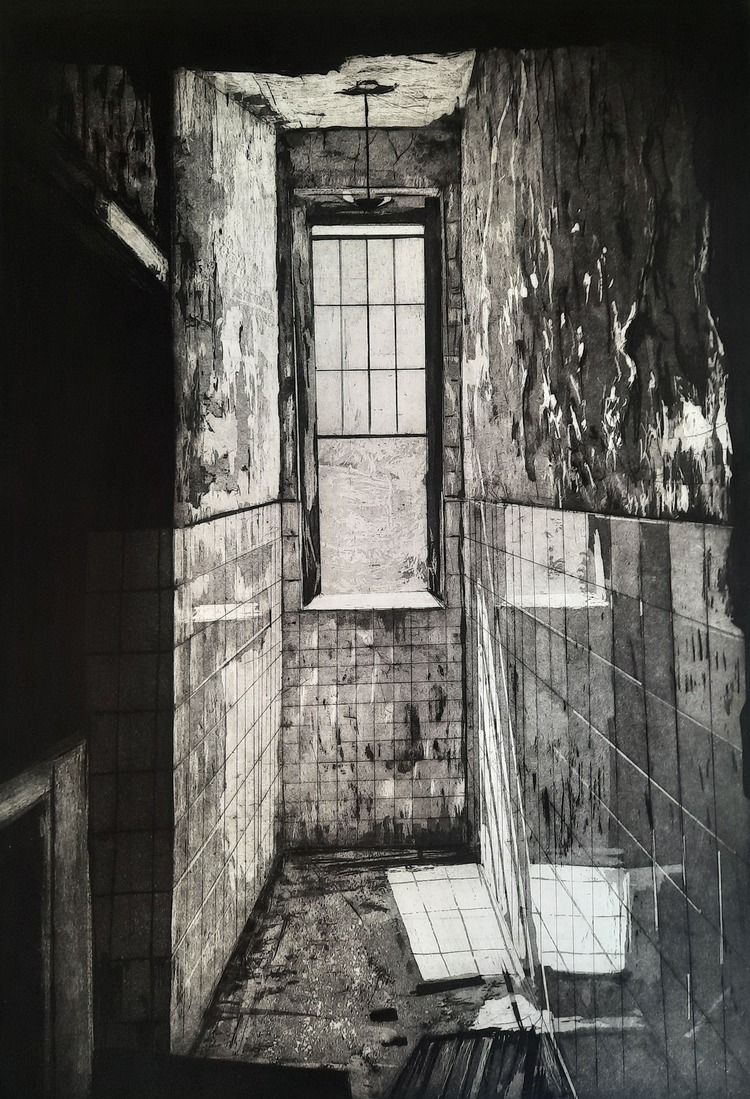
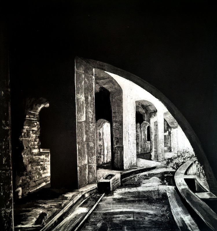 Jemma Gunning is a longstanding icon of WCPF, having exhibited at the fair from the very beginning. She comments; “I have loved seeing the fair evolve over the past years into the successful fair that it is known for. I enjoy being part of the fair and sharing walls with printmakers from different backgrounds and stages in their practices. There’s always a buzz when you visit and it’s something that I’ve wanted to stay being apart of each year.” The two pieces she has in this year’s show are from a larger body of work that visually documents abandoned buildings that have a historic narrative. The works aim to record Our Fading Heritage where her prints act like portals into the past. On the surface the works are quite dark and gloomy (after all they are mostly scenes of abandoned buildings), but if you look a bit closer there is life and energy within the scenes where new ecosystems start to emerge as mother nature reclaims back our waste lands.
Hannah Gilson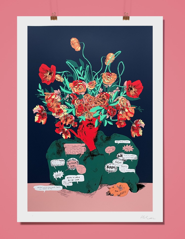
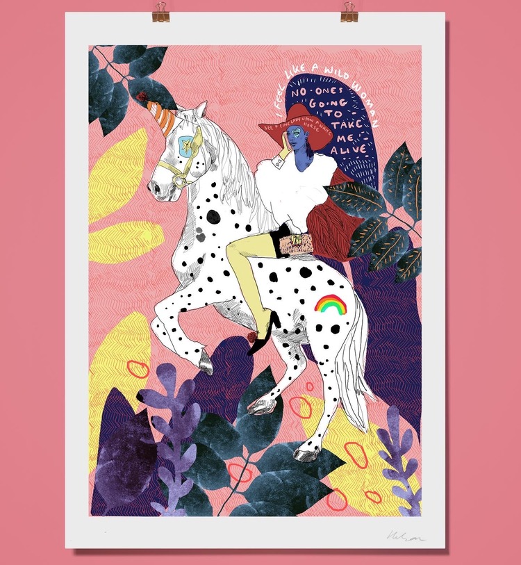 WCPF21 was printmaker Hannah Gilson’s debut into the contemporary print world. Thrilled with how well her prints were received the first time round, she was keen to come back for a second year. “The standard of work on show is so high, it’s such a privilege to be featured among so many fantastic artists,” comments Hannah. This year she will be exhibiting two limited edition screen prints; Banbury Cross and Origins. Empowering, bold, and intriguing, the works look at womanhood and the various narratives that surround it. Banbury Cross is an eccentric contemporary twist on the nursery rhyme of the same name, and Origins references the beginning of things – whether they be internal thoughts and feelings or the experiences that shape us.
Michael van Kekem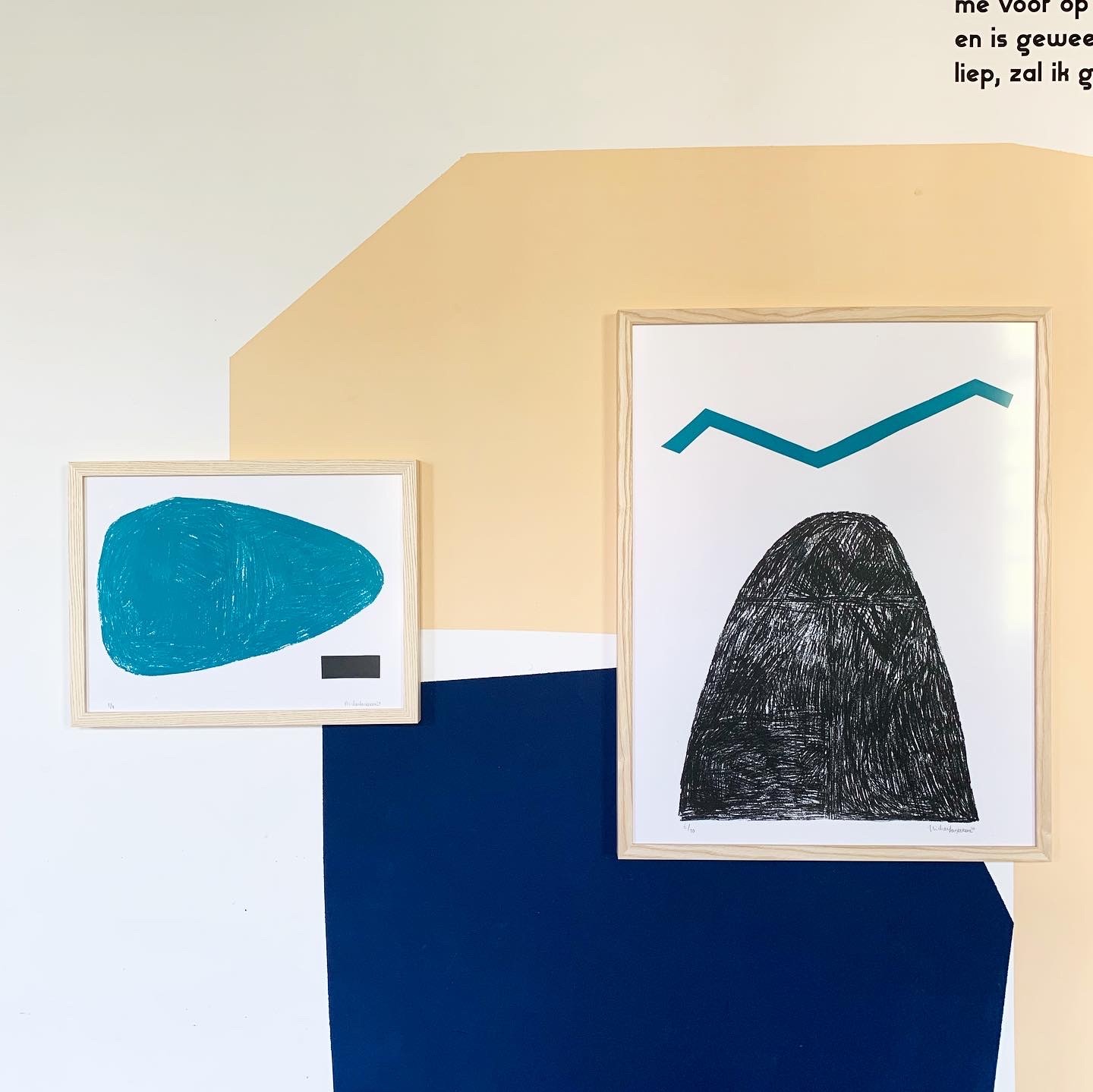
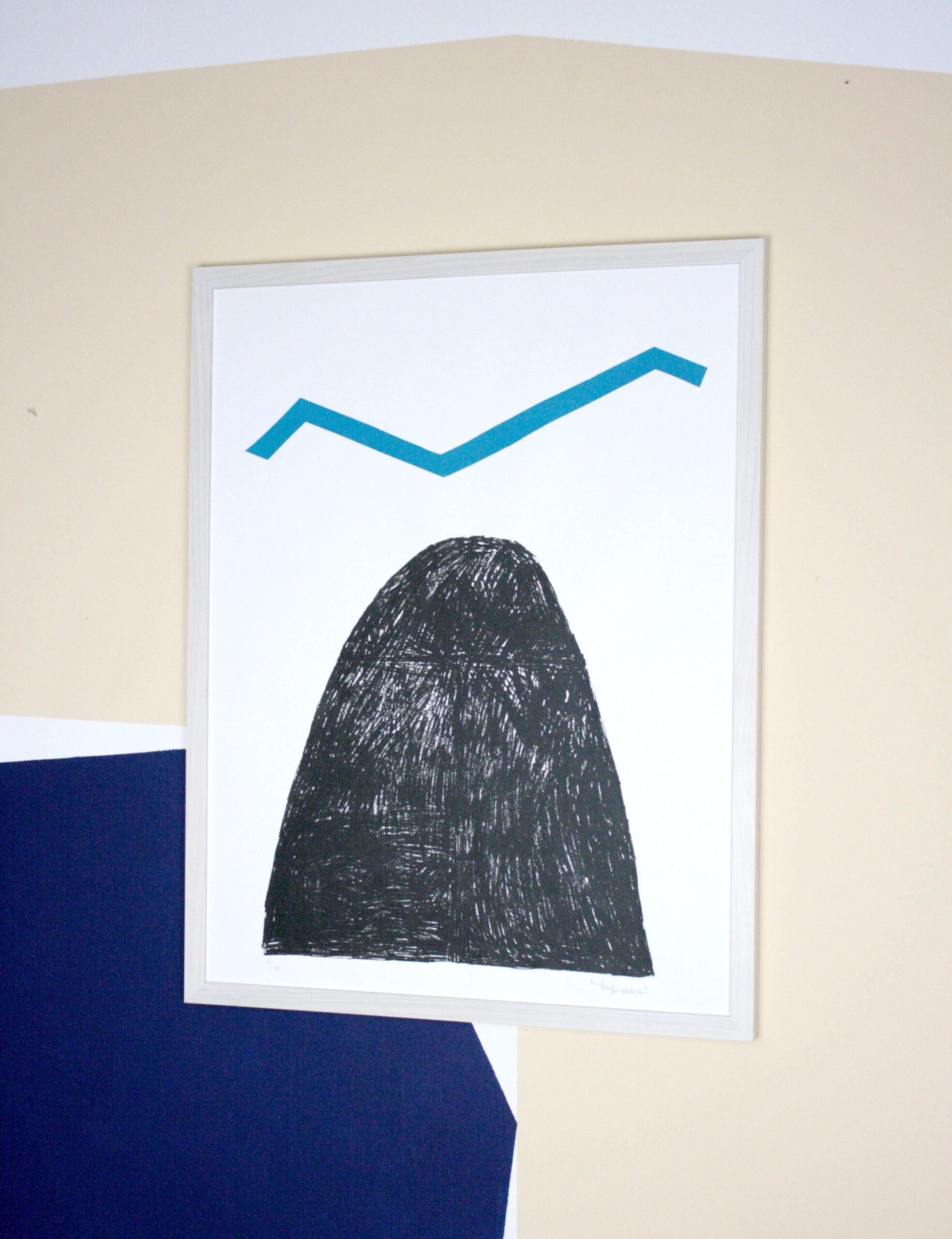 2022 will be Rotterdam-based printmaker Michael van Kekem’s debut at WCPF, and his first time exhibiting at a large-scale fair. His style can be characterised as playful, intuitive, and colourful, showing an atmosphere that is emotional and thoughtful. The two works that will be exhibited at WCPF22 Hier and Daar (‘Here’ and ‘There’) are about loss, grief, saying goodbye, and feeling frozen in moments. In the first piece, Hier, Michael has drawn and printed an enlarged stone he used to wear on his person every day. The stone was a gift from a friend, so that whenever he would feel sad or emotional he could touch this stone and have a moment of comfort. In the second piece, Michael explores a journey to the island of recovery after a big traumatic loss, reflecting the process of trying to find yourself after a very impactful series of events.
Emmanuelle Orr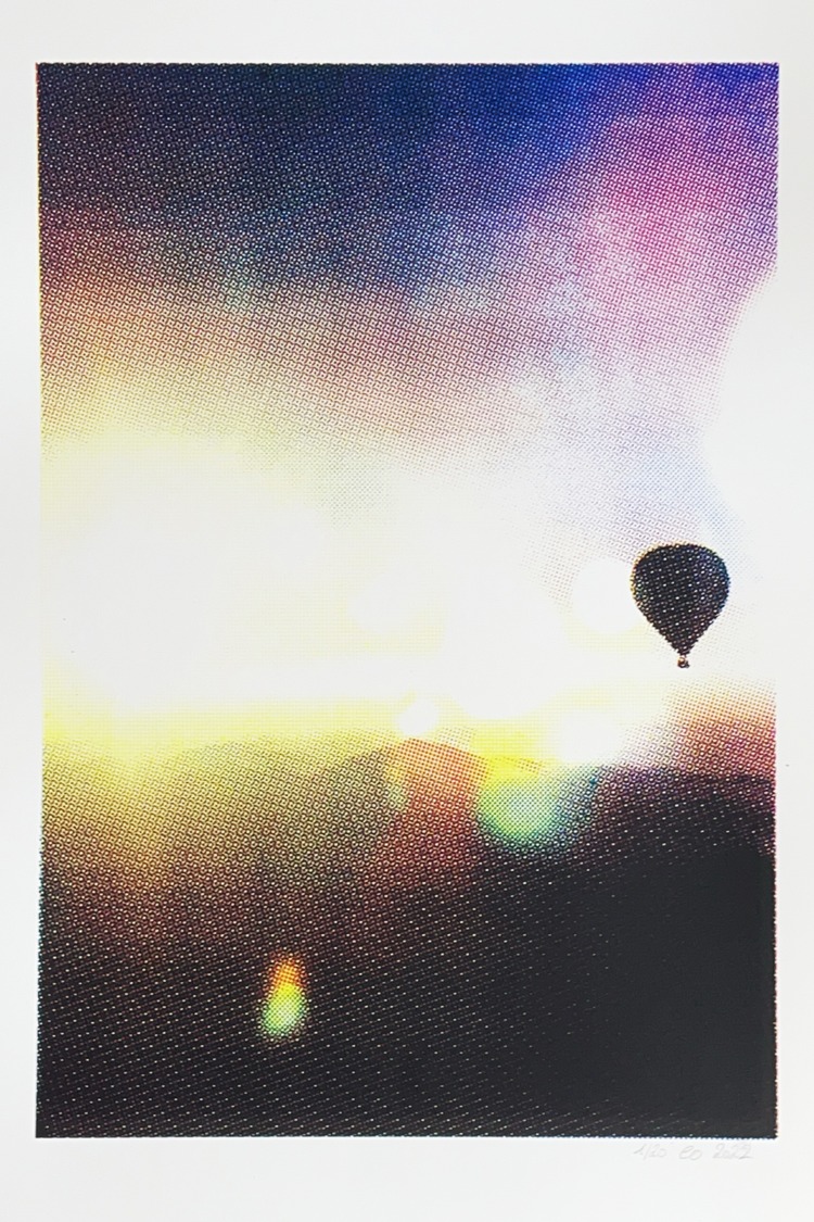
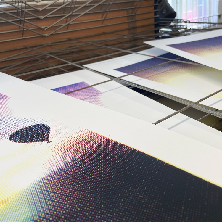 For WCPF22 Emmanuelle Orr will be exhibiting one piece, Above the World, a limited edition CMYK screen print. In the work Emmanuelle focuses on how light works in a landscape, and how it can almost obliterate the image, or at the very least transform it, specifically by using CMYK printing. This is not simply a technical exercise to create colour schemes in different ways, but a way to further explore the impact of light and its relation to colour. She deliberately keeps the halftone patterns visible so that the image further decomposes into colours, as if the light is being diffracted through a prism, thus reinforcing the impact it has on the landscape it depicts and illuminates. The colours are vibrant and saturated, accentuating certain aspects of the image or twisting reality into a dream world. Halftones and gradients suggest dissolution and force the eye to constantly switch between the harmony of the bigger picture and the tangle of colours within.
Jo Boddy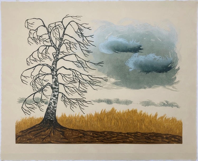
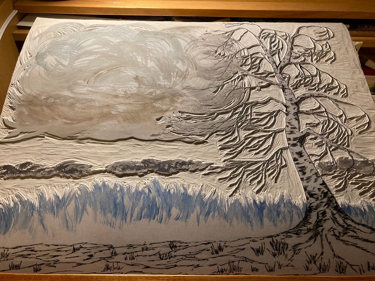 This year, Jo Boddy will be showcasing Winter Westerly at WCPF. 2021 was her debut at the fair, and it was such a brilliant success after she sold the whole edition that she had to enter the call out again. Jo’s prints explore landscapes that she is deeply attached to, usually in linocut and collagraph. Winter Westerly stared life as a sketch of a silver birch tree made high up on a hill where the winter grasses were really orange. As she walked home a huge black cloud was trying to snow and the light was amazing. She tells us; “I kept going back to that sketch thinking there was just something about it and then became fascinated watching silver birches move in the wind with those long tendril-like branches.” The drawing for the print evolved until she was happy with the shape of the tree and the clouds. Jo created the print on Kitakata paper – the warmth of the paper and yellow of the grasses hints at that cosy feeling you only get in winter.
Browse more WCPF22 exhibitors here.
WCPF22 will also be going online from 3-20 November.
Purchase tickets for the fair here.
Woolwich Works, The Fireworks Factory, No.1 Street, Royal Arsenal, Woolwich, London, SE18 6HD
Check out more work by the members of our POP community and apply to become a Verified POP Member at www.members.peopleofprint.com.
Want to know more about our membership? Give us an email at members@peopleofprint.com.
- Tim Belonax |All Of My Mistakes Have Led Me To You - April 26, 2024
- The Humber Printmaker - April 25, 2024
- Horizons by Angus Vasili - April 24, 2024