Sergey Zhigarev is an Art Director with nearly 15 years of experience in Graphic design. Born and raised in Moscow, he Studied Graphic Design at British Higher School of Art and Design, where he was mentored by the greatest national design educators such as Ivan Vasin and Ivan Velichko, the Shuka Brand Bureau founders.
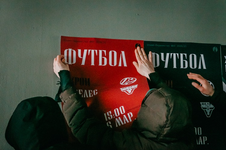
 Currently, Sergey focuses on branding, working across a wide variety of media to represent brand communications. Despite the global shift towards digitisation, Sergey always insists the usage of physical media for his clients, increasing awareness of printed techniques for reproducing materials for both clients and consumers.
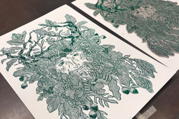
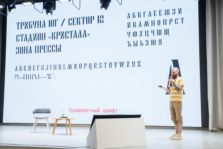
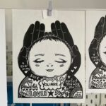
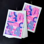
Creating strong visual systems, no matter a project’s scale, is also important to Sergey. Strongly influenced by Swiss grids and typography, he usually builds up graphical systems around specially created fonts or lettering. From the type he then creates a composition to achieve the highest match and cohesion. This leads to a supreme consistency across a variety of media.
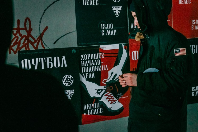
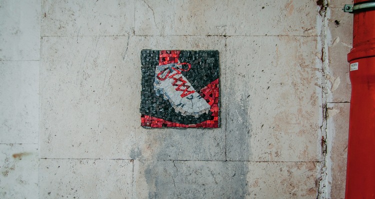
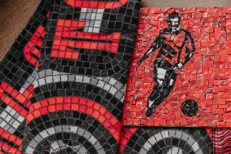
“It’s really inspiring to see an art, for example a mosaic, which is easily attending to the particular poster, which is in its turn clearly indicates a brand, which is recognisable by it’s typography. And in the end, it all comes together into a coherent image, element by element. This gives you limitless possibilities to compare, for example a brutal modernists moods in a soft and cosy knitted materials.”
 And of course, being a person of a ideas rather than a formal artist, Sergey is seriously interested in the field of semiotics. The science of sign always stands alongside his working processes. In turn, this affects a lot of the deadlines for the completing of tasks; outside of commercial projects Sergey never hurries to finish what he is working on.
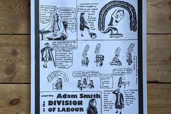
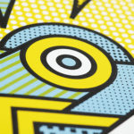
 “It’s ok for me to spend months trying to perform a single poster, chasing for clear ideas and simple solutions. I was always fascinated by posters of Shigeo Fukuda and Lex Drewinski. It may contain just two colours, simple shape and no words at all, but you totally get the message. This is my consistent benchmark.”
You might like...
 TYRSA / AIR JORDAN 5 ‘GRAPES’
- Liquorice Press
- Post Typography
- Bongout on Vice
- Competition :: Aida Prints Giveaway
- Stoffdoktor
- Nelly Duff presents – Ben EINE
- The Private Press | Editions Series Launch
- Real Friends: End Days
- Dulux Colour Britain Campaign
- Petra Verkade | Risograph Birthday Calendar 2024
- 25 Hour International Print Challenge 2024 in Venice
- Fresh Lemon Print: Creative Clean Up
- Vans x Liberty Art Fabrics :: Holiday Collection
- Jamie Reid
- Effect Desire


Want to know more about our membership? Give us an email at members@peopleofprint.com.
- Tim Belonax |All Of My Mistakes Have Led Me To You - April 26, 2024
- The Humber Printmaker - April 25, 2024
- Horizons by Angus Vasili - April 24, 2024