Jinu Hong is a graphic designer, art director and video creator originally from Seoul in Korea, but currently based in New York. Having originally studied architecture, he moved to the US to study at the prestigious MFA graphic design course at Yale School of Art. He currently teaches at Parsons School of Design in New York, as well as working on his own practice. With a focus on collaboration and a skew towards working with cultural clients, his work is both beguiling to look at and conceptually rigorous. We had a chat about his experience at Yale, the Korean design scene and more.
 How was your experience of the Yale MFA? It’s known for a certain graphic design style – what would you say that style is? What was the teaching like?
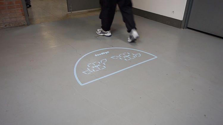
The time I spent with a group of talented graphic designers at Yale was such a fun, pleasant and memorable experience in my life. The fact that everyone comes from different backgrounds and trajectories of professional life made it very lively and vibrant, being amid spontaneous interactions and continuous collaboration. Everyone enters into the program with a specific or sometimes vague direction around what our interests are. For me, the whole time was a process of externalising what’s already in myself to the point where I felt like excavating the past paths and revisiting them, and making them take shape. I know it’s an abstract way to put it, but, long story short, it’s about the development of a cohesive, investigative body of work within your visual methodology—according to the school’s website.
Unlike what people say about the look and feel of the design from the Yale MFA Graphic Design programme, that preconception about the design style is not true. The projects students work on take shape in different mediums, and the application of each student’s visual methodology to studio works varies from person to person.
 How different is the graphic design scene in the US from Korea?
I did architecture for my undergrad in Seoul and worked as an architect and interior designer there most of the time. I had very little connection to the graphic design scene in Korea before I moved to The States. It was only after I graduated from Yale that I started to engage in the graphic design scene in Korea. I have worked within various realms and met a range of people to collaborate with, which is always the most thrilling part of a process for me. There are lots of talented graphic designers working independently, and studios bringing in novel graphic design discourses that contribute to the diversity and vitality of the scene. I see interdisciplinary collaborations happen here and there, simultaneously and spontaneously, which I feel hopeful for and which excite me to keep pursuing my practice back home someday. Can you tell me more about your interest in moving image work?
I think the power of moving images comes from the idea of time, which is often accompanied by the sound factor. It is a duration of time that attracts people and makes them stick around longer. When they fall into place perfectly, sound and timing provide synesthetic satisfaction, and they are additional layers adding depth to still images. In retrospect, my interest in moving images began to grow since I learned how to play the piano.
 As a teacher, what do you think are the most important things that graphic design students should leave uni knowing/being able to do? What do you wish you’d been taught that you weren’t?
I think it is essential to have an eye to see the big picture and the details at the same time when it comes to managing timelines and delivering products. Also, to keep a good balance between what you really care about and what you would do for a living when receiving and juggling projects.
 What sort of projects and clients do you most enjoy working on or with, and why?
Regardless of the medium, projects that excite me are when the contents/subjects reflect my interests. I’m the type of person who prefers to collaborate with others rather than working alone, although there are pros and cons. In the same sense, I’ve enjoyed working with all my past clients. I would say those in art, architecture, music and fashion, if I had to pick.
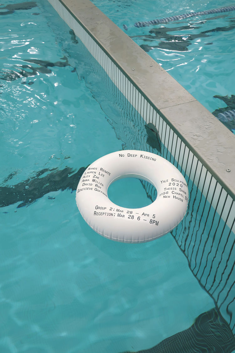
 Please can you tell me a little bit more about the 401 project?
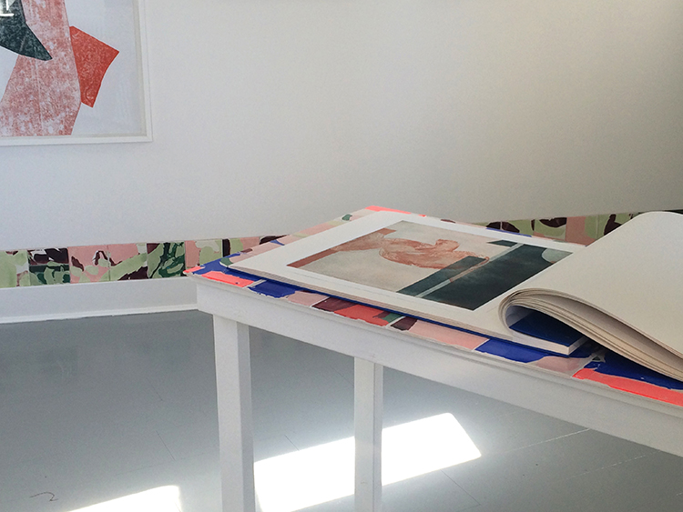
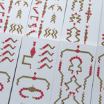
Architect friends of mine opened a space called 401 in Seoul last year. It is a space of investigation and exhibition for contemporary Korean architecture, spaces and related objects. Distant from the logic of systems and businesses, its primary goal is to seek independent and alternative architectural curation possibilities.
I designed a flexible identity system that describes the personality of the space. The numbers and shapes can be placed randomly to create different configurations, depending on the exhibition’s character. The shapes are extracted from the negative spaces of figures 4, 0, and 1.
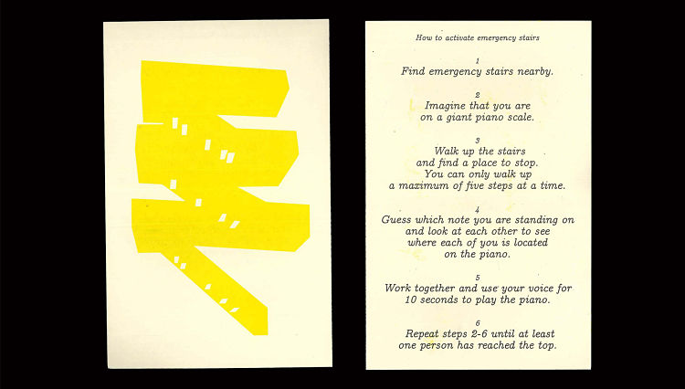
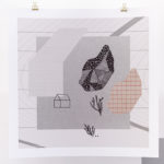
And your poster for the exhibition, Now the sun had sunk?
This exhibition had a unique way of activating the space—the gallery was only open after sundown. The only light that helps visitors to appreciate the works was from the tall office building right across, which was lit most of the time until late. The artist had six pieces of work in the space. For this poster, I tried to portray the atmosphere, and formal decisions were made on the spot very spontaneously.
You might like...
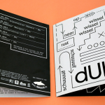
 Cox & Grusenmeyer / dUb
- Supreme :: Harmony Korine Decks
- Atelier Burano
- Huf :: Holiday 2013
- Hui yeon Hwang: Ildetex Identity & Let’s run for it
- Trove x Melissa North Limited Edition Wallet
- Catherine D’Amours (CDA)
- Posterzine™ Issue 48 | Zipeng Zhu
- Leendert Meets Ingrid | Art Print of the Month
- Mark Steinmetz
- Papier Machine
- Drop Dead Clothing
- People of Print | Graduate Print Awards 2014
- John Knuth :: ‘Faded State’
- International Exhibitions by GDFS
- BROKENLOGO


- Autobahn - November 26, 2021
- Alphabetical - November 12, 2021
- SOFA Universe - November 8, 2021