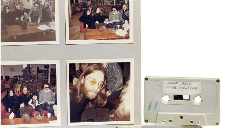
An unreleased cassette tape with an interview of John Lennon and Yoko Ono was sold at auction last month for a whopping 64,700 Euros (around £55,383) / USD 75.500 (including buyer’s premium). On the 33 minute recording, made in 1970, you can hear the conversation between the couple and the four 16-year-old Danish schoolboys who were allowed to interview Lennon and Ono, discussing everything from friendships to “peace visions” and generation gaps.
In light of this news and the apparent resurgence in new artists releasing music on cassette tapes, we’ve rounded up seven of our favourite tape designs from the past year.
1. Metronomy, Posse EP Volume 1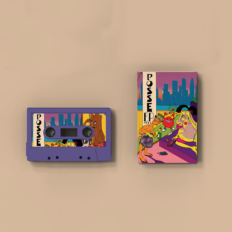 Having been hinting at a new record, Metronomy surprised everyone in September when it released an unannounced EP of collaborations with “pals” new and old on Because Music.
Posse EP, Volume 1 features collaborations with artists from Sorry, Biig Pinty, Spill Tab, Folly Group and Brian Nasty. According to God is in the TV Zine, Metronomy founder Joe Mount has long wanted to make his own version of producer records like those of Unkle and Handsome Boy Modelling School, and took the opportunity presented (in a way) by lockdown to experiment and collaborate with new acquaintances, several of which met for the first time in making the record.
As with most of Metronomy’s output, the artwork is superb – we can’t get enough of the punchy, vivid and beautifully odd illustration for the cassette-only release by London-based illustrator Stella Murphy. Her work draws on the style of 1960s and 70s artworks and cartoons, merging the two disciplines with flair. Among her impressive client list are Ace & Tate, Adult Swim, Bloomberg Businessweek, The Face, The New York Times, Selfridges, The Smudge and Vice.
2. Studio Komische, Gamma 75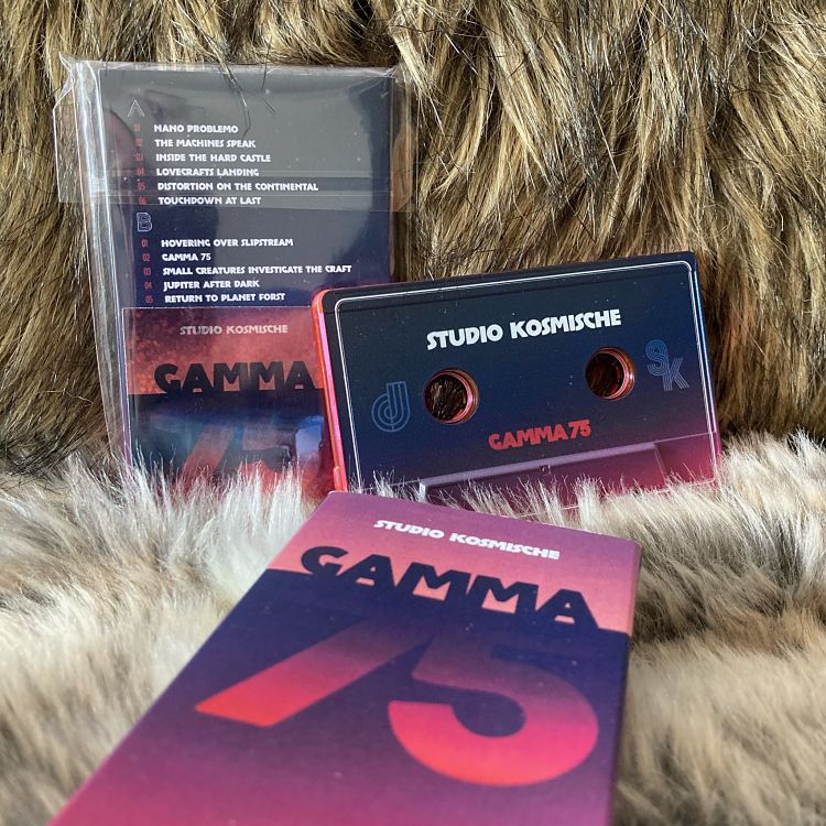 Studio Komische (aka Dom Keen, a graphic designer, musician and producer working under whose previously worked with the likes of Death in Vegas, Dark Horses, The Lodge and Jack Medley’s Secure Men) has been incredibly prolific over the past year or so, releasing three albums in an ongoing series: Gamma 75, Omega 76 and Alpha 77.
The designs for all three, as well as the forthcoming Sigma 74 are based around the same concept, which varies in colour palette across each. The artwork began with a landscape photo sourced from a free stock photo site. “This was inspired by the covers of kosmische ambient albums from the 70s that often featured a landscape inspired by the ‘ambient’ music – mainly the work by bands such as Harmonia, Cluster, Harmonia, Eno, Moebius and Roedelius,” Keen explains.
“I wanted to do a slant on that, so decided to add the typography to avoid just copying an idea – again, a reflection of the music contained inside. I did not alter the colours of the original photographs for the sleeves, just chopped and rearranged them.”
The name Alpha 77 is derived from an effects processor (a collection of sound-processing modules including a pitch-shifter, ring modulator, phaser, tape delay etc.) of the same name, made for Irmin Schimdt of seminal krautrock band Can. That machine “was a tremendous influence on how I make music,” says Keen. “I have more or less put together my own modular version of this which I use along with a looper pedal to create much of the music.”
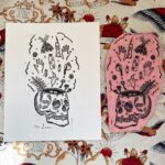
3. Tout Debord, Rester La, Detriti Records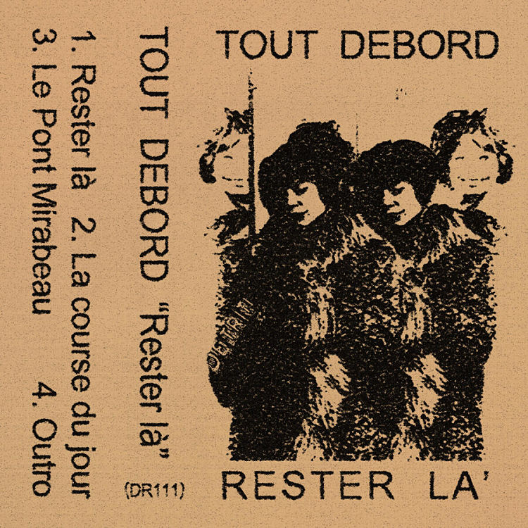 Tout Debord is a Paris-based project founded by Leonid Diaghilev in 2020 inspired by post punk, shoegaze, 80’s pop, French cold wave, Soviet new wave and Siberian punk. Its first EP, Le Dernier Voyage, was released in November 2020; but now it’s back with a stunningly designed tape release on Detriti Records called Rester La.
The label has long been synonymous with superb tape covers, the vast majority of which are created by its founder DAvide Lace. This release, as with most Detriti tapes, uses the label’s distinctive duo-coloured imagery, which looks like a mix between photocopier and linocut processes.
He also takes pride in the visual components of each release. “For each artist I try to create the best ‘dress’ possible, keeping their music in mind, their specific genre and their references, with a fil rouge among all the [album] covers, putting a ‘Detriti touch,’ I would say,” Lace told Bandcamp.
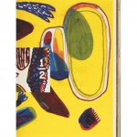
4. Dry Cleaning, New Long Leg, 4AD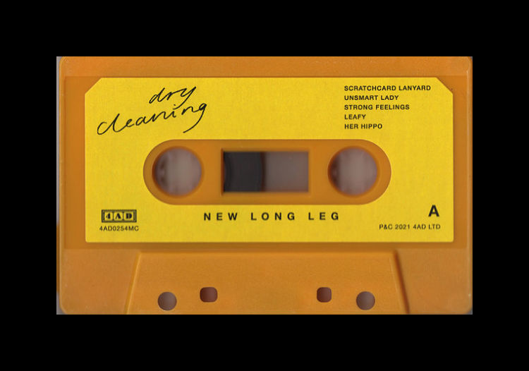 A shoutout to my new favourite band here, Dry Cleaning, formed of RCA grads, superb production (John Parish) and lyrics collaged together, seemingly, from advert slogans and tabloid tales.
Now signed to iconic label 4AD, earlier this year the band released its superb record New Long Leg on the usual formats – plus a very cute cassette tape. The artwork, much like the music, is a peculiar, nonsensical but somehow cohesive mixture of images and styles: a stark brutalist grey backdrop; oddly cropped photographic images (one of the long shadow of the titular long legs); childlike scrawled doodles on the inner sleeve; Factory-esque yellow throughout.
The artwork and design were created by the band themselves, with design assistance from Alison Fielding, art director at The Beggars Group.
5. Macroblank & Oblique Occasions, Verdant Halcyon, Aloe City Records![]() If you thought vapourwave was niche, just wait until you hear about Aloe City Records, a London-based label that specializes in “various sub-genres of vaporwave,” releasing its music on vinyl, cassette and -yes – MiniDisc, a nice nod to the fetishissation of obsolescence that’s a key pillar of everything vapourwave.
If you thought vapourwave was niche, just wait until you hear about Aloe City Records, a London-based label that specializes in “various sub-genres of vaporwave,” releasing its music on vinyl, cassette and -yes – MiniDisc, a nice nod to the fetishissation of obsolescence that’s a key pillar of everything vapourwave.
Design-wise, we can’t get enough of a release from the label in summer this year, Macroblank & Oblique Occasions’ Verdant Halcyon. As a collaboration between the two artists, the tape takes the unusual tact of separating their tracks by number – odd numbered tracks are by Oblique Occasions, even numbered by Macroblank.
Despite its relationship to vapourwave, the tape’s design doesn’t rely too heavily on its familiar tropes: there’s none of the saccharine pink or baby blue that characterised the genre’s first tranche of releases; nor is there the sort of uncanny valley representations of sterile cityscapes and plazas, or Windows 95 graphics or Japanese letterforms.
There is however one relic of vapourwave in the form of what looks like a concrete classical statue head. Rendered in high-contrast neon green and black, the design is accented with red type in that rather trendy all-caps condensed serif lettering. The tape itself is superb too, in a vibrant transparent orange plastic.
6. Beatbully, BbBeatTape, Fine Grains Records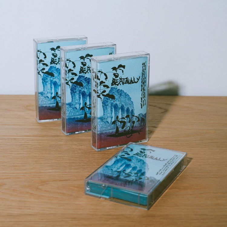 Norwegian producer and Dødpop Records co-founder Beatbully’s recent release BbBeatTap includes 13 lo-fi tracks “punched out on the weathered MPC,” according to label Fine Grains Records, which adds that he’s a “ leading figure of the Scandinavian skweee scene.”
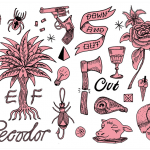
The designs for the limited-to-100-edition tapes have a very interesting design concept that plays to Beatbully’s roots. The image printed on the tape is taken from a photograph taken in 1902, sourced from the Norsk Folk Museum and showing the remains of a medieval cathedral in Innlandet, the home of black metal.
Label founder and graphic designer Alexander Horne worked with letterpress master Thomas Gravemaker to create the tape, starting the process by making magnesium clichés (plates) of Anders Beer Wilse’ photograph and Efrain Vivas‘ illustrations.
“To make the drawings I gave Ef an advance of the beat tape, he zoned out to the sounds and came out with pages and pages of drawing,” Horne explains. “I picked out the elements that worked best with the photograph, made the layout then added a logotype that melted into the early 90s aesthetic and black metal/skweee origins.”
Horne and Gravemaker chose a light blue 160 gsm Celeste paper from Fedrigoni to compliment the psychedelic magenta/cyan gradient ink printed on top. To create the gradient Gravemake had to manually add ink to the roller every 10 print runs or so, meaning every cover is unique.
7. Chem Trails by Reflex Blue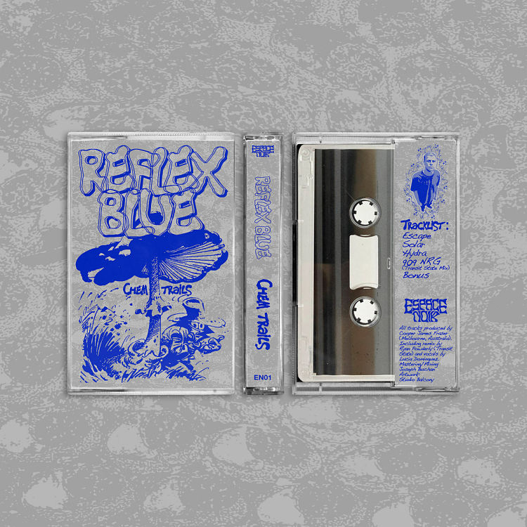 They say you shouldn’t judge a book by its cover, but surely a tape’s fine. In all honesty, I’ve no idea what this band/outfit are (or didn’t); but was very taken in by the design for this five-track tape by Melbourne-based Reflex Blue.
The artwork was created by Studio Balcony, who as it turns out is a fantastic little independent visual design studio, located in Footscray, Melbourne. Maintaining a focus on printed and digital media, with an extended interest in apparel and music, the studio’s work for various record labels across sleeve designs, flyers and more is playful, impactful and smart.
You might like...
 Primitive Press
- Brian Flaherty
- El Famoso
- Sara Cwynar
- Concrete Nature | In Bloom
- BN1: A Board Game All About Brighton
- Caroline Tomlinson | Love is The Best Compass
- Nasir Mazhar
- 1/2 Zine
- KOPIJ :: Three Times A Layer
- Cari Vander Yacht
- T-Shirt Party R.I.P.
- People of Print Book :: Innovative, Independent Design and Illustration
- Chad VanGaalen
- Payton Doerner
- Letterpress Printing: A Timeless Craft and the Legacy of the Heidelberg Windmill


- Autobahn - November 26, 2021
- Alphabetical - November 12, 2021
- SOFA Universe - November 8, 2021