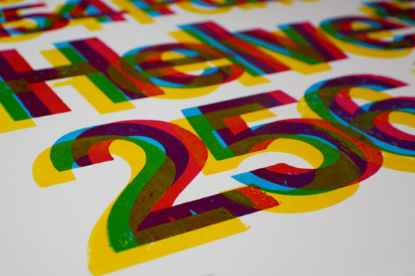
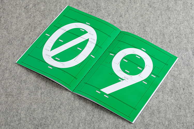
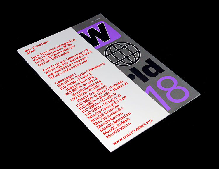
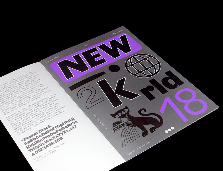
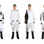
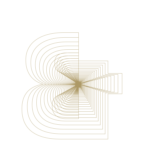
Designer Philipp Herrmann presents his two 10-page specimens showcasing his bespoke retail typeface Atak along with two colourful projects of Out of the Dark bespoke type design work for Ramazzotti and Campari Group. Herrmann’s 10 page specimen takes the form of a bold 4-colour Pantone offset print in an edition of 240. Atak evolved from the need for a sans serif type family which offers bold weights with a distinct originality instead of being just the fattened versions of their Regular counterpart.
 The aim of the face was to create bold and compact letterforms by keeping their specific character, which gives Atak a overall nuanced and concise look. Its idiosyncratic forms result in a powerful grotesk family with a comprehensive range of weights from Light, Regular, Medium, Semibold, Bold to Black. Atak Black has rather wide dimensions compared to the normal width of the Regular weight. This is without loosing the family’s natural graduation when it comes to interpolation. In contrary, taking the space it needs, the heavier weights avoid undefined, ambitious design.
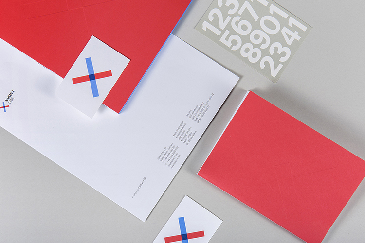
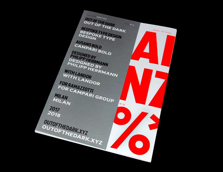
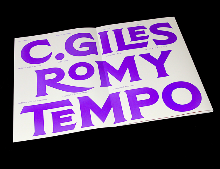
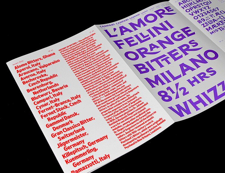
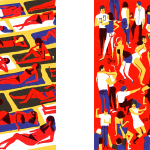
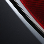
 Herrman’s second custom typeface “Campari Bold” has been constructed with extended proportions and sharp serifs shares characteristics with ATF’s all-time best-selling typeface Copperplate — “being used extensively for stationery and form work, especially in the small neighbourhood print shops of the letterpress era”. The sharp endings of letters like C G J K Q R S — derived from lettering of early century Campari Advertising — and make Campari Bold a much more vivid and dynamic typeface with an ahistorical attitude.
NAME: Campari Bold
EXTENT: Bold
YEAR: 2018
LICENSE: Exclusive
AGENCY: Landor Milan
CLIENT: Campari Group
DESIGNER: Philipp Herrmann
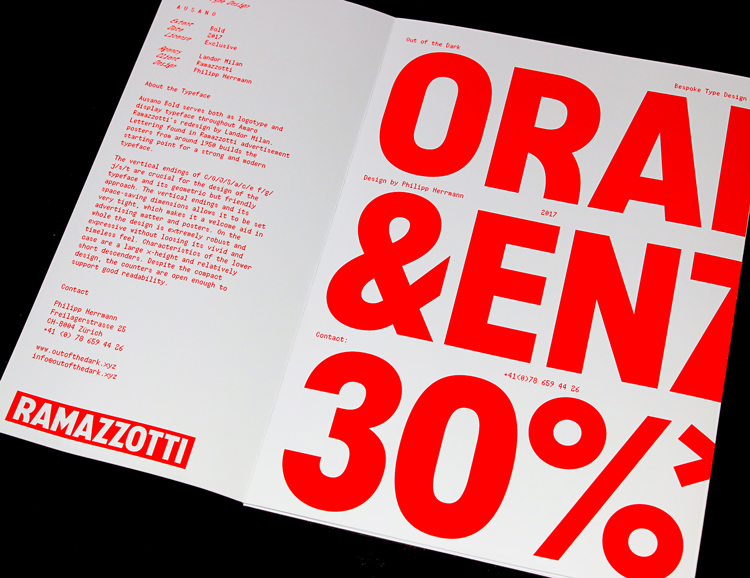
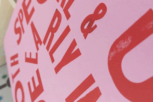
 Finally, Herrmann’s third project, Ausano Bold, serves both as logotype and display typeface throughout Amaro Ramazzotti’s redesign by Landor Milan. Lettering found in Ramazzotti advertisement posters from around 1950 builds the starting point for a strong and modern typeface. The vertical endings of C/G/J/S/a/c/e f/g/j/s/t are crucial for the design of the typeface with its geometric yet friendly approach. On the whole the design is extremely robust and expressive without loosing its vivid and timeless feel.
NAME: Ausano Bold
EXTENT: Bold
YEAR: 2017
LICENSE: Exclusive
AGENCY: Landor Milan
CLIENT: Ramazzotti
DESIGNER: Philipp Herrmann
 Check out more of Herrmann’s work via the links below.


- Posterzine™ Issue 46 | Marylou Faure - September 16, 2019
- Posterzine™ Issue 45 | Mojoko - September 13, 2019
- Posterzine™ | Karl Grandin - August 21, 2019