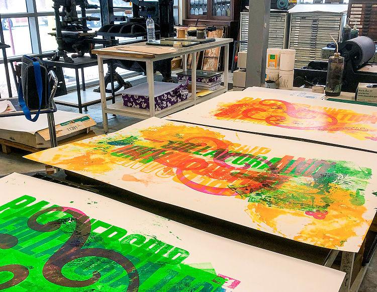
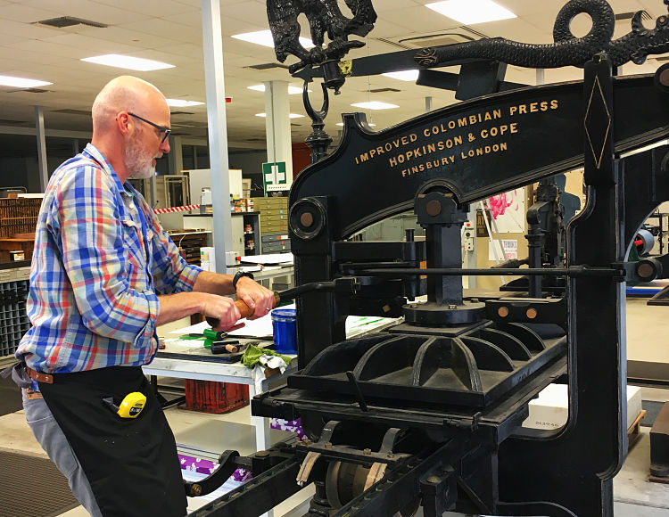
Phil Gambrill of letterpress studio Fresh Lemon Print was recently invited to undertake the letterpress artist in residence position at North Metropolitan TAFE in the heart of Perth’s CBD. At the residency he explored many typographic shapes within their extensive wood type collection and ended up focusing on the ampersand letterform and the history associated with it.
 In the first century, Roman scribes wrote in cursive, thus when they wrote the Latin word ‘et’ meaning ‘and’, they linked the E and T. Over time, the ‘&’ ligature’ came to signify the word ‘and’ in English. Certain older typefaces clearly reveal the origin of the ampersand shape, but nowadays it comes in many shapes and forms creating a decorative logogram.
In the early 19th century, the letter ‘&’, or ampersand as it then became known, was the 27th letter of the alphabet. The name was derived from ‘and-per-se-and’ where ‘per se’ meant ‘by itself’, so the alphabet concluded X, Y, Z and by itself &.
 Phil produced a series of large format, hand printed posters on this subject and simply named them ‘and’. He looked at the ampersand ligature in all of its shapes and forms and eventually settled upon an oversized Goudy italic typeface iteration as the centre piece. The background was created from various 30 and 40 line wood type founts, all printed on their masterful 19th Century Colombian press.
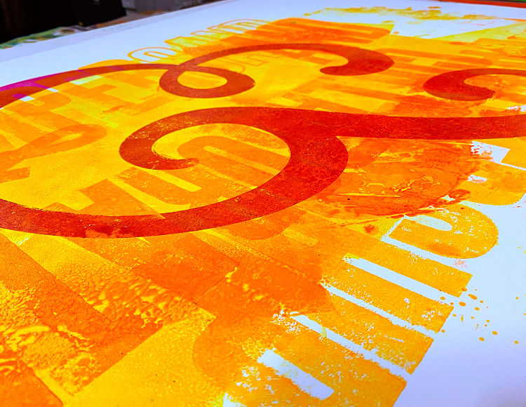
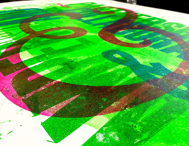
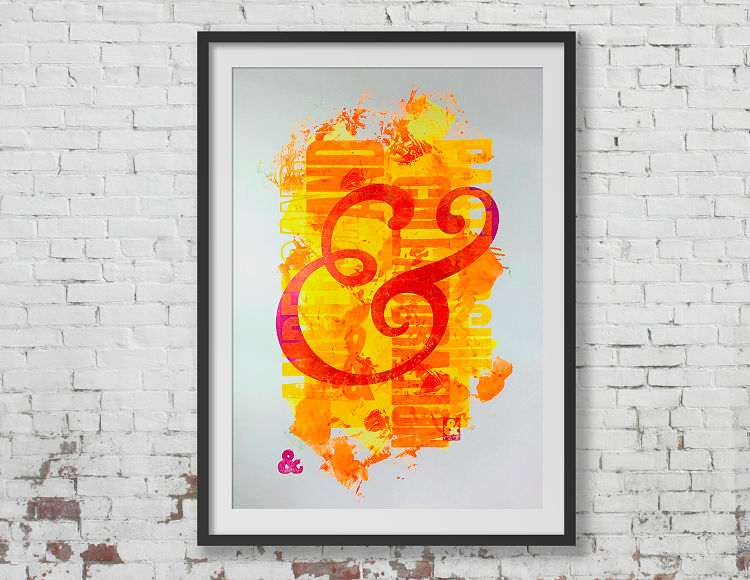 This large format print is his celebration of the symbol and in his trademark style of ink textures and overprints has created a colourful, grungy, typographic poster.
www.freshlemonprint.com
@freshlemonprint
You might like...
 Print Isn’t Dead Tote Bags With Everpress
- 2 Press
- Studio Gruhl
- Studio Kars + Boom | Rietveld Schroder House 100th Anniversary Prints
- Kyu Hwang
- Jon Burgerman – ‘Drawings of girls I’ve seen on tumblr’
- DEFCAD – ‘Liberator’ :: 3D Printed Handgun
- Kenji Nakayama
- Inkygoodness: Glug Birmingham Poster Design Competition
- Mirka Laura Severa
- The Print Room | Manchester
- Directors Picks 2013 :: Print-based
- RAGING BUSH: Not Your Grandmothers’ Embroidery
- Instant Touch Launch
- (fos)
- Sean Tyler


Want to know more about our membership? Give us an email at members@peopleofprint.com.
- Tim Belonax |All Of My Mistakes Have Led Me To You - April 26, 2024
- The Humber Printmaker - April 25, 2024
- Horizons by Angus Vasili - April 24, 2024