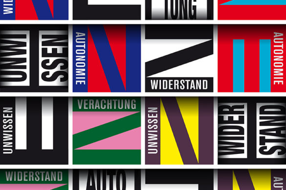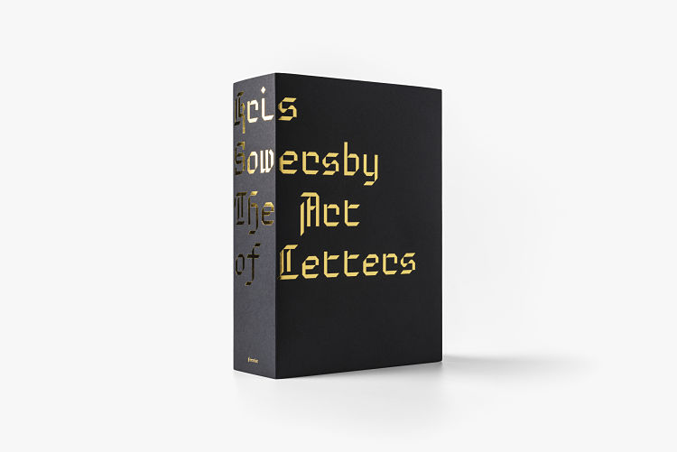
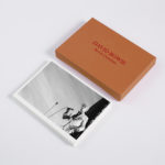
Kris Sowersby: The Art of Letters is one of the latest releases from Formist Editions. The paperback, 800 page publication examines type designer Sowersby’s letter drawing practice while considering the characters as independent works of art. Expressing the intersection of art, function and form in type design, the book champions the absurd beauty involved in creating multiple expressions of predetermined alphabets through nuance and theory.
 The publication presents and provides the opportunity for one to re-see letterforms for their individual form and function. While a typeface is a well considered set of many elements, if one removes the context of language systems and alphabets, each character may be viewed as a singular abstract drawing, as art in its own right. As Sowersby states; “Each letterform in a typeface is painstakingly drawn. It simultaneously has to function on its own and with others. Typography is language made concrete, and typefaces are the material from which it’s made.”
 Formist founder Mark Gowing describes the concept as “asking more questions than it answers. What type designers do is often discussed as a kind of science. But the process of type design is also highly creative and involves an intuitive artistry led by thousands of minute decisions. I wanted to look beyond the function of type and realise the beautiful art form within the system. Type is an expressive art that can embody complex concepts and social meanings.”
 For a type designer, their relationship to letterforms is intimate and complex. Something Kris Sowersby of Klim Type Foundry can attest. Along with his popular library of commercial fonts, Sowersby has designed custom typefaces for commissioners including The Financial Times, PayPal and National Geographic. He has received numerous awards and accolades, including a Certificate of Excellence from the New York Type Directors Club and the John Britten Black Pin, the highest award given by the Designers Institute of New Zealand. In 2019, Sowersby was named an Art Laureate by The Arts Foundation for his continuing contribution to New Zealand Art and Design.
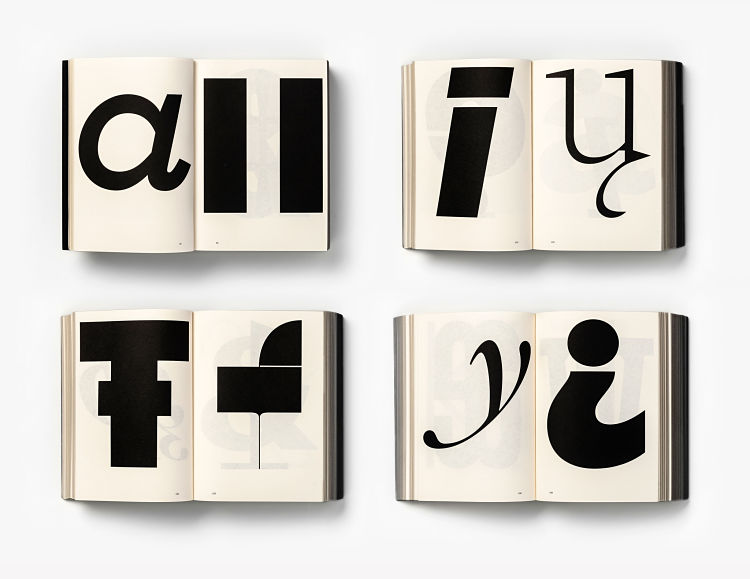
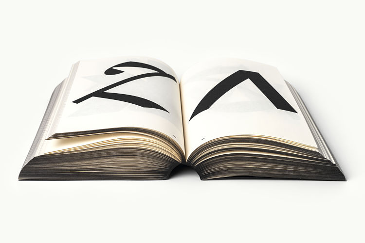
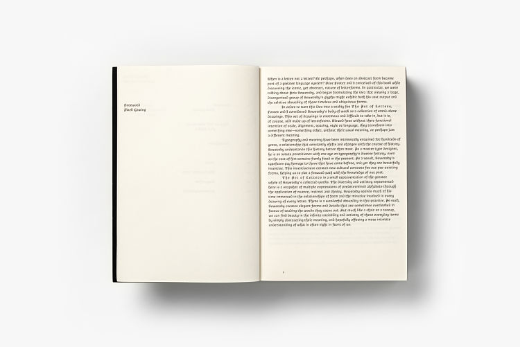
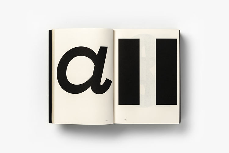
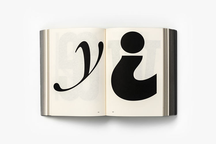
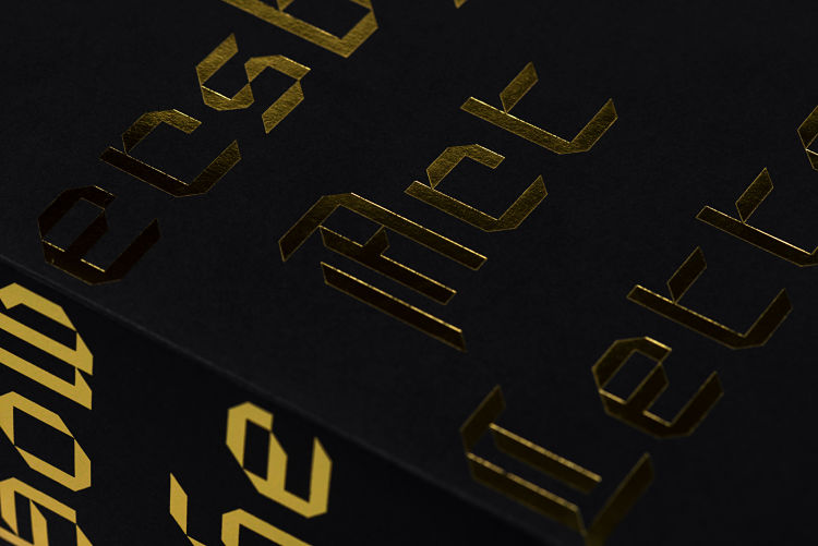
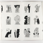
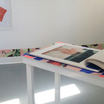
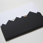
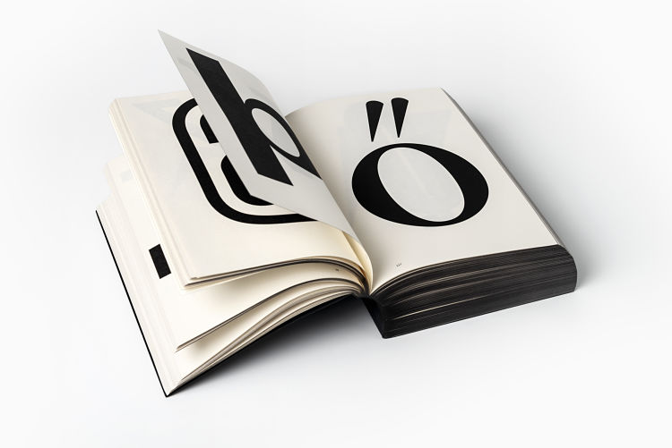 Kris Sowersby: The Art of Letters is finished with black-edged pages and a dust jacket featuring gold foil-stamped custom typography. Inside the 150 × 210 mm publication Sowersby’s letters come to life, printed one per page in black on cream paper. The book also features an essay from graphic designer, writer and educator Paul McNeil titled What we read when we see and a foreword by Formist publisher and designer Mark Gowing.
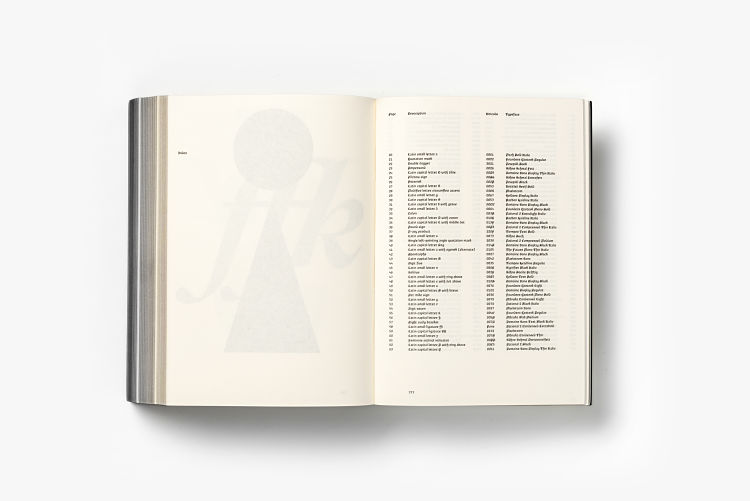
Sowersby and Gowing collaborated on a custom typeface, Brotunda, used to typeset the book. Inspired by the rich history of rotunda typefaces, its use is exclusive to the publication.
 Purchase the book here.
You might like...
 Joris Vandecatseye
- Cleon Peterson (NSFW)
- Lauren Curl: Vibrant Torn Edges
- Jeremie Fischer
- Jazmine Joye Prints
- Kitty McCall
- David Bowie | Kevin Cummins
- Thomas Albdorf
- Sophie Cunningham
- Joe Cruz
- Cold Picnic – Private Parts
- Shrewsbury’s First Open Access Screen Print Studio Is Crowdfunding!
- Euphrosyne Andrews | Interview
- Everyday Ornaments 2020 Calendar
- Beatriz Costo | Two Suns*
- SilvesterArt


Want to know more about our membership? Give us an email at members@peopleofprint.com.
- Tim Belonax |All Of My Mistakes Have Led Me To You - April 26, 2024
- The Humber Printmaker - April 25, 2024
- Horizons by Angus Vasili - April 24, 2024