If you’re in need of inspiration, or just pottering about from tab to tab in need of some procrastination that’s way more enriching than, say Googling “when exactly do the pubs reopen” or Photoshopping your friend’s faces onto those of Princess Di (just as an example), you could do far worse than to take a nice leisurely trip around the Letterform Archive. We’ve been excited about the project since mutterings about it first began a few years back, and it’s something of a consolation to have the San Francisco-based collection open up online for the world to peruse.
The archive, as with most such projects, is a true labour of love, gathering printed ephemera from the past 4,000 years or so (yes, 4,000 years), hailing from around the world. There’s a push to present more than just the more familiar Westernised canon, and to showcase the work of deserving but sorely underrecognised designers as well as the big guns (Josef Albers’ album design are a highlight, as is this 1920s Japanese elephant, this 1970s Typress catalogue, also Japanese… the list is truly as long as the time you have to browse the collection.
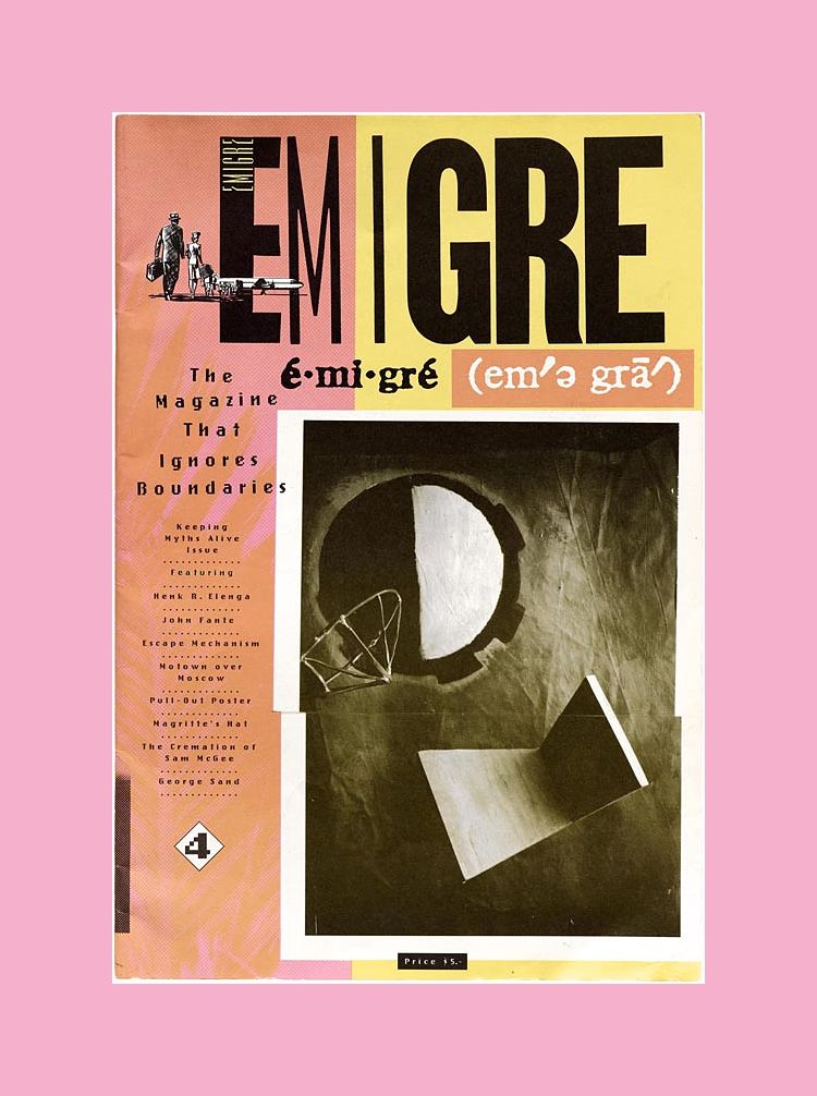
Emigre #4: The Magazine That Ignores Boundaries. 1986. VanderLans, Rudy (Art Director, Publisher), Susan, Marc (Associate Publisher), Meyjes, Menno (Associate Publisher)
Emigre (Agency)
West Coast Print Center (Printer)
The Archive was founded by letter arts collector Rob Saunders as a place to share his private collection with the public, and opened to visitors in February 2015. The archive now comprises more than 60,000 items related to lettering, typography, calligraphy, and graphic design, spanning thousands of years of history.
With the archive recently moving to a new home, we had a chat with Stephen Coles. Letterform Archive’s editorial director associate curator.
How did you come to be working with the archive ?
I first saw the collection that would become Letterform Archive in 2012. My friends Tânia Raposo and Frank Grießhammer introduced me to Rob Saunders who had this incredible stash of books and ephemera that were pure eye candy for us type nerds. Rob would host gatherings of designers from the around the Bay Area and we’d hang out and look at letters. He’d ask, “Who do you like?” and I’d say something like “Ben Shahn”, and he’d go upstairs or climb the ladder on the huge wall of shelving and come back with a big stack of books or original drawings, many of which I’d only seen online, and others I’d never seen before.
After a few months of this, it was clear to all of us — especially Rob — that this experience should be available to everyone. He explored donating to libraries and museums, but chances were that most of the collection would end up in a vault somewhere. There just wasn’t an institution with such a singular focus on letterform design, and yet a broad scope of history and styles. So, Letterform Archive was born as an official nonprofit organisation in 2015 with the goal to keep the collection as accessible as possible and maintain as much of that friendly, welcoming vibe we all felt when we were visiting Rob’s home. The collection has since quadrupled in size, thanks in large part to donations from designers of their own archives.
I was on the board for a couple years and then joined the staff in 2017.
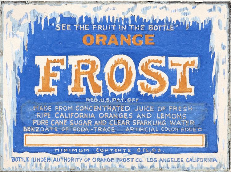
Orange Frost. 1920–1932. Lehmann Printing and Lithography Company (Agency).
What does your job involve and what does a typical day look like ?
My role is mainly to help define the collection by bringing in new work, and then to share it with our community through articles, social media, tours, presentations, and occasional teaching. And, really, all of us on staff do some version of these things. Yesterday, I taught a type history class using the collection (a partnership with California College of the Arts), helped our librarian Kate Long add some metadata to the Online Archive, answered some questions from our Type West students about their typeface revival projects, met with our exhibition team about possible future shows, and did some prep work with our associate publisher Lucie Parker on a book I’m writing about our collection of type specimens.
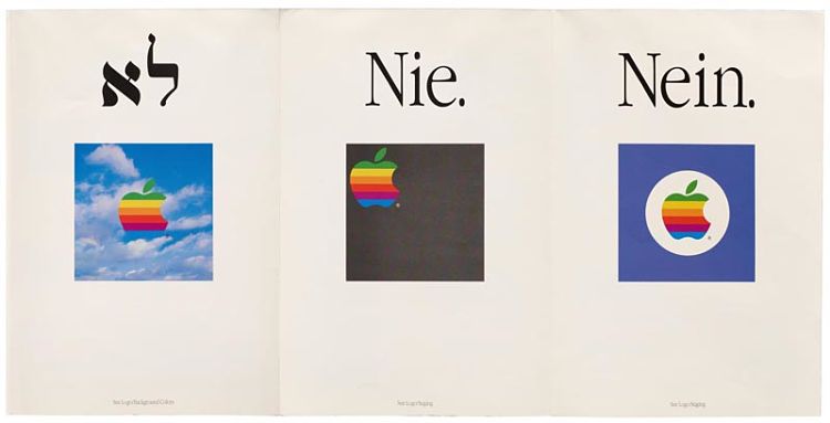
Full colour double-sided poster.1987. Apple Computer, Inc. (Agency).
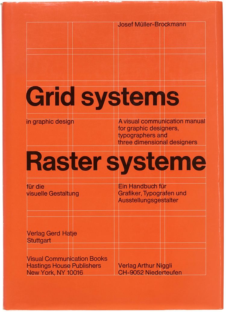
Grid Systems. 1985. Müller-Brockman, Josef (Designer).
What, to you, are the standout pieces in the archive and why?
It’s so hard to pick individual items because the strength of the collection is the scope of the collection. It’s that unique focus-plus-breadth I mentioned before. Visitors usually come to see our oldest and rarest objects — such as a 4,000-year-old cuneiform tablet and a leaf of the Gutenberg bible — but the best part of the job is introducing them to stuff they hadn’t heard of. Like, “Here’s a series of iconic record covers by artist Josef Albers, but did you know Laini, who is probably the first African American woman to be credited as an album designer?” Or, “Many western designers only learn about what was going on in Europe or North America. What was going on in the rest of the world?” There are countless examples of these stories that I could never summarize, but we try to tell some of them in our blog.
Who would you say the Collections are aimed at, broadly speaking ?
Our circle is continually growing. The original idea was to reach typophiles, then it extended to designers seeking inspiration, but now we aim to share the history of lettermaking with anyone who is interested in art, craft, culture, or language. The great thing is that this expansion of our audience hasn’t diluted our curatorial vision in any way. In fact, it’s the depth of material in type design, graphic design, lettering, calligraphy, visual poetry, covering lots of different subjects, that allows the general public to get excited about these crafts.
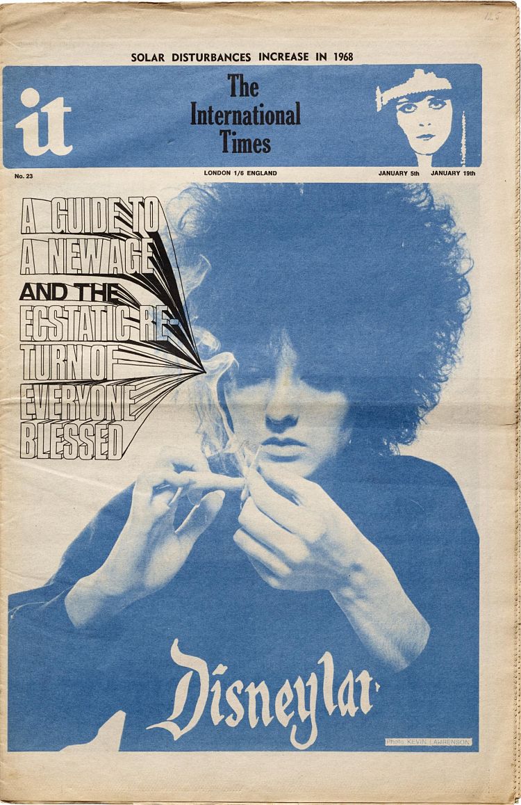
The International Times, no. 23. 1968. Levy, Bill (Editor).
What sort of feedback have you had about them so far?
I really miss on-site tours. We’ve seen students moved to tears when they can pick up and hold a historical landmark of design that they’d only seen in tiny images on screen or in a textbook. They often react to the feel and size of the thing — a Paula Scher poster or a tiny medieval manuscript appear to be the same size if you don’t get to see them in real life.
What are the main challenges main of presenting the works online as opposed to physically ?
Our goal is to bring as much of that in-person experience to our Online Archive as possible. One challenge is to represent relative scale (as I mentioned before), so our thumbnails are not all the same size — a postcard appears smaller than a poster, for example. We also use photography (not scans) and images are never cropped, so you can a better sense of each item as a physical object rather than a flat image. We’re a little obsessive about our photography standards. The other part of emulating a visit to the physical archive is the experience of serendipity. Rather than immediately presenting you with a scary search form, the Online Archive encourages visual exploration. And we just launched a feature to members that allows them to set their own tables (curated sets) the way we do in person.
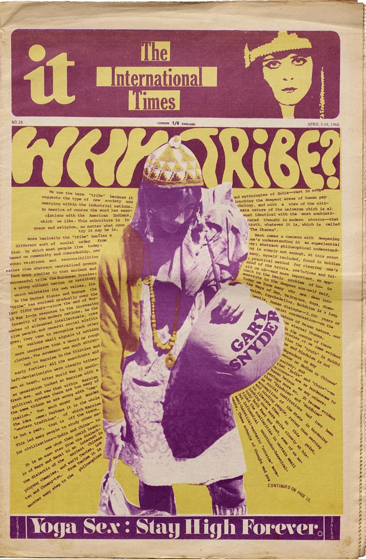
The International Times, no. 28. 1968. Levy, Bill (Editor).
What can letterforms tell us about history and culture that other elements of visual culture might not?
Letters all all around us. They may be as universal as anything humans make. It’s a thrill to remind people of that and help them understand how they came to life.
If someone only had a couple of minutes to look through the works in the archive what would you tell them to look at and why?
Check out the selection of highlights on the Online Archive homepage , or just type a word into the search and see where it leads you.
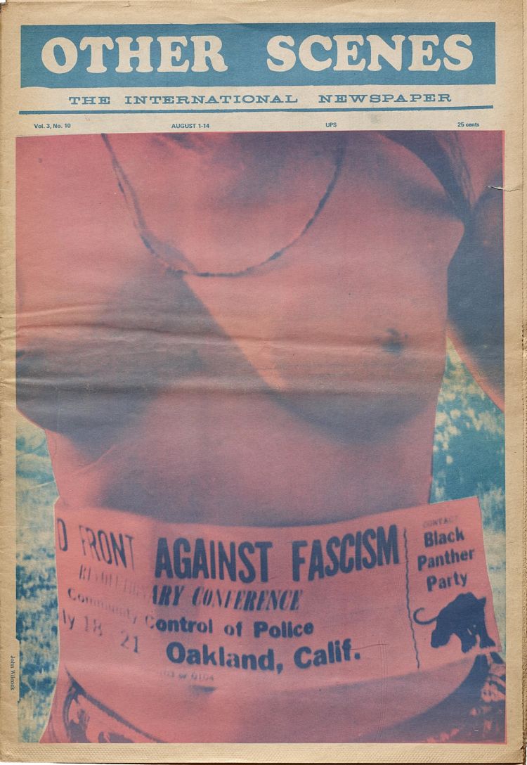
Other Scenes, vol. 3, no. 10. 1969. Johnson, Oliver (Editor).
What’s coming up for you?
We’re still unpacking boxes after a herculean move to a new location. Next is to set up our shop and gallery. The first exhibit, hopefully opening this fall, is a comprehensive and focused look at the typography of the Bauhaus, which just celebrated 100 years. We’ll follow that with a wide-ranging and provocative show about protest graphics throughout the 20th century curated by Silas Munro.
You might like...
- Autobahn - November 26, 2021
- Alphabetical - November 12, 2021
- SOFA Universe - November 8, 2021


