Koji is a brand new bilingual publication exploring our relationship with time, food, and nature through the lens of contemporary art, design, craftsmanship, and lifestyles. Published in Tokyo by Onishi Jun, the magazine is conceptualised, edited, designed, and printed in Shanghai as a creative collaboration between Shanghai Erweiyi Culture & Lifestyle Co., Ltd. and Iroha Studio.
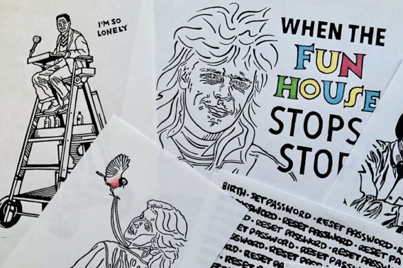
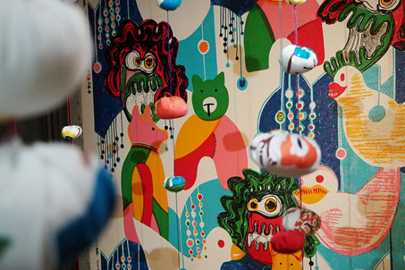
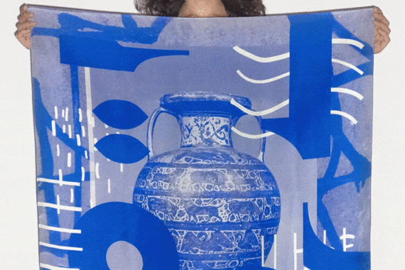
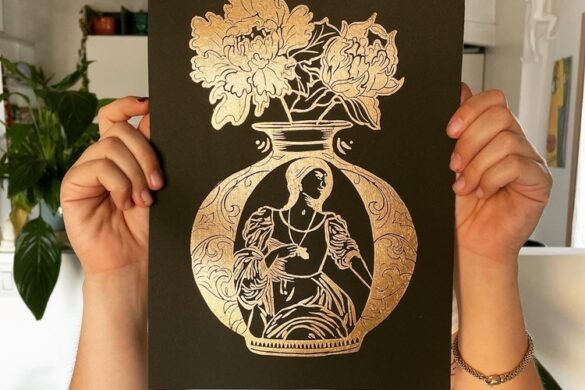
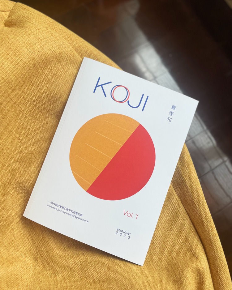
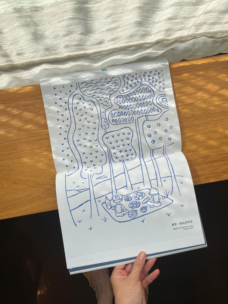
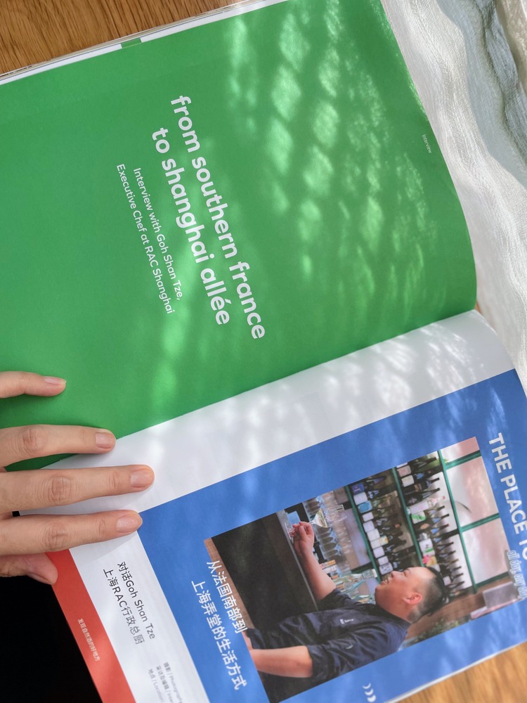
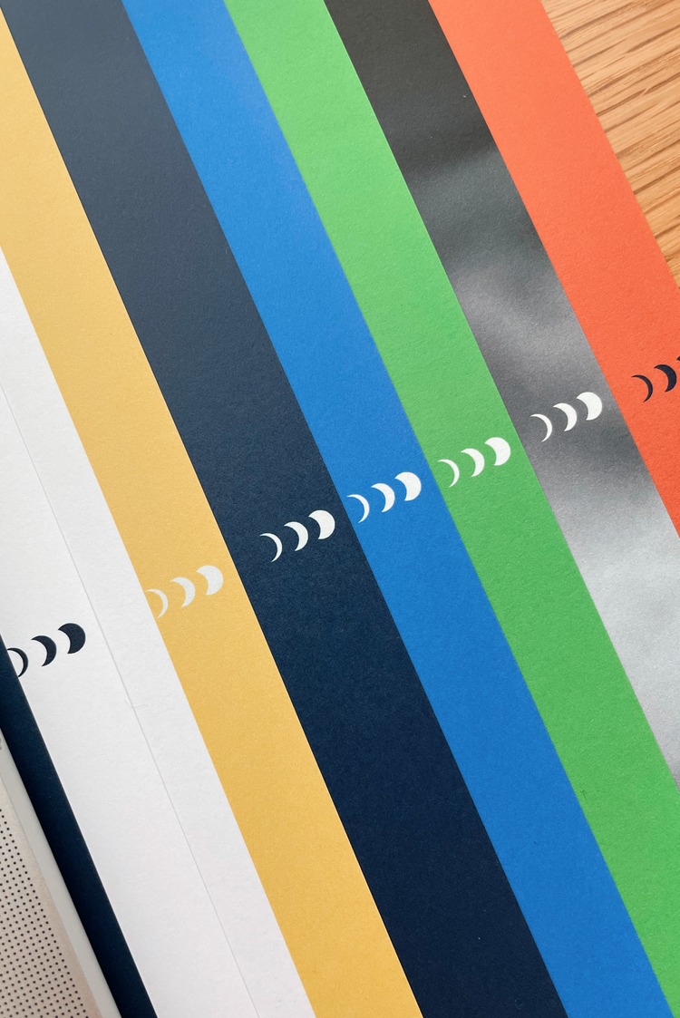
Hot off the press, Issue 1 takes the moon as a muse for inspiration and contains 9 chapters (mirroring the moon’s cycle) featuring beautiful storytellers and creators from Shanghai, Tokyo, Nagano, Osaka, Paris, and Berlin. Inside, one can explore the expression of “time” in the art of photography alongside the “fermentation” in the image-making process. The publication’s design takes the reader on a sensory journey inspired by the interaction with the “moon” and the “craftsmanship” of the unique sake vessel and its “four season” aesthetics. You will also find personal stories of “natural wine lovers”, original illustration work interpreting the “relationship between nature and food”, and healthy home recipes that combine “fermented ingredients”.
 The ideation of Koji was born from the curiosity of fermented food cultures and the passion for building a sustainable wellbeing in our everyday life. Lyla Lee of Iroha Studio describes; “It is very natural for us to see and connect with nature through the appreciation of artisan food on our table. And through design, art and craft that is around such food experience, we always can see and feel the beautiful flow and the weight of time.” The stories featured in issue 1 are all based upon on this relationship between food, time, and nature, analysed within a contemporary context, and selected for their originality and edginess, interconnections among art, design, and craft. Lyla Lee comments further; “We love the blurred boundaries, multi-cultural background that has good niche with Koji’s mixed cultural identity”.
Furthermore, time, food, and nature were 3 of the concepts that were treasured during recent times of lockdown, when life was more limited and basic. “We are aware of the significance of them more than ever now,” says Lyla Lee. They continue; “Living mindfully, in a way, is fundamentally related to how we deal with time, food and nature, the foundation of building our wellbeing inside out.”
 As an independent magazine enthusiast, and a curator and designer who works with creative contents and community locally and internationally, Lyla Lee has been constantly subconsciously influenced by all sorts of reading and work on other projects. They tell us; “The opportunity of creating a brand new print media arose at a time when such inputs also wanted a creative outlet. Who I am, how I read. and what I wanted to challenge on the art of storytelling all become part of the motivation and creative fuels of creating Koji.”
 So why did Lyla Lee and her collaborators decide to publish independently? “It’s the most direct and rewarding approach that maximises the space for creative freedom and editorial independence. Leading both content and design on my own has been a great challenge but also the best practice ever to rethink the relationship between content and form, storytelling and visual communication and eventually create an one of a kind publication.” For some, international distribution and marketing may be considered a disadvantage for independent publications in general. But for Lyla Lee, this is not the case; “I personally believe that from creator to readership/content consumer, the direct C2C mode will be the future. Making a solid print takes time. We shall allow the time and organic efforts too for it to get connected with or cultivate the authentic readership slowly and step by step. Koji is finding its ways too, so far so good!”
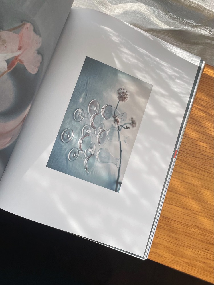
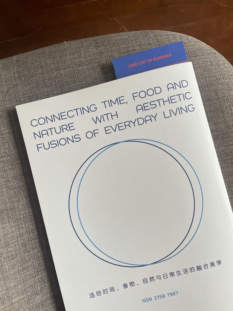
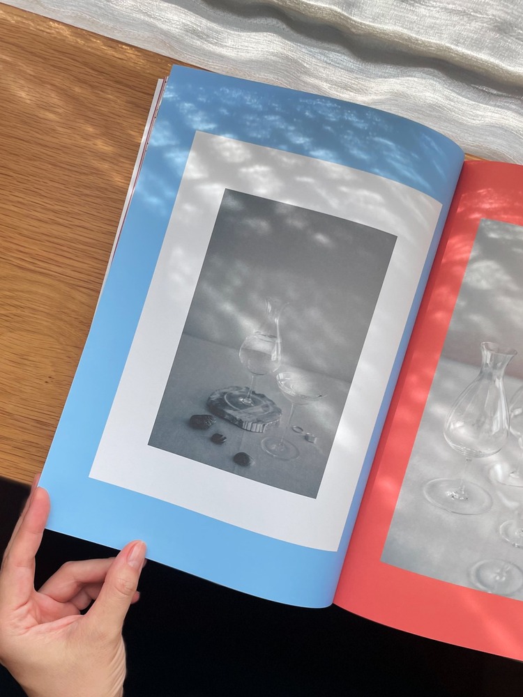
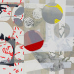
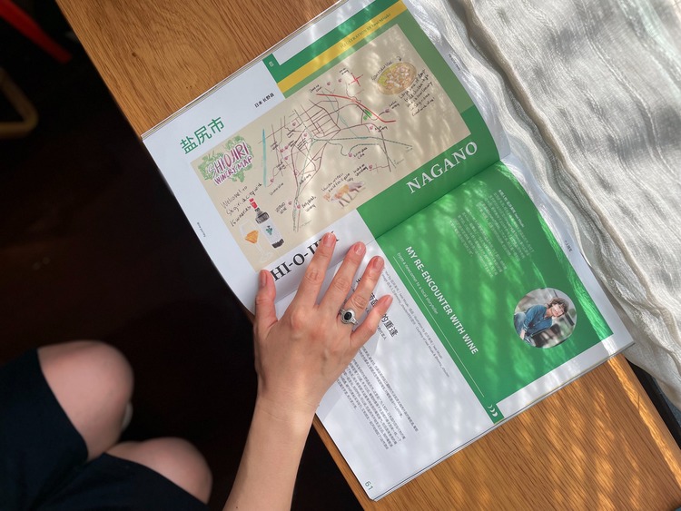 Aesthetically, the publication’s design could be considered fairly minimal, and interpretation is left open to the readers. Lyla Lee states; “One can call it minimal, while the other may see it different. I don’t have any design reference from such styles that are already defined.” Koji has instated its own preliminary colour system to establish a brand identity. For example, two Pantone colours: dark night and light sky have been selected and will be used as signs of day/night-time flow throughout the project. The launch issue’s white cover is a hint of “start from scratch”; an innocent yet bold colour to begin the publication’s creative journey.
The design itself is a very human and content-centric approach, emphasising the stories featured and the people and humans behind them. Lyla Lee details; “Conventional graphic designers might easily go for inspiration of visual styles on trend, while I work away from those trends. I care about the humans, their stories, the most reflective emotional colours of each story one by one.” For a bilingual print in Chinese and English, two completely different types, Lyla Lee focused on creating something new by questioning, exercising, and zooming in and out to find the right balance for a better reading experience.
 Currently, Lyla Lee and team are working on the editorial plan for issue two, with interviews already lined up for October and early November. Koji is set to be a biannual publication, and Issue 2 will be coming in Dec/Jan. Looking further to the future, Lyla Lee hopes to curate a series of exhibitions in Shanghai and Tokyo with Koji creators and storytellers. These will be a reflection of the early phases of designing the publication, a get-together with their growing community, and a presentation of Koji within a three dimensional offline experience where the concept of Koji can be touched, read, and experienced in person.
Order your copy here.
You might like...
 Caroline Tomlinson | Homewards
- Dungarees + Squeegees | Spooky Goodies
- Hound & Bone
- Ktoed
- Beer Stained Pulp
- Rachel Hodgson
- Ray Ewing
- The Art Socks Photo Series by Kate Brien
- Stussy X Champion :: Spring 15
- Akasha Rabut
- Kim Minuti
- Press Relief
- David Cumming
- PechaKucha x Fair Trade at Design Museum
- Two Points x ESPN
- Booklyn


Want to know more about our membership? Give us an email at members@peopleofprint.com.
- Tim Belonax |All Of My Mistakes Have Led Me To You - April 26, 2024
- The Humber Printmaker - April 25, 2024
- Horizons by Angus Vasili - April 24, 2024