Like Mystic Meg with a Photoshop and an array of tote bags, we bring you five predictions for the design world and visual culture in 2021.
Buying fonts ain’t like it used to be
And that’s a good thing! We’re seeing a number of foundries and type studios cheating new licensing models that better reflect things like the move towards variable fonts, and which are fairer on customers (for instance, a solo freelance designer might not be expected to pay the same amount as a big brand design team that’s using it for many applications, and which has numerous designers on various computers accessing the licence.)
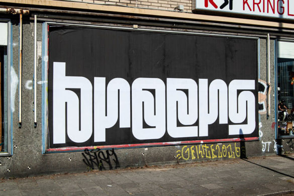
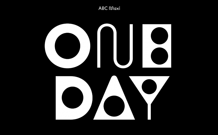 In September last year, Swiss foundry Dinamo launched its new website with two new fonts, Maxi and Diatype). The new site is a delicious melange of strange post-internet 3D shapes and animations, emojis, huge orbiting brain-planets, and more—but it’s also the vehicle for Dinamo’s revolutionized approach to font design, licensing, and pricing. Design-wise, this means that the foundry has chosen to focus on variable font technology because it “feels relevant,” says Dinamo cofounder Johannes Breyer, “yet also human, real, tangible, and relatable.” He adds that such fonts offer their end-user, the designer, a multitude of new possibilities for applications such as animated billboards, streaming, or interactive physical type installations compared to their traditional static counterparts.
Future Fonts is a platform that’s been getting a hell of a lot of attention lately. Originally launched in 2018, Future Fonts sells typefaces that are works in progress—and as such, they retail for far cheaper than standard fonts. Designers using the platform set the price of their font and manage the font files and licensing independently. Future Fonts selects which type submission to feature and takes a cut of their sales, but otherwise that’s its only involvement in the process. The lower pricing doesn’t mean type designers lose out: the lower price is still higher than nothing—i.e. what the typeface would be earning its creators in the months leading up to its completion (assuming it reaches completion). Selling fonts as they iterate means the project has a funding stream for longer. As more work is completed and new versions are added, the price goes up, but those who bought it early get it cheapest, with the updates along the way available for free.
Enough is enough when it comes to equality in the creative industries…
In the wake of the summer’s BLM protests etc. there were a number of promises made by various art and design-led organisations to address institutionalised racism: galleries pledged to up their diversity when it came to what they show and who they hire, art schools have acknowledged the need to decolonise the histories they teach, art and design prize lists seem to be less-white… the list goes on. The optimists in us are hoping that these very, very pressing issues around representation won’t fall by the wayside without the prodding of big news headlines and global protests, or become overshadowed by the pandemic even more than they are currently.
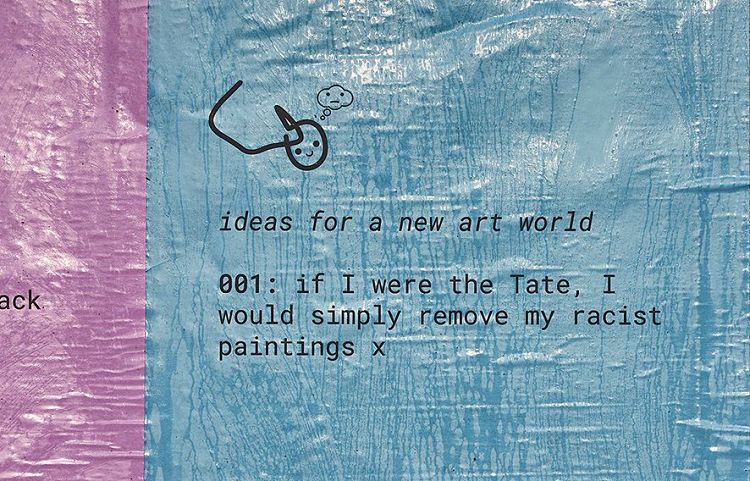 A new campaign from arts platform The White Pube looks to keep the ideas of fairness in the art world front of mind. The manifesto “for strong hearts and minds” has taken to the streets of London and Liverpool following The White Pube’s collaboration with the BuildHollywood family of agencies Jack Agency, Jack Arts and Diabolical for its Your Space Or Mine initiative. The White Pube’s “ideas for a new art world” take the form of six direct and ambitious suggestions as to “how things might be improved for the many and not just the few”.
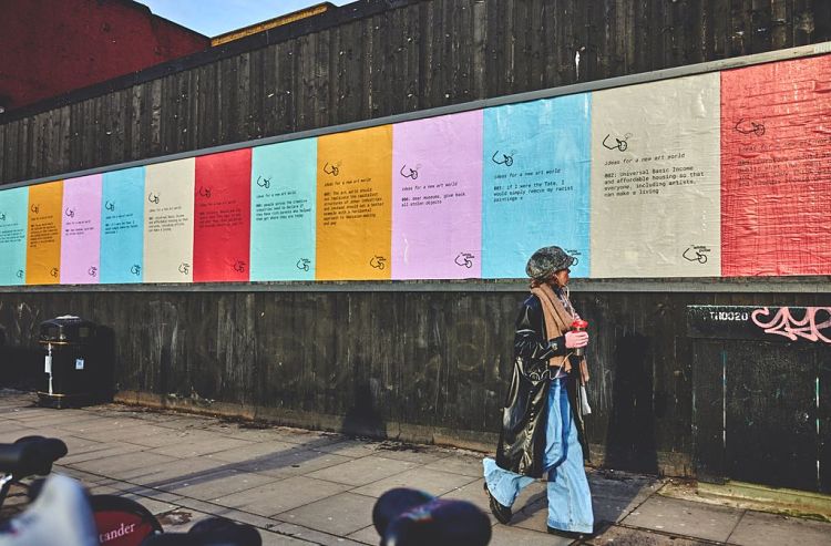 With black lettering on bold backgrounds, the text-based billboards and posters feature no-nonsense ideas for a better, more equality-driven art world such as “Universal Basic Income and affordable housing so that everyone, including artists, can make a living”, “Curators should ask the public to see what they think galleries and museums should be used for’ and ‘Dear museums, give back all stolen objects.” The White Pube team describes them as “simple, feasible solutions, almost to prove how easy they can be if change is sincerely sought….None of these things is particularly radical, they’re just common sense, but for some reason, the creative industry operates in this wild space that makes them seem outlandish. Maybe they’re also manifestations… Universe! Make it happen, please!”
The collaboration will run over three months, with the artwork changing every two weeks.
A new approach to branding
Since the pandemic, those working in branding design who’ve spent much of their careers thinking about the translation of graphics onto physical touchpoints—sumptuous packaging, lush interiors, point of sale materials, wall spaces and so, so much more are having to look at their work anew. The tactility of packaging and even how it might stand out on shelf has a different resonance when buyers purchase online, and can’t touch them; but that means the packs also don’t have to compete with similar brands on busy shop shelves.
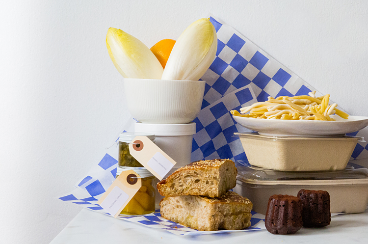 Restaurant branding is one of the most significant areas in which designers will have to rethink their process: eateries now have to sell themselves on photography, branding and other image-based means—their enforced closure means walk-in trade, or the smell of fresh coffee as a lure, nice exterior signage, convenient locations and so on aren’t relevant at the moment. Food outlets now have to behave online more like lifestyle brands than ever before.
“Restaurants that have been able to remain open for delivery and takeaway orders (and increasingly, reopen for outdoor dining) have relied on disposable design collateral to evoke their brand and stay top-of-mind through word-of-mouth and user generated content online,” as Rachel Del Valle wrote on Eye on Design. “Translating a restaurant’s brand—a unique combination of hospitality, food, décor, and general, for lack of a better term “vibe”—for remote dining is a challenge…” Many are looking to things like branded tape, stickers, and bags; or delivered meal kits
Goth, Monochrome Graphics Are Out (for now…)
It’s an aesthetic favoured by the likes of modular synth nerd-baiting Berlin arts festivals, techno record labels, pop-up t-shirt stores and the kind of subtly edgelord-leaning male art directors who spend a lot of time on Instagram. Black, white, occasional shades of grey; all-caps, widely spaced, sparse serif fonts; some sort of scientific illustration or geometric patterns. Such designs have, to their designers’ credit, been largely successful; hence their perennial status throughout the 2010s.
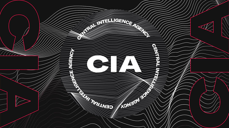 However, just three letters has changed all that: CIA. The US federal agency recently launched new designs that pilfer that trendy design language and take it to its logical conclusion: the very opposite of what it’s supposed to signify. Perhaps unsurprisingly, the new CIA brand and website design—which aims to appeal to young recruits with its hip vibe, monochrome palette and fonts like Grilli Type’s America, more usually associated with the hip young design crowd than national security—has got itself a fair few detractors. Designer David Rudnick said that “with this rebrand, the CIA has lost all credibility”; while some on Twitter compared the new logo’s line-based graphic (alluding to data and sound recordings, apparently) to Peter Saville’s iconic sleeve design for Joy Division’s Unknown Pleasures.
Typography Goes Back to the 1970s
In Burger King’s first rebrand in 20 years, design agency Jones Knowles Ritchie created a very cute, unabashedly retro but also undeniably stylish new logo that directly references the one used by the brand in the 1970s, 80s and 90s. The new bespoke font, Flame Sans, is deliciously 70s in its squidgy, pliable forms and carefree aesthetic.
![]()
 A number of new fonts that are predicted to do very well this year also tread a 70s path: Moranga by Sofia Mohr Latinotype uses similar tones in its promo imagery, and its retro serif letterforms call to mind iconic twenty-first-century type stalwart Cooper Black. That font is also referenced in Aesthet Nova, a display serif type family designed by Mariya V. Pigoulevskaya and released through The Northern Block this January. It’s perhaps a more subtle nod to the 70s; while Bogart is unashamedly vintage. Designer Francesco Canovaro, who published it through Zeta Fonts, created it as a typographic tribute to low-contrast, old-style fat faces like Cooper Black and Goudy Heavy Face, and its playful, hippie-ish vibes suggestive of simpler times, with their hints of 60s and 70s rub-on transfer designs and phototypesetting systems of the 1960s and 1970s, and are bursting with hippie energy and childlike personality.
You might like...
 Node on Facebook
- Fiorucci and Its Provocative Ads
- Naomi Prints
- Crumb’s World
- Half Cut Exhibition | Curated by Nick Morley
- nicedamien
- Sneak Preview :: Druck Berlin :: Erik Winkowski
- PSA >>|
- Petra Verkade | Wanderer Screenprint
- Vanda Sim Sim
- Typographic Passport 2013
- Jean-Pierre Raynaud
- POP Member Showcase | 10 Posters
- Le Dernier Cri
- Dan Blackman
- Barbara Rae


- Autobahn - November 26, 2021
- Alphabetical - November 12, 2021
- SOFA Universe - November 8, 2021