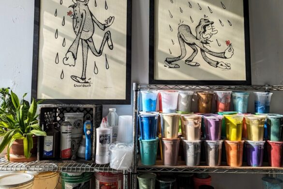
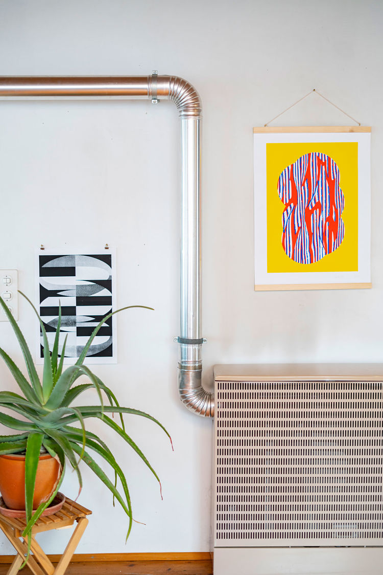
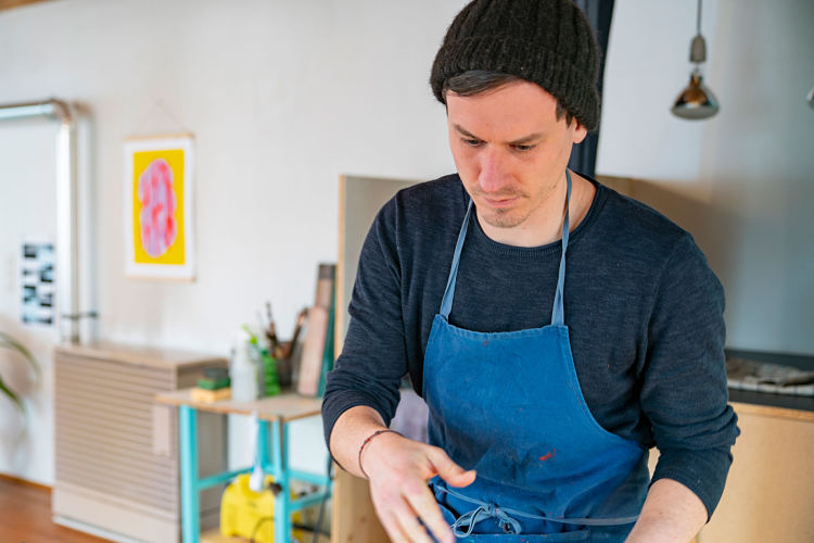
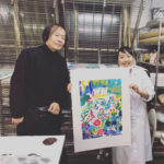
Manuel Trautmann studied at the School of Design in Basel, where he graduated in 2013, and was nominated for the Swiss Federal Design Award for his diploma thesis, Speechless. After several internships in graphic design offices, he now works part-time at a design agency in Zurich. But far away from the big city, in an old wooden shed, he has set up his studio as a space for experimenting, researching, and creating. While the firewood rattles in the background, and the cat creeps across the old floorboards, the room fills with the scent of a hundred colours; dove blue, coral red, emerald green, and ivory.
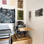
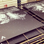
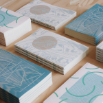
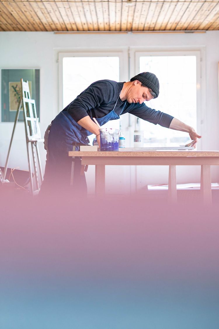 Manuel got into screen printing rather by accident. During his studies, he attended a printing workshop that lasted several days, though his everyday life was dominated by InDesign and Xerox printers. He bought printing utensils from a friend who no longer needed them, and set up his workshop in a shared studio in 2015. However, Manuel quickly realised just how much space this craft takes up; “…Just to wash out the screens, I had to run across a busy street every time, hoping I wouldn’t drop the squeegee on the way”. For the last two years, Manuel has been working in his own studio near Aarau, between Zurich and Basel, and focuses on small editions of art prints.
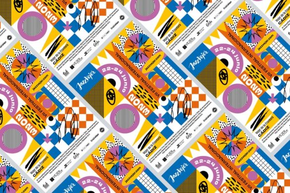
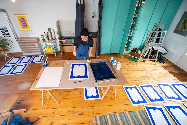
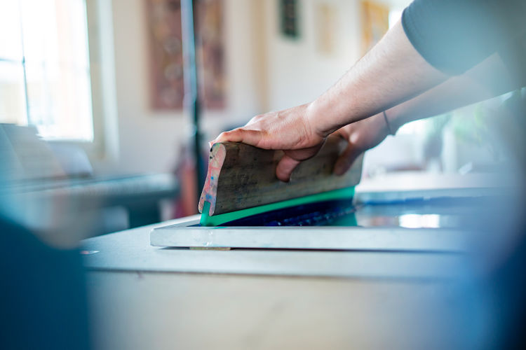
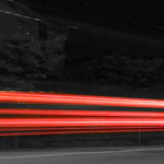
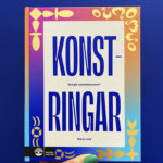
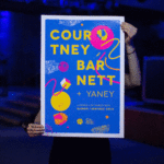
 “Screen printing is a ceremony. A clear and steady sequence of different working processes – and that’s what I love about my work. The moment just before you lift the screen after the last printing pass is an adventure every time. It is this power of colour and sharpness that makes this kind of printing so appealing.”
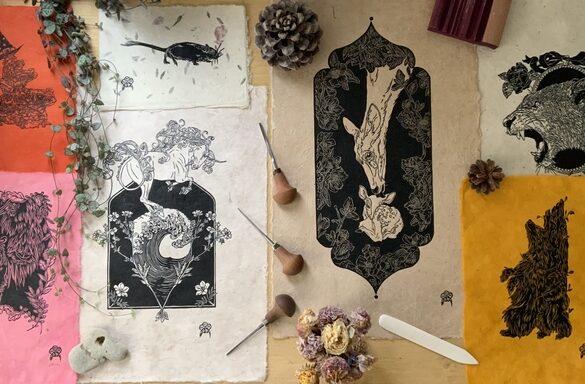
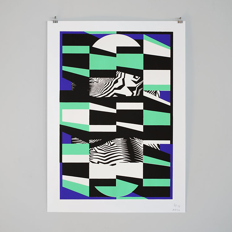
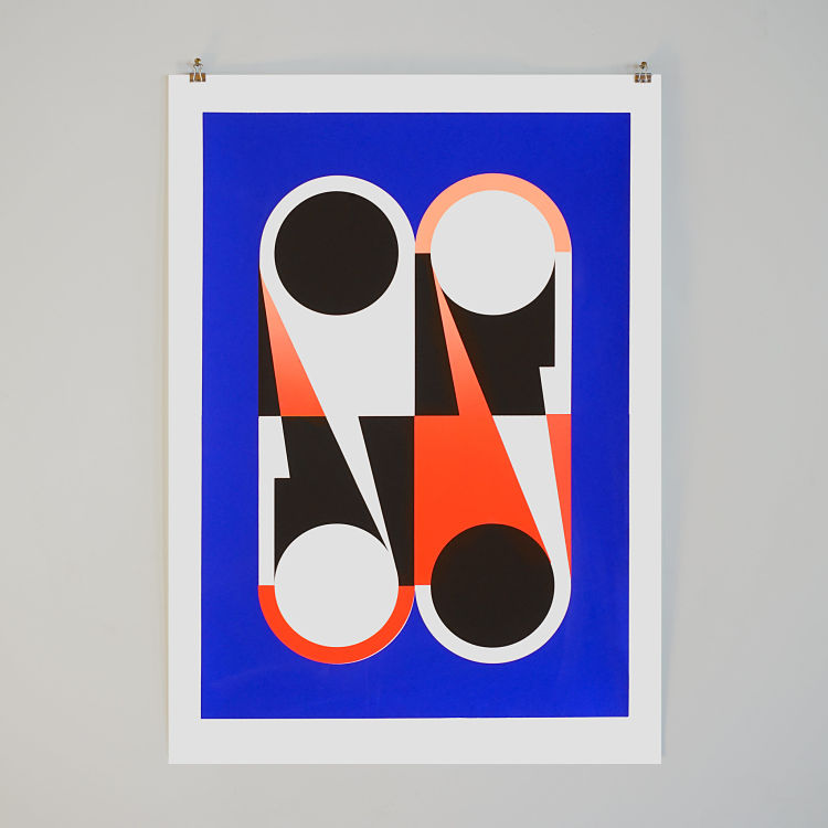
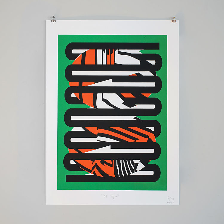
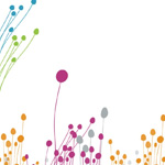
 His work is characterised by clear formal languages and high contrasts; Manuel always tries to “put as little as possible but as much as necessary on paper”. It often takes him days, even weeks, to be satisfied with a design. He says; “Every line and every surface has its home. Sometimes they meet – by chance – other times they face or repel each other. Colours can further support or break these situations. The most difficult thing is to recognise and force these interactions. This is not always successful, but when such a moment arises, it is like a rush.”
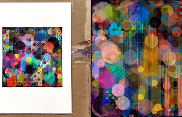
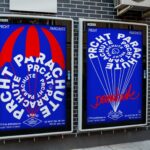
 Manuel’s style is influenced by Swiss graphic art, especially the Basel School. Armin Hofmann’s Graphic Design Manual is still current after more than 50 years, and acts as great source of inspiration. But the paintings of the Japanese artist Kumi Sugai or the Op-Art artist Victor Vasarely also fascinate him time and again. “It’s these playful and at the same time very stringent moments, the interplay between the random and the planned, which in combination develop an enormous visual power,” states the printmaker.
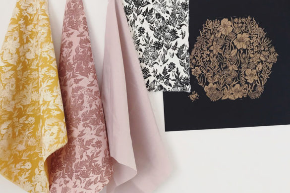
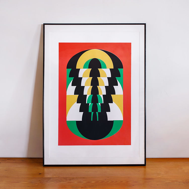
 In addition to inspiration from books and museum halls, it is personal observations and experiences that give rise to new ideas. Manuel comments; “Travelling through Central and South America opened up the world of colours to me. In no other place have I ever seen so much inspiring arts and crafts. Pre-Columbian art with its mesmerising colours and clear geometric patterns opened up a new approach to design for me”.
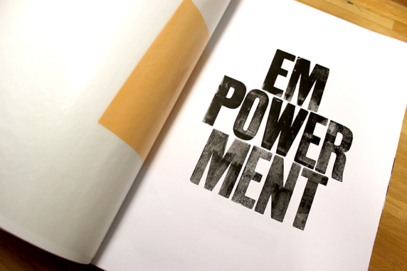
 “Manual printing techniques have been experiencing something of a renaissance in recent years. In a time when we sit for hours in front of screens and consume images mainly as LED constructs, it is all the more important to give the haptic and sensual experience back its place.”
You might like...
 Telegramme
- Bridge Unltd :: Visual Archive 003
- Makers and Shakers
- Flycatcher Press
- Dominic Hawgood
- Kirsty Buckley
- Parasto Backman
- Printing Service by People of Print
- Phone Pop
- POP Member Showcase: 9 Poster Projects
- Palace Skateboards Spring 16
- Saki Matsumoto
- Exhibition: Mike Perry – Pulled
- Nelly Duff presents – Ben EINE
- Julia Kostreva
- Mikhail Lychkovskiy


Want to know more about our membership? Give us an email at members@peopleofprint.com.
- Tim Belonax |All Of My Mistakes Have Led Me To You - April 26, 2024
- The Humber Printmaker - April 25, 2024
- Horizons by Angus Vasili - April 24, 2024